Local Directory & Marketplace Platforms Provider Directory Website Template
Atelier is a Bold Brutalist split-screen landing page template built for an art teacher directory app. It pairs a product screenshot header with raw typographic energy, an animated teacher counter, a lesson carousel, and a zip code preview flow. The result is a single-page experience designed to earn the app download before asking for it.
by Rocket studio
Quick summary
Atelier is a single-page app download landing page for an art teacher directory. It splits the viewport in two, pairs a live-feel product screenshot with massive condensed typography, and builds scroll momentum through an animated counter, a rapid-fire lesson carousel, and a zip code preview gate. Every section earns trust before asking for the install.
Who this template is for
This template is built for founders, product teams, and indie developers who are launching or growing a local art teacher directory app. It speaks directly to the audiences that directory serves, so the people evaluating the template should picture their actual users when reading it.
- Developers or studios launching an art teacher directory app and needing a conversion-ready landing page fast
- Art education entrepreneurs who want a bold, credible first impression before directing visitors to an app store
- Designers building for clients in the creative education or local services space who need a strong opinionated starting point
What problem this template solves
Finding the right art teacher is genuinely hard. Adult hobbyists, parents, and retirees searching online land on generic results with no sense of a teacher's real work or availability. A plain landing page will not convince them to download an unfamiliar app. This template solves the trust and momentum problem.
- It proves directory depth before asking for a download, using the zip code preview flow to show local results exist
- It communicates the app's value visually and typographically before a visitor reads a single line of body copy
- It removes the cold-start hesitation that kills app install rates for niche local directories
What you get with this template
You get a fully structured single-page layout built around one clear goal: the app download. Every section is sequenced to build confidence and escalate momentum toward that install moment.
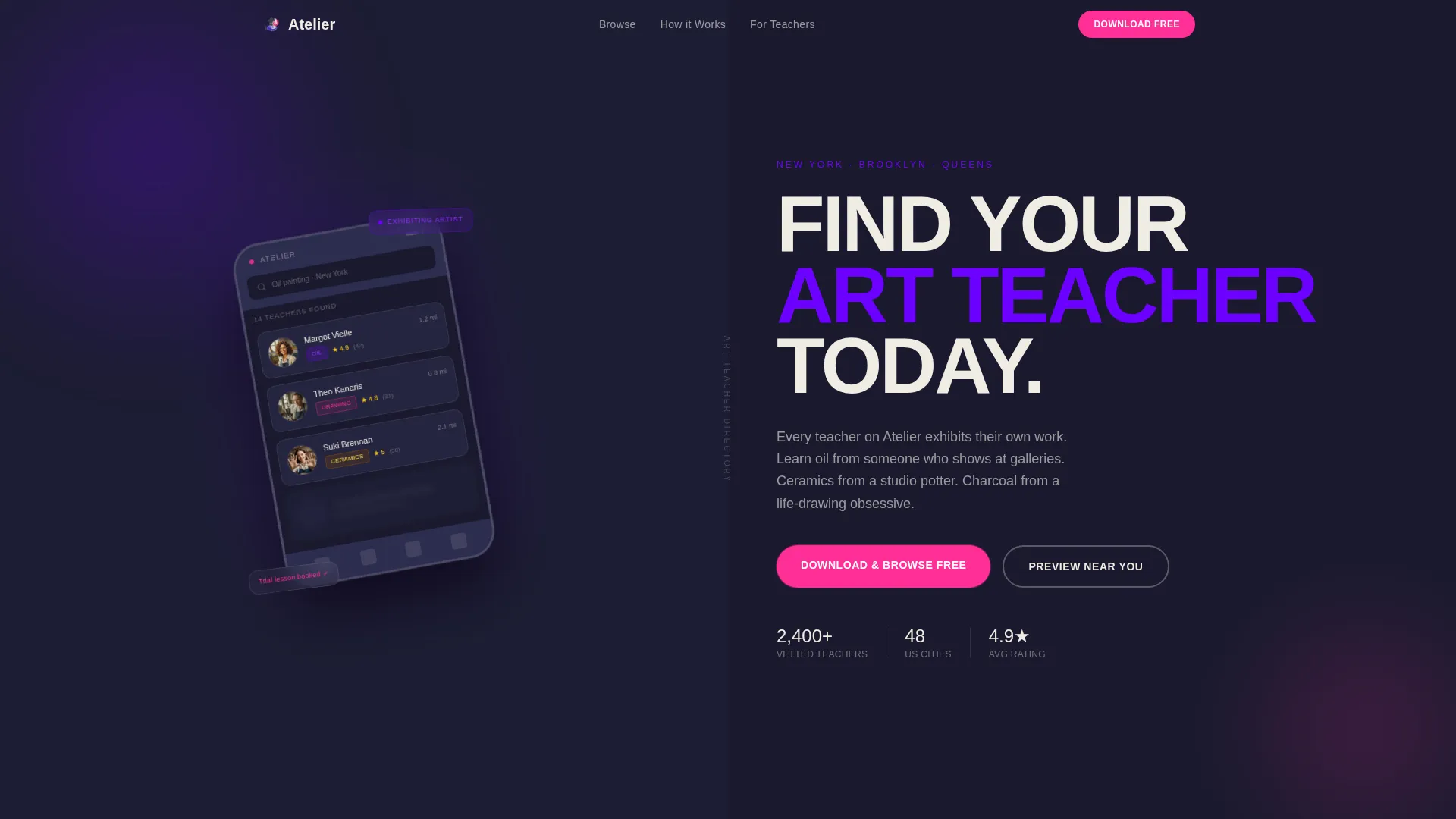
- A split-screen header with a phone-framed product screenshot and a stacked typographic headline
- An animated teacher counter, a rapid-fire lesson image carousel, and a multi-section scroll flow
- A sticky mobile bottom bar, three desktop call-to-action placements, and a zip code preview gate with blurred profile cards
Feature list
This template brings together layout, interaction design, and conversion structure in one cohesive package. Each feature below is drawn directly from the brief and built into the page.
Split-Screen Viewport Header
The header divides the screen exactly 50/50. The left side holds a phone frame tilted five degrees, showing the app's search-results grid with teacher cards, star ratings, medium tags, and distance badges. The right side runs a massive condensed sans-serif headline stacked in three lines on chalk white.
Animated Teacher Counter
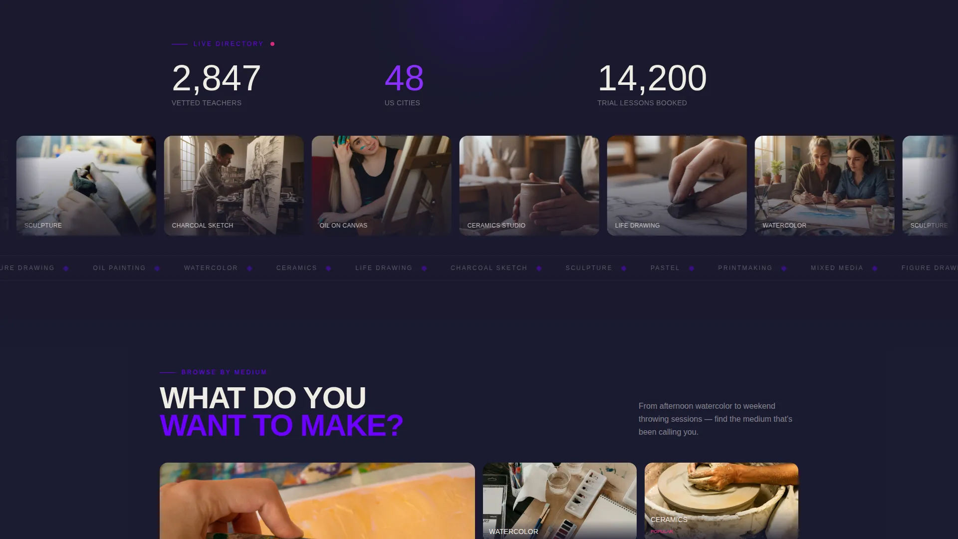
An upward-ticking number at the top of the scroll flow signals that real teachers are already listed. It creates immediate social proof without requiring testimonials and communicates directory scale at a glance.
Rapid-Fire Lesson Carousel
A high-energy auto-advancing image carousel moves through lesson snapshots: paint-smeared hands, kiln-lit faces, charcoal dust catching afternoon light. The pace is intentionally just-uncomfortable, reinforcing the raw studio energy of the brand.
Zip Code Preview Gate
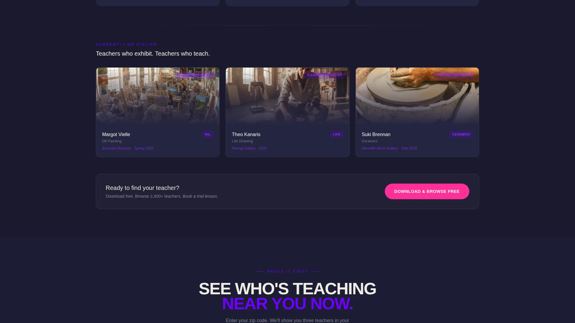
Visitors enter a zip code and receive three blurred teacher profile cards for their area. The blur creates curiosity and earns the download by proving local depth before requesting commitment. A download prompt follows naturally.
Sticky App Download Bar
On mobile, a bottom bar stays pinned throughout the scroll with the primary call to action: "Download & Browse Free." On desktop, the same call to action repeats at three distinct scroll depths so the opportunity to convert is never far away.
Smart App Store Detection
Tapping the primary call-to-action button opens a smart banner that detects whether the visitor is on an iOS or Android device and routes them to the correct app store automatically.
Page sections overview
| Section | Purpose |
|---|---|
| Split-Screen Header | Introduce the app with a product screenshot and bold headline |
| Animated Teacher Counter | Show directory scale with a live-feel upward-ticking number |
| Lesson Snapshot Carousel | Build emotional energy with rapid auto-advancing studio images |
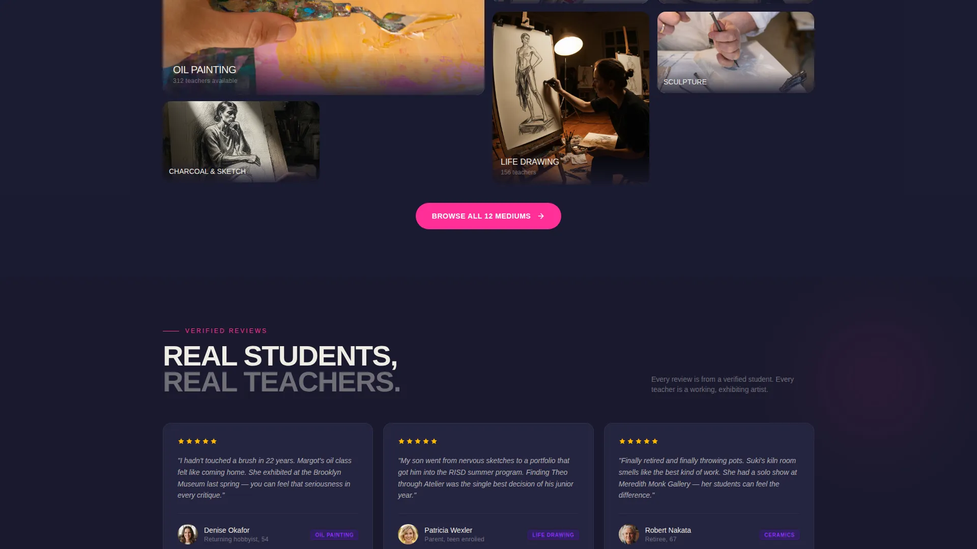
| Browse by Medium | Let visitors understand how teachers are categorized and searchable |
| Verified Student Reviews | Build trust through real feedback from students in the directory |
| Trial Lesson Booking | Communicate the two-tap booking flow as a key app benefit |
| Full-Width Video Loop | Peak the scroll energy with a studio-door video and teacher moment |
| Zip Code Preview Gate | Prove local depth before asking for the download |
| Primary Download call to action | Convert visitors with a sticky bar and repeated desktop placements |
Design & branding system
The visual identity is Bold Brutalist, built around an Electric Indigo color system that feels like a wheat-pasted poster on a poured-concrete gallery wall. Every color choice is intentional and unapologetic.
- Deep slab charcoal (#1A1A2E) as the base, chalk white (#F0ECE3) for text and breathing space, and electric indigo (#6C00FF) as the dominant accent across headlines and structural elements
- Hot signal magenta (#FF2E97) used exclusively for buttons and notification badges, reserving maximum visual contrast for the moments that matter most
- Massive condensed sans-serif typography stacked vertically, treated as structural blocks rather than decorative elements, consistent with the Brutalist design language
Mobile & speed optimization
The template is built with mobile conversion as the primary delivery target. The sticky bottom bar ensures the download call to action is always reachable without scrolling back up.
- Pinned mobile bottom bar keeps "Download & Browse Free" visible at every scroll position without interrupting the page content
- Smart banner logic detects iOS or Android on tap, reducing friction between the click and the correct app store destination
- The zip code preview flow works within the single-page structure, delivering a result and a prompt without a page reload or separate screen
How this template helps you convert
The page is sequenced specifically to overcome the three biggest obstacles to app installs from a landing page: distrust, uncertainty about local relevance, and weak urgency.
- The animated counter and carousel create immediate proof of life, showing that the directory is active and populated before the visitor has read any marketing copy
- The zip code preview gate converts passive browsers into invested prospects by personalizing the experience with local teacher cards, then presenting the download as the natural next step
- The sticky call-to-action bar and three desktop placements ensure the download prompt appears at every natural pause point, so motivated visitors never have to hunt for the button
Other information about this template
This template is part of a broader family of Bold Brutalist creative-direction layouts built around high-contrast Electric Indigo color systems. It is categorized under Technology, specifically the Directory and Marketplace Platforms subcategory, with a niche focus on art teacher directories.
- The template style is Split Screen (50/50), a format well suited to pairing a product visual with a strong value proposition
- The creative direction is Launch Energy, meaning the page is designed to open hot and maintain intensity through each scroll section rather than easing visitors in gently
- The header concept is Product Screenshot, grounding the first impression in the real app interface rather than abstract illustration or stock imagery
Theme
Bold Brutalist
Creative direction
Launch Energy
Color system
Electric Indigo
Style
Split Screen (50/50)
Direction
App Download
Page Sections
Split-screen Viewport Header
Animated Teacher Counter
Rapid-fire Lesson Carousel
Zip Code Preview Gate
Sticky App Download Bar
Smart App Store Detection
Related questions
Can I customize the color palette for a different brand?
Does the template include the zip code preview logic?
Is this template suitable for a web directory rather than an app?
What kind of images work best in the lesson carousel?
Who is the intended end user of the directory this template promotes?



