Atelier - Exclusive Architecture Landing Page Template
Atelier is a hub-and-spoke architecture membership landing page built for firms and solo practitioners who need instant access to detail libraries, specification templates, and continuing education credits. The Dashboard Pro glassmorphic design uses deep obsidian backgrounds, frosted card surfaces, and electric blueprint cyan accents to create a focused, control-room aesthetic that speaks directly to late-night studio work.
by Rocket studio
Quick summary
Atelier is a single-page membership landing page for an architecture digital library. It targets mid-career project architects, solo practitioners, and emerging studio leads. The anchor navigation, glowing wireframe header, and comparison table work together to turn frustrated architects into trial members before they reach the bottom of the page.
Who this template is for
This template is built for architecture membership platforms that serve practicing professionals, not students or hobbyists. The target visitor already knows the pain. They just need a platform that names it clearly and offers a credible solution.
- Mid-career project architects who lose billable hours searching vendor catalogs for reusable details
- Solo practitioners who left large firms but still need large-firm technical standards and specification libraries
- Emerging studio leads who cannot yet hire a full technical support team but cannot afford to work without one
What problem this template solves
Technical resources in architecture are fragmented. Details live in old project folders. Specifications get recycled past their useful life. Continuing education credits, known in the profession as CEUs, get chased at the last minute. This template confronts each of those pain points directly, using hard statistics and a side-by-side workflow comparison to show how much the status quo actually costs.
- Architects spend unpaid time digging through vendor PDFs and outdated Revit families instead of designing
- Recycled specification sets from 2016 or earlier are still circulating through active project files
- CEU deadlines create stressful scrambles rather than steady professional development
What you get with this template
The template delivers a complete, conversion-ready landing page structure. Every section is purpose-built to move an architect from recognition to action. The sticky anchor navigation, glassmorphic card components, and glowing call-to-action buttons are all defined in the design system and ready to customize.
- A full hub-and-spoke page layout with a pinned frosted-glass anchor nav labeled in practitioner language: Details, Specs, CEUs, Templates, Community
- A sticky comparison table that pits current workflow problems against Atelier membership benefits, line by line
- Two conversion paths: a primary 14-day free trial button and a gated secondary download of five free wall section details
Feature list
This section covers the core structural and design capabilities built into the Atelier landing page template.
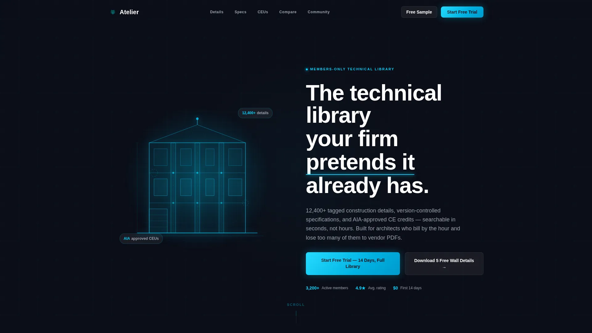
Glowing Wireframe Hero Header
The header fills the full viewport with a pure black background. A single building section wireframe rendered in electric blueprint cyan floats in negative space and rotates five degrees on scroll. The headline appears in crisp white with a soft cyan underline glow, creating an immediate tonal signal for the platform.
Pinned Anchor Navigation Bar
A frosted-glass navigation bar pins to the top of the page as the visitor scrolls. Each anchor is labeled in practitioner language: Details, Specs, CEUs, Templates, and Community. Visitors jump directly to the spoke section most relevant to them without losing their place on the page.
Industry Report Spoke Sections
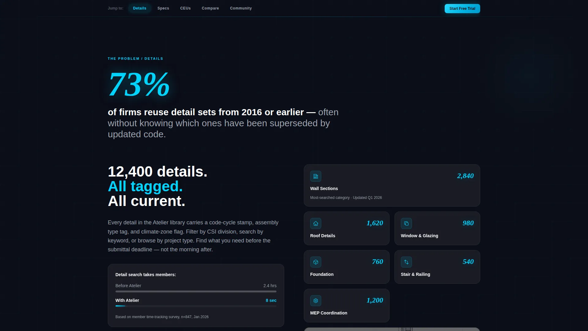
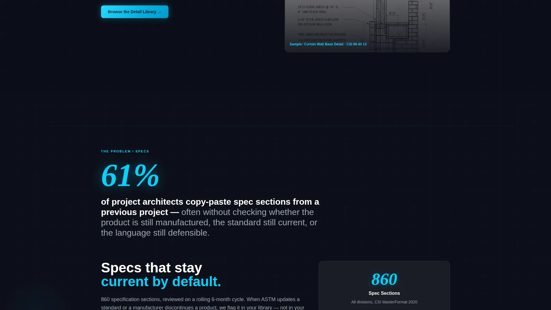
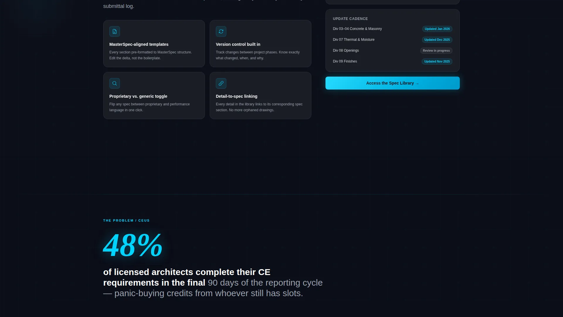
Each spoke section opens with an oversized hard statistic, such as the fact that 73% of firms reuse outdated detail sets from 2016 or earlier, before transitioning to the membership feature that solves it. Glassmorphic cards slide into frame carrying data visualizations, member counts, and library depth metrics.
Sticky Comparison Table
A frosted-glass comparison table appears mid-scroll. It lists the current workflow in one column and the Atelier membership benefit in the other, line by line. Examples include searching vendor PDFs versus tagged detail search, and expired CEU scrambles versus automated credit tracking.
Dual Conversion Path Design
The primary call to action, "Start Your Free Trial - 14 Days, Full Library," appears as a glowing cyan button at the comparison table conclusion and again at the bottom of the page. The secondary path is a gated download of five free wall section details that requires only an email address.
Glassmorphic Card System
Every data card and feature block uses the frosted translucent surface treatment: white at 6% opacity with a 12-pixel blur. Cards layer visually in planes, creating a depth effect that matches the control-room aesthetic while keeping information structured and scannable.
Page sections overview
| Section | Purpose |
|---|---|
| Hero Header | Introduce platform with glowing wireframe and headline |
| Anchor Nav Bar | Let visitors jump to any spoke section instantly |
| Details Spoke | Highlight the detail library with a lead statistic |
| Specs Spoke | Showcase specification templates and version control |
| CEUs Spoke | Address continuing education credit tracking |
| Templates Spoke | Present downloadable specification masters |
| Community Spoke | Show peer access and professional network value |
| Comparison Table | Contrast current workflow with membership benefits |
| Free Trial call to action | Drive primary sign-up with 14-day full-access offer |
| Sample Download | Capture email via five free wall section details |
| Page Footer call to action | Reinforce trial offer at scroll end |
Design & branding system
The visual identity follows a Dashboard Pro theme built on a glassmorphic color system. The overall feel is a control room constructed from smoked glass and neon wire, where every surface is slightly transparent and every edge is softly lit from behind.
- Core palette: deep obsidian background at hex #0B0D17, frosted card surfaces at white 6% opacity with 12-pixel blur, electric blueprint cyan at #00D4FF for glowing accents and active navigation states, and muted drafting graphite at #9CA3AF for secondary text
- Typography uses crisp white headline type with generous letter spacing, paired with graphite secondary text to maintain hierarchy across dark surfaces
- Active navigation states, button glows, and wireframe accents all use the blueprint cyan to create a consistent visual thread from the header to the final call to action
Mobile & speed optimization
The layout is designed to translate the glassmorphic depth effect cleanly across screen sizes. The frosted card blur and dark background remain legible on smaller displays without relying on photography or heavy image assets.
- The pinned anchor navigation collapses gracefully so practitioners on mobile can still jump between spoke sections without losing context
- The wireframe hero and glassmorphic cards use CSS-based visual effects rather than large image files, keeping the visual richness lightweight by design
How this template helps you convert
The Atelier template is structured as a deliberate conversion funnel. Every scroll interaction is designed to increase the perceived cost of not joining before the call-to-action button appears.
- The Industry Report rhythm confronts visitors with a hard statistic first, then resolves it with a specific membership feature, so each section builds urgency before asking for anything.
- The comparison table makes the status quo feel expensive by showing the time and frustration cost of the current workflow against the Atelier alternative, creating a clear decision moment directly above the primary call-to-action button.
- The gated sample download provides a low-commitment second path for architects who are not yet ready to start a trial, capturing email leads while giving genuine library value upfront.
Other information about this template
The Atelier template is built as a hub-and-spoke anchor navigation landing page, a structure well-suited to membership platforms with multiple distinct value categories. Each spoke functions as a self-contained section that stands alone in search or share context while contributing to the full-page conversion flow.
- The template style is Hub and Spoke with anchor navigation, and the conversion direction is Comparison versus Versus, making it reusable for any professional membership platform that needs to dismantle a legacy workflow habit
- The creative direction follows an Industry Report model, using data and statistics as emotional triggers before presenting the solution, a technique common in high-trust professional membership marketing
- The template falls under the Architecture Digital Presence subcategory within the Technology category, targeting the Architecture Membership Site niche
Theme
Dashboard Pro
Creative direction
Industry Report
Color system
Glassmorphic
Style
Hub & Spoke (Anchor Nav)
Direction
Comparison/Versus
Page Sections
Glowing Wireframe Hero Header
Pinned Frosted Anchor Navigation
Industry Report Spoke Sections
Sticky Workflow Comparison Table
Dual Conversion Path Layout
Glassmorphic Card Component System
Related questions
Who is this landing page template designed for?
Can I customize the spoke sections for a different membership category?
What are the two conversion paths included in this template?
Does this template use photography in the header?
How does the comparison table work in this template?



