Quiet Luxury Jewelry Waitlist Landing Page Template
Atelier is a full-width immersive landing page template for quiet luxury jewelry brands. It pairs an obsidian and gold color system with an unboxing scroll experience, a cinematic portrait header, and a waitlist form that captures email and metal preference. The design sells through restraint, letting scarcity and taste do the work.
by Rocket studio
Quick summary
Atelier is a single-page waitlist template built for an understated fine jewelry brand. It opens with a full-viewport portrait header, unfolds through a layered unboxing scroll experience, and closes with a minimal reservation form. The obsidian and gold palette keeps every detail deliberate, and the "Reserve Your Place" call to action makes scarcity feel like privilege.
Who this template is for
This template is designed for fine jewelry founders and creative directors who want their digital presence to match the quiet confidence of their work. It suits brands that sell through exclusivity rather than volume, and whose buyers are already fluent in luxury.
- Independent jewelers launching a debut collection with a limited edition run
- Quiet luxury jewelry brands building early demand before a public release
- Creative studios designing a landing page for a discerning, style-literate audience
What problem this template solves
Most jewelry landing pages default to bright white backgrounds, busy grids, and discount-driven copy. That visual language signals mass retail, not craft. Atelier solves the mismatch between a hand-forged, conflict-free jewelry brand and a template that feels generic.
- Eliminates the visual noise that undermines a premium, understated brand identity
- Replaces aggressive sales language with restrained, taste-driven conversion cues
- Gives collectors a reason to wait rather than browse away to a competitor
What you get with this template
You get a complete single-page layout that guides a visitor from first impression to waitlist signup through a carefully sequenced scroll journey. Every section is built around the source brief's unboxing concept, so the experience feels intentional rather than assembled.
- Full-viewport portrait header with brand wordmark at sternum line, no tagline or navigation
- Three-piece debut collection grid with hover states showing weight, stone origin, and edition size
- Waitlist form capturing email and metal tone preference through three minimal toggle circles
Feature list
This template delivers six carefully considered layout and interaction features drawn directly from the source brief.
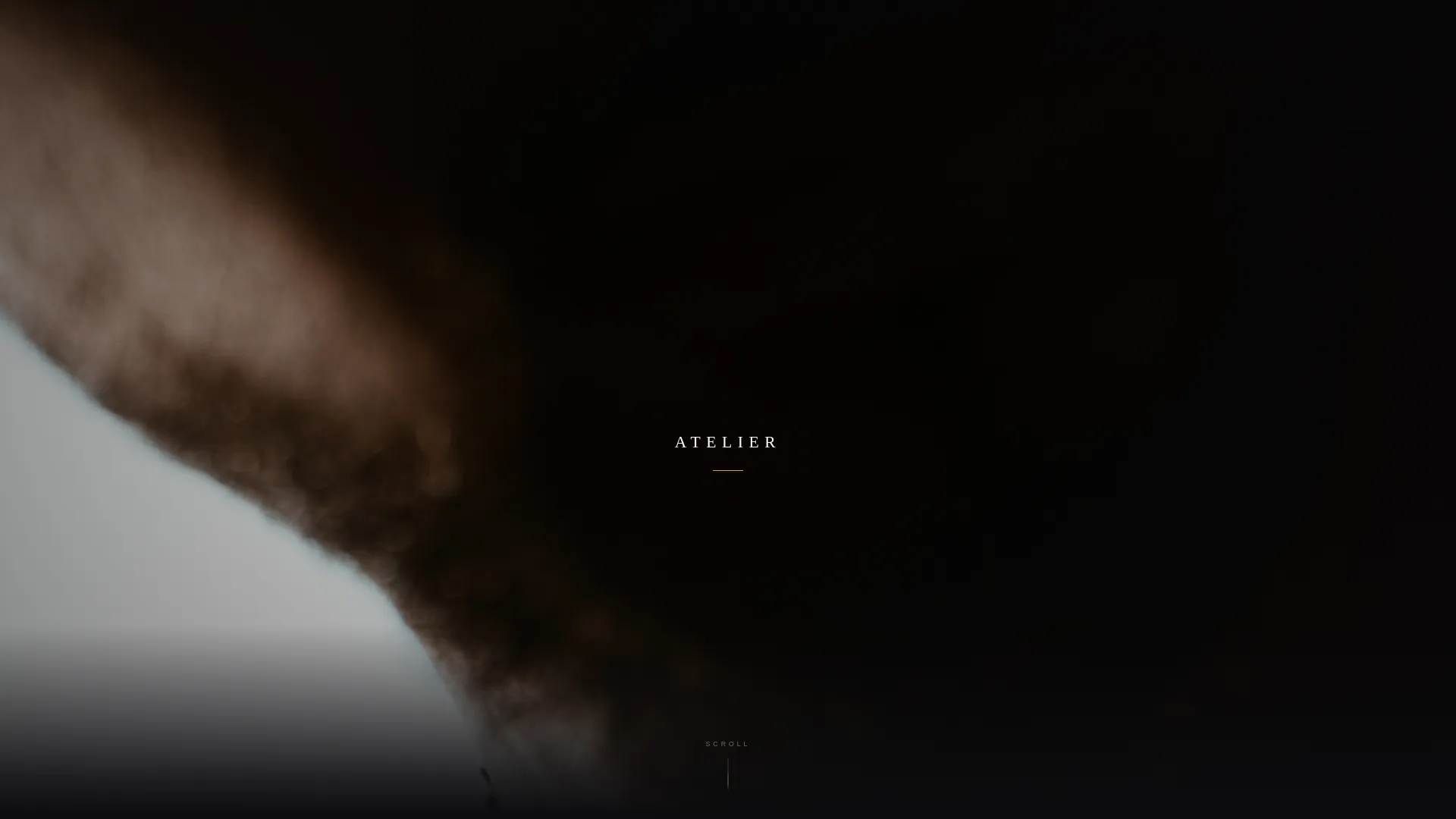
Cinematic Portrait Header
The opening section fills the entire viewport with a vertical portrait, collarbone and neck, a single thin chain, and a wash of linen shadow. The brand wordmark appears letterspaced in gallery white. There is no navigation, no tagline, and no distraction.
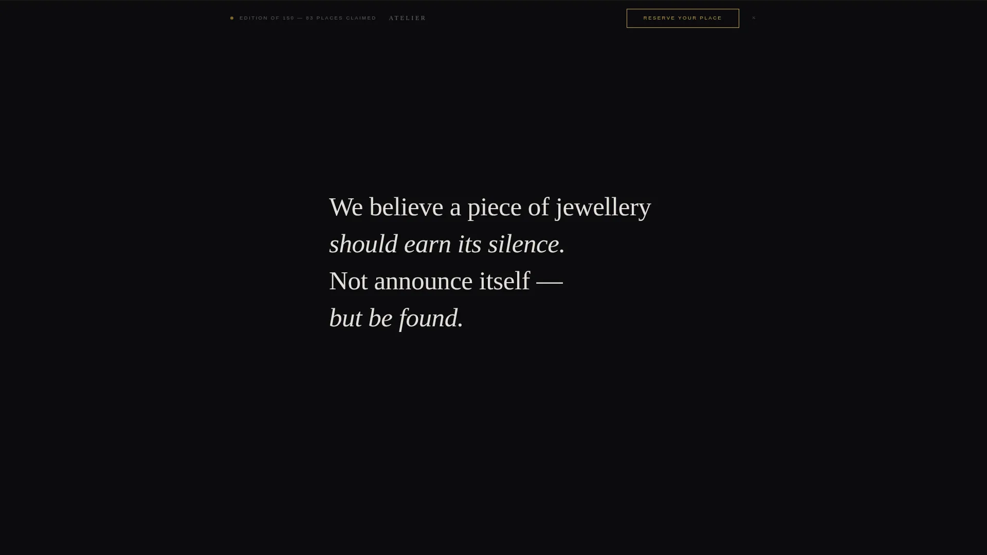
Layered Unboxing Scroll Experience
Each section transition uses a soft vertical wipe that mimics folding back tissue paper. The first section peels back a matte-black texture to reveal the design philosophy in sparse type. The next opens like a hinged box lid to expose the collection grid.
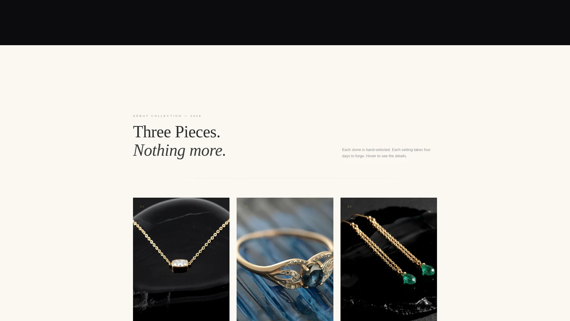
Collection Grid with Hover Reveals
Three debut pieces are photographed on obsidian stone and arranged in a clean grid. On hover, each piece enlarges and surfaces a single line of product detail: weight in grams, stone origin, and edition size. The interaction rewards curiosity without overwhelming the eye.
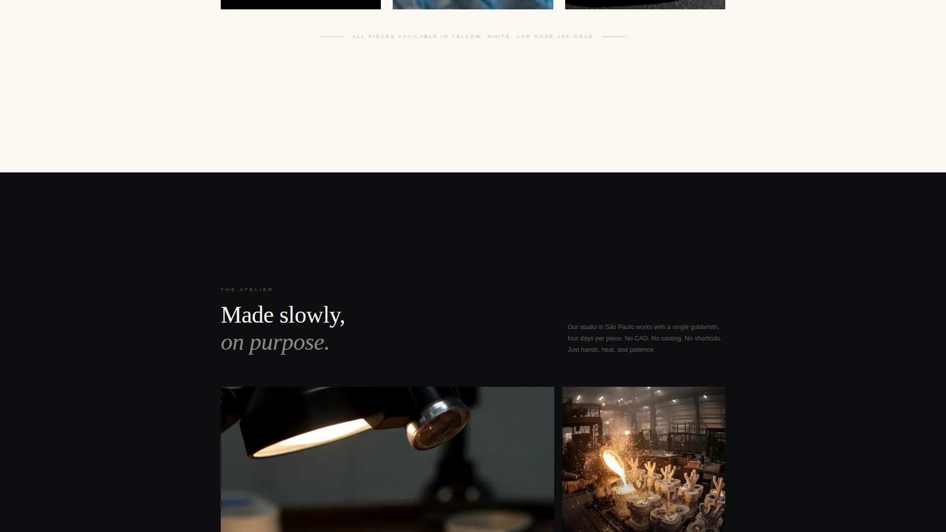
Atelier Materials Footage Section
A dedicated section plays handheld footage from the São Paulo atelier. It includes a slow-motion pour of molten gold and a close-up of fingers polishing a bezel with cotton cloth. This section builds trust through process transparency, not marketing language.
Live Scarcity Waitlist Form
The "Reserve Your Place" call to action appears after the collection reveal and again as a fixed bottom bar once the visitor scrolls past the hero. The form asks only for email and preferred metal tone. A single live-updating line beneath the form reads the current claim count against the edition of 150.
Alternating Background Rhythm
Page backgrounds alternate between true obsidian black and warm gallery white. Each scroll-stop resets the eye, creating the pacing of a printed lookbook. Gold appears only on hover states, divider lines, and the primary call to action, so every instance feels earned.
Page sections overview
| Section | Purpose |
|---|---|
| Full-viewport header | Opens with portrait, wordmark, and silence |
| Design philosophy reveal | Peels back obsidian texture to show brand ethos |
| Collection grid | Displays three debut pieces with hover detail |
| Atelier footage section | Shows sourcing process and craft in motion |
| Waitlist reservation form | Captures email, metal preference, and live count |
| Fixed bottom bar | Persists the call to action after hero scroll |
Design & branding system
The palette is built around four values: true obsidian black (#0B0B0D), warm gallery white (#FAF7F2), molten 18k gold (#C9A84C), and charcoal (#2C2C2E) for body text. The system is intentionally minimal so the metal always reads first.
- Gold is reserved for hover states, divider lines, and the single call-to-action label, keeping every appearance of it significant
- Typography uses wide letterspacing in gallery white or charcoal depending on background, reinforcing the lookbook aesthetic
- Backgrounds alternate between obsidian and gallery white across sections, creating visual breathing room between each content stop
Mobile & speed optimization
The full-width immersive layout is structured to maintain its cinematic feel on smaller screens without sacrificing the scroll pacing that makes the unboxing experience work.
- Portrait header crops to a tight vertical frame on mobile, keeping the collarbone and chain composition intact
- Hover reveals on the collection grid adapt to tap interactions on touch devices
- The fixed bottom bar remains persistent on mobile, keeping the "Reserve Your Place" call to action always within reach
How this template helps you convert
The page is engineered for waitlist conversion through restraint. Every design and copy decision removes friction while making the act of reserving a place feel considered rather than impulsive.
- The live edition counter ("Edition of 150, 83 places claimed") creates honest, real-time scarcity without a countdown timer or a discount code
- The minimal two-field form (email plus metal tone preference) reduces signup hesitation and signals that the brand respects the buyer's time
- The fixed bottom bar ensures the call to action is visible at every scroll depth, so a decision-ready visitor never has to hunt for the form
Other information about this template
This template sits at the intersection of quiet luxury fashion and fine jewelry, designed for a niche where restraint is the primary brand signal. It is part of a Marketplace Grid theme collection and uses a Full-Width Immersive template style suited to editorial and fashion-forward categories.
- The creative direction is an Unboxing Experience, a scroll narrative that mimics the physical sensation of opening a jewelry box
- The header concept follows a Vertical/Portrait format, a deliberate choice that prioritizes intimacy and material detail over wide-angle product staging
- The landing page direction is Waitlist and Coming Soon, making this template a strong fit for pre-launch campaigns where demand must be built before inventory is released
- The color system (Obsidian and Gold) and the quiet luxury jewelry brand niche position this template within the Fashion and Lifestyle category, subcategory Quiet Luxury Fashion
Theme
Marketplace Grid
Creative direction
Unboxing Experience
Color system
Obsidian & Gold
Style
Full-Width Immersive
Direction
Waitlist/Coming Soon
Page Sections
Cinematic Full-viewport Portrait Header
Layered Unboxing Scroll Transitions
Collection Grid with Hover Detail Reveals
Atelier Process Footage Section
Live Scarcity Waitlist Form
Persistent Fixed Bottom Call-to-action Bar
Related questions
Can I change the edition count and waitlist copy?
Does the fixed bottom bar appear on all devices?
Can I adjust the color palette to match a different brand identity?
Is this template suitable for a brand that already has an active store?
How many pieces can I feature in the collection grid?


