Architecture Firm Post-Booking Confirmation Website Template
Atelier is a glassmorphic architecture firm landing page built for the thank-you moment after a prospect submits their project inquiry. It features a live-feeling dashboard preview, a modular feature matrix organized by project phase, and two conversion paths that move visitors from confirmed interest to active portal engagement without asking them to fill in another form.
by Rocket studio
Quick summary
Atelier is a single-page, card-grid template designed as an architecture firm thank-you page. It greets confirmed prospects with a personalized dashboard preview, then guides them through a phase-organized feature matrix built on a deep obsidian and ice-blue glassmorphic palette. Every section is built to convert free-tier curiosity into portal activation.
Who this template is for
This template is built for architecture firms that work with high-stakes clients and need a post-submission page that earns continued engagement rather than losing momentum after the inquiry form.
- Property developers holding active site permits who need quick visibility into project phases
- Municipal boards and civic clients reviewing proposals that require structured, professional communication
- Boutique hoteliers and design-led clients for whom the first brand impression begins long before a site visit
What problem this template solves
Most thank-you pages do nothing. They confirm a form submission and go quiet. For an architecture firm with complex, multi-phase engagements, that silence creates doubt and delays the next decision.
- Visitors leave the page with no sense of what comes next or what the firm's process looks like
- High-value clients such as developers and civic boards expect immediate proof of capability, not a holding message
- Without a conversion path, the momentum built during the inquiry process dissipates before a call is ever scheduled
What you get with this template
You get a fully structured, single-page layout that transforms the post-submission moment into an active introduction to the firm's client portal. The page is organized into two primary zones: a dashboard header and a scrollable feature matrix.
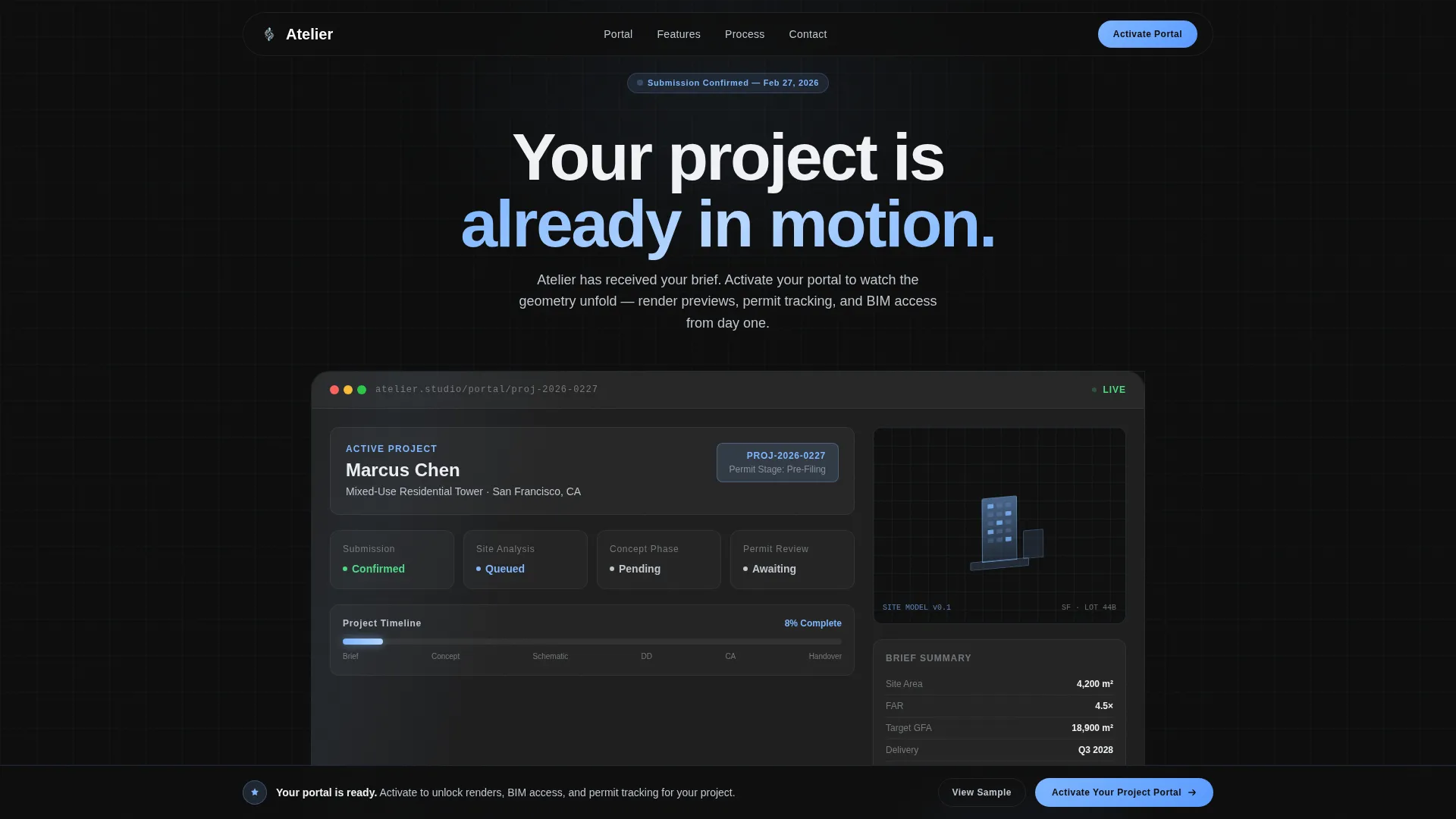
- A personalized dashboard preview in the header that displays the visitor's name, project type, a timeline bar, and a rotating 3D site model thumbnail
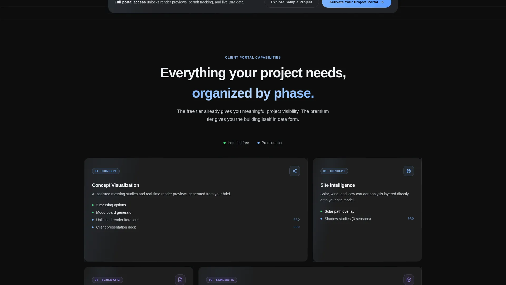
- A modular card grid organized by project phase, with hover-reveal features covering render previews, permit tracking, material libraries, and BIM access
- Two conversion paths: a primary "Activate Your Project Portal" call to action and a secondary "Explore a Sample Project" modal demo
Feature list
This template delivers a focused set of interactive and visual components, each grounded in the architecture client experience described in the brief.
Personalized Dashboard Header
The header renders as a stylized project portal the moment the page loads. It pulls the visitor's name and project type from their prior form submission and displays them in the top-left corner. A timeline bar sits at 8% completion, signaling that the project has officially started.
Rotating 3D Site Model Window
An isometric window in the dashboard header shows a slowly rotating 3D site model thumbnail. This single visual element communicates technical depth and spatial thinking before the visitor reads a single word of body copy.
Phase-Organized Feature Matrix
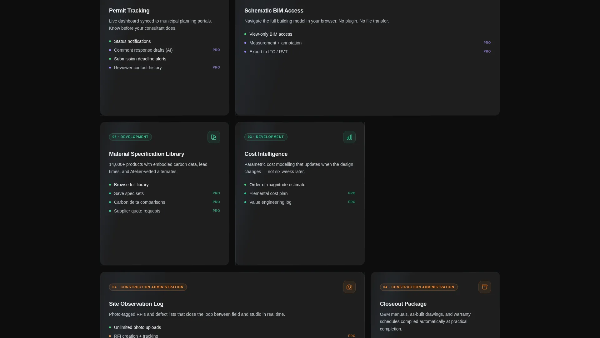
The card grid below the header organizes the firm's portal capabilities into four project phases: Concept, Schematic, Development, and Construction Administration. Each phase has its own translucent card column, making the full scope of the engagement immediately scannable.
Hover-Reveal Feature Cards
Each card in the matrix reveals a specific capability on hover. Features disclosed this way include real-time render previews, permit-tracking dashboards, material specification libraries, and BIM model access. The interaction rewards curiosity without overwhelming the initial view.
Sticky Conversion Bar
After the visitor scrolls past the second card row, a sticky bottom bar appears with the primary call to action. It stays visible throughout the rest of the scroll, ensuring the activation prompt is always one click away without interrupting the content experience.
Guest-Mode Demo Modal
The secondary call to action opens a modal demo portal with blurred client data. Visitors can navigate the portal interface before committing to activation, which removes hesitation by letting them experience the product rather than just read about it.
Page sections overview
| Section | Purpose |
|---|---|
| Dashboard Preview Header | Greets visitor with personalized project status, timeline bar, and rotating site model |
| Concept Phase Cards | Introduces early-stage portal features available in the free tier |
| Schematic Phase Cards | Reveals schematic-level capabilities through hover interaction |
| Development Phase Cards | Shows mid-project tools including material libraries and render previews |
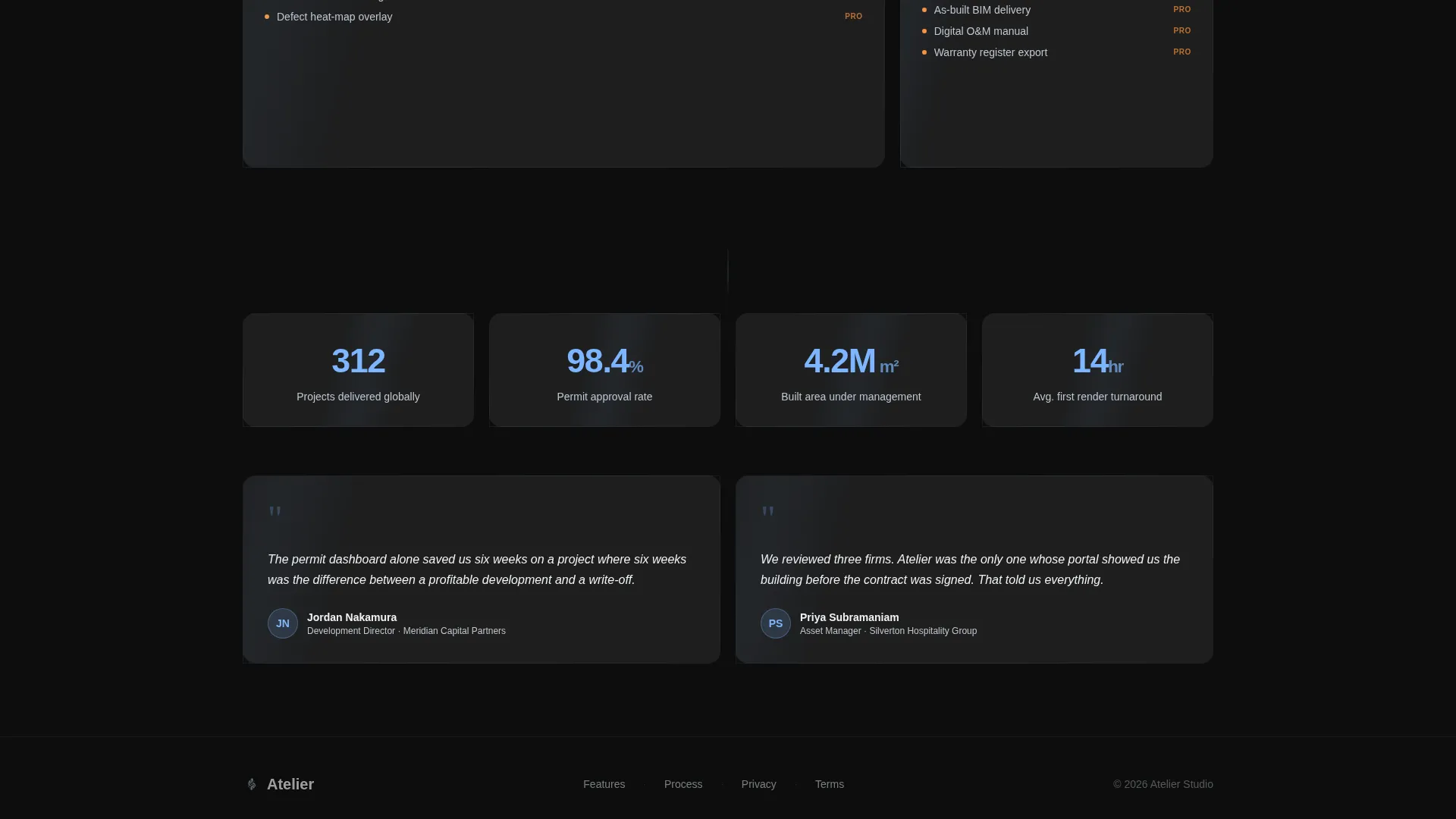
| Construction Admin Cards | Displays full-scope BIM access and permit tracking for premium tier |
| Sticky Activation Bar | Keeps the primary call to action visible after the second card row |
Design & branding system
The visual language is built entirely around glassmorphism, layering translucency, blur, and gradient borders to create a sense of depth on a flat screen.
- Color palette: deep obsidian (#0D0D0D) background, frosted white card surfaces at 12% opacity, ice-blue (#7EB6FF) for hover states and active indicators, and silver (#C0C7D0) for secondary type
- Card styling: 1px gradient borders running from transparent to ice-blue, with backdrop-blur applied to every module so each card appears to float against the background
- Hover and interaction states: ice-blue luminance activates on hover, creating a clear visual hierarchy between explored and unexplored content without relying on heavy shadow or contrast shifts
Mobile & speed optimization
The modular card grid is structured to reflow cleanly across screen sizes, keeping the phase-organized layout readable on smaller viewports.
- Cards stack vertically on mobile so phase labels and hover-reveal features remain accessible without horizontal scrolling
- The sticky conversion bar maintains its bottom-fixed position on all screen sizes, preserving the activation prompt regardless of device
- The isometric model window and dashboard header scale proportionally, keeping the personalized confirmation experience intact on tablet and phone
How this template helps you convert
The page is designed around a single insight: the visitor already submitted their information, so the only job left is to show them enough value that activation feels inevitable.
- The dashboard header makes the portal feel already live. Seeing your own name and project type on screen creates immediate personal investment, which lowers resistance to clicking "Activate Your Project Portal."
- The scrolling feature matrix escalates commitment gradually. Each phase card adds to the visitor's mental picture of what they gain, so by the time they reach the Construction Administration tier, the premium path feels like a natural next step rather than an upsell.
- The guest-mode demo modal removes the final barrier. Visitors can navigate a sample project before activating, replacing abstract promises with a direct hands-on experience.
Other information about this template
This template sits within the Architecture Firm Website Templates subcategory and is specifically designed for the thank-you page niche within that category. A few additional details worth noting:
- The template falls under the Technology category, which shapes the overall user interface language toward portal-style interfaces rather than traditional brochure layouts
- The freemium and trial conversion direction means the layout is structured to surface free-tier value first, then escalate to premium features as the visitor scrolls deeper
- No additional form fields appear on the page; the visitor's information was already captured, so the experience is frictionless from the first second
- The card grid style allows individual phase columns to be reordered or removed to match a firm's actual project workflow without breaking the visual system
- The Tech Glass theme and glassmorphic color system are applied consistently across every component, including the modal, the sticky bar, and the dashboard tiles, so the design reads as a unified product environment rather than a collection of sections
Theme
Tech Glass
Creative direction
Feature Matrix
Color system
Glassmorphic
Style
Card Grid (Modular)
Direction
Freemium/Trial
Page Sections
Personalized Dashboard Header
Rotating 3D Site Model Thumbnail
Phase-organized Feature Matrix
Hover-reveal Feature Cards
Sticky Activation Bar
Guest-mode Demo Modal
Related questions
Does this template require any form input from the visitor?
Can the four project phase labels be updated to match a different workflow?
What are the two conversion paths included in this template?
What types of clients is this template designed to impress?
Is the glassmorphic visual style consistent across all components?



