Precision Interior Design Landing Page Template
Atelier is a data-driven interior design landing page template built on a dark cockpit aesthetic. It leads with measurable proof, ROI metrics, floor plan utilization scores, and satisfaction data, before revealing portfolio work. Designed for studios targeting tech founders, discerning couples, and boutique hoteliers, the modular card grid makes every scroll feel purposeful and every click feel earned.
by Rocket studio
Quick summary
Atelier is a modular, single-page interior design landing page template built around a Data Command visual theme. It opens with a cockpit-style dashboard header packed with live-looking metrics, then guides visitors through evidence cards, portfolio renders, and a methodology download before landing them on a clear call to action. The result is a page that earns trust before asking for anything.
Who this template is for
This template is built for interior design studios that want to lead with data instead of mood boards. It suits practices that serve discerning, analytical clients and need to signal expertise before showcasing aesthetics.
- Interior design studios targeting tech founders and high-income homeowners
- Boutique hotel operators and commercial space owners focused on revenue per square foot
- Design practices that want to communicate a measurable, process-driven approach to new clients
What problem this template solves
Most interior design pages open with lifestyle photography and subjective language. Analytical clients tune out fast when they see no evidence of rigor. Atelier flips that order entirely.
- Visitors never see portfolio images before they see proof of outcomes
- The stats-first grid removes the "this is just a taste decision" friction that causes high-intent leads to leave
- The persistent call-to-action bar and mid-grid methodology download card capture two distinct buyer mindsets without cluttering the layout
What you get with this template
The template delivers a fully structured, single-page layout with every section pre-designed and ready to customize. Each component serves a specific role in the conversion arc, from trust-building to direct action.
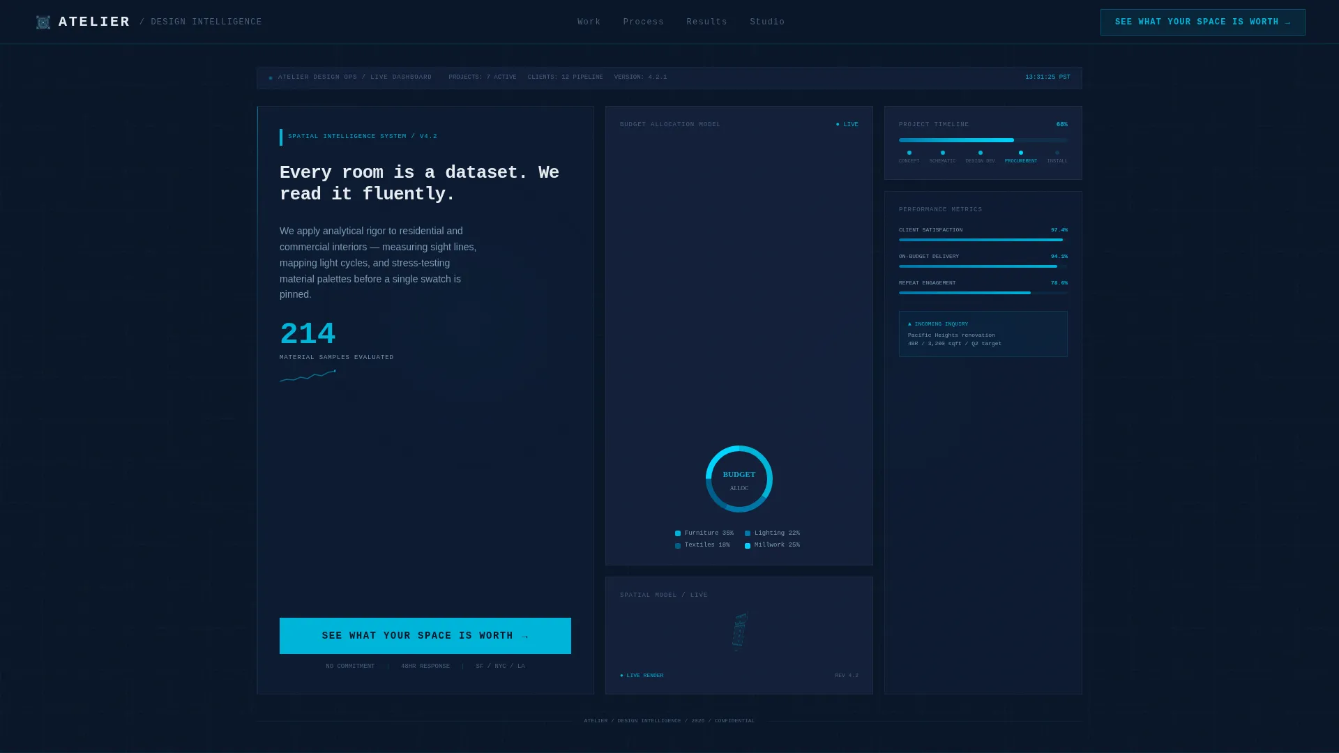
- A viewport-filling dashboard header with typewriter headline, live-looking metrics, and a primary call-to-action button
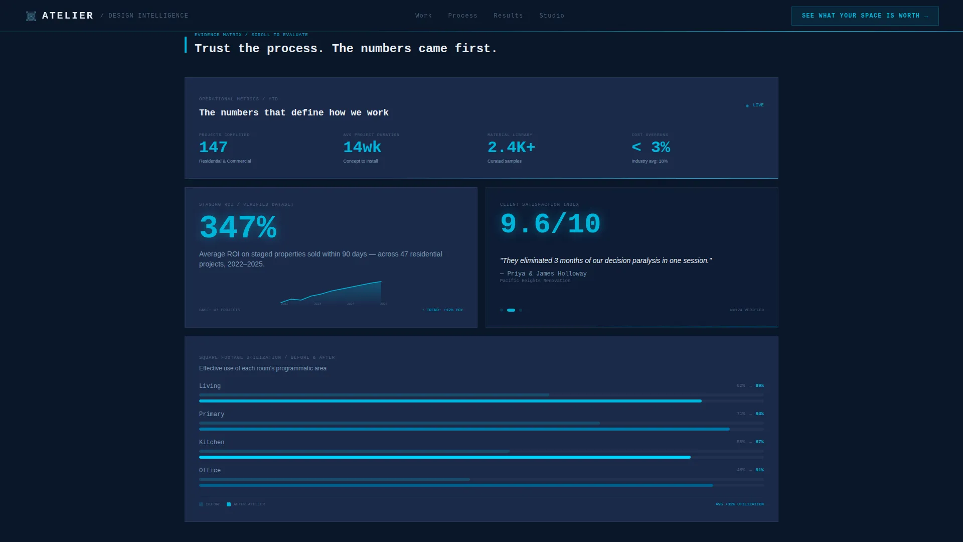
- A modular evidence card grid alternating wide and two-column pairs, covering ROI data, floor plan utilization, and cycling satisfaction quotes
- A portfolio bento section, a process deck download card, a testimonial block, a sticky bottom call-to-action bar, and a linear single-row footer
Feature list
This section covers the core built-in capabilities that define the Atelier template experience.
Dashboard-Style Hero Header
The hero section fills the full viewport with a stylized design-operations interface. It displays live-looking metrics including material sample counts, a radial budget allocation chart, a project timeline bar at 68% completion, and a slowly rotating 3D floor plan panel. A monospace typewriter headline animates on load. No stock photography is used anywhere in this section.
Modular Evidence Card Grid
The core of the page is a card grid that alternates between single wide cards and two-column pairs. Each card functions as a self-contained proof unit, showing data such as staging ROI percentages, before-and-after floor plan utilization overlays, and cycling client satisfaction scores with verbatim quotes. The rhythm shifts naturally from quantitative proof toward qualitative portfolio as the visitor scrolls.
Persistent Call-to-Action Bar
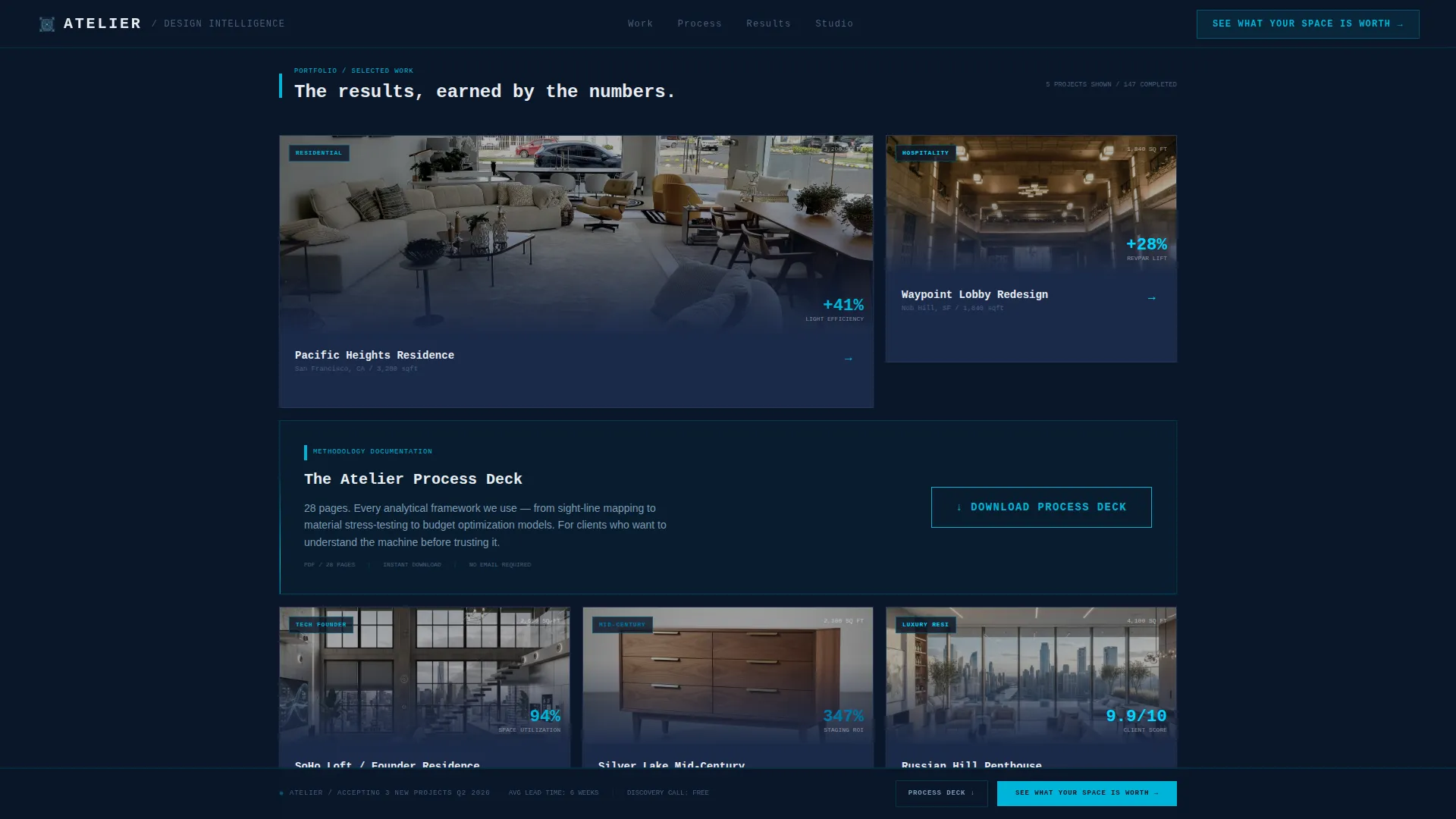
The primary call to action, "See What Your Space Is Worth," appears first inside the dashboard header and then reappears as a sticky bottom bar after the third card row. This dual placement keeps the conversion path visible without interrupting the content flow.
Process Deck Download Card
A single dark card placed near the grid's midpoint offers a secondary conversion path. Visitors who want to study the studio's methodology before committing can download the process deck directly. This captures high-intent leads who are not yet ready to book but are deeply engaged.
Scroll-Triggered Animations
The template includes counter animations, beam border effects, typewriter text reveals, and scroll-triggered card entrances driven by IntersectionObserver logic. Hover states glow in electric cerulean. The rotating 3D floor plan and radial chart animate as components enter the viewport.
Portfolio Bento Section
After the stats grid, rendered room visuals appear in a wide-plus-paired bento layout. Data overlays remain visible on these cards, connecting the earlier proof metrics to the actual finished spaces. The emotional arc moves from analytical trust to visual desire in a deliberate sequence.
Page sections overview
| Section | Purpose |
|---|---|
| Hero Dashboard | Establish authority with live-looking metrics and typewriter headline |
| Stats Evidence Grid | Build trust through ROI data, floor plan overlays, and satisfaction scores |
| Portfolio Bento | Show rendered spaces with data overlays after proof is established |
| Process Deck Card | Capture methodology-first leads with a mid-grid download call to action |
| Testimonials Block | Cycle verbatim client satisfaction scores to reinforce social proof |
| Persistent call to action Bar | Keep the primary conversion action visible from the third card row onward |
| Linear Footer | Close the page with a clean single-row footer pattern |
Design & branding system
The visual identity follows a Data Command theme. Every color and typographic choice reinforces the idea that a precise, analytical intelligence is running the process.
- Color palette: deep command-center navy (#0A1628) for the background, tactical slate (#1B2A4A) for card surfaces, cool interface white (#E8ECF1) for all body and headline typography, and electric cerulean (#00B4D8) for hover states, progress rings, and live data callouts
- Typography: JetBrains Mono is used for monospace headlines and data labels, while Manrope handles body text for comfortable reading at any card size
- Visual tone: dark, purposeful, and illuminated only where attention is required, no lifestyle photography, no decorative gradients, no unnecessary color
Mobile & speed optimization
The template is designed desktop-first because the cockpit dashboard layout requires a wide viewport to display all metric panels clearly. A mobile-responsive fallback is included so the page remains functional and readable on smaller screens.
- Scroll animations use IntersectionObserver so components only activate when they enter the viewport, keeping the page light during initial load
- All motion effects rely on CSS transforms only, avoiding heavy JavaScript-driven repaints that can slow rendering on lower-powered devices
- The sticky call-to-action bar adapts to mobile viewports so the primary conversion path stays accessible regardless of screen size
How this template helps you convert
Atelier is engineered around a specific emotional arc: make visitors trust the process first, then let them fall in love with the results.
- The hero dashboard opens with measurable proof, material samples evaluated, budget allocation breakdowns, and a project timeline, so analytical visitors feel immediately respected rather than sold to.
- The modular card grid keeps evidence front and center before portfolio imagery appears, removing the common objection that design is purely subjective and replacing it with confidence in outcomes.
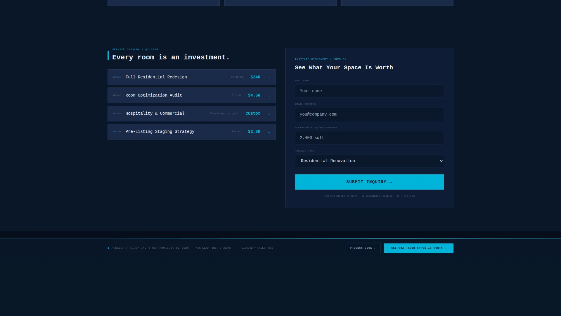
- Two distinct calls to action serve two different buyer states: the "See What Your Space Is Worth" button for visitors ready to engage, and the process deck download for those who need more information before committing.
Other information about this template
Atelier is part of a broader family of technology-category landing page templates designed for service businesses that need to bridge analytical credibility with visual appeal. A few additional points worth knowing:
- The template uses English copy, USD pricing references, and a United States market context by default
- Animation intensity is high by design; teams that prefer a quieter experience can reduce motion by adjusting the CSS animation properties directly in the template files
- The card grid structure is fully modular, meaning individual evidence cards, portfolio cards, and the process deck card can be reordered or replaced without breaking the overall layout
- The footer follows a linear single-row pattern, keeping the page's closing experience minimal and uncluttered
Theme
Data Command
Creative direction
Stats-First Impact
Color system
Midnight Blue
Style
Card Grid (Modular)
Direction
Click-Through
Page Sections
Dashboard-style Hero Header
Modular Evidence Card Grid
Persistent Call-to-action Bar
Process Deck Download Card
Scroll-triggered Animation System
Portfolio Bento with Data Overlays
Related questions
Who is the Atelier template built for?
Can I replace the placeholder metrics with my own studio's data?
Does the template include both a booking path and a download call to action?
Is this template suitable for mobile visitors?
How much animation is built into this template?



