Data Lakehouse Technology Reviews Website Template
Lakehouse is a bold brutalist data engineering newsletter landing page built for senior data engineers, analytics engineers, and platform leads. It uses a hub-and-spoke anchor navigation layout with an interactive lakehouse architecture diagram, collapsible sample issue sections, community thread previews, and live format-comparison toggle cards, all wrapped in a Void and Violet terminal aesthetic.
by Rocket studio
Quick Summary
Lakehouse is a single-page, hub-and-spoke landing page designed for a data engineering newsletter and community. It opens with a live, clickable architecture diagram and a typewriter headline. Visitors explore self-contained spokes, sample issues, community threads, and format comparison cards, before a pinned call-to-action closes the loop.
Who This Template Is For
This landing page speaks directly to the engineers who live in the engine room of modern data architecture. It is built for people who already understand the basics and want something that respects their depth.
- Senior data engineers debugging Spark jobs and evaluating table formats
- Analytics engineers migrating teams off legacy warehouse systems
- Platform leads pitching data lakehouse modernization to stakeholders and leadership
What Problem This Template Solves
Most newsletter landing pages show a headline and a subscribe form. That approach works poorly for a technical audience. Engineers do not convert on promise alone, they convert on proof. This landing page design solves that gap by making every interactive element real content, not a teaser.
- Visitors leave before subscribing because the page offers no tangible evidence of quality
- Generic landing page design fails to signal that this community speaks a technical language
- A static hero image cannot demonstrate newsletter depth the way an interactive diagram can
What You Get With This Template
You get a fully structured, single-page hub-and-spoke layout with five distinct interactive spokes anchored by a persistent navigation bar. The design, copy structure, and animation logic are all defined in the brief and ready to build from.
- An interactive Bronze, Silver, Gold node diagram with animated data lineage arrows in the header
- Collapsible sample issue sections, ranked community thread previews with syntax-highlighted code, and live Delta versus Iceberg versus Hudi toggle cards
- A pinned primary call-to-action in the anchor nav bar and a behavior-triggered Discord toast notification
Feature List
This landing page packs several high-output features into one cohesive design. Each feature serves the goal of earning the click before asking for it.
Interactive Lakehouse Architecture Diagram
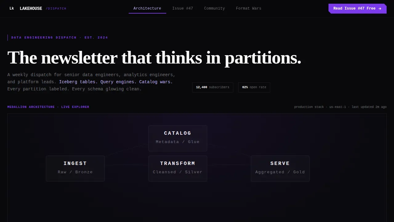
The header is not a static image. Visitors click nodes labeled Bronze, Silver, and Gold to watch animated SVG lineage arrows trace data through ingestion, transformation, and serving layers. The diagram functions as the hero, proving the community speaks the visitor's language before a single scroll happens.
Hub-and-Spoke Anchor Navigation
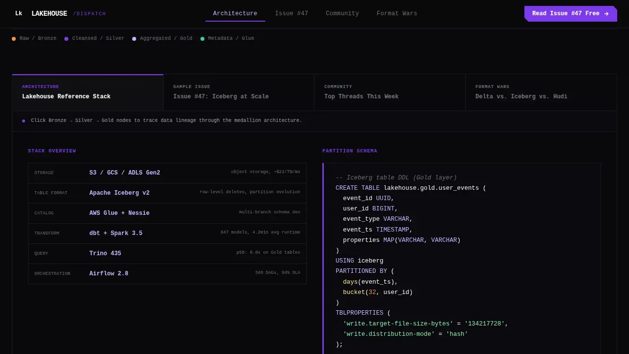
A persistent anchor nav bar ties all five spokes together. Visitors can jump between the sample issue, community threads, format comparison, and about section without linear scrolling. The open navigation always keeps the primary call-to-action one click away, regardless of which spoke is active.
Collapsible Sample Issue Module
One spoke expands a real newsletter issue with collapsible sections for deep dives, hot takes, and tooling benchmarks. A raw content preview gives visitors a bare-bones look at actual issue structure. This approach lets the content itself close the subscription rather than a persuasion-heavy form.
Live Format Comparison Toggle Cards
Visitors can toggle between comparison cards for Delta, Iceberg, and Hudi, watching specs rearrange in real time. This spoke is the most direct demonstration of the newsletter's analytical value. It shows the community approach: substance over polish, hard data over marketing copy.
Behavior-Triggered Discord Toast
After a visitor has interacted with at least two spokes, a brutalist toast notification slides in anchored at the bottom-left of the screen with a secondary call-to-action to join the Discord. The trigger is intentional, the page earns the second ask only after the visitor has already demonstrated engagement.
Typewriter Headline Animation
The header headline types itself in character by character: "The newsletter that thinks in partitions." This single animation sets the tone for the entire web design. It signals immediacy, technical precision, and a voice that understands the world of partition pruning and schema management.
Page Sections Overview
| Section | Purpose |
|---|---|
| Hero Diagram Header | Renders clickable Bronze, Silver, Gold nodes with animated SVG data lineage arrows and typewriter headline |
| Sample Issue Spoke | Expands collapsible newsletter sections showing deep dives, hot takes, and tooling benchmarks |
| Community Threads Spoke | Surfaces upvoted community threads with inline syntax-highlighted code snippets |
| Format Comparison Spoke | Lets visitors toggle between Delta, Iceberg, and Hudi comparison cards with live spec rearrangement |
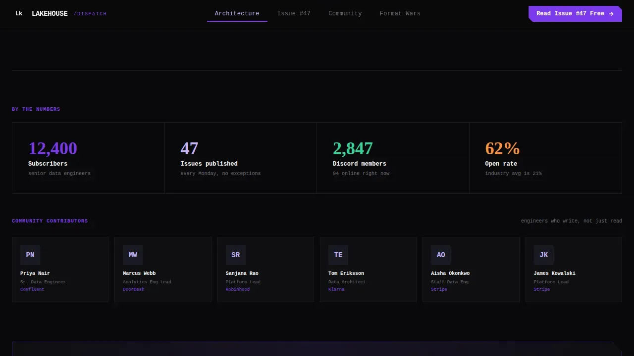
| About and Stats Spoke | Displays newsletter credibility metrics, subscriber count, and contributor profiles |
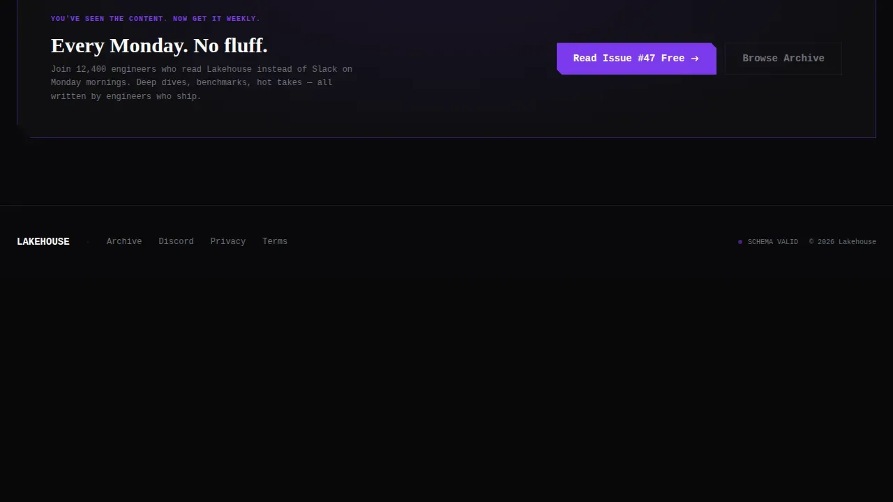
| Footer | Horizontal flow pattern with community links and navigation anchors |
Design & Branding System
The visual design is rooted in Bold Brutalism, a web design approach that emphasizes raw, unpolished aesthetics over refined polish. Brutalism in web design refers to stripping away unnecessary visual distractions so visitors focus entirely on essential content. This design commits to that idea completely.
- Void black (#09090B) covers roughly eighty percent of the canvas; deep partition violet (#7C3AED) marks every interactive state and navigation anchor; schema lilac (#C4B5FD) labels secondary metadata; and raw terminal white (#FAFAFA) delivers sharp, anti-aliased body text
- Typography uses JetBrains Mono for code labels and monospace accents, Fraunces for display headings, and DM Sans for body copy, oversized display type creates immediate visual impact consistent with bold brutalist landing page design principles
- The brutalist grid snaps hard between spokes with blunt cut transitions rather than smooth fades; raw structural elements include visible grid lines and thick section borders that lean into the architectural roots of brutalism
Mobile & Speed Optimization
The landing page is designed desktop-first, matching the primary audience who work at workstations. A mobile fallback layout is included so the page remains usable across devices. The design approach naturally supports lighter page weight through its brutalist principles.
- Brutalist web design often features minimal graphics, which supports faster load times and a better user experience without sacrificing visual identity
- Interactive spokes use client-side components for animation and interactivity, while the static shell is served independently to keep initial load efficient
- Desktop-first layout prioritizes the workstation experience, with the mobile fallback preserving the anchor navigation and core spoke structure
How This Template Helps You Convert
This landing page design is built around a Click-Through direction. The goal is not to collect an email address on the page, it is to send a confident, already-engaged visitor directly to the latest full issue. Every design and interaction decision supports that outcome.
- The pinned anchor nav keeps "Read Issue #47 Free" visible at all times, so the primary call-to-action is never more than one click away regardless of which spoke the visitor is exploring
- The behavior-triggered Discord toast surfaces only after two-spoke interaction, meaning the secondary ask appears only when the visitor has already demonstrated real interest, not as an interruption
- Social proof elements including subscriber counts and contributor profiles from real companies share the credibility signal early, so visitors arrive at the call-to-action already trusting the community
Other Information About This Template
This section covers additional context that helps designers, web designers, and developers understand the full scope of the template and where it fits in the broader world of brutalist web design and landing page design.
Brutalism as a concept has deep roots. The term originated in the field of architecture, specifically from the French phrase "béton brut," meaning raw concrete. In Europe and the United Kingdom, brutalist architecture shaped the history of post-war public buildings, housing blocks, and civic spaces. Architects in that tradition valued material honesty over decorative refinement. Contemporary architecture has moved on, but brutalism left a legacy that graphic design and web design communities later rediscovered.
In the early days of the web, many websites were functionally brutalist by accident, raw HTML, unstyled elements, and high-contrast text on plain backgrounds. Today, designers deliberately choose brutalism to achieve a specific effect: standing out, making an impression, and communicating that substance matters more than surface.
Web designers and studio teams who build for technical audiences often find that brutalist landing page design performs well precisely because it mirrors the aesthetics their users already love. A terminal window, a monospace font, a schema glowing against the dark, these are not foreign art objects to a senior data engineer. They are home.
This template sits at the intersection of brutalism and data engineering culture. It is an excellent fit for newsletter creators, developer community architects, and studio teams building content hubs for technical audiences. Designers who want to create a landing page that earns trust through depth rather than polish will find this template gives them a strong foundation.
The template supports portfolio-quality delivery for web designers working with clients in data infrastructure, developer tools, and platform engineering. It can help teams build a landing page that functions as a live product demo, not just a marketing artifact. Visitors who explore all five spokes will come away with a clear sense of what the newsletter offers, and that sense is what converts them.
Other relevant details to account for:
- The Void and Violet color system uses colors that communicate important information at a glance, consistent with brutalist web design principles around high-contrast schemes
- Asymmetrical layout shapes and visible grid lines are intentional design objects, not production oversights
- The animation level is high: typewriter effects, SVG lineage arrows, node click interactions, spoke transitions, and the Discord toast trigger all require client-side JavaScript
- Localization is set to English with United States date format and USD currency references where applicable
- The footer follows a Vercel Horizontal Flow pattern, keeping the page grounded with clean horizontal navigation at the bottom
Theme
Bold Brutalist
Creative direction
Interactive Explorer
Color system
Void & Violet
Direction
Click-Through
Page Sections
Interactive Bronze, Silver, Gold Node Diagram
Hub-and-spoke Anchor Navigation Bar
Collapsible Sample Issue Sections
Live Delta, Iceberg, and Hudi Toggle Cards
Behavior-triggered Discord Toast Notification
Typewriter Headline and Terminal Aesthetic
Related questions
Who is this landing page template built for?
Do I need coding knowledge to use this template?
Can I customize the colors and fonts?
What makes this different from a standard newsletter landing page?
Is the behavior-triggered Discord toast notification adjustable?



