Atlas - Powerful Traveldirectory Landing Page Template
Atlas is a card-grid landing page template built for travel directory and listing sites. It pairs a Void & Violet color system with a Dashboard Preview header and an Industry Report scroll structure. Visitors see live-style listing cards, comparison tables, and a lightweight signup form, all designed to communicate depth, credibility, and immediate search utility.
by Rocket studio
Quick summary
Atlas is a single-page, card-grid landing page template purpose-built for travel directory and listing sites. The layout opens with a dashboard-style header, moves through data-forward comparison sections, and closes with a low-friction email signup. The Void & Violet palette makes every listing card and call-to-action feel like a glowing departure board at midnight.
Who this template is for
Atlas suits anyone who runs, builds, or promotes a searchable travel listing platform. The design speaks directly to audiences who make fast, data-driven decisions about travel options.
- Solo backpackers and digital nomads who need filterable, ranked results fast
- Travel agency owners and operators benchmarking listings across multiple destinations
- Directory site builders launching a travel listing or discovery platform
What problem this template solves
Most travel directory pages feel either like bloated booking engines or stripped-down link lists. Neither builds immediate trust. Atlas solves the credibility gap by leading with evidence before asking for any action.
- Visitors have no quick way to gauge directory depth or data freshness on arrival
- Generic layouts fail to show the breadth of listings across categories and regions
- Registration prompts feel demanding rather than useful, raising drop-off rates
What you get with this template
You get a fully structured, section-led landing page that puts directory depth front and center. Every layout block is designed to reduce doubt and move visitors toward search or signup.
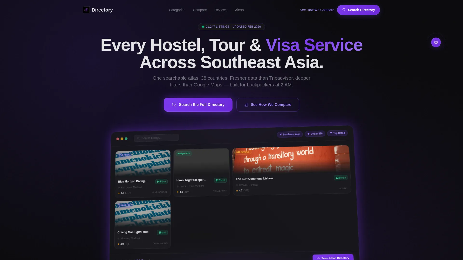
- A Dashboard Preview header with angled, floating card mockups and active filter states
- Modular card grid sections organized by category, region, and listing type
- Comparison table blocks, a coverage map section, and a lightweight two-field signup form
Feature list
Atlas delivers a coordinated set of layout blocks and visual components drawn directly from its brief. Each element serves the directory's core job: make abundance feel navigable.
Angled Dashboard Preview Header
The header renders a tilted, floating mockup of the directory interface. Cards are pre-populated with real-style listings including ratings, prices, and review counts. A soft violet glow sits beneath the mockup against void black, and filters read "Southeast Asia → Under $50 → Top Rated" so visitors grasp the data depth instantly.
Modular Card Grid Layout
Listings display in a modular card grid that organizes hostels, tour operators, visa services, and niche venues into scannable rows. Each card carries the information a traveler actually uses: category, rating, price point, and review volume.
Comparison Table Blocks
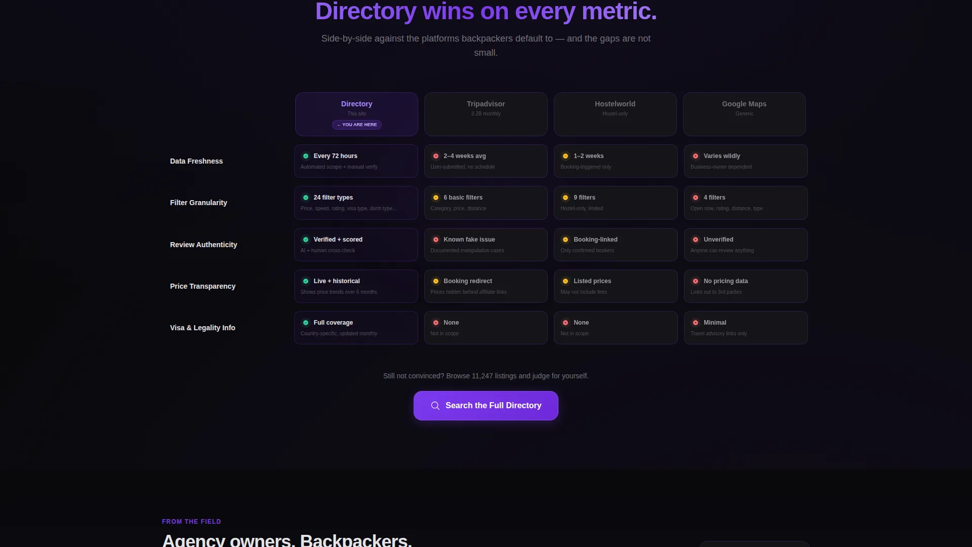
Side-by-side comparison sections let you present your directory's advantages across data freshness, filter granularity, and review authenticity. The structured table format keeps the argument visual and easy to scan without requiring long paragraphs.
Stat and Coverage Sections
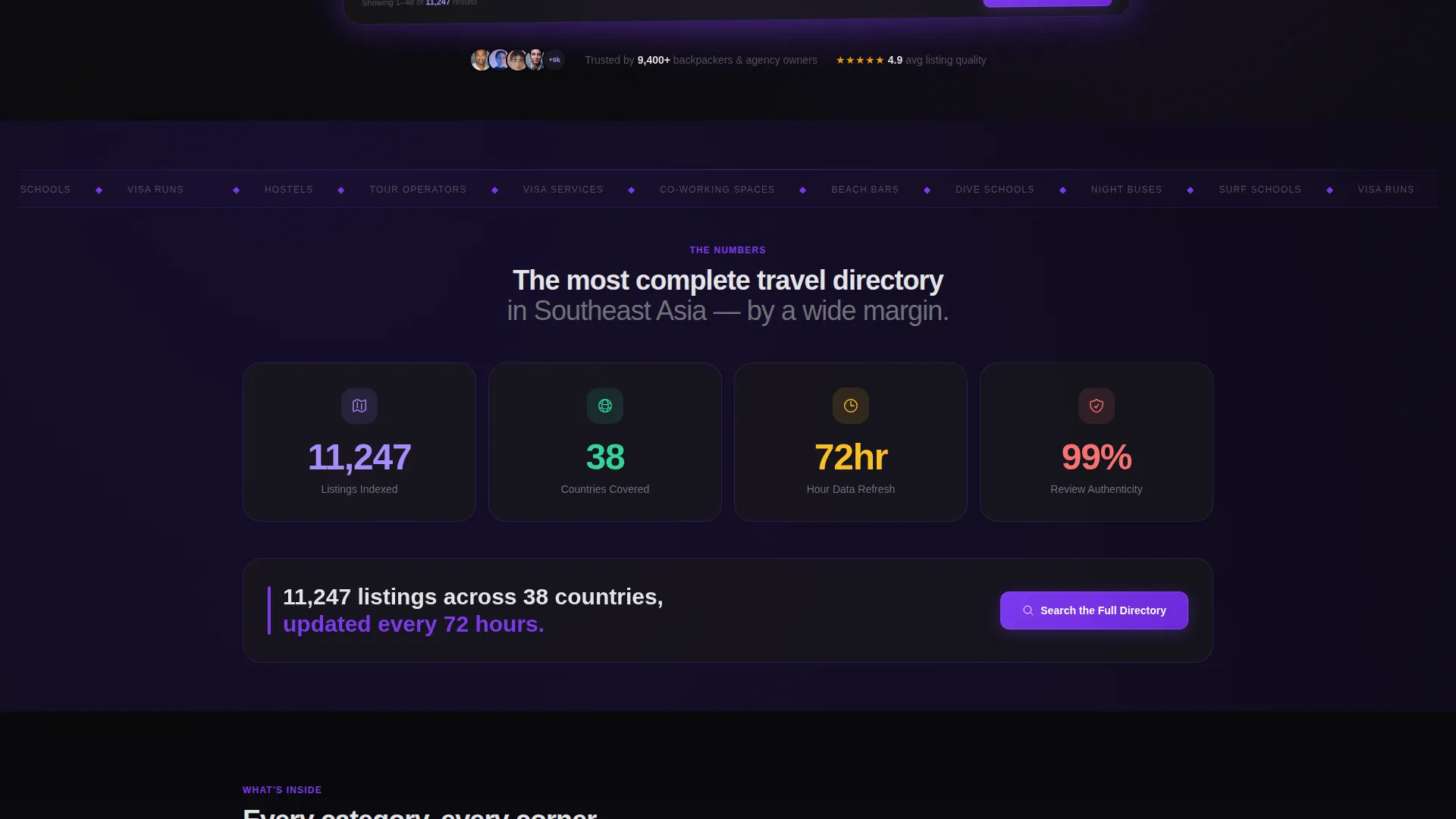
A bold opening stat block anchors the scroll with a concrete scale claim. Below it, a coverage map with violet heat dots and category breakdowns in card grids add visual evidence of geographic and categorical reach.
Testimonial Card Strip
Agency-owner testimonial cards cite specific outcomes, giving the page social proof that feels grounded rather than generic. The cards sit naturally within the Industry Report scroll rhythm.
Lightweight Email Signup Form
The closing signup form asks only for an email address and a preferred travel region via dropdown. The supporting line "Get weekly listing alerts for your region" reframes registration as a practical utility rather than a commitment.
Page sections overview
| Section | Purpose |
|---|---|
| Dashboard Preview Header | Opens with a floating, angled directory mockup to communicate data depth immediately |
| Bold Stat Block | Anchors credibility with a concrete listing count and update frequency |
| Comparison Table | Shows side-by-side directory advantages across key quality dimensions |
| Coverage Map Section | Visualizes geographic reach using violet heat dots on a map layout |
| Category Card Grid | Breaks listings into browsable categories and destination groupings |
| Testimonial Cards | Provides specific, outcome-focused social proof from travel industry users |
| Repeat call to action Strip | Places the primary call-to-action button after each major evidence section |
| Email Signup Form | Closes the page with a two-field, low-friction registration prompt |
Design & branding system
The visual identity follows a Directory & Discovery theme built on the Void & Violet color system. The palette is designed to evoke the feeling of a live departure board, glowing data against deep darkness, each listing a portal to somewhere new.
- Core colors: absolute void black (#09090B), deep interstellar purple (#1A1035), electric violet (#7C3AED) for all clickable surfaces and hover states, and lunar dust gray (#E4E4E7) for card backgrounds and body text
- Electric violet is applied consistently to every button, hover state, and active filter indicator throughout the page
- The floating dashboard mockup uses a subtle violet glow effect to separate it visually from the void-black background
Mobile & speed optimization
The card-grid layout is built with a modular structure that adapts naturally to smaller screens. Stacked card rows and single-column comparison blocks keep the directory experience readable on any device.
- Modular card components reflow cleanly from multi-column desktop grids to single-column mobile stacks
- The angled dashboard preview and comparison tables are designed to remain legible and visually coherent at mobile viewport widths
How this template helps you convert
Atlas is structured around a Comparison/Versus conversion strategy. Every scroll depth adds another layer of evidence before the visitor reaches the signup form.
- The primary call-to-action "Search the Full Directory" appears as a glowing violet button inside the dashboard preview and repeats after each comparison table, keeping the prompt visible without being aggressive.
- A secondary anchor link "See How We Compare" smooth-scrolls visitors to the versus section, giving skeptical readers a low-pressure path to the evidence they need before committing.
- The closing signup form reframes registration as immediate utility with the line "Get weekly listing alerts for your region," reducing the perceived cost of signing up.
Other information about this template
Atlas is a single landing page template, not a multi-page site. It is designed to serve as the public-facing entry point for a travel directory or listing platform.
- The template style is Card Grid (Modular), making it straightforward to adapt the number of visible listing cards or category rows to your actual directory content
- The creative direction is Industry Report, meaning the scroll cadence is paced like a data briefing rather than a marketing brochure
- The header concept is Dashboard Preview, a layout approach that works especially well for directories, search tools, and any platform where showing the product interface early builds faster trust
- The template is well-suited to travel listing sites covering Southeast Asia, broader Asia-Pacific routes, or any multi-country destination network

Theme
Directory & Discovery
Creative direction
Industry Report
Color system
Void & Violet
Style
Card Grid (Modular)
Direction
Comparison/Versus
Page Sections
Angled Dashboard Preview Header
Modular Card Grid Layout
Side-by-side Comparison Tables
Stat Block and Coverage Map
Testimonial Card Strip
Lightweight Two-field Signup Form
Related questions
Can I customize the listing cards with my own directory data?
Is this template suitable for a directory covering regions outside Southeast Asia?
What is the primary call-to-action on this landing page?
How does the closing signup form work?
Does the template include comparison table content, or do I supply that?



