Data & Analytics Professional Website Template
Attribute is a data-dense, dashboard-style landing page template built for multi-touch attribution platforms. It combines a live Sankey diagram hero, a problem-proof discrepancy section, a methodology data grid, and an interactive competitor comparison table. The design follows a Data Command visual identity with monospaced data typography and a single electric green accent for key metrics and primary calls to action.
by Rocket studio
Quick summary
Attribute is a single-page, scroll-driven landing page template for attribution platforms and marketing analytics tools. It opens with a live-fidelity dashboard preview, proves its value through verified conversion discrepancy data, and converts visitors through a two-step audit form. Every section earns the next scroll by anchoring a bold claim to a visible number.
Who this template is for
This template is built for B2B software-as-a-service teams that need to earn trust fast and convert high-intent buyers with data rather than persuasion copy.
- Growth leads and performance marketers who need to demonstrate attribution accuracy to skeptical stakeholders
- Chief Marketing Officers who must defend budget decisions to finance teams using verified numbers, not platform screenshots
- Performance marketing agencies proving return on investment beyond last-click reporting
What problem this template solves
Marketing analytics platforms lose prospects at the credibility gap. When a visitor arrives already skeptical, generic hero images and bullet-point feature lists do not close that gap. This template is designed to replace that doubt with visible proof before asking for anything.
- Ad platforms routinely overstate conversions, and marketers have no single view that reconciles the discrepancy
- Comparison shoppers need a structured, side-by-side reason to choose one platform over another
- Free-trial forms feel risky without enough upfront evidence to justify the data handover
What you get with this template
You get a fully structured, desktop-first landing page layout with five content sections, a sticky conversion bar, and two distinct conversion paths. Every component is grounded in the Data Command visual identity described in the source brief.
- A Sankey diagram hero section with annotated contribution percentages and a native-style audit call-to-action button
- A three-column methodology grid and a twelve-dimension competitor comparison table with hover interaction states
- A two-step gated audit form and a secondary email-gated competitor teardown conversion path
Feature list
This template includes purpose-built components designed for high-intent, data-literate visitors evaluating an attribution platform.
Live-Fidelity Sankey Diagram Hero
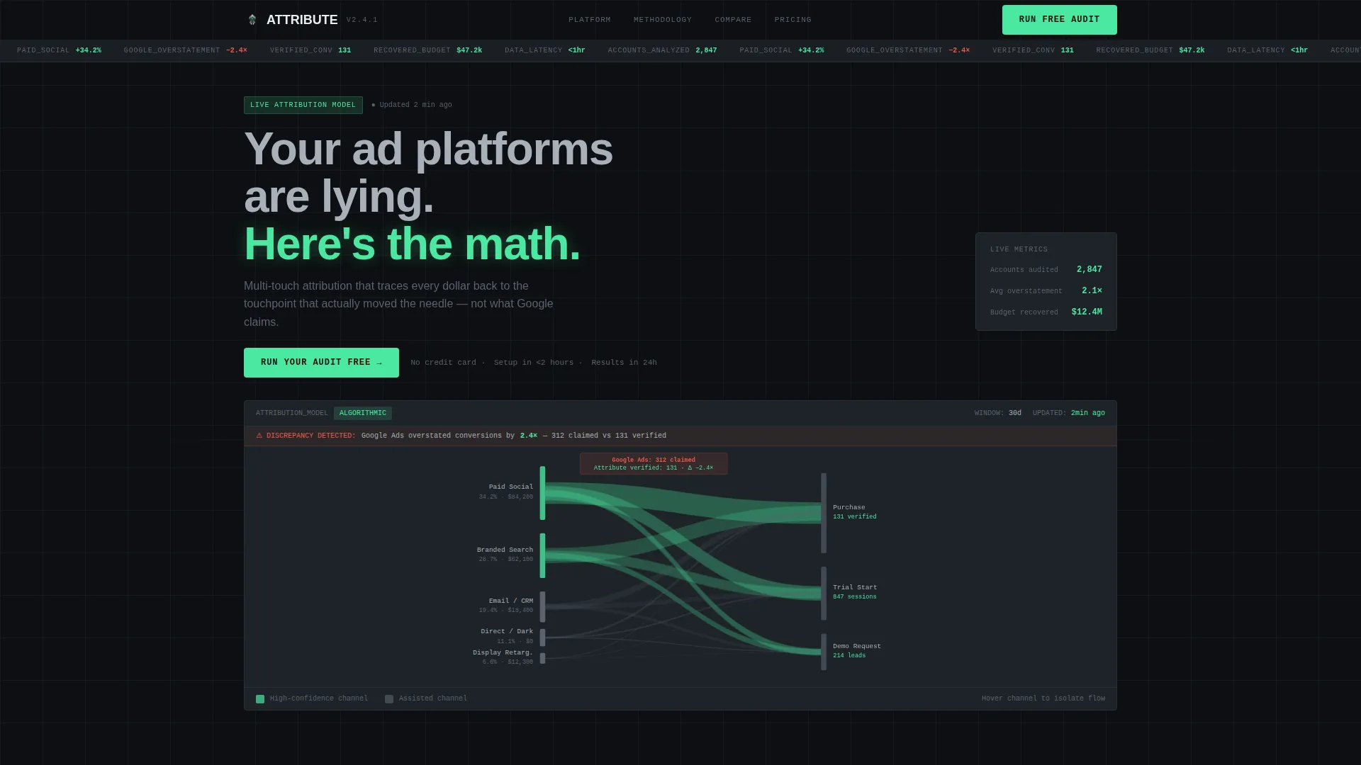
The header fills 80% of the viewport with a multi-touch attribution model visualized as a Sankey diagram. Channel strands on the left flow into conversion events on the right, with strand thickness representing spend weight. Specific modeled contribution percentages and platform discrepancy callouts are visible directly inside the diagram area.
Conversion Discrepancy Proof Section
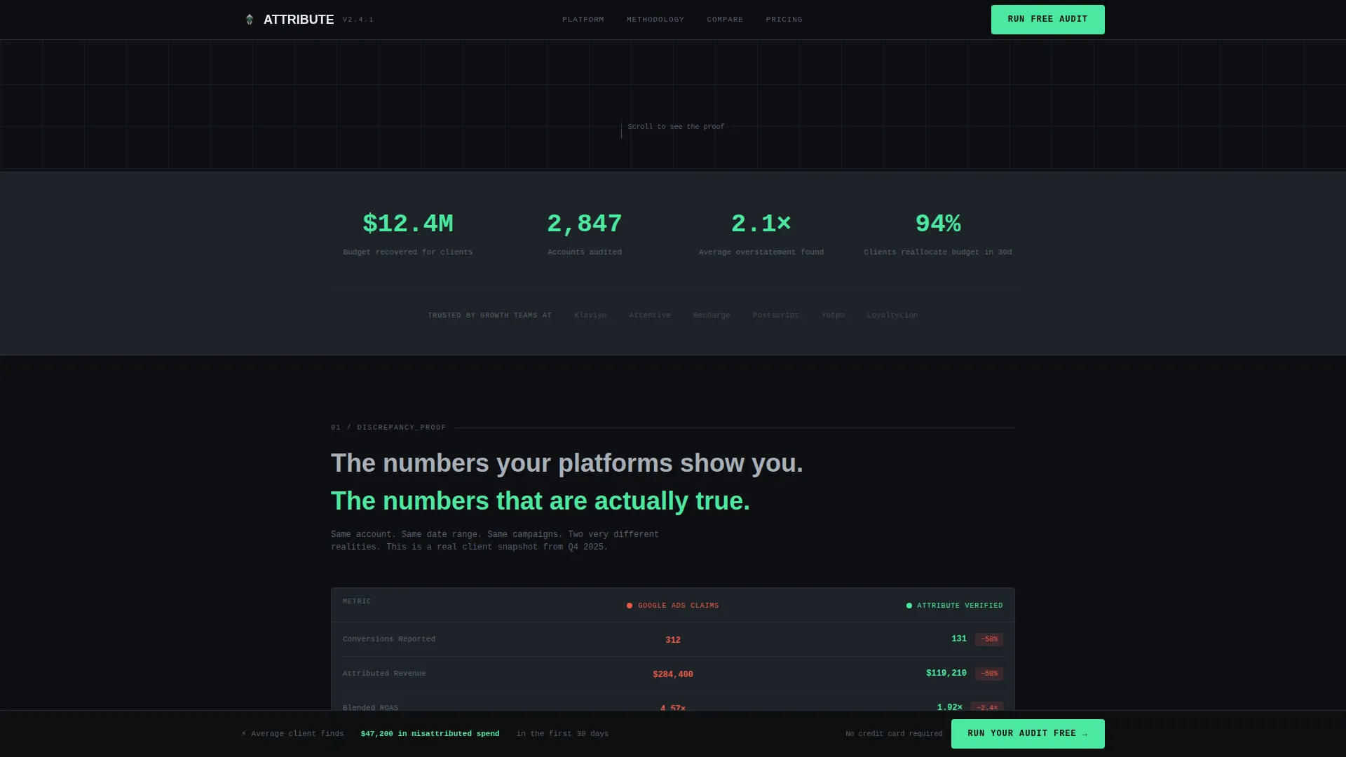
A side-by-side comparison shows the gap between what an ad platform claims and what the attribution model verifies. The layout displays 312 platform-reported conversions against 131 verified conversions, with the delta highlighted in brushed steel on terminal black. This section establishes credibility before any feature is named.
Three-Column Methodology Data Grid
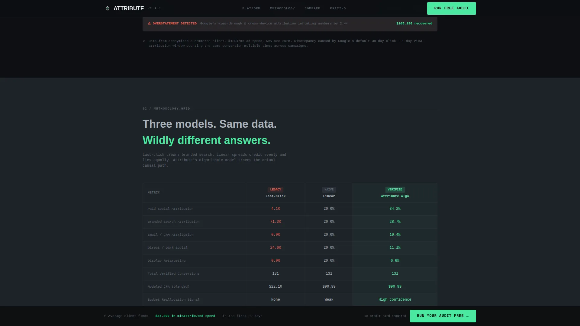
Section two presents last-click, linear, and algorithmic attribution models across identical campaign data in a structured three-column grid. Monospaced typography is applied to all data cells. The layout lets visitors see precisely how each model produces different outcomes from the same source data.
Interactive Competitor Comparison Table
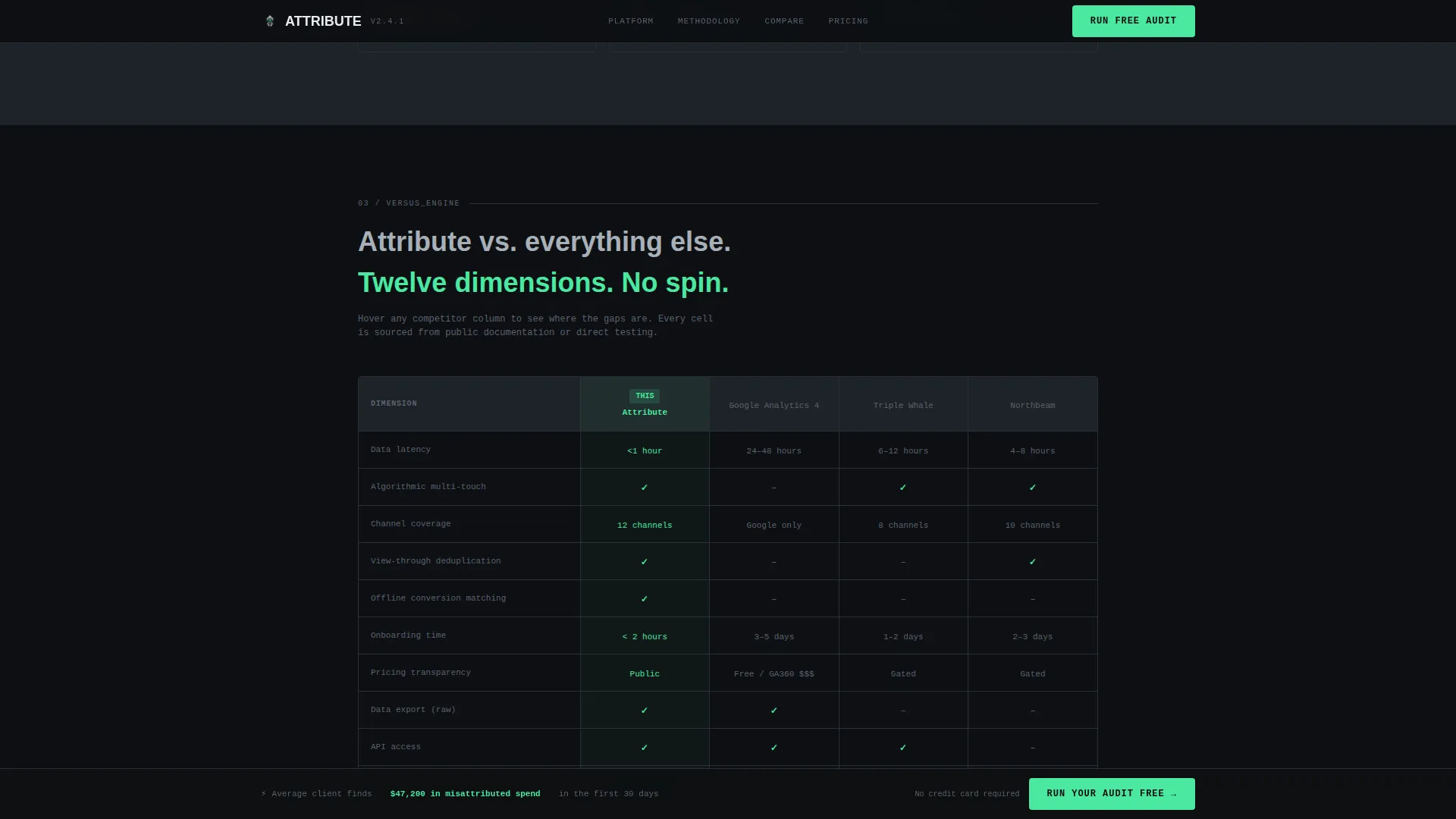
The versus engine compares the platform against multiple analytics competitors across twelve measurable dimensions, including data latency, channel coverage, onboarding time, and pricing transparency. Electric green checkmarks indicate platform advantages. A hover state on each competitor row dynamically labels the secondary call-to-action button below the table.
Two-Step Gated Audit Form
The primary conversion path uses a two-step form. Step one collects monthly ad spend via a slider input and primary ad channels via multi-select chips. Step two asks for email address and company name. This progressive disclosure approach reduces form friction while capturing qualified lead data.
Sticky Bottom Conversion Bar
A slim call-to-action bar appears after the first scroll and remains pinned to the bottom of the viewport throughout the page. It carries the primary "Run Your Audit Free" action, keeping the conversion path accessible at every point in the scroll journey without interrupting the content flow.
Page sections overview
| Section | Purpose |
|---|---|
| Dashboard Hero | Sankey diagram preview with headline and native audit call to action |
| Discrepancy Proof | Side-by-side conversion count comparison with highlighted delta |
| Methodology Grid | Three-column last-click versus. linear versus. algorithmic model breakdown |
| Versus Engine | Twelve-dimension competitor comparison table with hover states |
| Audit Form call to action | Two-step lead capture form gated by spend range and email |
| Footer | Single-row linear footer with minimal navigation |
Design & branding system
The visual identity follows a Data Command theme built entirely around information density and restraint. There is no warm color, no decorative illustration, and no stock photography anywhere in the layout.
- Color palette: terminal black (#0D0F12) for backgrounds, gunmetal gray (#1E2328) for card and section layers, brushed steel (#A8B0B9) for secondary text and dividers, and electric green (#4AE8A0) reserved exclusively for positive-delta numbers and primary call-to-action elements
- Typography: JetBrains Mono is used wherever data appears, including table cells, metric callouts, and form labels; DM Sans is used for all narrative and heading copy
- Section dividers are 1-pixel steel lines; no gradients or decorative backgrounds are used between sections
Mobile & speed optimization
The template is built desktop-first because its core components, the Sankey diagram, the comparison table, and the methodology grid, are designed for data-dense screen real estate. A mobile fallback layout is included.
- The Sankey diagram and comparison table reflow gracefully for smaller viewports without losing the key callout numbers
- Scroll-triggered counter animations and staggered section reveals use client-side components only where interactivity is required, keeping static sections lean
- Server Components handle all non-interactive content blocks, reducing client bundle size and supporting fast initial page load
How this template helps you convert
The page is structured as a proof sequence. Each section validates the claim made above it, so the visitor arrives at the conversion form already convinced rather than still skeptical.
- The Sankey diagram hero creates immediate product recognition and surfaces a specific discrepancy claim before the visitor reads a single paragraph of copy, producing the "itch" the audit offer then resolves.
- The competitor comparison table directly addresses the most common objection for evaluation-stage buyers: "how is this different from what I already use?" The dynamic secondary call to action below the table personalizes the next step based on competitor hover behavior.
- The two-step audit form uses progressive disclosure, first collecting context (spend range and channels), then requesting contact details, which reduces abandonment and improves lead quality simultaneously.
Other information about this template
This template is categorized under Technology, Data and Analytics, with a niche focus on attribution platforms. It is suitable for any B2B SaaS product that competes in the marketing measurement space, including multi-touch attribution tools, incrementality testing platforms, and unified marketing measurement solutions.
- The template style is Dashboard and Data Grid, reflecting the intersection of high-information-density design and conversion-focused layout architecture
- The creative direction follows a Launch Energy sequence: each scroll section fires with escalating proof, moving the visitor from awareness of the problem to confidence in the solution
- The header concept is a Dashboard Preview, meaning the product interface itself is the hero visual rather than any illustrative or photographic element
- The landing page direction is Comparison and Versus, making it especially well-suited for platforms competing against established analytics tools in an active evaluation market
Theme
Data Command
Creative direction
Launch Energy
Color system
Monochrome Steel
Style
Dashboard/Data Grid
Direction
Comparison/Versus
Page Sections
Live Sankey Diagram Hero Section
Conversion Discrepancy Proof Block
Three-column Attribution Methodology Grid
Twelve-dimension Competitor Comparison Table
Two-step Progressive Audit Form
Sticky Bottom Call-to-action Bar
Related questions
What type of product is this template designed for?
Can I customize the competitor names in the comparison table?
Does this template include the Sankey diagram animation?
Is this template suitable for mobile visitors?
How does the two-step audit form work?



