Expert Speech Recognition Technology Professional Website Template
Transcribe is a Bold Brutalist landing page template for an on-device, open-source speech recognition engine. Built for indie developers, machine learning researchers, and startup teams, it combines dark glass panel visualizations, a modular card grid, and live interactive demos to let visitors prove the engine's speed and accuracy on their own voice before signing up.
by Rocket studio
Quick summary
Transcribe is a single-page, card-grid landing page template for an open-source speech recognition engine. It delivers sub-200ms on-device transcription without cloud dependencies. The design leans on a Bold Brutalist aesthetic with teal accents, void-black backgrounds, and live data visualizations that replace stock photography entirely. Visitors interact with the engine before they ever see a signup prompt.
Who this template is for
This template is built for technical builders who need to show what their speech recognition project actually does. It communicates capability through hands-on demos rather than marketing copy, making it ideal for developers and researchers who distrust polished pitches.
- Indie developers adding voice commands to personal or weekend projects
- Machine learning researchers benchmarking transcription accuracy against competing models
- Startup chief technology officers (CTOs) who want production-ready transcription without per-minute cloud API costs
What problem this template solves
Most open-source project pages describe features in long readme-style blocks that visitors skim and close. Transcribe replaces that pattern with a page that hands visitors the controls immediately. The result is a page that earns trust through direct experience rather than claims.
- Visitors leave before they understand the engine's real speed and accuracy
- Technical audiences distrust marketing copy and want reproducible proof
- CTOs evaluating alternatives need a clear self-serve trial path before committing
What you get with this template
The template is a fully structured, modular card-grid landing page. Every major section is a self-contained card or panel that a developer can rearrange, extend, or repurpose. The layout is designed so the data is always the visual centrepiece.
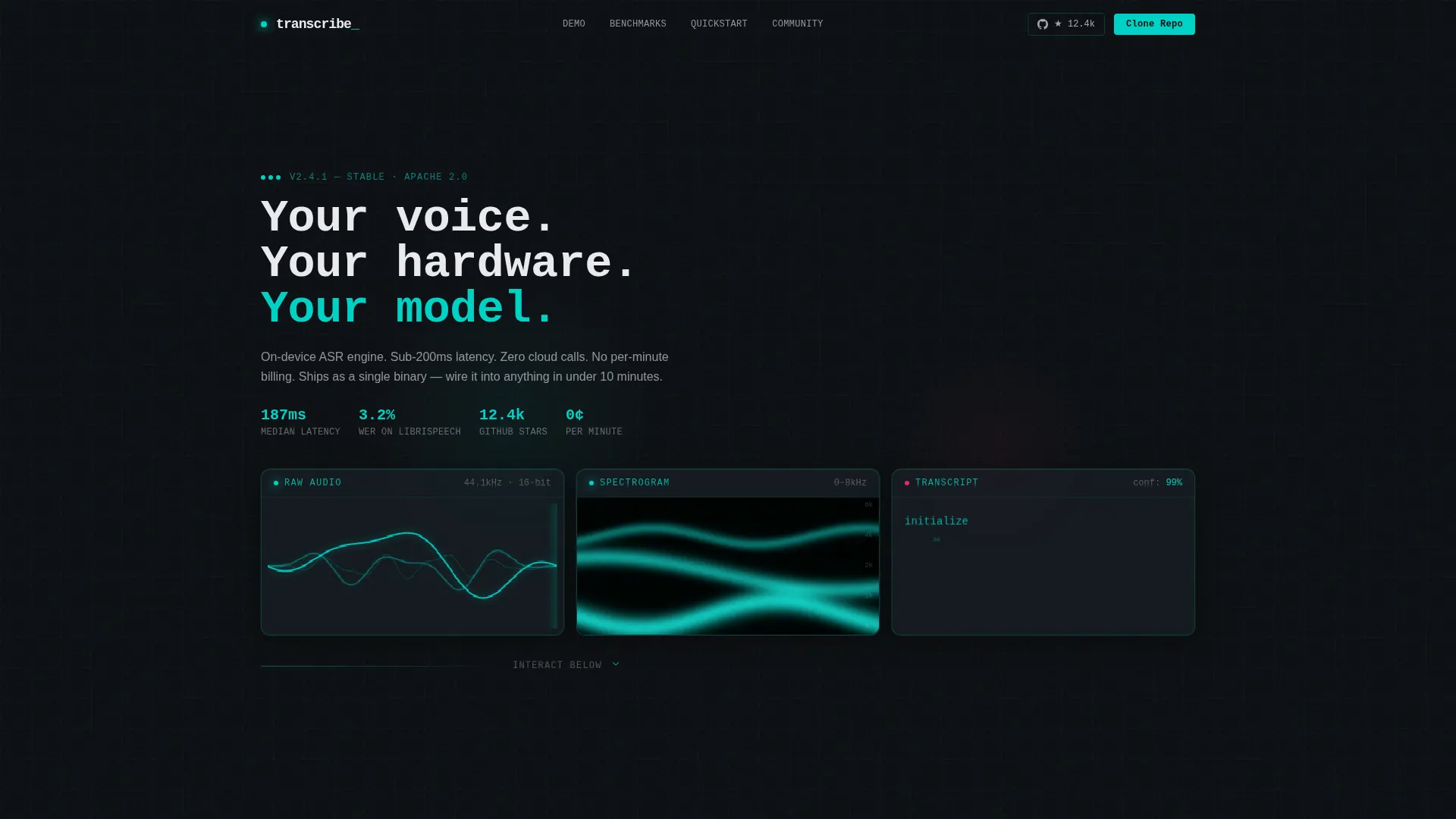
- A three-panel dark glass header with live audio waveform, spectrogram waterfall, and streaming transcription visualizations
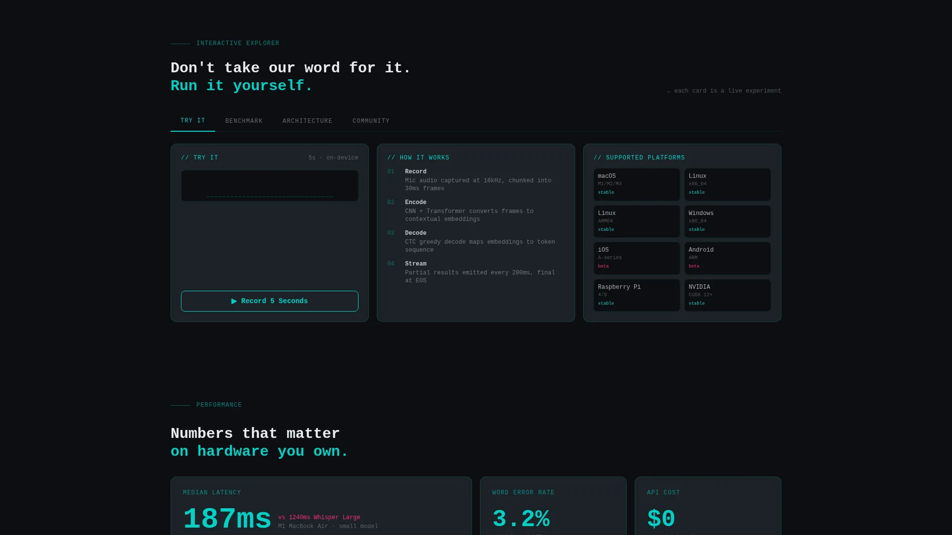
- An interactive card grid organized into Try It, Benchmark, Architecture, and Community category tabs
- A persistent bottom conversion bar that appears after any card interaction, carrying both the primary and secondary calls to action
Feature list
A paragraph introducing the features of this template. Each card and section in the Transcribe template is designed to demonstrate the engine's on-device capability in a concrete, touchable way. The features below reflect exactly what the template brief specifies.
Live Audio Transcription Card
One card in the grid lets a visitor record five seconds of audio directly from their microphone. The model transcribes the input live, with word confidence scores displayed in signal magenta and reactor teal so the viewer can read accuracy at a glance.
Model Benchmark Comparison Card
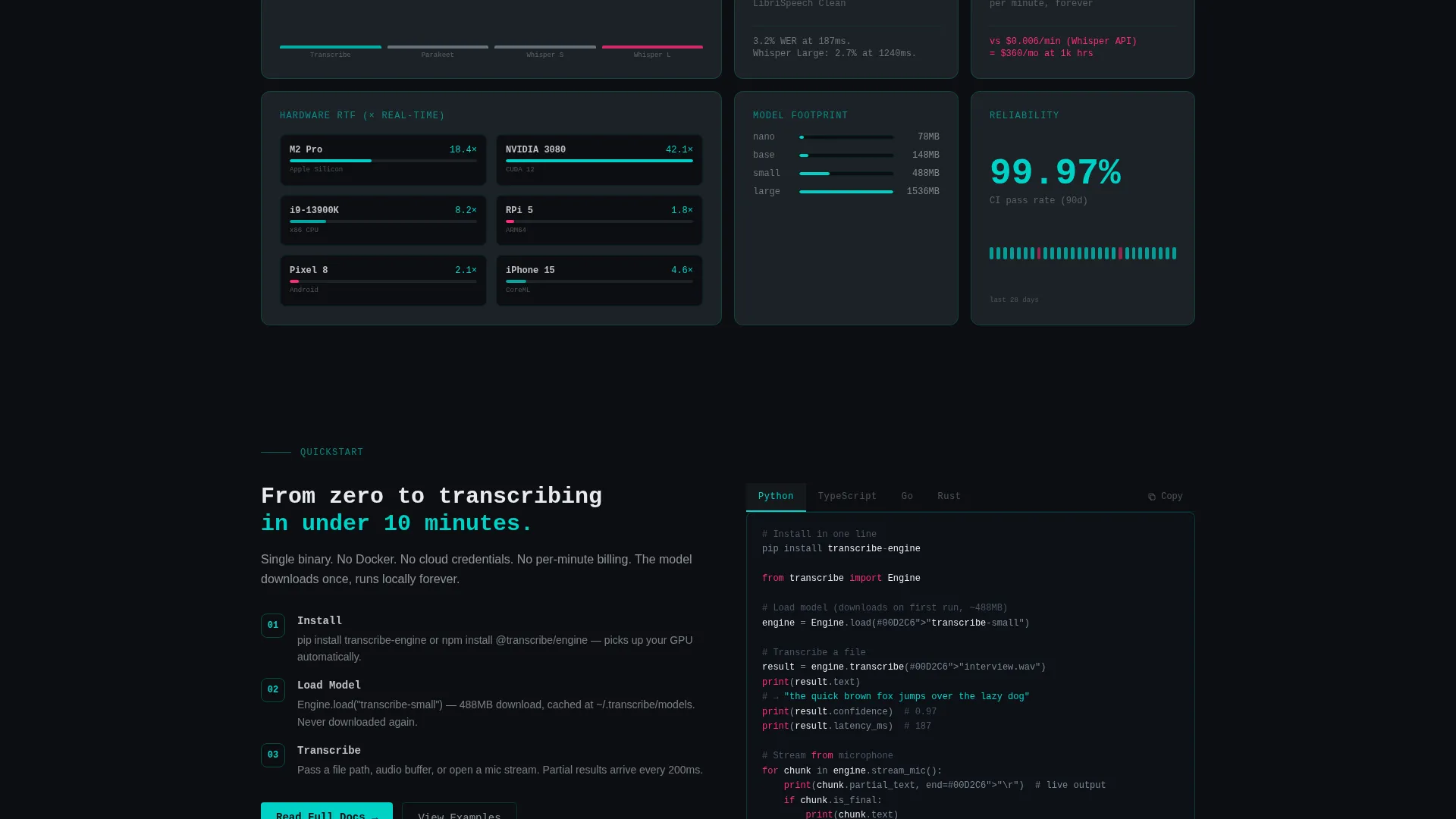
A dedicated benchmark card lets visitors select a dataset from a dropdown and compare word error rates across three competing models side by side. This card lets researchers and CTOs run their own comparisons rather than accepting published numbers.
Interactive Architecture Diagram
The architecture card renders a clickable diagram of the engine's full model structure. Clicking any layer, whether the encoder, decoder, or CTC head (Connectionist Temporal Classification), expands a plain-language explanation of what that component does.
Category Tab Navigation
The card grid is organized by four tabs: Try It, Benchmark, Architecture, and Community. Visitors filter the grid to the cards most relevant to their intent. Each tab state keeps the page focused without hiding content permanently.
Persistent Conversion Bottom Bar
After a visitor interacts with any card, a persistent bar slides into view at the bottom of the page. It carries the primary call to action ("Clone the Repo") and a secondary path for the hosted API key, which includes a single email field and a GitHub OAuth button.
Dark Glass Panel Header
The header renders three translucent frosted-glass panels over a void-black background. Each panel shows a different live visualization: a raw audio waveform, a spectrogram waterfall in teal gradients, and streaming transcription text appearing word by word. No hero image is used.
Page sections overview
| Section | Purpose |
|---|---|
| Dark Glass Header | Displays live waveform, spectrogram, and streaming transcription panels |
| Monospaced Headline | Sets the project's core promise in a single stark line |
| Try It Card | Lets visitors record audio and watch live transcription output |
| Benchmark Card | Compares word error rates across models using a selectable dataset |
| Architecture Card | Shows the model diagram with clickable, expandable layer explanations |
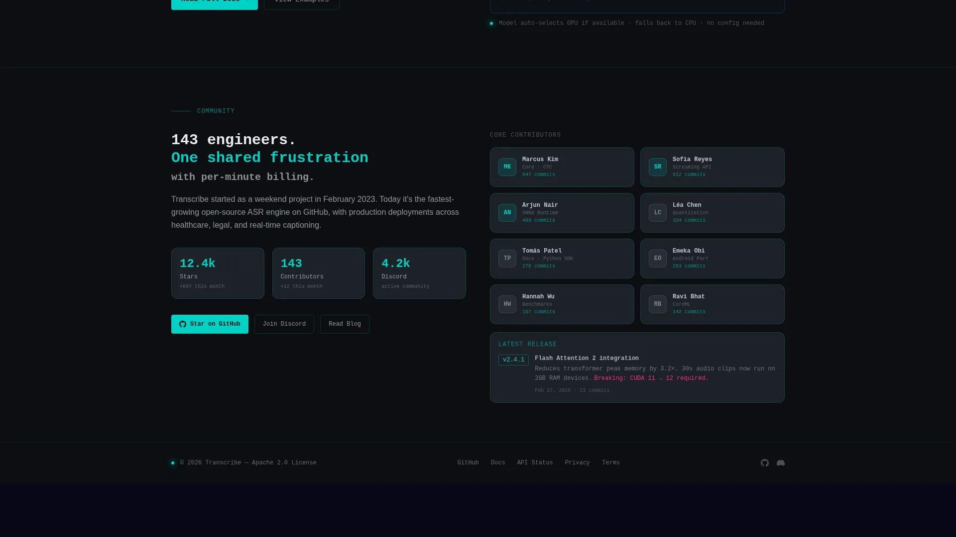
| Community Card | Provides links and context for the open-source project community |
| Category Tab Bar | Filters the card grid by Try It, Benchmark, Architecture, or Community |
| Persistent Bottom Bar | Surfaces primary and secondary conversion actions after first interaction |
Design & branding system
The template uses a Teal Catalyst color system built around four core values. Every color decision has a functional reason: teal signals interactivity, magenta signals warnings and breaking changes, graphite grounds card surfaces, and void black anchors the background. The result reads like a circuit board photographed under ultraviolet light.
- Void black (#0B0E11) as the dominant background, slate graphite (#1C2127) for all card surfaces, and bone white (#E8EAED) for body text
- Reactor teal (#00D2C6) on every interactive element including links, hover states, waveform animations, toggle switches, and the 1px card borders that brighten on hover
- Signal magenta (#FF2D78) reserved for warnings, error states, confidence score highlights, and breaking-change notices
Mobile & speed optimization
The modular card grid is built to reflow naturally across screen widths. Cards are self-contained units, so the layout adapts without losing the visual logic of the grid. The interactive elements are designed to work on touch screens as well as pointer devices.
- Card grid columns collapse to a single-column stack on narrower viewports without breaking the tab navigation
- The persistent bottom conversion bar remains anchored and readable on mobile, keeping both calls to action accessible without scrolling back to the top
How this template helps you convert
The conversion strategy in this template is built on a principle the brief makes explicit: proof first, signup second. Every structural decision pushes the visitor toward an interaction before presenting any ask.
- Visitors engage with a live transcription card using their own voice, creating personal evidence of the engine's quality before any call to action appears.
- The persistent bottom bar appears only after a card interaction, so the signup prompt arrives at the moment of highest interest rather than on page load.
Other information about this template
This template is part of a broader set of technology landing page templates built for open-source and developer-tool projects. It suits any project in the speech recognition technology space that relies on a freemium or self-serve trial conversion model.
- The template style is a Card Grid (Modular) layout, compatible with standard front-end component systems
- The creative direction is Interactive Explorer, meaning the scroll experience is designed as a playground rather than a passive pitch
- The header concept is Dark Glass Panels, a design pattern that uses frosted-glass depth, subtle reflections, beveled edges, and teal light-leak effects instead of photography
- The template fits the speech recognition open-source project niche and can support related audio processing or voice interface projects with similar architecture
Theme
Bold Brutalist
Creative direction
Interactive Explorer
Color system
Teal Catalyst
Style
Card Grid (Modular)
Direction
Freemium/Trial
Page Sections
Live Microphone Transcription Card
Model Benchmark Comparison Card
Clickable Architecture Diagram
Category Tab Grid Navigation
Persistent Post-interaction Bottom Bar
Dark Glass Panel Header
Related questions
Who is this landing page template designed for?
Does the template include a live microphone recording demo?
What are the two conversion paths included on this landing page?
Can the card grid be rearranged or extended?
What visual style does this template use?



