Advanced Accounting Firm Software Professional Website Template
The Audit Dynamic Quality Management Landing Page Template is a hub and spoke, anchor-navigated landing page built for accounting firm quality management platforms. It combines an interactive dashboard preview, scroll-triggered industry data, animated audit findings charts, and a personalized app download flow into one kinetic, data-dense page designed for managing partners, quality assurance directors, and engagement managers.
by Rocket studio
Quick summary
This template delivers a single-page, anchor-navigated experience for an accounting firm quality management platform. It opens with a live interactive dashboard preview, then walks visitors through six spokes of inspection data, deficiency benchmarks, and methodology analysis before driving them to a personalized app download. Every section is built around real audit process urgency and regulatory context.
Who this template is for
This landing page is built for teams that live inside the audit process every day. It speaks directly to the people responsible when an inspection goes wrong and to those who plan to make sure it never does.
- Managing partners who need a single cockpit view to track compliance across multiple offices
- Quality assurance directors scheduling cold file reviews and preparing for regulatory inspections
- Engagement managers checking methodology adherence before a partner sign-off
What problem this template solves
Quality management in accounting firms is too often fragmented across spreadsheets, shared drives, and disconnected checklists. The result is that audit findings surface during inspections rather than before them. This template gives the platform a landing page structure that communicates the cost of that fragmentation and positions the app as the resolution.
- Firms struggle to consolidate peer review workflows, engagement checklists, and compliance monitoring into one view
- Partners lack a structured approach to track improvements across engagements in real time
- Marketing teams and agencies need a landing page that earns the download by proving value before asking for it
What you get with this template
You get a fully structured, motion-rich landing page with six content spokes, an interactive header, a progressive onboarding form, and a sticky app download bar. Every section is pre-built to carry real audit data, regulatory context, and conversion-focused copy.
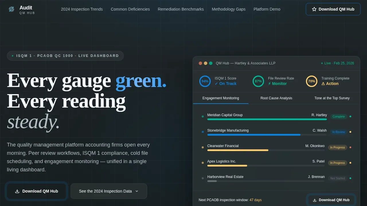
- An interactive header with animated completion rings, tab-switching panels, and a live findings tracker
- Six anchor-navigated spokes covering inspection trends, deficiency categories, remediation benchmarks, methodology gaps, and a platform demo
- A progressive form capturing firm size, primary compliance framework, and work email to personalize the download experience
Feature list
This template includes purpose-built components that reflect both the visual ambition and the functional depth the platform requires. Each feature below maps directly to the brief.
Interactive Dashboard Header
The header renders a functioning micro-version of the app dashboard directly in the browser. Animated completion rings fill to 94%, a review timeline displays color-coded engagement dots, and a findings tracker resolves items in real time. Visitors can click between three tabs: Engagement Monitoring, Root Cause Analysis, and Tone at the Top Survey. Each tab triggers a smooth panel transition. A subtle particle trail follows the cursor, establishing the Dynamic Motion theme before any copy is read.
Anchor Navigation Bar
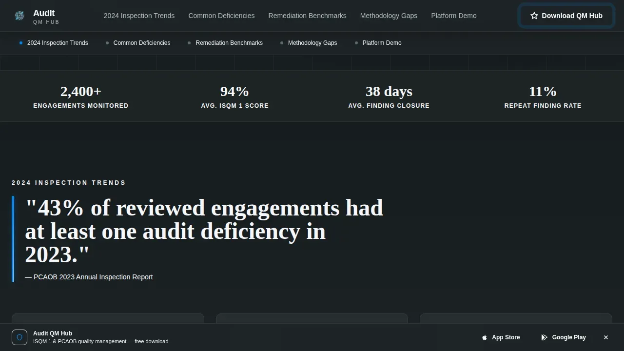
A sticky anchor navigation bar locks to the top of the page after the header. It carries five spoke labels that let visitors navigate directly to any section. Active nav dots use the sky blue accent to confirm position. This structure helps visitors with specific requirements move quickly to the content most relevant to their role, reducing bounce rate and keeping user engagement high.
Scroll-Triggered Data Sections
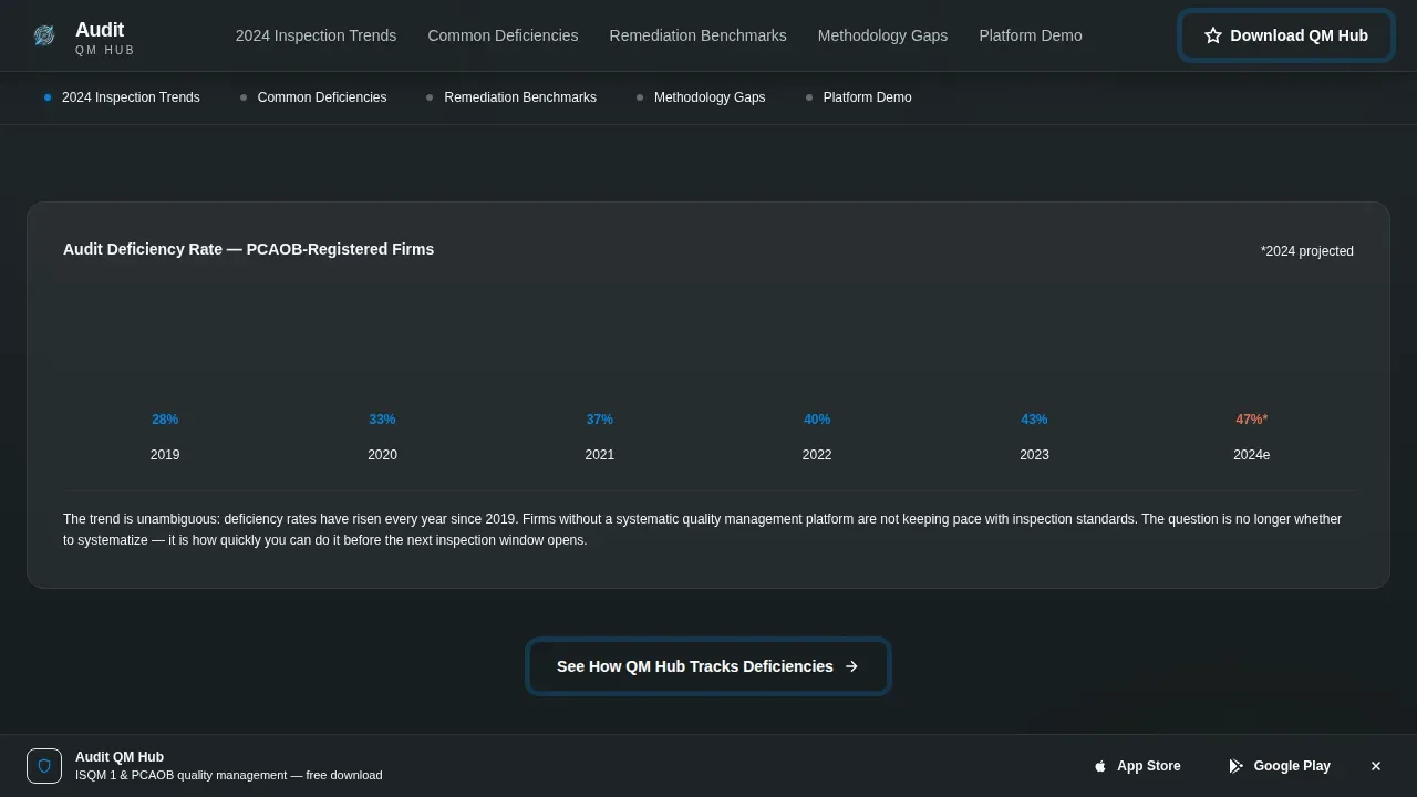
Each spoke section opens with a bold data callout drawn from real inspection findings, then layers in animated charts, comparative benchmarks, and analytical commentary. Charts draw on scroll, stat counters tick upward, and section transitions use horizontal wipes. This scroll architecture builds a continuous case from industry-wide problems through to firm-level consequences and the platform as the answer.
Bento Grid Deficiency Display
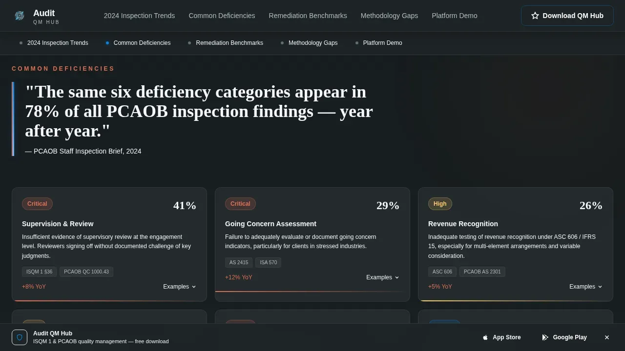
The Common Deficiencies spoke uses a bento grid layout with deficiency categories and severity indicators. The layout gives visitors a fast, visual audit checklist of the most common failure points across engagements, helping them identify issues in their own workflow before they become inspection findings.
Progressive Onboarding Form
Before the final call to action, a short form captures three fields: firm size, primary compliance framework (ISQM 1, PCAOB QC 1000, or both), and work email. The form is framed as customizing the onboarding experience rather than gating access. This approach supports data driven decisions around personalization and can meaningfully improve conversion rates by aligning the download with the visitor's specific context.
Sticky App Download Bar
A secondary sticky bar at the bottom of the page detects the visitor's device and auto-displays the appropriate App Store or Google Play badge. The primary call to action "Download the QM Hub" appears first inside the interactive header and resurfaces at the close of each spoke. This repetition keeps the conversion goal visible without interrupting the content flow.
Page sections overview
| Section | Purpose |
|---|---|
| Interactive Dashboard Header | Live preview of quality scorecard with animated rings, tab switching, and particle cursor |
| Anchor Navigation Bar | Sticky spoke labels letting visitors navigate to any data section instantly |
| 2024 Inspection Trends | Scroll-triggered charts and PCAOB data callouts establishing industry-wide audit process risk |
| Common Deficiencies | Bento grid showing deficiency categories and severity indicators across engagement types |
| Remediation Benchmarks | Comparative benchmark visualization broken down by firm size |
| Methodology Gaps and Demo | Feature showcase for the platform paired with the progressive onboarding form |
| Footer | Minimal horizontal footer with privacy policy link and compliance documentation |
Design & branding system
The visual identity follows a Dynamic Motion theme using a Slate and Sky color system. The palette reads like a glass-walled office at elevation: serious enough for a regulatory filing, with a band of open sky pulling the eye forward.
- Deep charcoal slate (#2D3436) for primary backgrounds, mid-tone graphite (#636E72) for secondary surfaces, and high-altitude white (#F5F6FA) for card surfaces and breathing room
- Sky blue (#0984E3) used sparingly as the action accent on active nav dots, completion rings, call-to-action buttons, and animated progress bars
- DM Sans for body text and user interface elements; Fraunces for display headlines to add gravitas without losing clarity
Mobile & speed optimization
The template is built desktop-first to match how managing partners and quality assurance directors actually work, with full responsive design scaling down to tablet. The layout adapts so that critical calls to action and key metrics remain visible and accessible on smaller screens without losing the visual appeal of the instrument-panel aesthetic.
- Responsive design ensures the interactive dashboard, anchor nav, and bento grid reflow cleanly for tablet viewports
- The sticky download bar and progressive form remain functional and easy to complete across device sizes
- Back-end performance of the dynamic template is designed to match its front-end ambition; server components handle static sections while client components power the interactive dashboard, keeping load speeds controlled
How this template helps you convert
The landing page is structured to guide visitors through each stage of the decision: attention, interest, desire, and action. Every section deepens the case rather than repeating it, so the call to action at the end feels earned rather than forced.
- The interactive header captures attention immediately by showing the platform working, not just describing it. Animated progress bars, live findings, and clickable tabs communicate value before a single headline is read, reducing bounce rate and establishing credibility with skeptical stakeholders.
- Six data-rich spokes build progressive urgency. Each section adds precise insights through animated charts, benchmark comparisons, and regulatory data. By the time visitors reach the progressive form, they have moved through a comprehensive evaluation of the problem and understand the cost of inaction. This structure supports stronger conversion rates and makes the download feel like the logical next step.
Other information about this template
This template is built for accounting firm software in the technology category and sits at the intersection of audit quality management and marketing conversion. It draws on real PCAOB and AICPA inspection data references to build credibility with a compliance-literate audience. Below are additional details relevant to buyers evaluating fit.
- The template accommodates documentation placeholders for version history and approval signatures, supporting audit trail requirements
- Sections include designated areas for trust signals such as compliance badges, certifications, and security icons to reduce visitor anxiety
- The layout includes placeholder slots for testimonials, case studies, and partner logos to support social proof
- The page follows AIDA funnel structure: the interactive header handles Attention, the data spokes handle Interest and Desire, and the progressive form plus sticky download bar handle Action
- Regular audits of the landing page itself are recommended to maintain alignment with business objectives as regulatory frameworks evolve
- The template suits various industries beyond accounting where quality management and compliance monitoring are primary concerns, including any sector running structured audit procedures against defined standards
- For teams running paid campaigns, a well-structured landing page of this type improves Quality Score for PPC ad groups, which can lower cost per acquisition and improve ad positions in search engine results pages
- Landing page relevance to the ad and keywords used in campaigns is critical; this template's spoke structure makes it straightforward to optimize campaigns by directing ad groups to specific anchor sections
- To optimize landing pages over time, teams can use tools like Google PageSpeed Insights to test load speeds and identify areas where performance can be improved
- A/B testing headlines, form lengths, and call-to-action copy is recommended to continuously track improvements and refine conversion rates
- The template can serve as a best resource for agencies building quality management platform pages, offering a repeatable audit checklist of landing page components already built in
- Competitor analysis is easier when the page structure is consistent; this template gives teams a clear baseline to test against rival platform pages
- No-code and low-code customization is supported through the platform's AI-powered development tools, meaning non-technical users can adapt copy, swap data callouts, and update audit templates content without traditional programming
- AI-powered tools built into the platform allow teams to iterate and test the landing page quickly, generating variations and personalizing content based on user behavior data
Theme
Dynamic Motion
Creative direction
Industry Report
Color system
Slate & Sky
Style
Hub & Spoke (Anchor Nav)
Direction
App Download
Page Sections
Interactive Dashboard Header Preview
Anchor Navigation with Spoke Structure
Scroll-triggered Animated Charts
Bento Grid Deficiency Layout
Progressive Personalization Form
Sticky Device-aware Download Bar
Related questions
Who is the primary audience for this landing page template?
What compliance frameworks does the template reference?
Can this template be adapted for free audits or introductory offers?
Does the template include trust and compliance signals?
Is this template suitable for firms in other industries?



