Automotive Quality Management App Landing Page Template
The Audit landing page template is built for automotive quality management apps. It pairs a bold comparison table with a Void & Violet visual identity, guiding plant quality managers, supplier engineers, and launch teams from the first scroll to a frictionless app download. Every section earns trust before asking for a tap.
by Rocket studio
Quick summary
This is a single-page, comparison-table landing page template designed for an automotive quality management app. It leads with industry credibility, stages a progressive feature matrix, and closes with a frictionless app download call to action. The visual system uses void black and deep violet to simulate a luxury EV cockpit, keeping data visible and fatigue low.
Who this template is for
This template is built for teams where quality failures have real production consequences. If your day starts with a control chart and ends with a closed non-conformance report (NCR), this page speaks your language.
- Plant quality managers running early-morning IATF 16949 audits and managing line holds
- Tier-one supplier engineers racing to close 8D reports before customer escalation deadlines
- Launch teams tracking Production Part Approval Process (PPAP) submissions across multiple regions
What problem this template solves
Quality teams at automotive plants often lose hours to scattered spreadsheets, shared drives, and disconnected tools. A landing page that looks generic fails to earn trust from engineers who know exactly what bad tooling costs.
- Visitors leave before converting because the page does not speak their workflow
- Feature value is buried in walls of text instead of shown through a structured comparison
- Download friction kills conversions when no-form, direct-to-app flows are available
What you get with this template
You get a fully structured, single-page template that stages every persuasion element in a deliberate order. Nothing is left to guesswork.
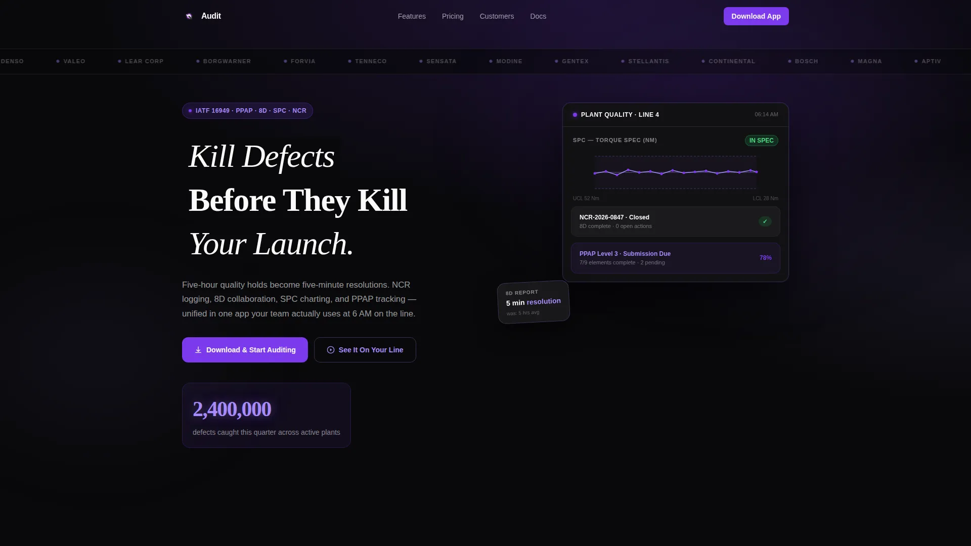
- A Logo Bar header with OEM and tier-one supplier silhouettes scrolling at conveyor-belt speed
- An animated metric counter displaying a live defect-catch figure in glowing violet
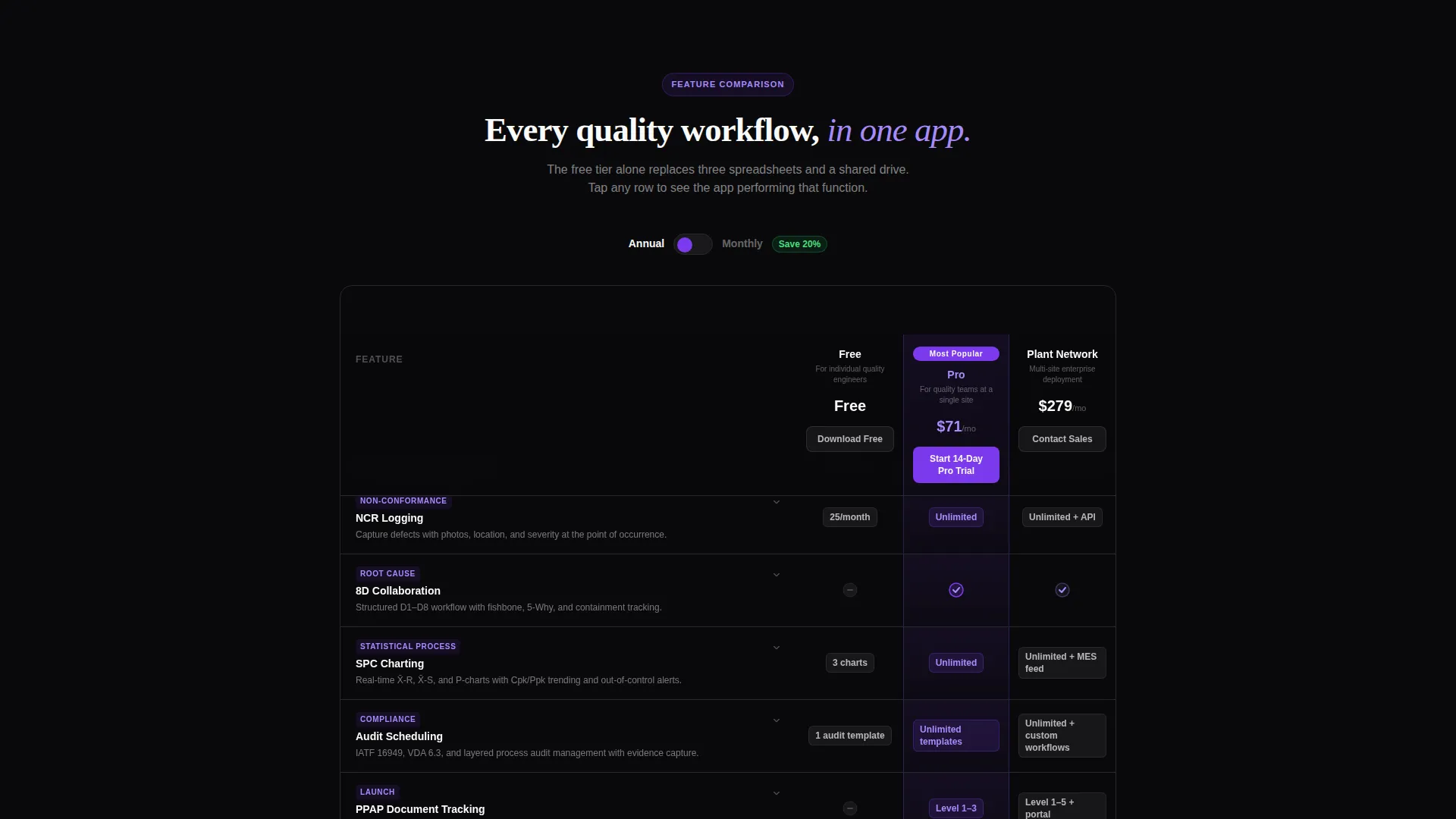
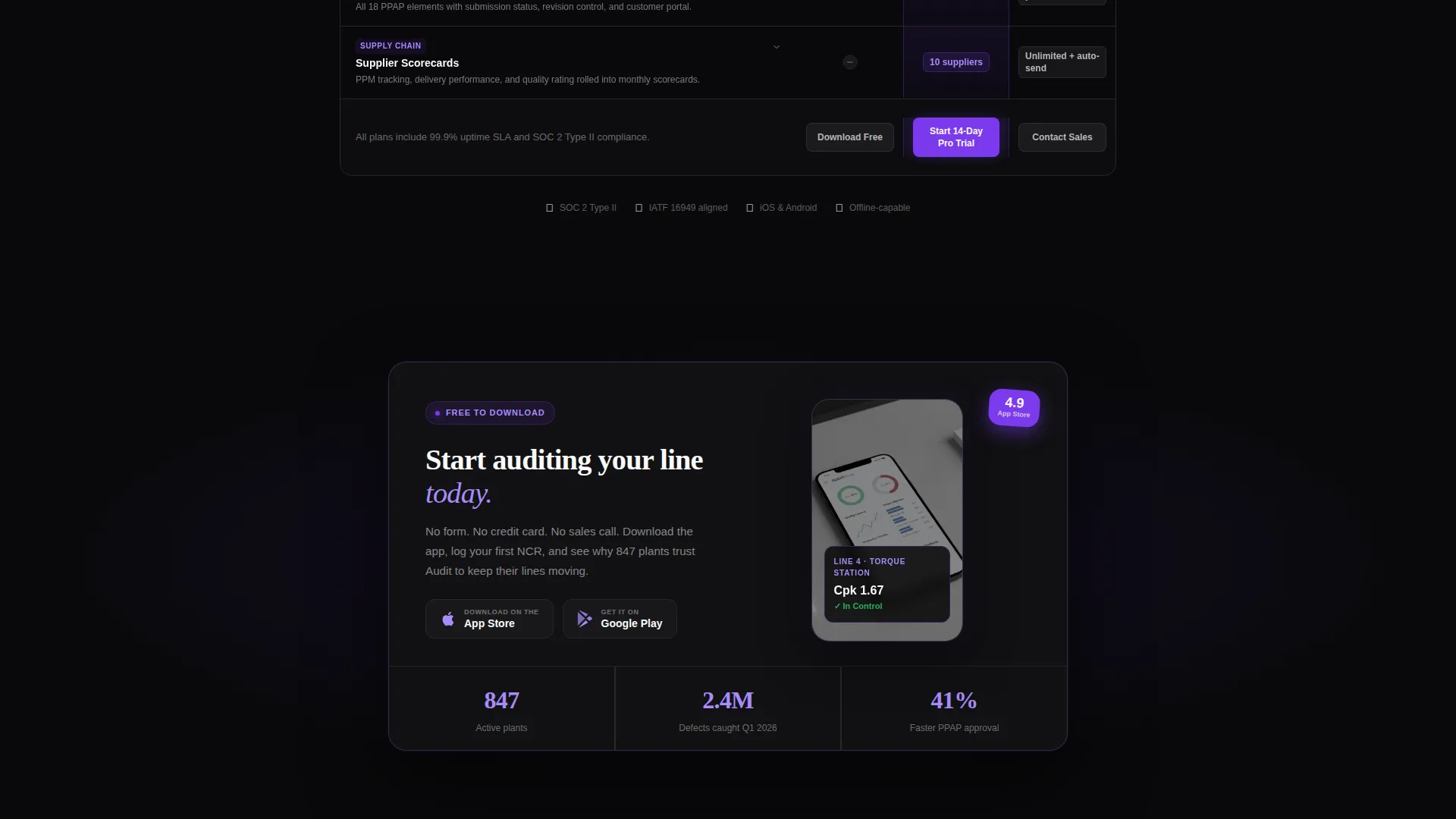
- A three-tier progressive feature matrix covering NCR logging, 8D collaboration, SPC charting, audit scheduling, PPAP document tracking, and supplier scorecards
- Expandable feature rows with micro-screenshot previews of the actual app interface
- A floating mobile bottom bar with paired App Store and Google Play badges
- A secondary inline demo video triggered by a "See It On Your Line" call to action
Feature list
This template delivers six tightly scoped components, each grounded in how automotive quality professionals actually evaluate a tool.
Scrolling Industry Logo Bar
A horizontal ribbon of anonymized OEM and tier-one supplier logo silhouettes scrolls continuously at conveyor-belt speed across the void-black header. The motion signals industry credibility immediately, before a visitor reads a single word of copy.
Animated Defect Metric Counter
A single large number counts up on page load, landing on "2.4M defects caught this quarter" in ultraviolet highlight. The counter pulses once like a heartbeat before holding steady, grounding the headline in a concrete performance signal.
Progressive Comparison Table
A three-column matrix, Free, Pro, and Plant Network, stages rows as the visitor scrolls. Each row covers a specific quality workflow. Violet checkmark animations light up each row as it enters the viewport, turning the scroll into a guided walkthrough of the platform's capabilities.
Expandable App Interface Previews
Every feature row in the comparison table expands on tap to reveal a micro-screenshot of the actual app performing that function. This transforms a static pricing table into a guided plant tour, showing rather than telling.
Floating App Download Bar
On mobile, a pinned bottom bar keeps the primary call to action, "Download & Start Auditing," always visible. App Store and Google Play badges render in violet-tinted monochrome, matching the overall design system without competing with the data.
No-Form Frictionless Download Flow
There are no sign-up forms blocking the path to the app. The download is direct, reducing drop-off at the final conversion step. The Pro column header carries a separate "Start 14-Day Pro Trial" call to action that deep-links into the app's onboarding flow.
Page sections overview
| Section | Purpose |
|---|---|
| Logo Bar Header | Establish industry credibility with scrolling OEM and supplier silhouettes |
| Headline and Metric | Lead with a bold claim and a live defect-count animation |
| Feature Comparison Matrix | Compare Free, Pro, and Plant Network tiers row by row |
| Expandable Row Previews | Show app interface screenshots for each quality workflow |
| Floating Download Bar | Keep the primary call to action pinned and always reachable on mobile |
| Inline Demo Video | Let visitors preview the product in context before committing |
Design & branding system
The Void & Violet color system is engineered for readability under fluorescent plant lighting. Every color choice serves a functional purpose, not just an aesthetic one.
- Absolute void black (#09090B) dominates backgrounds and table rows, making data the only thing that reads
- Deep transmission purple (#7C3AED) pulses through active states, toggle switches, and selected plan columns, while ultraviolet highlight (#A78BFA) traces borders and hover states
- Instrument-cluster white (#FAFAFA) keeps all text crisp and zero-fatigue against the dark background
Mobile & speed optimization
The template is structured for engineers checking status from a plant floor, not just from a desk. The mobile layout prioritizes immediate action.
- The floating bottom bar pins the download call to action so it never leaves the screen on any scroll position
- The comparison table is designed to reveal rows progressively as the user scrolls, keeping the initial load focused and uncluttered
- Violet-tinted monochrome app badges and the inline video trigger keep the mobile layout tight without sacrificing conversion paths
How this template helps you convert
Every layout decision in this template is made to earn the download before asking for it. The structure follows a deliberate persuasion sequence.
- The logo bar and animated metric establish credibility and scale in the first viewport, before any feature claim is made
- The progressive feature matrix educates the visitor row by row, letting each quality workflow, from NCR logging to PPAP tracking, build the case that the free tier alone replaces three spreadsheets and a shared drive
- The no-form download flow removes the final barrier, so the only decision left is which platform to download from
Other information about this template
This template is part of the Startup Velocity theme family, which pairs high-contrast dark interfaces with kinetic layout moments to communicate product confidence. The Void & Violet color system is the same palette used across the broader template set, making it straightforward to extend or adapt for related product pages. The comparison table structure also works well for automotive quality management software categories beyond audit workflows, including supplier quality and incoming inspection apps. The template is designed as a standalone landing page and does not require a multi-page site structure to function effectively.
- Template theme: Startup Velocity
- Color system: Void & Violet
- Creative direction: Feature Matrix
- Header concept: Logo Bar
- Primary call-to-action direction: App Download
- Template style: Comparison Table

Theme
Startup Velocity
Creative direction
Feature Matrix
Color system
Void & Violet
Style
Comparison Table
Direction
App Download
Page Sections
Scrolling Industry Logo Bar
Animated Defect Metric Counter
Progressive Comparison Table
Expandable App Interface Previews
Floating App Download Bar
No-form Frictionless Download Flow
Related questions
Who is this landing page template designed for?
Does this template include the app itself or just the landing page design?
Can the comparison table tiers be renamed or reconfigured?
Is the animated metric counter editable?
Does the page require visitors to fill out a form to download the app?


