Developer Tools & API Pricing Website Template
Audit is a code review landing page template built for developer tool platforms that need to prove their value fast. It opens with an interactive cost estimator, flows into a head-to-head comparison table, and closes with a frictionless free-trial sign-up. The dark-mode design and terminal-inspired visuals speak directly to engineering teams who live in the command line.
by Rocket studio
Quick summary
Audit is a single-page landing page template for code review platforms. It leads with a live cost-of-delay estimator, builds momentum through a staggered comparison table, and converts with a sticky free-trial call to action. The Teal Catalyst color system and terminal-black palette give it an instant developer-facing identity.
Who this template is for
This template is designed for developer tool founders, product marketers, and engineering platform teams who need to communicate technical value without a wall of text. It targets audiences who are already frustrated with slow, manual review processes.
- Engineering leads at mid-stage startups managing growing pull request backlogs
- Senior developers inheriting legacy codebases with little or no test coverage
- CTOs who need to demonstrate that their team's merge and review process is under control
What problem this template solves
Most developer tool landing pages list features and hope visitors connect the dots. Audit flips that approach. It makes the cost of inaction visible and specific before a single product feature is mentioned.
- Review bottlenecks, unreviewed bugs, and context-switching costs are difficult to quantify for buyers
- Generic feature lists fail to differentiate a code review platform from built-in or free alternatives
- Long sign-up flows kill conversion for technical audiences who distrust friction
What you get with this template
You get a fully structured, single-page layout with every section wired for developer-audience conversion. The template includes interactive estimator logic, a multi-column comparison table, a live activity feed section, and a sticky bottom bar with a primary call to action.
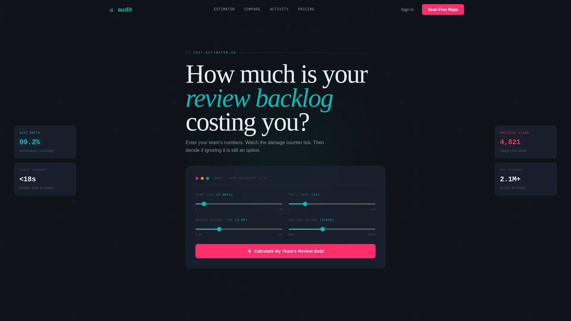
- Interactive header estimator that calculates review delay cost, unreviewed bugs per quarter, and context-switching dollar impact
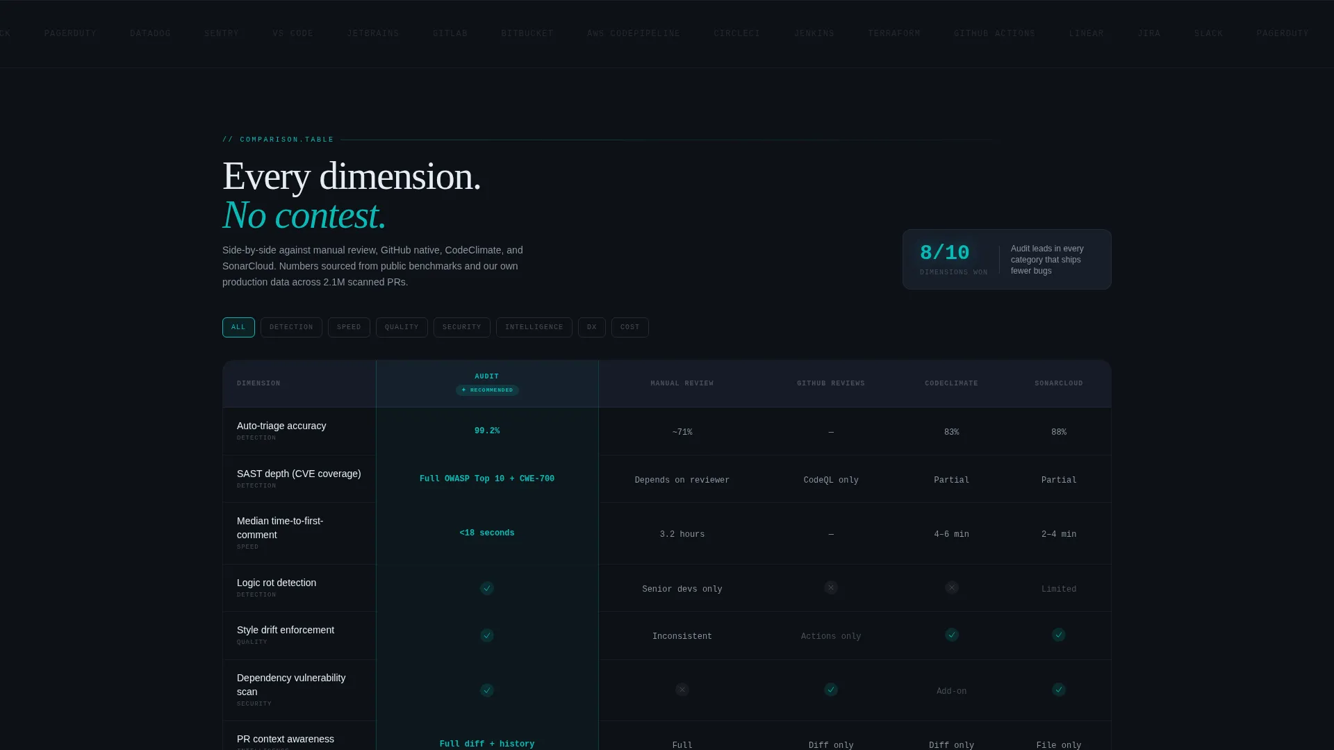
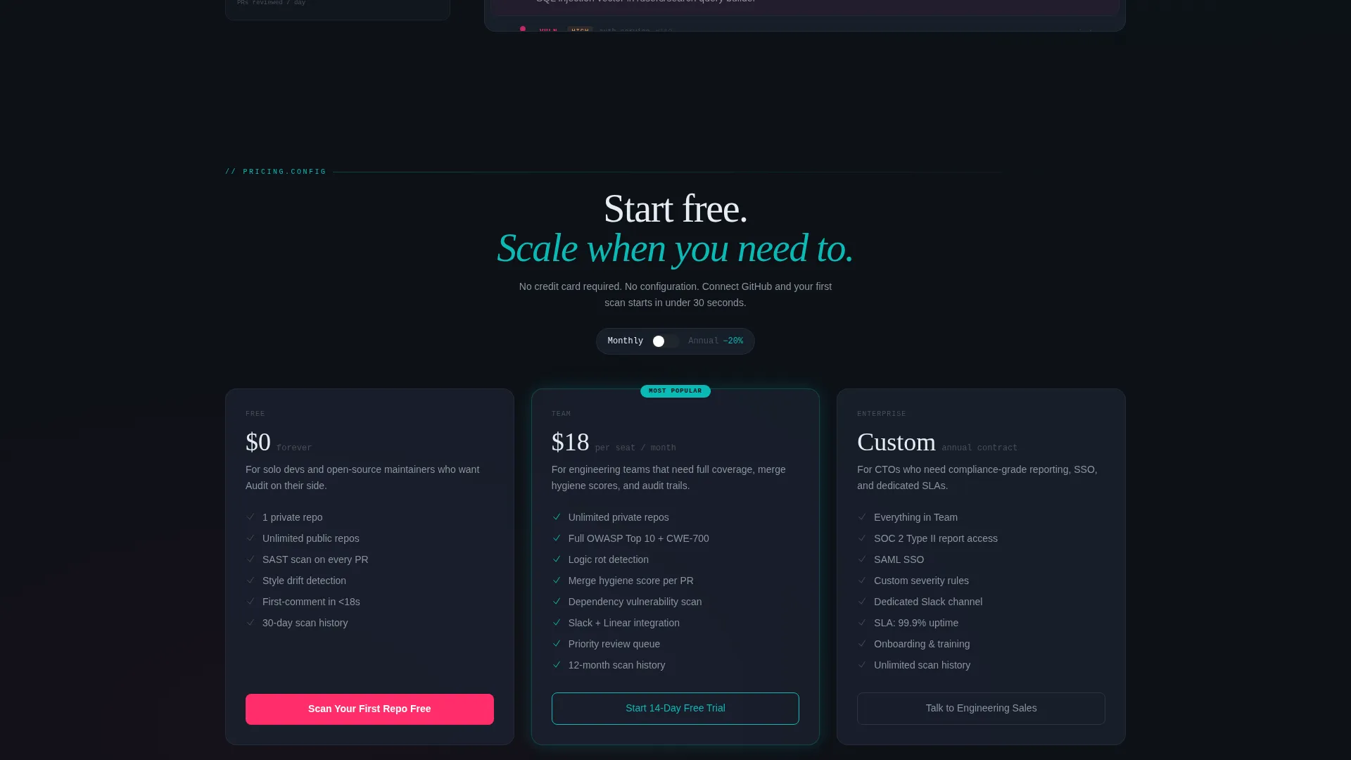
- Column-by-column comparison table benchmarking against manual review and competing tools across dimensions like auto-triage accuracy, static analysis depth, and pricing per seat
- Sticky bottom bar pinned after estimator interaction, carrying the primary free-trial call to action in catalyst magenta
Feature list
This template is built around a tight set of high-impact components. Each one serves the conversion flow rather than just filling space.
Live Cost-of-Delay Estimator
Visitors enter their team size, weekly pull request volume, and median review turnaround time, or paste a public repository URL. The tool instantly renders animated estimates: sprint hours lost to review bottlenecks, projected unreviewed bugs per quarter, and dollar cost of context-switching. Teal digits tick upward against a terminal-black background, making the problem feel real before any feature is described.
Staggered Comparison Table
The estimator results feed directly into a multi-column comparison table. Rows reveal with a cascade animation, benchmarking the platform against manual review, native repository review tools, and two named competitor columns. Dimensions include auto-triage accuracy, static application security testing depth, median time-to-first-comment, and seat-based pricing. Each row lands like a deliberate product-launch win.
Live Activity Feed
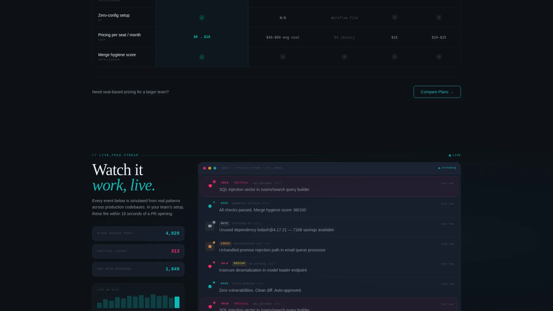
Below the comparison table, a simulated live feed displays real-time-style review events: comments posted, vulnerabilities flagged, and approvals granted. Each event pulses with a teal dot indicator against a dark card surface, giving the page a mission-control energy that keeps visitors engaged after the table.
Sticky Free-Trial Call to Action Bar
A bottom bar appears after the visitor interacts with the estimator. It carries the primary call to action in catalyst magenta: "Scan Your First Repo Free." The bar stays pinned while the visitor scrolls, maintaining conversion pressure without interrupting the reading flow.
GitHub OAuth One-Field Sign-Up
Clicking the primary call to action opens a minimal auth flow: connect via GitHub OAuth, select a repository, and the first scan begins immediately with no configuration required. The reduced friction is intentional and visible in the design.
Secondary Pricing Path
A "Compare Plans" call to action sits beneath the comparison table, offering a clear secondary path for engineering leads who need seat-based pricing details before committing to a free scan.
Page sections overview
| Section | Purpose |
|---|---|
| Estimator Header | Quantify review delay cost before introducing the product |
| Comparison Table | Benchmark platform against manual and competitor alternatives |
| Live Activity Feed | Simulate real review events to build platform credibility |
| Sticky call to action Bar | Maintain free-trial conversion pressure across the full page |
| Secondary Pricing call to action | Capture decision-makers who need seat-based pricing first |
Design & branding system
The visual identity uses the Teal Catalyst color system, styled to feel like a dark-mode integrated development environment where muted tones do the heavy lifting and electric accents demand attention only when it counts.
- Deep terminal black (#0D1117) as the page background, cool slate (#1C2333) for card surfaces, and primary teal (#0ABAB5) for data highlights and passing-status indicators
- Catalyst magenta (#FF2D6B) reserved exclusively for critical-severity highlights and all primary call-to-action elements, making every conversion trigger visually unmistakable
- Directory and Discovery theme layered over a Launch Energy creative direction, giving the page the pacing of a product keynote rather than a static brochure
Mobile & speed optimization
The layout is designed to remain functional and readable on smaller screens. The estimator, comparison table, and sticky bar each adapt to mobile viewports without losing their core interactivity.
- Comparison table columns collapse into a scrollable or stacked format on narrow screens so no data is hidden from mobile visitors
- Sticky bottom bar remains anchored and tappable on touch devices, keeping the free-trial path accessible at every scroll position
How this template helps you convert
The conversion strategy is sequential and deliberate. Every section is placed to build evidence before asking for a commitment.
- The estimator makes the cost of the problem personal and numeric, so visitors arrive at the comparison table already motivated rather than passive.
- The comparison table delivers a structured, side-by-side case for switching, row by row, with each reveal adding momentum toward the free-trial decision.
- The sticky call-to-action bar and the low-friction GitHub OAuth flow remove the final hesitation by reducing the commitment to a single click and zero configuration.
Other information about this template
This template is categorized under Technology, Developer Tools and Application Programming Interface tools, and the Code Review Platform niche. It is built with the Comparison Table template style and the Directory and Discovery theme, making it well suited for platforms that need to stand out in a crowded tooling landscape.
- The template style and creative direction are aligned with Launch Energy pacing, meaning the scroll itself is part of the persuasion sequence
- The Freemium and Trial landing page direction means the page is optimized for low-commitment entry points rather than demo-request or contact-form flows
- The Calculator and Estimator header concept is the core differentiator: it personalizes the value proposition before any marketing copy is read
- This template can support code review platforms competing in spaces where tools like pull request automation, automated code review, and security scanning overlap with developer workflow tooling
Theme
Directory & Discovery
Creative direction
Launch Energy
Color system
Teal Catalyst
Style
Comparison Table
Direction
Freemium/Trial
Page Sections
Live Cost-of-delay Estimator
Staggered Comparison Table
Live Activity Feed Section
Sticky Free-trial Call to Action Bar
Github Oauth One-field Sign-up
Secondary Pricing Call to Action
Related questions
Can I customize the estimator inputs and output labels?
Does the comparison table support more or fewer competitor columns?
Is the live activity feed pulling real data?
Who should use the secondary Compare Plans call to action?



