Local Architecture Firm Software Cost Estimator Website Template
Audit is a dashboard-style landing page template built for architecture firm quality management platforms. It combines a live multi-project data grid header, an interactive audit estimator, animated workflow diagrams, and a compliance matrix into one high-impact, single-page layout. The design uses a Slate and Sky color system to make dense quality data feel clear, urgent, and actionable.
by Rocket studio
Quick summary
Audit is a single-page landing page template designed for architecture firm quality management software. It opens with a living dashboard preview showing twelve active projects, issue counts, and real-time resolution feeds. An interactive audit estimator sits just below, returning personalized value metrics before a single click-through is asked. The Slate and Sky palette gives the page technical weight without visual clutter.
Who this template is for
This template is built for teams marketing quality management platforms directly to the people who feel the pain of manual review. It speaks the language of production-floor QA, not enterprise sales decks.
- Quality assurance managers at firms with roughly 200 staff who are overwhelmed by redline cycles
- Principals at mid-size architecture practices who personally sign off every drawing set
- Building Information Modeling (BIM) coordinators who spend Friday afternoons running checks that software should handle automatically
What problem this template solves
Architecture firms lose billable hours and face legal exposure when coordination failures, code violations, and design clashes slip past manual review. A landing page for this kind of platform needs to make the value undeniable before asking for a commitment.
- Visitors arrive skeptical; they need evidence, not promises, so the calculator makes the value personal and immediate
- Generic software landing pages bury features in paragraphs; this template leads with live data that proves the tool works
- Without a structured conversion path, high-intent visitors leave before reaching a call to action
What you get with this template
You get a fully structured, section-led landing page that mirrors the feel of the product it promotes. Every section earns the next scroll with evidence before asking for action.
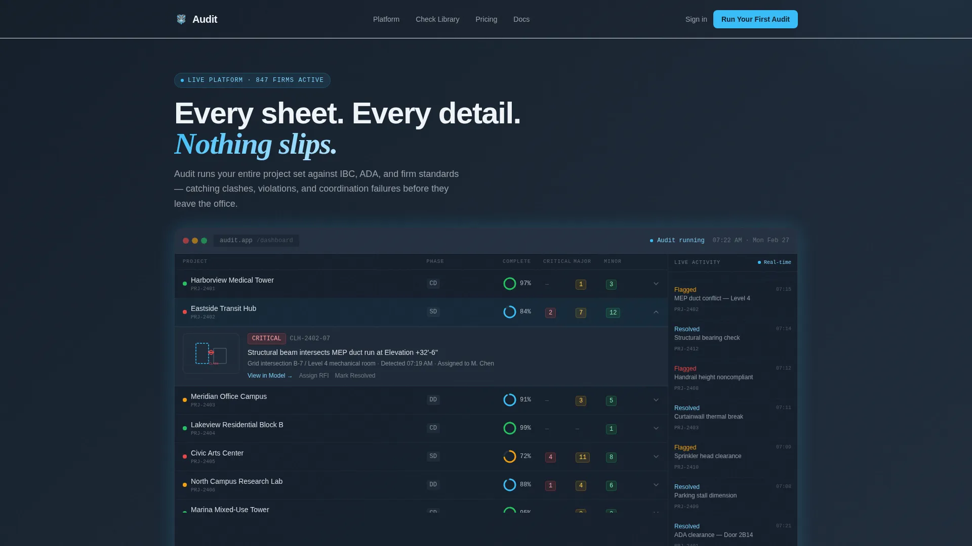
- A full-width dashboard header showing a multi-project quality grid with animated counters, completion rings, and a clash detail expansion
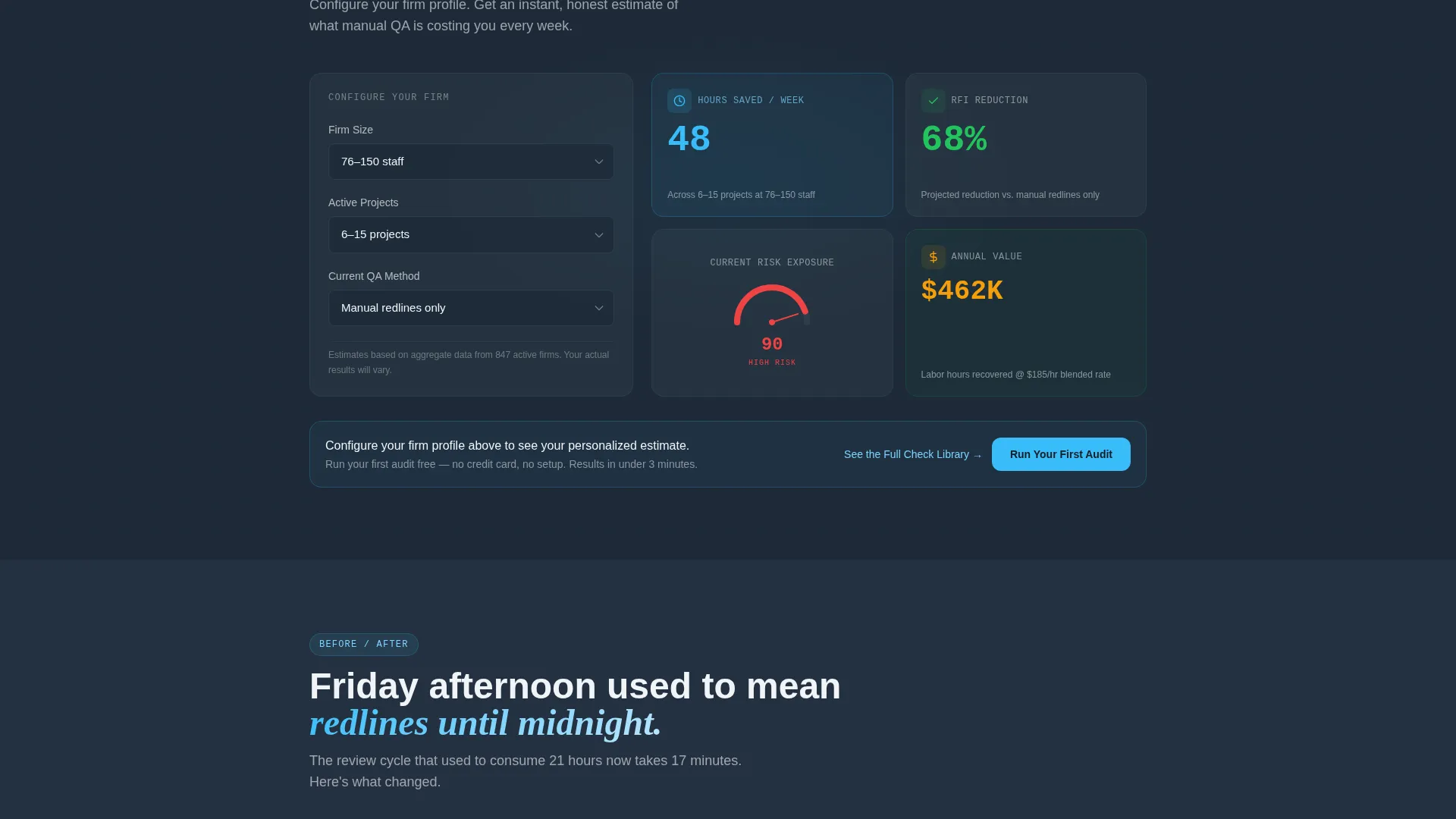
- An interactive audit estimator that takes firm size, active project count, and current QA method as inputs, then returns estimated hours saved, projected RFI reduction, and a risk-exposure score
- A primary call-to-action rail locked to the bottom of the viewport after calculator interaction, plus repeat placements at the close of every evidence section
Feature list
This template is built around five core design and functional components drawn directly from the brief. Each one serves a specific role in moving a skeptical QA professional from first impression to click-through.
Living Dashboard Header
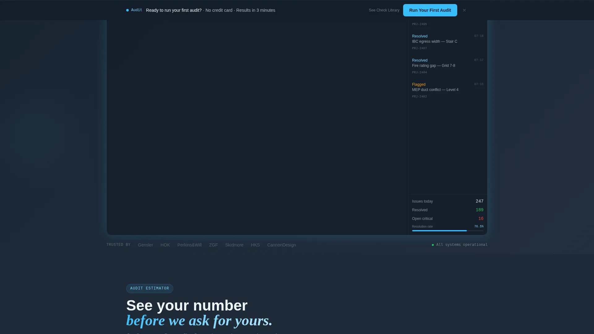
The full-width header renders a multi-project quality grid showing twelve projects with completion percentages and color-coded issue counts. A real-time resolved-item feed scrolls on the right rail. One project row expands to reveal a clash detail with a markup thumbnail. Animated counters tick and a progress ring fills from 84% to 97%, making the tool the pitch before any headline is read.
Interactive Audit Estimator
Visitors select their firm size, number of active projects, and current QA method from options including manual redline, Revit warnings only, third-party plugin, or none. The estimator instantly returns three personalized metrics: estimated hours saved per week, projected reduction in Requests for Information (RFIs), and a risk-exposure score. Calculator inputs carry forward into the free trial signup on the next screen, pre-filling firm size and project count.
Animated Workflow Diagrams
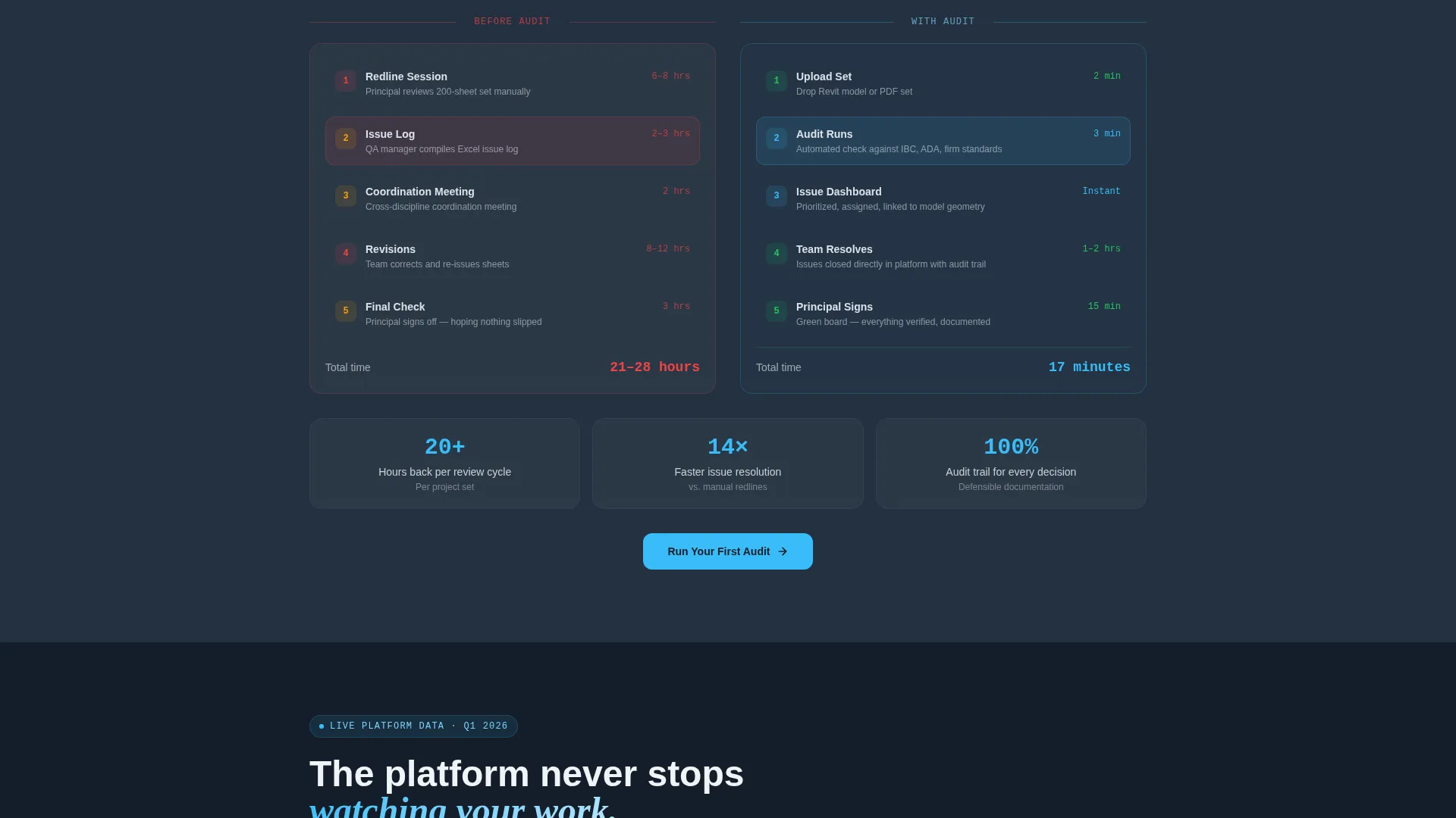
Scroll sections after the calculator feature before-and-after review cycle diagrams that animate as the visitor scrolls. These diagrams illustrate the gap between a manual QA process and the platform's automated checking workflow, making the efficiency argument visual rather than text-heavy.
Live Issue Count Ticker
A running counter displays the total number of issues caught across all platform users this quarter. The ticker adds social proof through volume, reassuring visitors that the platform is active and catching real problems at scale.
Compliance Matrix Section
A structured matrix maps the platform's checks against the International Building Code (IBC), Americans with Disabilities Act (ADA) requirements, and firm-specific standards. This section gives evaluators a reference-grade view of coverage depth without requiring a sales conversation.
Persistent call to action and Secondary Link
The primary "Run Your First Audit" call-to-action locks to the bottom viewport rail after the calculator interaction and repeats at the close of every evidence section. A secondary text link, "See the Full Check Library," opens a searchable spec sheet for visitors still comparing options.
Page sections overview
| Section | Purpose |
|---|---|
| Dashboard header grid | Opens with animated project data to prove the tool immediately |
| Audit estimator tool | Personalizes value with firm-specific metrics before any ask |
| Workflow before/after | Animates the efficiency gap between manual and automated QA |
| Live issue ticker | Adds real-time social proof through platform-wide catch volume |
| Compliance matrix | Maps platform checks against IBC, ADA, and firm standards |
| Persistent call to action rail | Locks the primary action to the viewport after calculator use |
| Check library link | Offers a searchable spec sheet for visitors in evaluation mode |
Design & branding system
The Slate and Sky color system is built around four values that reflect the physical world of an architecture studio: deep charcoal for data-dense regions, drafting-table slate for structural elements, open-sky blue for live indicators and interactive components, and cloud-white for card surfaces and breathing space. The overall feeling is a rooftop terrace at dawn, concrete still cool, sky already electric.
- Deep architectural charcoal (#1E2A38) dominates the data grid and background regions, giving the layout technical gravity
- Open-sky blue (#38BDF8) pulses on status indicators, progress rings, and interactive elements to draw the eye to live data
- Cloud-white (#F0F4F8) floats card surfaces above the dark grid, echoing sheets on a light table and providing visual relief between dense data sections
Mobile & speed optimization
The template is structured for responsive display across device sizes, keeping the dashboard grid and estimator tool readable on smaller screens. Motion is constant but purposeful, designed to perform without overwhelming the layout on any viewport.
- Cards slide into the data grid, visualizations draw themselves on scroll, and status dots pulse continuously without blocking content
- The estimator inputs and output metrics are sized and spaced to remain usable on touch screens
- Sections are stacked in a logical reading order so mobile visitors follow the same evidence-to-action path as desktop users
How this template helps you convert
Every section of this template is sequenced to build confidence before asking for a click. The conversion logic is baked into the layout itself, not left to copy alone.
- The dashboard header makes the product the first thing a visitor sees, replacing a traditional hero headline with live data that proves capability before a word is read.
- The interactive estimator makes the value personal by returning firm-specific numbers, so visitors self-qualify and arrive at the call-to-action already convinced.
- Calculator inputs carry forward into the free trial signup screen, pre-filling firm size and project count so the transition from landing page to registration feels seamless and frictionless.
Other information about this template
This template sits within the Technology category, specifically the Architecture Firm Software subcategory. It is designed for the architecture firm quality management niche and scored a strong intersection match for its combination of theme, creative direction, and template style.
- The Dynamic Motion theme governs all animation behavior: cards slide in, data visualizations draw themselves, and status indicators pulse on a continuous loop
- The Calculator/Tool First creative direction means the estimator is the structural centerpiece of the page, not a secondary feature
- The Dashboard/Data Grid template style means the header and body sections are organized around data display rather than narrative copy blocks
- The Click-Through landing-page direction means there is no form on this page; the entire layout is optimized to earn a single, high-confidence click to the trial signup screen
- The template is categorized under the Audit quality management use case, making it directly applicable to firms evaluating QA software for the first time or replacing an existing manual process
Theme
Dynamic Motion
Creative direction
Calculator/Tool First
Color system
Slate & Sky
Style
Dashboard/Data Grid
Direction
Click-Through
Page Sections
Living Dashboard Header
Interactive Audit Estimator
Animated Workflow Diagrams
Live Issue Count Ticker
Compliance Matrix Section
Persistent Call to Action Rail and Secondary Link
Related questions
Who is this landing page template designed for?
Does the template include the interactive audit estimator?
Is there a form on this landing page?
What makes this template different from a standard software landing page?
Can the compliance matrix be customized for different firm standards?



