AR-Enhanced RPA Comparison Table Landing Page Template
The Augment AR-enhanced RPA comparison table landing page template is built for enterprise operations teams who need proof before they commit. It layers a metrics-first header, a twelve-row side-by-side comparison, and a data-backed mini case study into a single scrolling landing page that reads like a research brief and ends at a browser-based spatial demo.
by Rocket studio
Quick summary
This template gives augmented reality-driven RPA platforms a landing page that earns trust through data, not decoration. Five oversized performance metrics open the page. A three-column comparison table runs twelve evaluation dimensions. A case study closes in three data points. Every section pushes visitors toward one action: entering a live spatial demo.
Who this template is for
Operations and automation leaders need a comparison page that speaks their language, numbers, benchmarks, and zero fluff. This template is built specifically for them.
- VP-level process automation leads at manufacturing firms managing 200 or more bots who have lost visibility into live execution.
- IT directors at insurance carriers who are overwhelmed by orchestration dashboards and need a clearer way to showcase their platform's advantages.
- COOs at logistics companies who need floor managers, not analysts, to troubleshoot bot failures in real time using augmented reality tools.
What problem this template solves
Traditional landing pages for AR platforms bury the comparison and front-load the sales pitch. Buyers in enterprise automation are not looking for inspiration; they are looking for informed decisions backed by hard data. This template flips the structure.
- Most landing pages in the AR and RPA space lack specific, cell-level data that lets potential customers compare platforms directly.
- Operations teams arrive with technical questions and leave when they find only marketing copy instead of detailed information.
- The buying process stalls when there is no structured side-by-side comparison that decision makers can share with a committee.
What you get with this template
You get a complete single-page layout that functions like an industry report. The scroll guides users from raw metrics to evidence-backed comparison to conversion, without a single form field in the way.
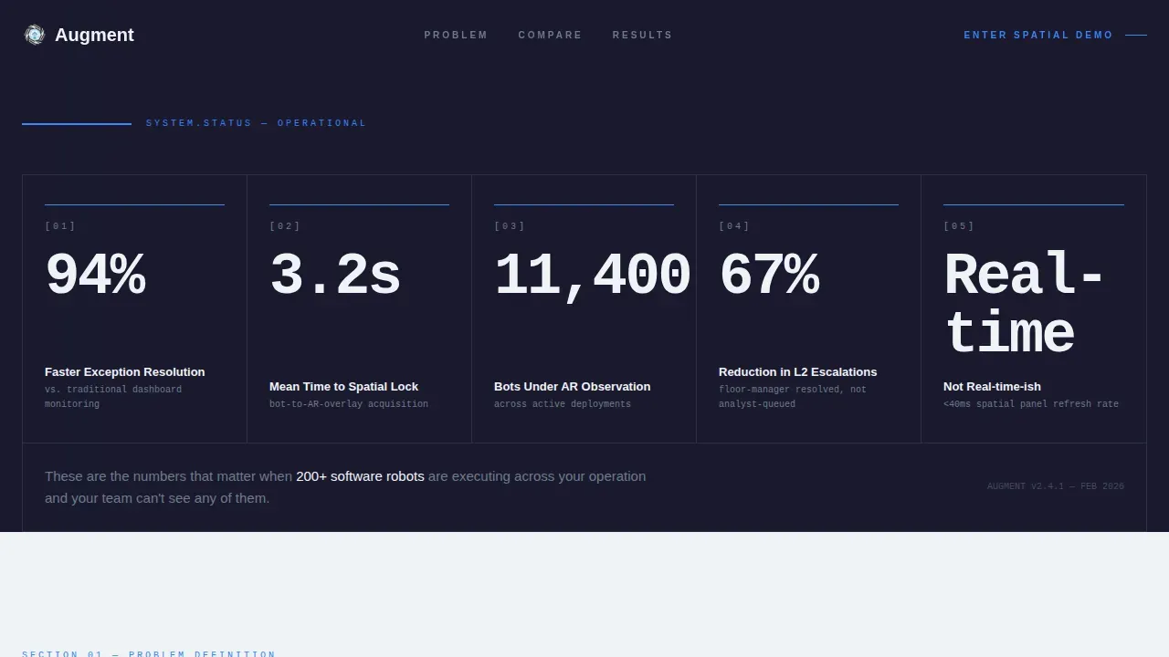
- A stats wall header with five animated performance metrics, each rendered in oversized type on a forge-black background.
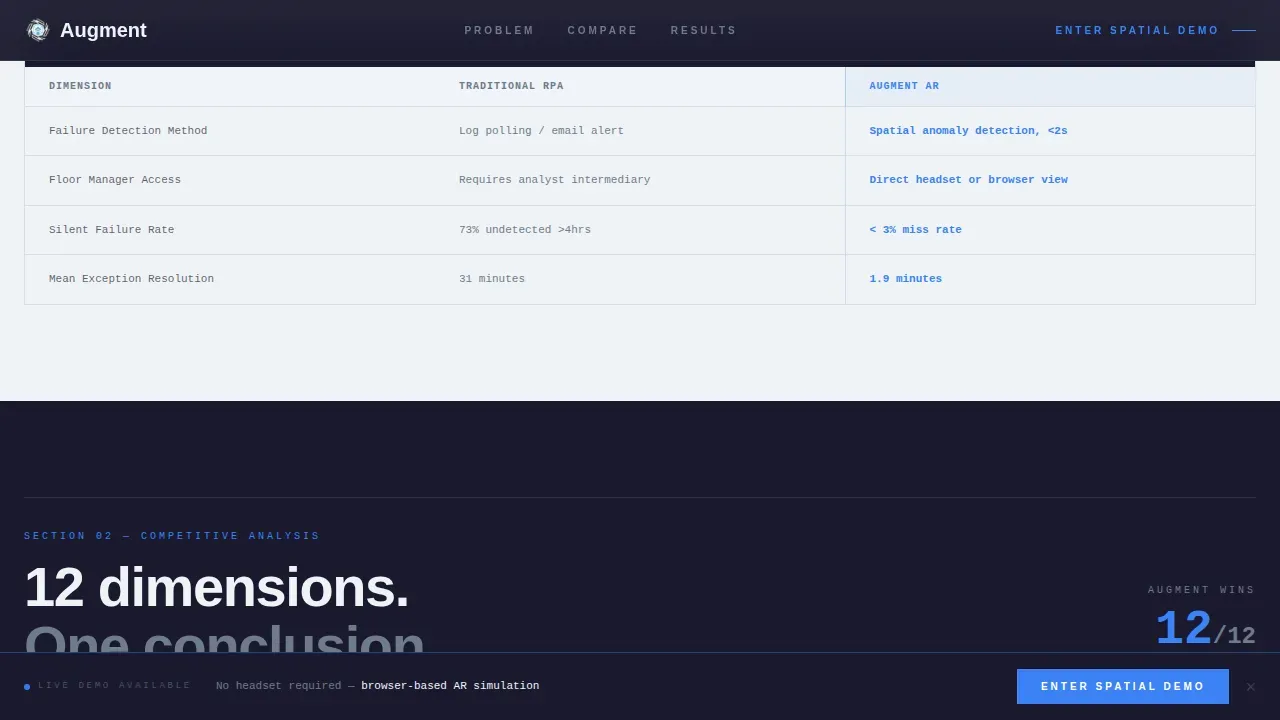
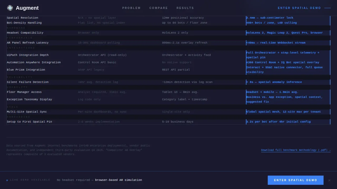
- A twelve-row, three-column comparison table covering spatial resolution, bot-density handling, headset compatibility, latency benchmarks, and integration depth, with specific values in every cell.
- A mini case study block presented in three data points, plus a persistent viewport-locked call to action and a secondary PDF methodology download link.
Feature list
This template's features are drawn directly from the source brief. Each one serves a distinct function in moving visitors from awareness to action.
Animated Metrics Header
Five oversized performance numbers open the page with a mechanical counter-tick animation, left to right. The effect simulates instruments powering up on a control panel. A single line of contextualizing text follows below the numbers, grounding what the visitor just absorbed.
Twelve-Row AR Comparison Table
The core of the page is a structured three-column comparison table. It runs twelve evaluation dimensions including spatial resolution, bot-density handling, headset compatibility matrix, latency benchmarks, and integration depth. Every cell contains specific values, not checkmarks, making it the definitive side-by-side comparison resource on the page.
Data-Point Case Study Block
Section three presents a mini case study told in exactly three data points rather than paragraphs. This format respects the reader's time while giving the company credible, specific evidence. It functions as a proof layer that strengthens the comparison before the final conversion push.
Persistent Viewport-Locked call to action Bar
The primary call to action appears first as a bar locked to the bottom of the viewport. It stays visible as users scroll the full page. After the comparison table, it repeats full-width with a secondary line noting browser-based access, so no headset is required to enter the demo.
Secondary PDF Download Link
A text link captures analysts and committee-driven buyers who need to bring benchmark methodology to a review before they will click a demo. This secondary path keeps potential customers in the funnel without adding form friction to the main page flow.
Monochrome Steel Design System
Typography is monospaced inside data cells and sans-serif everywhere else. Backgrounds alternate between forge black and cold white. Every border is 1px machined aluminum. The single accent color, arc-weld blue, appears only on interactive elements, hover states, and the data points that need the eye to land first.
Page sections overview
| Section | Purpose |
|---|---|
| Stats Metrics Header | Opens with five animated performance numbers to frame AR platform advantages instantly |
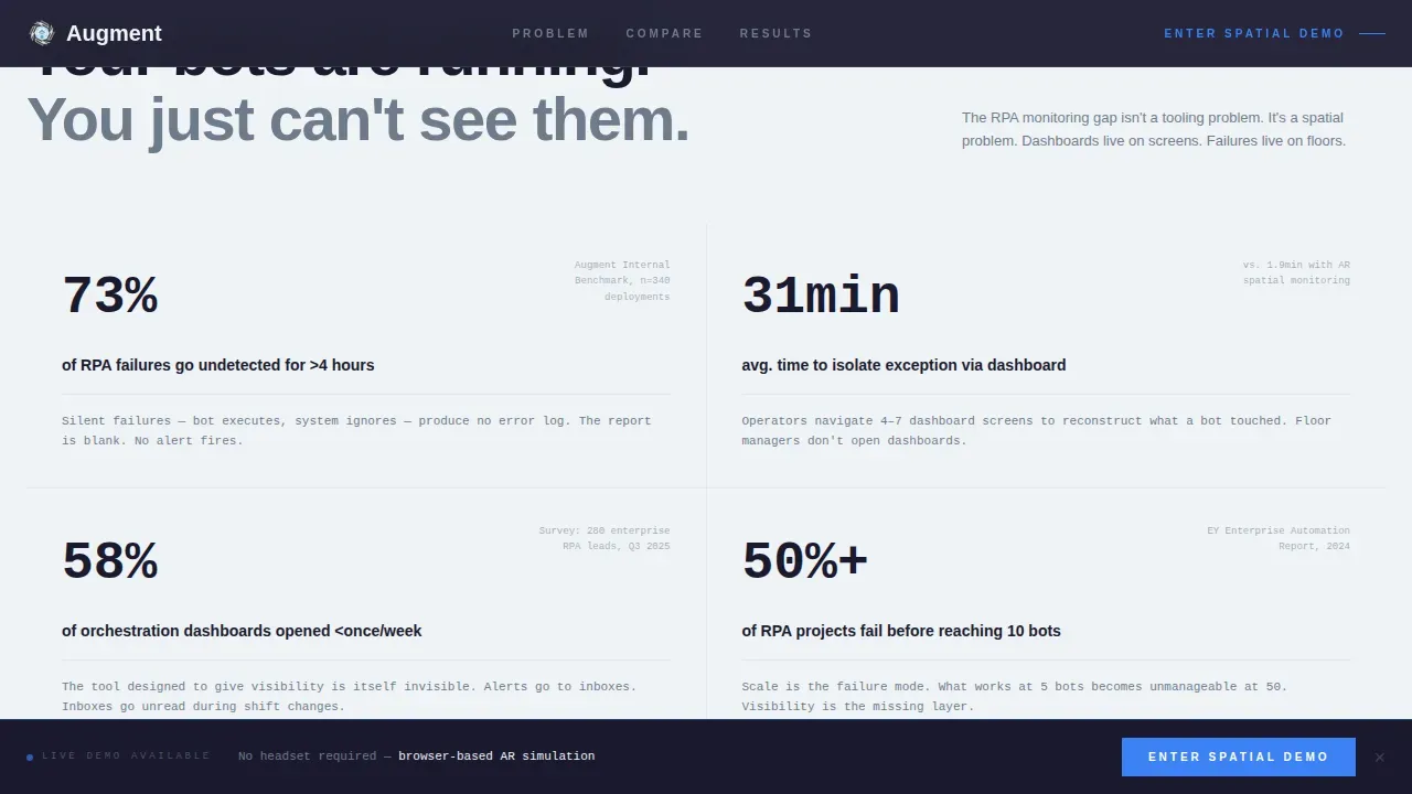
| Problem Reframe Block | Presents proprietary data on undetected RPA failures and monitoring time comparisons |
| Twelve-Row Comparison | Delivers a full side-by-side comparison across twelve AR and RPA evaluation dimensions |
| Mini Case Study | Supports the comparison with three specific data points from a real operational scenario |
| Full-Width call to action | Repeats the primary demo entry point after the comparison table with secondary context |
| PDF Download Link | Provides a secondary exit for analyst buyers who need benchmark evidence for committees |
Design & branding system
The visual identity follows a Directory and Discovery theme built on a Monochrome Steel color system. The palette communicates precision and technical authority without visual noise.
- Colors: forge black (#1A1A2E), brushed titanium (#6E7B8B), machined aluminum (#C9D1D9), cold white (#F0F3F7), and arc-weld blue (#3B82F6) reserved for interactive elements only.
- Typography: monospaced in all data cells for technical readability, sans-serif in all other text areas; every border is 1px machined aluminum with no decorative additions.
- Background rhythm: forge black and cold white alternate across sections, creating the visual cadence of a technical specification sheet rather than a marketing website.
Mobile & speed optimization
The template layout is designed for legibility and interaction across different devices. The comparison table, metrics wall, and call to action bar each adapt to narrower viewports without losing their structured hierarchy.
- The persistent call to action bar remains anchored to the viewport bottom on mobile, keeping the demo entry point visible at all times without blocking content.
- Table cells use monospaced type and controlled column widths to preserve readability of specific values across devices, including tablets used by floor managers in operational environments.
How this template helps you convert
A well-designed comparison page should include a clear call to action that guide users toward conversion naturally. This template engineers that path at every scroll depth.
- The metrics header does the work before the visitor has read a single sentence; five hard numbers create immediate credibility and set a frame of understanding that the rest of the page confirms.
- The twelve-row comparison table is built so that by the time a visitor reaches the bottom, the decision has already been made; the "Enter the Spatial Demo" button becomes a formality rather than a leap.
- The PDF methodology download captures the analyst segment without adding form friction, preserving the main page's clean, zero-form conversion flow while still enabling the company to reach committee-stage buyers.
Other information about this template
This template sits at the intersection of augmented reality website design and enterprise SaaS comparison page best practices. Several broader AR and design concepts inform its structure and are worth understanding before customizing it.
- Augmented reality technology is reshaping how users interact with digital content on the web. AR experiences no longer require a dedicated ar app; platforms like 8th Wall deliver web-based AR experiences directly through a browser, which is why this template's demo call to action emphasizes browser access.
- Developers building AR platforms can look to tools like Vuforia for advanced computer vision capabilities. Advanced AR systems use Computer Vision (CNN-based) for marker-less tracking, enabling identification of robots and equipment without physical markers.
- Snapchat Lens Studio and lens studio tools in the broader ar platforms ecosystem show how ar content can reach users across different devices without specialized hardware. The same browser-first philosophy applies here.
- AR dashboards can project real-time updates of sales metrics and KPIs, and augmented reality dashboards facilitate faster decision making in business contexts. These are the ideas this template's spatial dashboard framing draws on.
- The integration of augmented reality with Robotic Process Automation (RPA) is projected to transform complex jobs into streamlined processes, with over 60% of manufacturing facilities expected to implement such intelligent technologies by 2026.
- AR-guided assembly and maintenance can speed up tasks by 15 to 30% and improve quality by 90%. AR overlays step-by-step guidance on physical machinery, aiding operators with complex, semi-automated tasks.
- New hires trained with interactive, three-dimensional instructions show learning retention rates up to 75%, compared to 10 to 20% with traditional methods, which is relevant context for the floor-manager audience this template targets.
- AI-augmented bots can detect user interface changes and adapt without breaking workflows, reducing maintenance costs by over 50%. This is the kind of data point the comparison table format was built to showcase.
- Competitive comparison pages are essential tools for guiding potential buyers during their purchasing journey. Including case studies and user stories enhances the credibility of any comparison page.
- Google Analytics can be connected to track visitor behavior and measure how users interact with each section of the page, including scroll depth on the comparison table and clicks on both call to action elements.
- The template supports design concepts drawn from the Industry Report creative direction, meaning the scroll feels less like marketing and more like due diligence someone already completed for the reader.
- BrandXR Studio is a no-code platform that allows users to create, publish, and measure three-dimensional AR experiences. Zappar specializes in AR experiences accessed via QR codes. These are examples of ar platforms that showcase different approaches to delivering ar experiences at scale.
- Virtual reality adjacent design ideas, including immersive technology framing and virtual space interfaces, inform the spatial dashboard concept that anchors this template's narrative.
- AR can enable remote assistance by allowing experts to see what a technician sees through AR glasses, which is one of the immersive experience use cases this template's spatial monitoring story builds on.
- The cohesive experience across header, table, case study, and call to action is intentional: every section reinforces the same message, and nothing decorates what does not communicate.
Theme
Directory & Discovery
Creative direction
Industry Report
Color system
Monochrome Steel
Style
Comparison Table
Direction
Click-Through
Page Sections
Animated Five-metric Stats Header
Twelve-row Three-column Comparison Table
Three-point Mini Case Study Block
Viewport-locked Persistent Call to Action Bar
Secondary PDF Methodology Download
Industry Report Scroll Architecture
Related questions
Does this template include a contact form or lead capture form?
Can I customize the comparison table rows and cell values?
Does the page require a physical AR headset to use?
How does the animated metrics header work on page load?
Is this template suited for AR platforms that connect with existing RPA tools?



