AutoML Consulting Landing Page Template
Autofit is a dark-glass, dashboard-style landing page template built for AutoML consulting services. It combines glassmorphic panels, live-styled data metrics, and a feature matrix scroll flow to communicate technical credibility fast. The layout drives toward a free pipeline audit sign-up, making it ideal for data-focused consulting practices targeting ML engineers, heads of data science, and technical CTOs.
by Rocket studio
Quick summary
Autofit is a single-page, dashboard-driven landing page template designed for AutoML consulting services. It uses a glassmorphic dark-glass visual system, live-styled metric panels, and a structured feature matrix layout to build trust with technical buyers. The primary conversion path leads to a free pipeline audit, with a secondary path to an ungated benchmark comparison table.
Who this template is for
This template is built for technically minded consulting practices that serve data and machine learning teams. It speaks the language of engineers and technical leaders who are already deep in the stack.
- Machine learning engineers at growth-stage startups who need production-ready workflows without a full platform team
- Heads of data science at mid-market software companies managing rising cloud infrastructure costs
- Technical founders and CTOs whose AI roadmap exists primarily in notebooks and scheduled scripts
What problem this template solves
Most consulting landing pages look like brochures. For an AutoML consulting service, that is a credibility problem. Technical buyers scan for proof, not promises, and a generic page loses them in seconds.
- No visual language that reflects the technical depth of the service being offered
- No structured way to show the gap between the client's current workflow and a production-ready AutoML pipeline
- No low-friction conversion path that earns trust before asking for contact details
What you get with this template
You get a fully structured, single-page layout that functions like a live dashboard. Every section is designed to demonstrate competence before asking for anything in return.
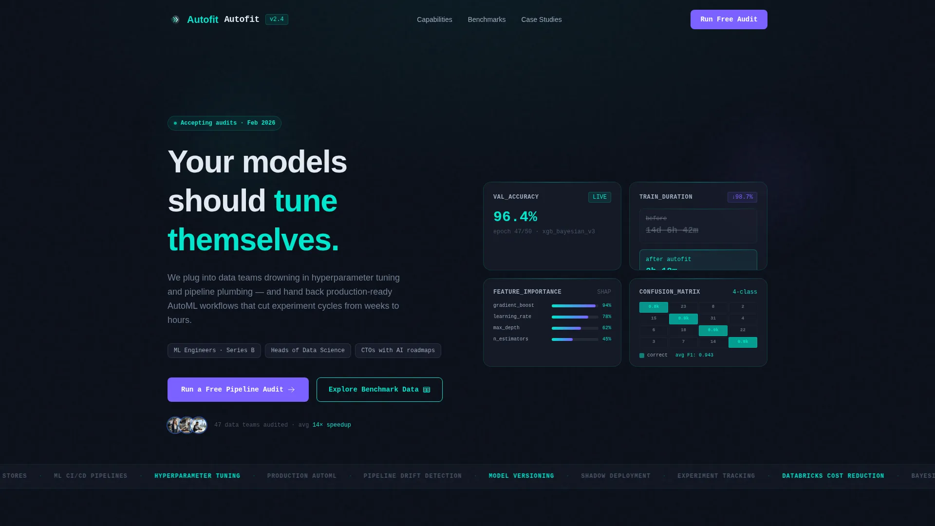
- A dark-glass header with four metric panels displaying model accuracy, training time, feature importance, and a confusion matrix
- A feature matrix scroll flow that moves through pain points, methods, and benchmark proof in alternating dense and breather sections
- A three-field pipeline audit modal and a persistent bottom-bar call to action that appears after the second scroll section
Feature list
This template comes with a tightly considered set of layout components and interaction patterns, each grounded in the brief.
Dark Glass Metric Header
Four frosted-glass cards float over a near-black gradient at the top of the page. Each card displays a live-styled metric: a model accuracy micro line chart, a training time countdown, a horizontal feature importance bar, and a confusion matrix resolving from noise to a clean diagonal. The panels carry a subtle parallax drift on mouse movement, with thin teal refraction lines catching at each edge.
Feature Matrix Scroll Flow
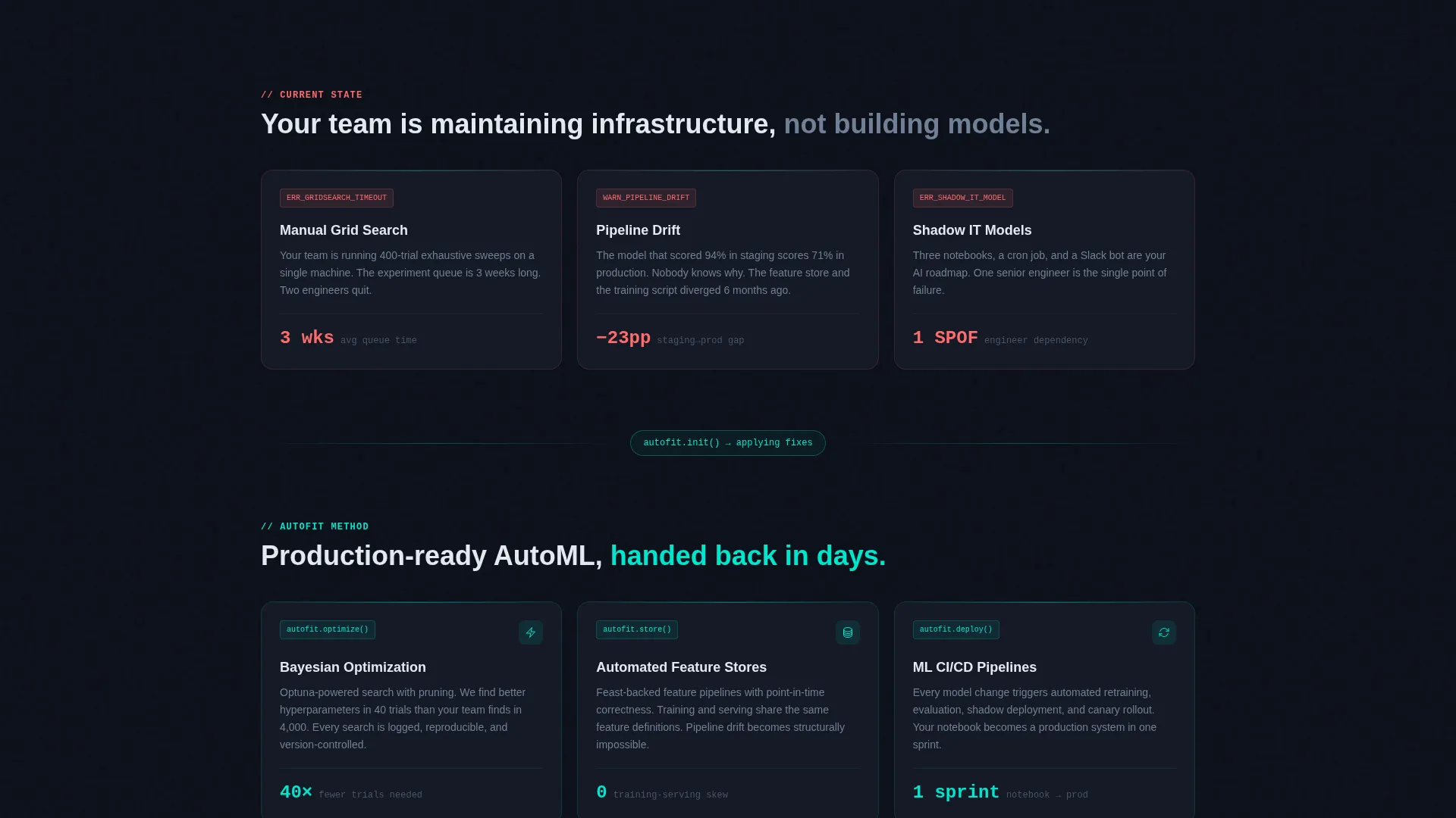
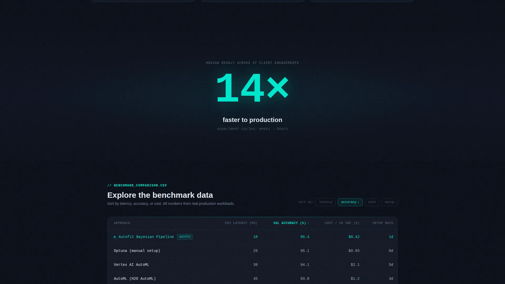
The main scroll experience is organized as a feature matrix with three distinct layers. The first row surfaces recognizable pain points such as manual grid search and pipeline drift. The second row presents the method layer covering Bayesian optimization, automated feature stores, and continuous integration and delivery for machine learning. The third row delivers benchmark comparisons rendered as an interactive data grid that visitors can sort by latency, accuracy, or cost.
Breather Stat Sections
Between dense information panels, single-stat breather sections appear. A large glowing number such as "14x faster to production" floats alone on dark glass. This rhythm alternates the scroll pace so the page feels like navigating a live dashboard rather than reading a static brochure.
Pipeline Audit Conversion Modal
The primary call to action opens a glass-panel modal with exactly three fields: a dataset size dropdown, a current stack multi-select chip selector, and a work email field. No phone number or company name is required. The minimal form reduces friction and signals respect for the visitor's time.
Persistent Bottom-Bar Call to Action
After the visitor passes the second scroll section, a persistent bottom bar appears with the primary "Run a Free Pipeline Audit" button. This keeps the conversion path visible throughout the rest of the page without interrupting the reading flow.
Ungated Benchmark Table Path
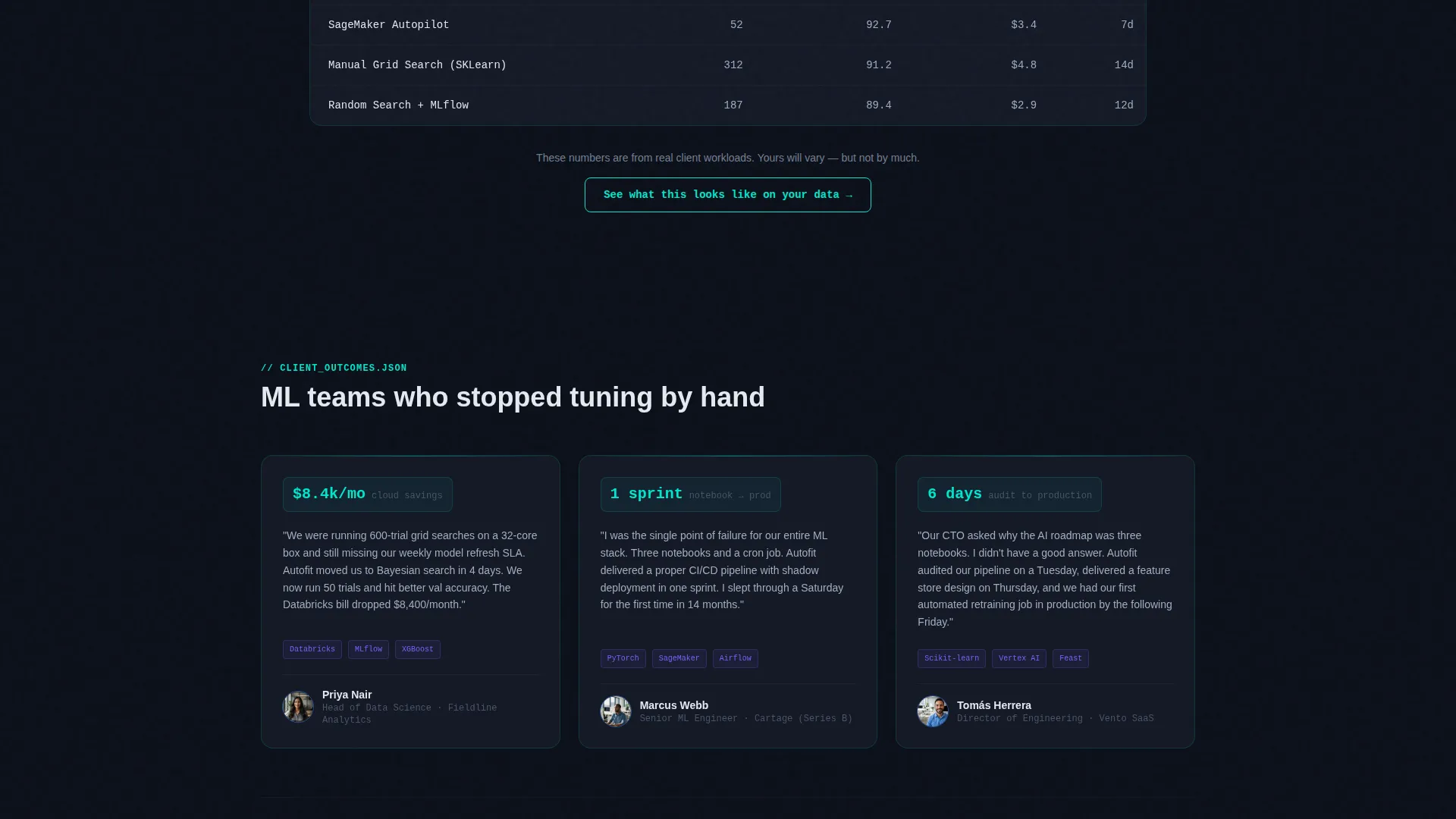
A secondary conversion path offers visitors access to an interactive benchmark comparison table without requiring any form submission. The table ends with a softer prompt inviting visitors to see what the results look like on their own data, creating a natural bridge from proof to inquiry.
Page sections overview
| Section | Purpose |
|---|---|
| Dark Glass Header | Displays four live-styled metric panels with parallax drift and the primary headline |
| Pain Point Row | Surfaces familiar ML workflow problems: grid search, pipeline drift, shadow IT models |
| Method Layer Row | Presents the consulting approach: Bayesian optimization, feature stores, ML CI/CD |
| Benchmark Proof Grid | Interactive data grid sortable by latency, accuracy, and cost |
| Breather Stat Panels | Single large glowing stats that pace the scroll and reinforce speed claims |
| Pipeline Audit Modal | Three-field form: dataset size, current stack chips, and work email |
| Persistent Bottom Bar | Sticky conversion bar with the primary call to action that activates after second scroll section |
| Benchmark Table Section | Ungated interactive comparison table with a soft closing call to action |
Design & branding system
The visual identity is built on a Tech Glass theme using a glassmorphic color system. Every surface is slightly transparent, with depth created by light bleeding through stacked planes rather than by shadow or hard borders.
- Obsidian base (#0B0F19) for the page background, translucent panel fill (#1A1F2E at 60% opacity with a 12-pixel blur) for glass card surfaces, and electric teal (#00E5CC) for active states and data highlights
- Muted silver (#A0AEC0) for secondary text and supporting labels, with signal violet (#7B61FF) reserved exclusively for call-to-action elements and progress indicators
- Medium-weight sans-serif typography for headlines, with layout depth achieved through layered transparent planes rather than border lines or drop shadows
Mobile & speed optimization
The template is structured with a lightweight, single-page layout. The glassmorphic panels and metric components are designed for visual clarity at any viewport size.
- Glass card components and the feature matrix grid reflow cleanly for narrower screens without losing the dark-glass visual character
- The persistent bottom-bar call to action is particularly effective on mobile, keeping the conversion path accessible during scroll without occupying primary content space
- The three-field audit modal is touch-friendly by design, with a dropdown, chip selectors, and a single email field that are straightforward to complete on any device
How this template helps you convert
The page is structured so that every panel delivers proof before the visitor encounters a form. The conversion logic is built into the scroll sequence itself.
- The header metric panels and the benchmark data grid establish technical credibility immediately, so the visitor arrives at the call-to-action already trusting the service rather than skeptical of it.
- The ungated benchmark table path gives hesitant visitors a no-commitment way to engage with real proof, and the soft closing prompt at the end of that table converts curiosity into intent naturally.
- The three-field modal removes the most common reasons people abandon forms: excessive fields, requests for company data, and phone numbers. The form feels like a logical next step, not a toll gate.
Other information about this template
This template is built specifically for the AutoML consulting niche and is not a general-purpose technology page. A few additional details are worth noting before you customize it.
- The template style is a Dashboard and Data Grid layout, which means the visual hierarchy prioritizes scannable data components over narrative paragraphs
- The theme is Tech Glass, and the glassmorphic color system is intentional throughout: changing the base palette significantly will affect the layered-depth effect that gives the design its character
- The headline "Your models should tune themselves" is included as a placeholder direction and is fully editable to reflect your specific positioning
- The breather stat sections use placeholder numbers such as "14x faster to production" that should be replaced with verified figures from your own client engagements before publishing
- This template is suited for consulting practices whose clients work with modern machine learning stacks and who expect visual proof of technical fluency before engaging
Theme
Tech Glass
Creative direction
Feature Matrix
Color system
Glassmorphic
Style
Dashboard/Data Grid
Direction
Freemium/Trial
Page Sections
Dark Glass Metric Header Panels
Feature Matrix Scroll Layout
Breather Stat Sections
Three-field Pipeline Audit Modal
Persistent Bottom-bar Call to Action
Ungated Benchmark Table Path
Related questions
Who is this landing page template designed for?
Can I change the metric values shown in the header panels?
Do I need a development team to customize this template?
Is the benchmark comparison table interactive out of the box?
Can this template work for data consulting services beyond AutoML?



