Dental Software Directory Website Template
This Drip dental email automation comparison landing page template is built for dental practices, DSO marketing directors, and dental marketing consultants ready to replace manual effort with precision-timed automation. The landing page showcases a full feature comparison, live automation counters, case study cards, and a three-step lead generation form, all wrapped in a dark Tech Glass visual identity.
by Rocket studio
Quick Summary
This is a single-page, high-conversion landing page template engineered for a dental-specific email marketing platform. It combines a glassmorphic code terminal hero, a live email-counter animation, a scroll-revealed comparison table, case study cards, and a three-step progressive lead generation form. The design runs on a Midnight Blue color system with electric cyan call-to-action elements throughout.
Who This Template Is For
This landing page is purpose-built for teams selling or promoting dental email marketing automation. It speaks directly to the people making buying decisions in the dental industry, and it does so without wasting their time.
- Solo dental practitioners who need automated appointment reminders and reactivation sequences without a steep learning curve
- DSO marketing directors managing email marketing campaigns across multi location groups of forty or more practices
- Dental marketing consultants who need a credible, white-label-ready landing page to present professional-grade automation services to their clients
What Problem This Template Solves
Generic email marketing tools were not built for dental practices. They lack the right integrations, the right email templates, and the right sequencing logic for patient interactions. This landing page solves the positioning problem, it shows, side by side, exactly why a dental-specific platform outperforms the alternatives.
- Lapsed patients never hear a friendly reminder because generic platforms cannot trigger drip campaigns based on visit history or treatment status
- Front desks waste hours on manual effort that automated appointment reminders and recall sequences could handle in seconds
- Dental marketing consultants lose credibility presenting generic software to clients who need dental-focused automation capabilities
What You Get With This Template
This landing page template delivers a fully structured, single-page layout with every component ready to customize. You get a dark terminal hero, animated data counters, a comparison table, social proof cards, and a conversion-focused lead form, all in one cohesive page.
- A glassmorphic code terminal header, a live email-sent counter, and a side-by-side comparison table that reveals on scroll
- Three case study cards showing real open rates, reactivation numbers, and revenue generated from dental email campaigns
- A three-step progressive lead generation form and a secondary lead magnet download path gated behind a single email field
Feature List
This landing page template is packed with components that support both visual impact and practical lead generation. Every feature below is grounded in the template brief.
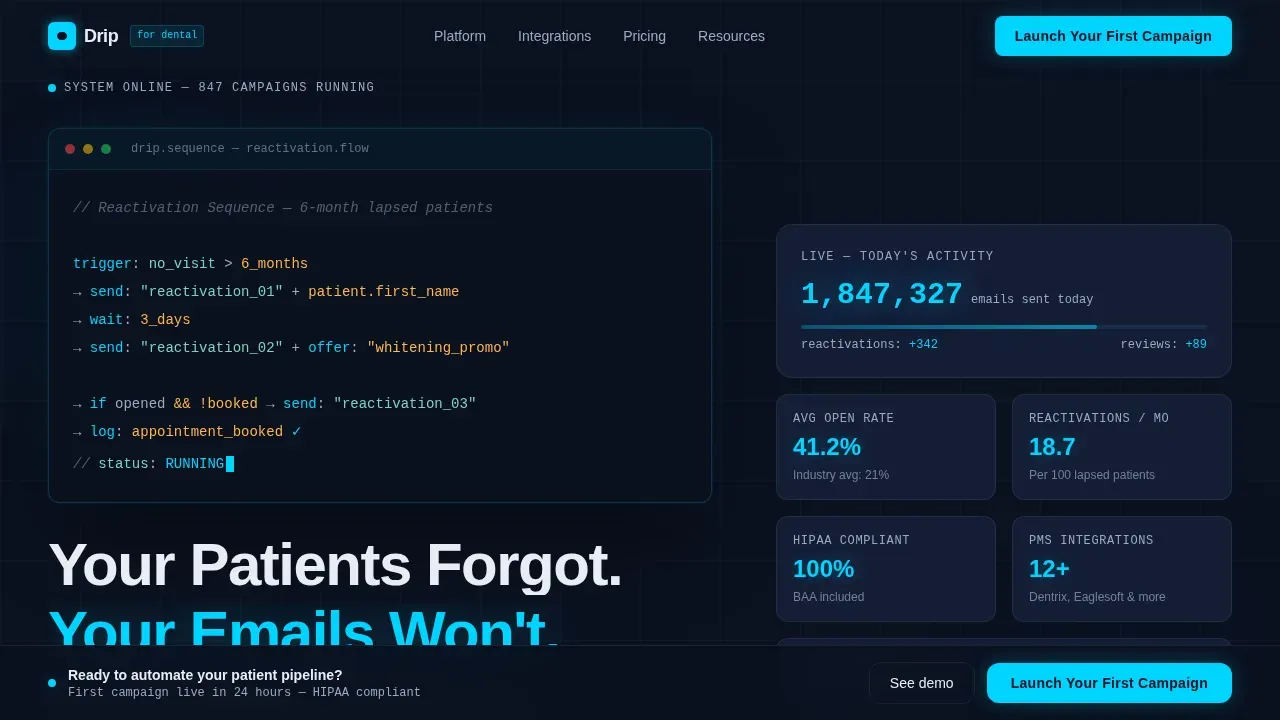
Glassmorphic Code Terminal Hero
The header opens with a frosted glass terminal window floating over the midnight navy background. It displays a real email automation sequence in clean pseudo-code, with syntax highlighted in cyan and frost. A blinking cursor sits at the end of the last line, reinforcing the "automation live and running" feeling that resonates with technical buyers.
Live Email Counter Animation
Below the hero, a live-counter animation shows the total emails sent today across all dental clients. This element is driven by GSAP counter animation and builds immediate social proof. It signals scale and trust before the visitor even reaches the comparison table.
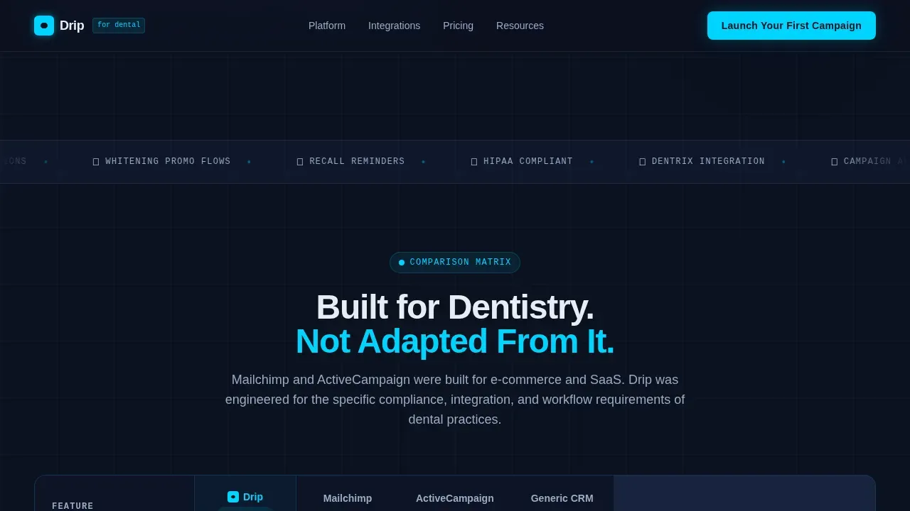
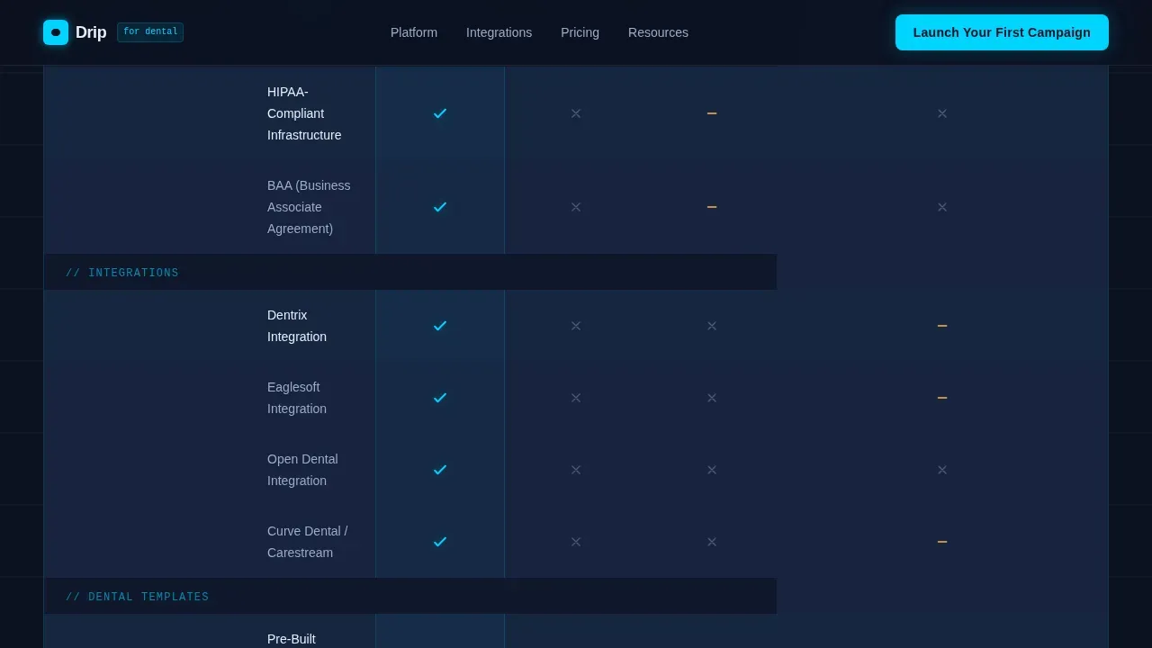
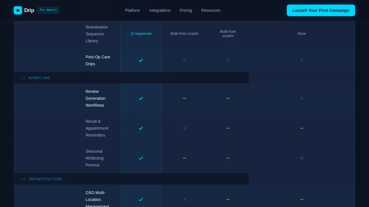
Scroll-Revealed Comparison Table
The centerpiece of this landing page is a detailed comparison table pitting the platform against Mailchimp, ActiveCampaign, and generic customer relationship management tools. Rows cover criteria that matter specifically to dental practices: HIPAA compliance, patient management system integrations (Dentrix, Eaglesoft, Open Dental), pre-built dental email templates, reactivation sequence libraries, and Google review generation workflows. Each row slides in on scroll using GSAP ScrollTrigger with a glass-slide animation.
Case Study Social Proof Cards
Three case study cards drop into view below the comparison table. Each card leads with a real metric, open rates, reactivation percentages, revenue generated, and builds in intensity. These cards replace generic stock photos of smiling dentists with actual performance data, which is far more persuasive to the target market of dental professionals.
Three-Step Progressive Lead Form
The primary lead generation form uses progressive disclosure across three steps. Step one asks for practice name and number of locations. Step two asks which patient management system the practice uses, with a dropdown covering every major dental system. Step three captures email address and preferred demo time. A fixed bottom bar showing the primary call to action appears after the visitor scrolls past the comparison table, keeping conversion intent visible at all times.
Secondary Lead Magnet Path
Below the comparison table, a second conversion path invites visitors to download a forty-page dental email playbook. This path is gated behind a single email field, making it low-friction for prospects who are not yet ready to book a demo. It catches not-yet-ready leads and feeds them into a drip sequence for future campaigns.
Page Sections Overview
| Section | Purpose |
|---|---|
| Hero Code Terminal | Opens with pseudo-code automation display and headline reveal |
| Live Email Counter | Animates total emails sent to establish scale and credibility |
| Comparison Table | Compares platform against alternatives across dental-specific rows |
| Case Study Cards | Delivers real performance data as social proof |
| Lead Generation Form | Three-step progressive form captures demo signups |
| Playbook Download | Secondary path captures early-stage leads via email field |
| Footer | Single-row linear footer with links and legal basics |
Design & Branding System
The visual identity follows a Tech Glass theme. The palette feels like peering through smart glass into a server room late at night, dark, still, and precise, with one bright signal confirming something just sent successfully.
- Background and structure use deep terminal navy (#0B1120) and translucent panel blue (#1A2744) to create layered glassmorphic depth
- Clinical frost (#E8EDF4) handles body text and card surfaces, keeping content readable against dark backgrounds
- Electric accent cyan (#00D4FF) is reserved strictly for call to action elements, hover states, and live data pulses, it only appears when something is clickable or alive
- Typography pairs DM Sans for body and user interface copy with JetBrains Mono for all code and terminal elements, reinforcing the platform's technical credibility
Mobile & Speed Optimization
This landing page is designed desktop-first, reflecting the reality that DSO marketing directors and dental marketing consultants typically work at a desk. That said, full mobile support is built into the layout, and the template respects the fact that more than 60% of marketing emails are read on mobile devices.
- The layout adapts to mobile devices with a single-column structure and large, tappable buttons that preserve the dark terminal aesthetic
- Server Components handle static sections for reliable rendering, while Client Components manage animations, the live counter, and the progressive form
- GSAP ScrollTrigger row reveals and spotlight effects are scoped to client-side rendering to keep the experience smooth across screen sizes
How This Template Helps You Convert
A landing page that looks impressive but fails to guide visitors toward a decision is just a brochure. This template is built around conversion at every scroll depth, using layout decisions backed by what works for lead generation pages in B2B software marketing.
- The fixed bottom bar with the primary call to action stays visible after the visitor passes the comparison table, ensuring that the most qualified visitors, those who read the full comparison, always have a clear next step within reach
- The three-step progressive form reduces form abandonment by breaking what could feel like a long commitment into small, logical steps that match the visitor's decision stage
- The secondary playbook download path acts as a sales funnel entry point for undecided visitors, delivering relevant content immediately and setting up future campaigns through an automated drip sequence
Other Information About This Template
This landing page template is part of a broader ecosystem of dental digital marketing resources. The following points cover practical considerations for buyers evaluating this template.
- The template is designed around the Drip dental email automation comparison landing page template framework, meaning every section is pre-structured for a dental email marketing platform comparison use case, no guesswork needed when customizing
- Drip campaigns built through this platform cover reactivation sequences for lapsed patients, post-op care drips, welcome email flows for new patients, appointment reminders, educational newsletters, and seasonal promotions for cosmetic procedures
- The email marketing software context built into the comparison table rows is specific to the dental industry, covering HIPAA compliance, patient management system integrations, and pre-built email templates, criteria that generic email providers simply do not address
- The best email marketing tools for dental practices go beyond basic email sending; they need automation capabilities tied to visit history, treatment status, and patient segmentation, this template's comparison rows make that argument visually and clearly
- Choosing the right email marketing platform requires comparing more than paid plans and send limits; this landing page template makes that case through structured, scannable rows that surface what actually matters to dental buyers
- The template supports the concept of unlimited landing pages if used within a platform that offers that feature; however, buyers should verify this against their chosen web page builder before publishing
- The average email open rate for dental practices is around 40%, and practices that automate appointment reminders and recall sequences see 20 to 30 percent fewer no-shows, facts that can be dropped into the case study cards or live counter section when customizing
- Email drip campaigns triggered by specific patient behaviors, such as a missed cleaning or a lapsed recall, can recover patients who would otherwise be lost, a point this template's comparison table surfaces through its reactivation sequence library row
- Segmenting patients based on treatment needs, demographics, and visit history allows for more targeted and effective marketing emails, the template's PMS integration comparison rows make this segmentation story concrete
- The comparison table's spotlight effect and scroll animations create a step by step discovery experience that mirrors the logic of a well-paced email drip campaign: reveal the right message at the right moment
- The template's case study cards can showcase revenue attribution data, helping prospects connect email automation directly to revenue generated rather than treating it as a soft engagement tool
- Artificial intelligence-assisted copy suggestions and subject lines optimization are emerging features in dental email marketing software; if the platform being marketed includes these, they can be added to the comparison table as an additional row
- The secondary playbook download acts as a lead magnet for potential customers and new customers who are not ready for a demo, keeping them inside the sales funnel with immediate, high-value relevant content
- Practices that prioritize ease of setup and a low learning curve will appreciate that the three-step form immediately asks about their current patient management system, signaling that the platform understands their existing workflow
- The template's design decisions, including removing standard navigation from the header area, are consistent with conversion rate best practices, focused landing pages with a single call to action outperform pages with multiple navigation options
- A/B testing, or b testing, of different subject lines and call to action copy can be layered onto this template by swapping text in the hero and comparison sections across test variants, helping teams optimize performance over time
- The template includes no generic stock photography; trust signals come from real data in case study cards and from the clinical precision of the Tech Glass design, which builds credibility through aesthetic choices rather than surface-level imagery
- This web page template supports multiple channels of entry: direct traffic, drip email link clicks, paid search, and referral from educational newsletters, the focused, distraction-free layout serves all of these traffic sources equally well
Theme
Tech Glass
Creative direction
Launch Energy
Color system
Midnight Blue
Direction
Lead Generation
Page Sections
Glassmorphic Code Terminal Hero
Animated Live Email Counter
Dental-specific Comparison Table
Case Study Social Proof Cards
Three-step Progressive Lead Form
Secondary Lead Magnet Download
Related questions
How do you start an email drip campaign for a dental practice?
What are the three types of landing pages?
How do you build a landing page template for dental email marketing?
Which of the following is a best practice for landing page design?
Can this template work for multi-location dental groups?


