Architecture Firm Software Professional Website Template
Automate is a dashboard-style landing page template built for architecture firm workflow automation platforms. It features a live-feeling Feature Tab Switcher, spec-sheet-style feature matrices, and a friction-minimized lead capture form. The dark Acid Digital color system and monospaced data typography create the focused, command-center aesthetic that resonates with operations directors and project architects.
by Rocket studio
Quick summary
Automate is a single-page, dashboard-driven landing page template designed for architecture firm workflow automation platforms. It opens with an interactive Feature Tab Switcher, moves through a progressive feature matrix that builds a cumulative case, and closes with a minimal three-field lead capture form. Every design decision serves clarity and forward motion.
Who this template is for
This template is built for software founders, product marketers, and go-to-market teams launching workflow automation tools aimed at the architecture and construction industry. It speaks directly to buyers inside firms who feel the daily cost of disconnected tools.
- Operations directors at mid-size architecture firms managing submittals and RFI cycles
- Project architects toggling between multiple disconnected tools throughout the workday
- Firm principals watching billable hours disappear into administrative overhead each quarter
What problem this template solves
Architecture firms run on fragmented tool stacks. Revit files, RFI logs, submittal trackers, timesheet systems, and drawing distribution channels rarely speak to each other. The result is delay, duplicated work, and lost billable time. This template gives platforms selling a solution to that problem a page that proves value before the visitor reads a single word of body copy.
- No single place exists that shows the manual process versus the automated process side by side
- Generic SaaS templates fail to communicate the operational depth architecture firms need to see
- Most landing pages bury the core value in paragraphs rather than showing it in live, scannable data
What you get with this template
You get a fully structured, dark-mode dashboard landing page that leads with interactive proof and closes with qualified lead capture. Every section is built to reflect the precision and data-density that architecture professionals recognize and trust.
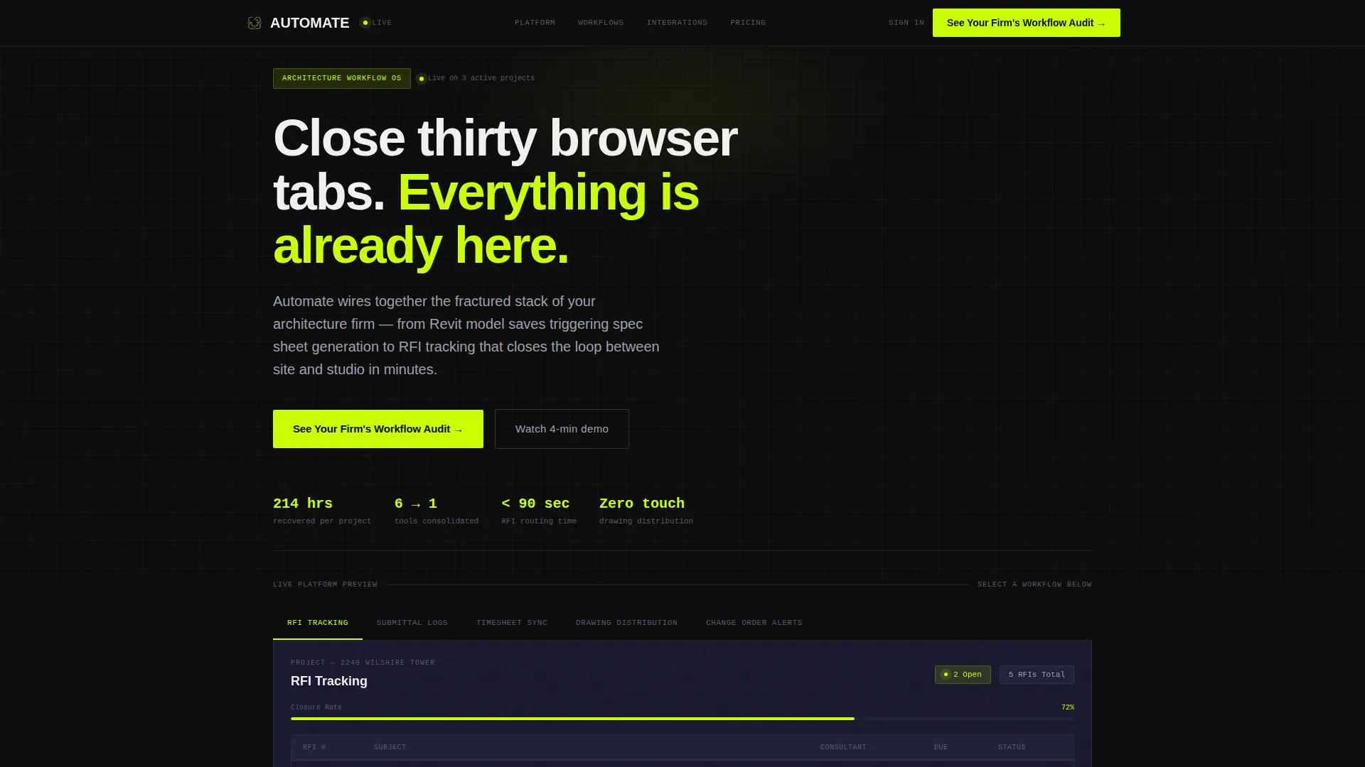
- A five-tab Feature Tab Switcher header with animated dashboard previews for each workflow
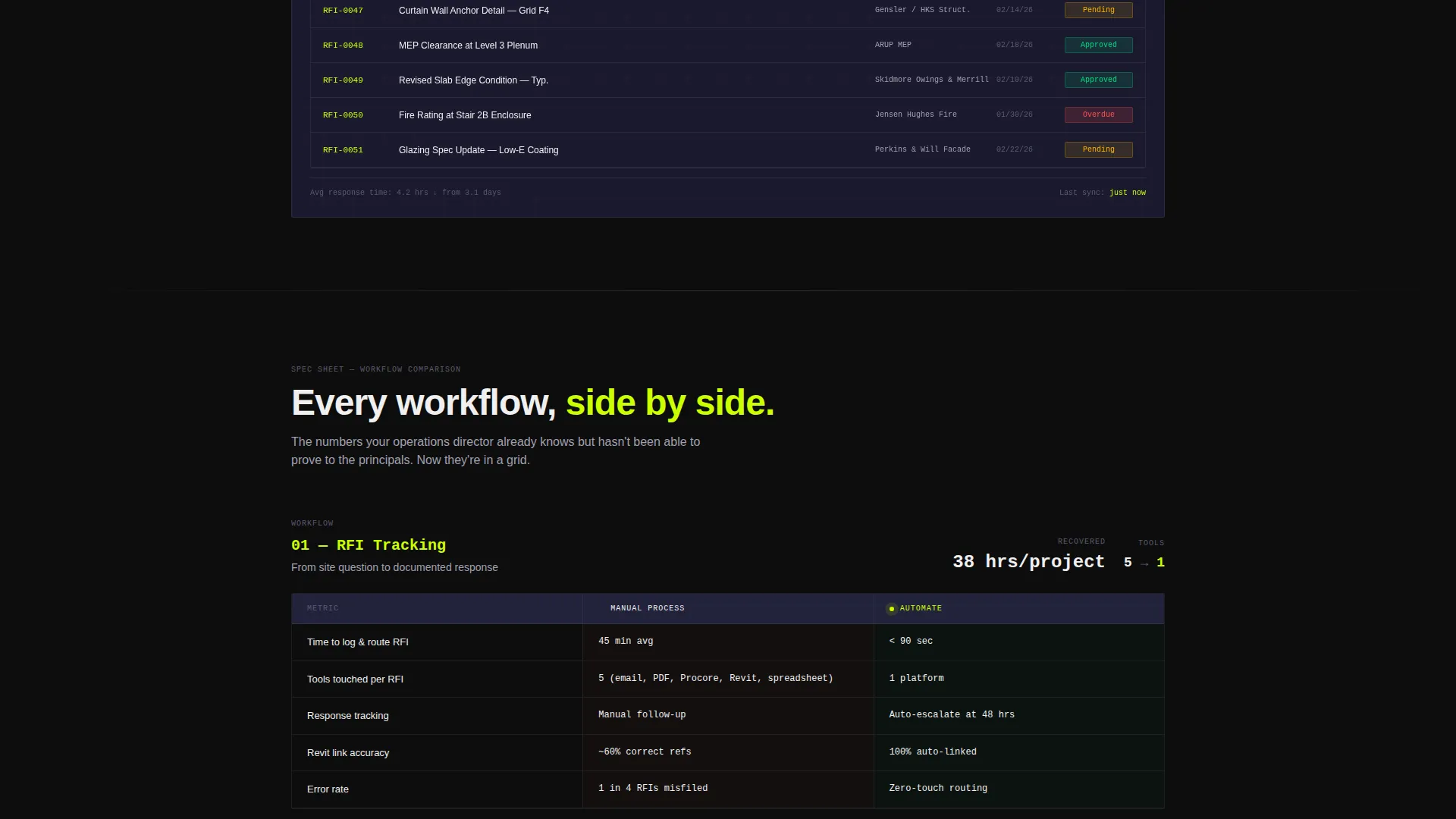
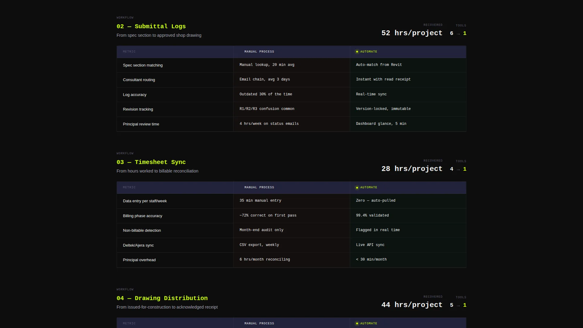
- A scrollable feature matrix comparing manual versus automated processes across multiple workflow categories
- A progressive lead generation form and a secondary content download path for visitors not yet ready to convert
Feature list
This template delivers a tightly scoped set of interactive and visual components, all described below.
Five-Tab Workflow Switcher
The header contains five horizontal tabs labeled with real architecture firm pain points: RFI Tracking, Submittal Logs, Timesheet Sync, Drawing Distribution, and Change Order Alerts. Each tab click transitions the dashboard preview below it. The active tab glows in electric chartreuse, making the interaction state unmistakable.
Animated Dashboard Preview Panel
Below the tab switcher, a fully rendered dashboard panel displays realistic project data including firm names, Revit file references, consultant names, and actual deadline dates. Micro-animations bring the panel to life with a progress bar completing, a notification badge incrementing, and a status pill flipping from Pending to Approved.
Progressive Feature Matrix
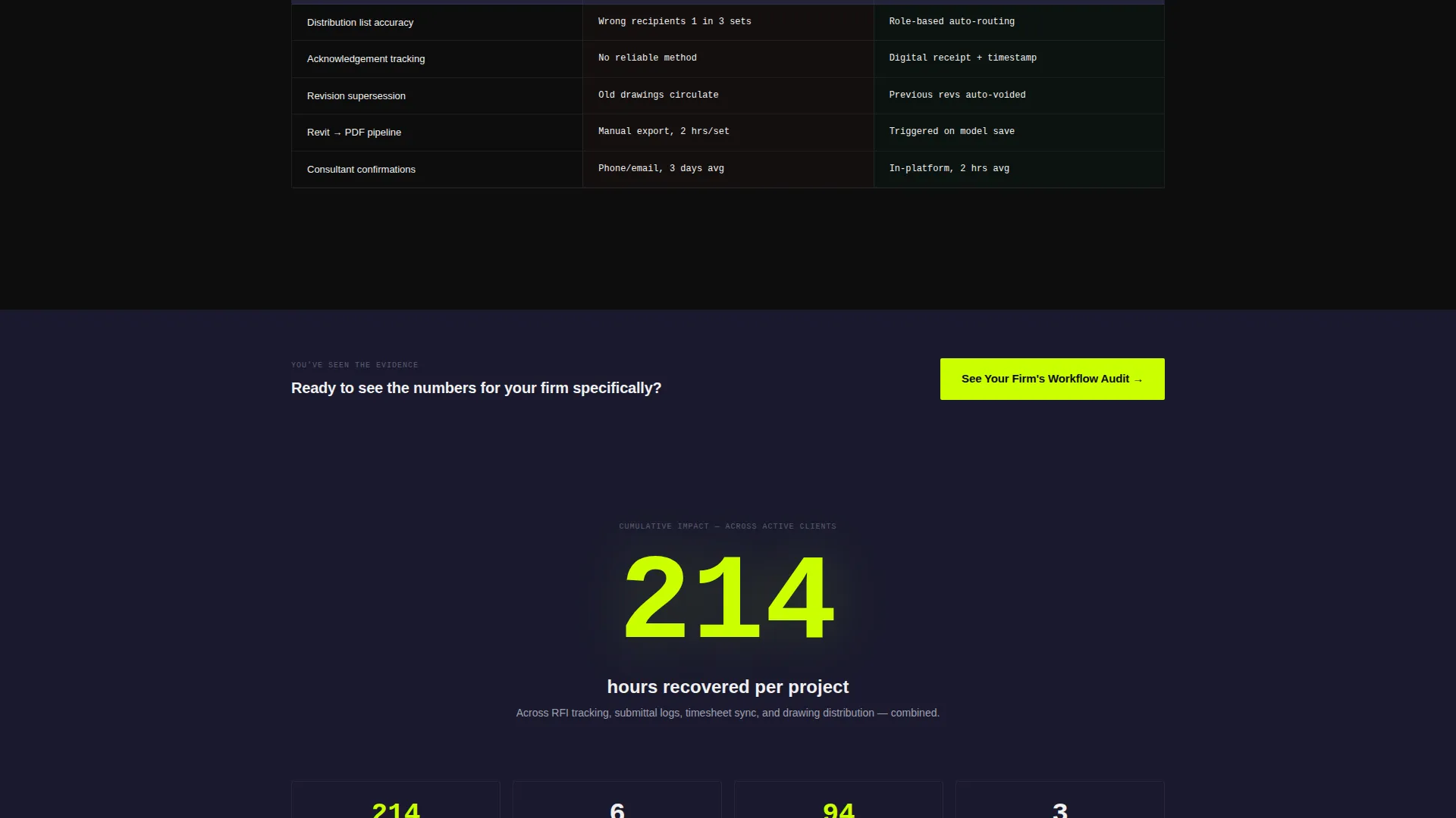
Each scrollable section isolates one workflow and presents a tight comparison grid. The manual process side shows red time estimates, tool counts, and error rates. The automated side shows green metrics, a single-platform badge, and zero-touch labels. A running counter appears after the fourth matrix section, displaying cumulative time savings calculated at 214 hours recovered per project.
Sticky Lead Generation call to action
The primary call to action, labeled "See Your Firm's Workflow Audit," is placed sticky in the top navigation and repeated after the third feature matrix. The form uses a three-field progressive sequence: firm size dropdown, primary project type, and work email only. No phone number or last name is required.
Secondary Content Download Path
A secondary conversion module offers a downloadable Architecture Firm Tool Stack Report gated behind email-only capture. This catches visitors who are not yet ready to book a demo but are willing to engage with educational content, extending the lead funnel without adding form friction.
Command-Center Visual System
The layout uses void black as the primary background, deep graphite for card surfaces, and electric chartreuse reserved exclusively for live, clickable, or changing elements. Monospaced data typography and subtle one-pixel borders evoke the precision of architectural drawing sets throughout the page.
Page sections overview
| Section | Purpose |
|---|---|
| Tab Switcher Header | Introduces five core workflow categories with interactive tab navigation |
| Animated Dashboard Preview | Shows realistic project data with live micro-animations per tab |
| Feature Matrix Block | Compares manual versus automated workflows with color-coded metrics |
| Cumulative Time Counter | Displays running total of hours recovered across all four workflow sections |
| Primary Lead Form | Captures qualified leads via three-field progressive form sequence |
| Secondary Download Module | Offers gated content download for early-stage visitors via email capture |
| Sticky Navigation Bar | Keeps the primary call to action visible throughout the full page scroll |
Design & branding system
The visual identity follows an Acid Digital color system layered over a Startup Velocity theme. The result feels like a command center built for focus, not decoration. Every color choice has a defined role and does not deviate from it.
- Void black (#0D0D0D) primary background, deep graphite (#1A1A2E) for card and panel surfaces, cool zinc (#A0A0B0) for body text and divider lines
- Electric chartreuse (#CBFF00) appears only on active states, live data pulses, buttons, and changing interface elements, never as decoration
- Monospaced data typography and one-pixel borders reference the precision of architectural drawing sets and reinforce the platform's technical credibility
Mobile & speed optimization
The layout is built with a grid that uses generous gutters, making content readable and scannable at any viewport size. The tab switcher and matrix sections reflow cleanly for smaller screens without losing the data-dense visual structure.
- The dashboard preview panel and feature matrix grids are designed to adapt to narrower viewports while preserving readability
- Micro-animations are scoped to interface-state changes rather than decorative effects, keeping motion purposeful and lightweight in feel
How this template helps you convert
The page is structured to build conviction progressively rather than ask for commitment upfront. Each section adds a layer of proof before the visitor reaches the form.
- The interactive tab switcher lets visitors self-select into their own pain point immediately, making the demo feel personally relevant before any reading begins.
- The feature matrix format presents evidence in a scannable grid rather than persuasive prose, which matches how architecture professionals actually evaluate tools.
- The friction-minimized three-field form and the secondary download path create two distinct conversion moments, capturing both sales-ready leads and early-stage prospects in a single page flow.
Other information about this template
This template is categorized under Technology, with a subcategory of Architecture Firm Software and a niche focus on architecture firm workflow automation. It is designed as a single-page lead generation landing page using a Dashboard and Data Grid visual style.
- The template style is classified as Dashboard and Data Grid, suited for platforms that need to show product depth rather than describe it
- The header concept is a Feature Tab Switcher, a pattern well suited to tools that cover multiple workflow categories within one platform
- The creative direction follows a Feature Matrix structure, making it a strong fit for any B2B software product where side-by-side comparison of old versus new processes is the core sales argument
- The theme is Startup Velocity, communicating speed, precision, and operational momentum to a technically literate audience
Theme
Startup Velocity
Creative direction
Feature Matrix
Color system
Acid Digital
Style
Dashboard/Data Grid
Direction
Lead Generation
Page Sections
Five-tab Workflow Switcher Header
Animated Dashboard Preview Panel
Progressive Feature Matrix
Cumulative Time Recovery Counter
Friction-minimized Lead Capture Form
Secondary Content Download Path
Related questions
Can I change the tab labels in the Feature Tab Switcher?
Does the dashboard preview panel use real data or placeholder content?
Is the lead capture form connected to a backend or email tool?
Who is this landing page template designed for?
Can the Feature Matrix sections be reordered or expanded?



