Franchise Workflow Automation Landing Page Template
Automate is a Bold Brutalist franchise workflow automation landing page built for multi-unit operators who've outgrown spreadsheets and email chains. It opens with a three-tab interactive header demonstrating onboarding, compliance, and inventory reorder workflows live. A modular card grid delivers proof point after proof point, driving visitors toward a low-friction freemium trial signup.
by Rocket studio
Quick summary
Automate is a single-page franchise workflow automation landing page designed for operators running 15 to 200 locations. It leads with a Feature Tab Switcher that puts three live workflow demos inside the first viewport. Below, a modular card grid reads like an industrial spec sheet, stacking discrete proof points until the "Launch 3 Free Workflows" call to action lands with full conviction.
Who this template is for
This template is built for franchise operators and their growth teams who need a fast, credible way to present an automation platform to skeptical, data-driven buyers.
- Multi-unit franchise operators managing 15 to 200 locations across inconsistent execution environments
- Franchise development directors scaling new territories faster than their standard operating procedures can follow
- Operations vice presidents who have outgrown their spreadsheet-and-email stack and need a platform that proves ROI on first contact
What problem this template solves
Franchise networks lose entire workdays to manual coordination. Regional managers chase checklists. Compliance audits sit in inboxes. Inventory reorders wait for someone to notice a threshold crossed. A generic software landing page cannot communicate the operational weight of that problem or the precision of the fix.
- Visitors arrive skeptical; they need to see workflows executing, not read marketing copy claiming they execute
- Most automation platforms bury their value inside feature lists; this template leads with live tab-switched demonstrations that make the product the hero
- The signup funnel loses leads by asking too much; the two-field form here removes every friction point that doesn't directly qualify the buyer
What you get with this template
You get a fully structured, single-page landing page that demonstrates franchise workflow automation through interaction, not description. Every design decision, from the modular card grid to the brutalist comparison block, is built to convert skeptical operators into trial signups.
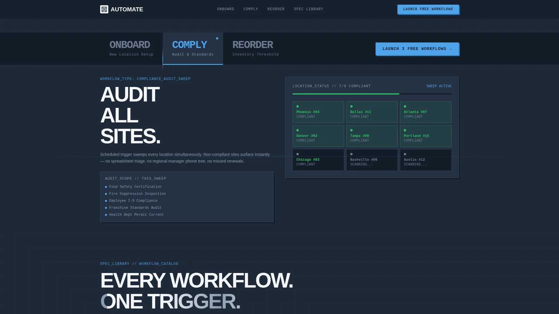
- A Feature Tab Switcher header with three tabs (ONBOARD, COMPLY, REORDER) that each load a distinct workflow card layout
- A modular spec-card grid where every card shows a trigger condition, an action chain, and an output metric in terse industrial format
- Two conversion paths: a primary "Launch 3 Free Workflows" trial form and a secondary "See the Spec Library" gated PDF download
Feature list
This template delivers a precise set of components, each one backed by the source brief. Nothing here is speculative.
Feature Tab Switcher Header
Three oversized typographic tabs sit across the top of the viewport. ONBOARD loads a step-sequence card chain with checklist items ticking complete. COMPLY surfaces an audit-status dashboard with location pins flipping green. REORDER displays an inventory threshold grid with automatic purchase order triggers firing in real time. The product demonstrates itself before the visitor scrolls.
Modular Workflow Spec Cards
Each card in the grid is a self-contained spec: trigger condition on top, action chain in the middle, output metric at the bottom. Numbers are rendered at display scale. Labels are terse. Every card answers one question: what does this workflow replace? The grid tightens toward the bottom, visually communicating that the system handles more as complexity grows.
Brutalist Before/After Comparison Block
A full-width comparison block drops in at midpage. It renders "Before Automate / After Automate" with raw time-saved and error-reduction figures at display scale. The format is deliberately raw and typographic, matching the spec-sheet creative direction and making the efficiency case without editorial commentary.
Low-Friction Trial Signup Form
The primary conversion form asks only for work email and number of franchise locations via a four-option dropdown (5 to 15, 15 to 50, 50 to 200, 200 and above). Name and phone fields are deliberately excluded to reduce drop-off. The call to action "Launch 3 Free Workflows" appears after the header tabs and again anchored at the page bottom.
Gated Spec Library Download
A secondary lead-capture path offers "See the Spec Library," a gated PDF download of all available workflow templates. This captures evaluators who are not ready to trial but want to assess the full scope of the platform before committing.
Bold Brutalist Visual System
The Slate and Sky color system uses deep gunmetal (#1E2A38) as the dominant background, poured-concrete gray (#6B7B8D) on card surfaces, open-sky blue (#4DA3E8) on every interactive element, and exposed-white (#F4F6F8) for typography. Brutalist drop shadows lift cards off the background. Typography is monospaced or heavy grotesque, oversized, and unapologetic.
Page sections overview
| Section | Purpose |
|---|---|
| Feature Tab Switcher | Demonstrates ONBOARD, COMPLY, and REORDER workflows live inside the first viewport |
| Workflow Spec Cards | Delivers modular proof points showing trigger, action chain, and output metric per workflow |
| Before/After Block | Renders time-saved and error-reduction figures at display scale for fast persuasion |
| Primary Trial call to action | Captures work email and location count with a two-field form and sky-blue button |
| Spec Library Download | Offers a gated PDF lead capture for evaluators not yet ready to start a trial |
| Anchored Bottom call to action | Repeats "Launch 3 Free Workflows" at page close to catch late-scroll converters |
Design & branding system
The visual identity is Bold Brutalist, built on a Slate and Sky color system that feels like a rooftop mechanical room at dawn: raw steel and ductwork lit by a strip of clean blue sky. Colors are applied with structural intent, not decoration.
- Gunmetal (#1E2A38) dominates the background; concrete gray (#6B7B8D) floats card surfaces above it with brutalist drop shadows; sky-blue (#4DA3E8) pulses only where the user can act, on buttons, toggles, active tabs, and progress indicators
- Typography is monospaced or heavy grotesque, oversized and unapologetic, reinforcing the spec-sheet creative direction where every label is terse and every number is enormous
- Exposed-white (#F4F6F8) provides typographic clarity and breathing room without softening the industrial palette
Mobile & speed optimization
The card grid layout is modular by design, which means it adapts naturally to narrower viewports without structural redesign. The spec-card format, with short labels and large numbers, stays readable at any scale.
- The two-field signup form (work email plus location dropdown) is touch-friendly and eliminates the input fatigue that causes mobile users to abandon longer forms
- The Feature Tab Switcher is built for viewport-first loading; the product demonstration occupies the first screen on both desktop and mobile, so visitors engage before they scroll
How this template helps you convert
This template is structured to build evidence before it asks for anything. By the time a visitor reaches either call to action, they have already watched workflows execute across three tabs and counted hours saved across a dozen spec cards.
- The Feature Tab Switcher demonstrates the product in the first two seconds, replacing the need for a written value proposition with a live operational proof
- The brutalist Before/After block makes the ROI case at display scale, rendering time-saved and error-reduction figures in a format that feels like data, not marketing copy
- Two conversion paths serve two buyer mindsets: the trial form captures ready-to-act operators, while the Spec Library download captures evaluators who need more scope before committing
Other information about this template
This template sits at the intersection of franchise software and workflow automation, making it well suited for platforms that serve the multi-unit operator market. A few additional details are worth noting for buyers evaluating fit.
- The page style is Card Grid (Modular), meaning individual workflow cards can be swapped, reordered, or expanded as a platform's workflow library grows
- The freemium and trial conversion direction means the page is optimized for volume lead capture, not enterprise sales cycles; the form deliberately avoids qualification fields that slow down signup
- The Spec Library secondary call to action creates a second lead segment: evaluators who download the PDF are prospects at a different stage, and the template supports both capture paths simultaneously


Theme
Bold Brutalist
Creative direction
Spec Sheet
Color system
Slate & Sky
Style
Card Grid (Modular)
Direction
Freemium/Trial
Page Sections
Feature Tab Switcher Header
Modular Workflow Spec Cards
Brutalist Before/after Block
Low-friction Trial Signup Form
Gated Spec Library Download
Bold Brutalist Visual System
Related questions
What kind of business is this landing page designed for?
Can I customize the workflow spec cards for my platform's features?
What does the signup form ask for, and why?
What is the Spec Library download, and who is it for?
Is this a single-page landing page or a multi-page website?


