Healthcare Software Premium Cost Calculator Website Template
Automate is a bento grid landing page template built for healthcare workflow automation platforms. It leads with a live ROI calculator, presents evidence-backed findings in an industry-report layout, and drives leads through a "Get Your Workflow Audit" call to action. The Carbon Fiber color system and Dynamic Motion theme give the page a precise, engineered feel that matches its audience.
by Rocket studio
Quick summary
Automate is a single-page bento grid template designed for healthcare workflow automation platforms. It opens with an interactive ROI calculator, flows through stat-driven content cells styled like an industry report, and closes every section with a clear lead-generation path. The design is matte, structured, and motion-driven, built to persuade hospital operators with evidence, not emotion.
Who this template is for
This template is built for B2B healthcare software companies that sell to operational decision-makers inside health systems. If your buyers weigh ROI before they book a demo, this page speaks their language.
- Hospital and health system COOs evaluating workflow automation tools
- Clinic operations managers looking to reduce manual administrative burden
- Health system CTOs responsible for connecting legacy systems and modernizing processes
What problem this template solves
Healthcare operations teams face a familiar problem: too much time spent on manual work that should already be automated. Denied claims pile up. Nurses spend hours on data entry. Referral handoffs stall in fax queues. A standard landing page cannot make that cost visible fast enough to move a skeptical buyer. This template solves that gap.
- No clear way to show buyers the financial cost of their current manual processes
- Generic layouts that fail to build trust with clinical and operational audiences
- Weak lead capture that loses visitors who want evidence before a conversation
What you get with this template
You get a fully structured bento grid landing page with purpose-built sections for every stage of the buyer journey. Each cell is designed to do a specific job, from proving cost to capturing contact details.
- A full-viewport interactive ROI calculator that recalculates results as the visitor adjusts inputs
- An industry-report scroll experience with stat cells, narrative cells, and looping motion graphics
- Two distinct lead capture paths: a workflow audit form and an email-gated report download
Feature list
This template includes the following core features drawn directly from the design brief.
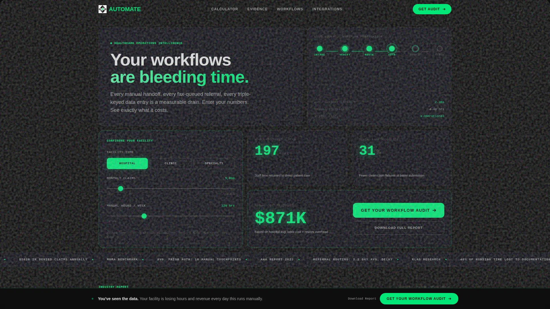
Live ROI Calculator Header
The header spans the full viewport width and functions as an interactive estimator. Visitors select their facility type, enter monthly claim volume, and drag a slider for current manual processing hours. Animated counters recalculate hours recovered, annual cost savings, and denied-claim reduction in real time with eased motion.
Bento Grid Layout
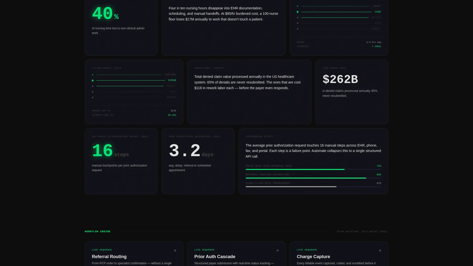
The page is built on a bento grid structure where each cell holds one focused piece of content. Grid density shifts as the visitor scrolls, moving from sparse headline-level data into tighter, evidence-rich clusters. This mimics the experience of drilling into a detailed industry report.
Industry Report Content Cells
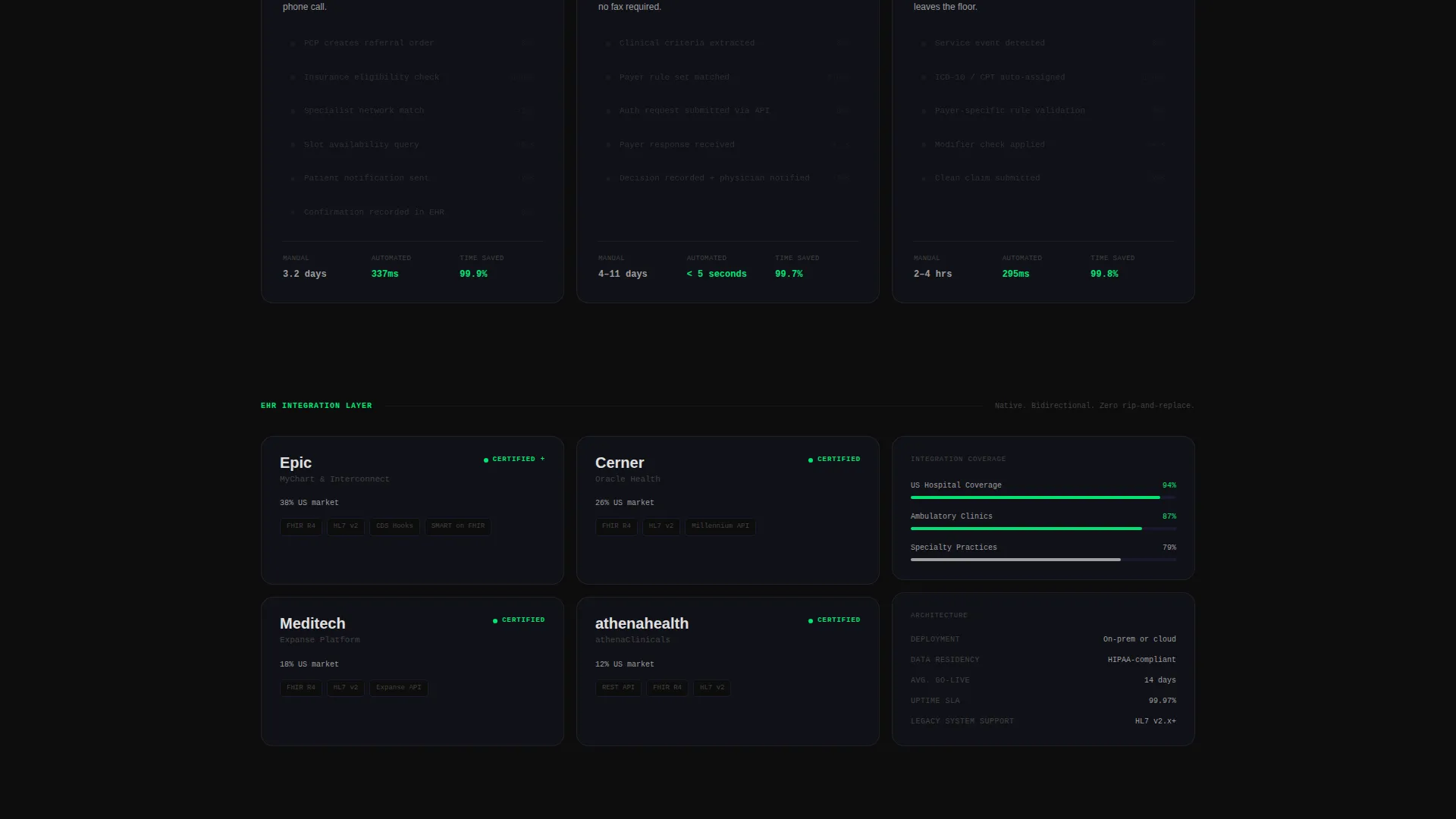
Each content row pairs three cells: one holding a data point with a sourced citation, one carrying a short operational narrative, and one playing a looping motion graphic. The motion graphics reference specific workflows such as referral routing, prior-authorization cascades, and charge capture sequences.
Dual Lead Generation Paths
The primary call to action, "Get Your Workflow Audit," appears inside the calculator output panel and as a fixed-bottom bar that activates after the third scroll section. A secondary path offers a downloadable report behind an email gate, capturing leads who want data before committing to a call.
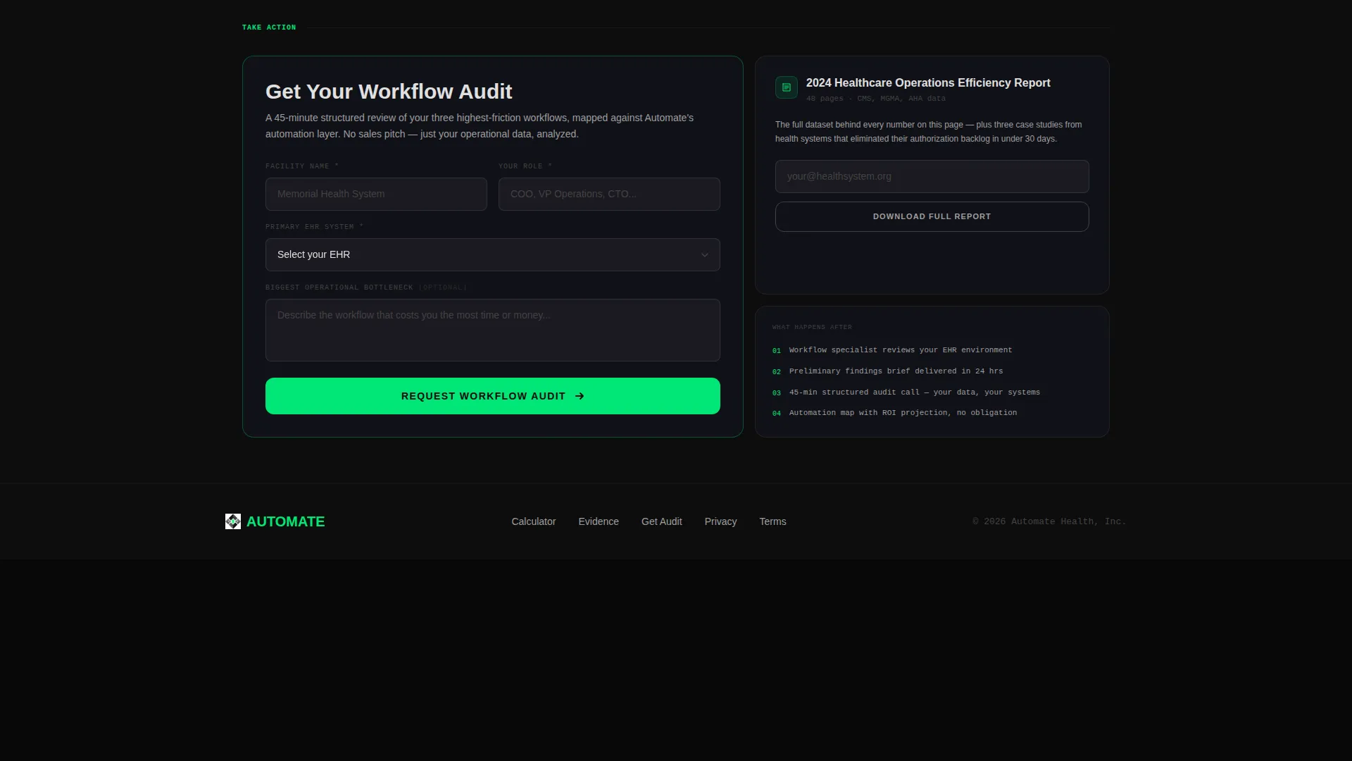
Workflow Audit Capture Form
The audit form collects facility name, role title, Electronic Health Record system via a dropdown, and an optional free-text field for the visitor's biggest operational bottleneck. This gives the sales team qualified context before the first conversation.
Dynamic Motion Theme
The page uses purposeful micro-animations throughout. A process node chain in the header lights up sequentially like a signal moving through a circuit. Progress indicators and interactive elements use pulse-green exclusively, so every moving or clickable element feels distinctly alive against the matte dark background.
Page sections overview
| Section | Purpose |
|---|---|
| Full-viewport calculator | Captures facility inputs and displays animated ROI output in real time |
| Headline and node chain | Anchors the core message and visualizes workflow momentum |
| Stat and citation cells | Presents sourced industry data to establish operational cost |
| Narrative context cells | Explains what each data point means for day-to-day operations |
| Workflow motion graphics | Shows referral routing, prior-auth, and charge capture as looping visuals |
| Fixed call to action bar | Keeps the audit call to action visible after the third scroll section |
| Report download gate | Captures email leads who prefer data before a direct conversation |
| Audit capture form | Collects qualified lead details including role, facility, and EHR system |
Design & branding system
The visual identity follows a Carbon Fiber color system built around four deliberate values. Every color has a specific role and does not drift from it. The result feels like the inside of a precision instrument case: matte, functional, and zero ornamentation.
- Structural black (#0D0D0D) and woven graphite (#1A1A2E) dominate grid cells and card layers, with clinical titanium (#E0E0E0) reserved for body text and data labels
- Pulse-green (#00E676) appears only on active states, progress indicators, and call-to-action elements, making every interactive moment feel like a system firing
- The Dynamic Motion theme uses eased counter animations, sequential node lighting, and looping workflow graphics to build momentum through accumulated evidence rather than decorative motion
Mobile & speed optimization
The bento grid layout is structured to adapt across screen sizes without losing the spatial logic of its content cells. Interactive elements and animated counters are designed to remain legible and functional as the layout reflows.
- Grid cells restack at smaller breakpoints while preserving the stat-narrative pairing that drives the report experience
- The fixed-bottom call-to-action bar is designed to remain visible and tappable on mobile without obstructing key content
- Motion graphics and animated counters are scoped to their bento cells, keeping visual weight contained and the scroll experience controlled
How this template helps you convert
The page is built around a single conversion insight: buyers who see their own numbers are far more ready to act than buyers who read general claims. Every structural decision flows from that idea.
- The ROI calculator makes the cost of inaction personal and specific before the visitor reads a single feature description, so the call to action feels like a logical conclusion rather than a sales push.
- The industry-report scroll structure builds credibility through accumulated evidence, with each row adding a sourced data point, an operational explanation, and a visual proof of the workflow in motion.
- The dual lead paths ensure that visitors who are not yet ready for a direct conversation still enter the funnel through the email-gated report download, giving the sales team two qualified entry points.
Other information about this template
This template is part of the broader healthcare software and health technology category, designed for platforms operating at the intersection of clinical operations and enterprise software. It suits teams building in areas such as revenue cycle management, clinical workflow automation, and health system integration.
- The EHR dropdown in the audit form includes options for major platforms used across health systems, making it relevant for teams that sell into mixed-technology environments
- The industry-report creative direction references benchmark data sources commonly cited in healthcare operations, lending the page credibility with analytically minded buyers
- The template style is Bento Grid with a Dynamic Motion theme, making it a strong fit for SaaS and health technology companies that want a product-led, data-forward visual presence
- It is well suited for use as a primary campaign landing page, a conference follow-up page, or a paid media destination targeting C-suite and director-level healthcare operations roles
Theme
Dynamic Motion
Creative direction
Industry Report
Color system
Carbon Fiber
Style
Bento Grid
Direction
Lead Generation
Page Sections
Live ROI Calculator with Animated Outputs
Bento Grid with Shifting Density
Sourced Stat and Narrative Cell Pairs
Dual-path Lead Capture System
Fixed-bottom Call-to-action Bar
Dynamic Motion Visual System
Related questions
Who is this template designed for?
Can I customize the ROI calculator inputs for my specific platform?
What lead capture options does the template include?
Does the template support the Carbon Fiber color system out of the box?
Is this template suitable for paid advertising campaigns?



