Nonprofit Workflow Automation Landing Page Template
Automate is a nonprofit workflow automation landing page template built for teams drowning in disconnected tools. It features an interactive savings calculator, a three-tier comparison table, and a signal-green free-trial conversion flow. The Dashboard Pro design system pairs deep navy backgrounds with crisp white type, giving every section the clarity of a mission-control screen.
by Rocket studio
Quick summary
Automate is a single-page template built for nonprofit software platforms that replace fragmented spreadsheets, donor databases, and grant trackers with one connected workflow. The page opens with a full-width dashboard screenshot, leads visitors through an interactive savings calculator, then presents a tiered comparison table before capturing free-trial signups with a two-field form.
Who this template is for
This template is designed for nonprofit-focused software companies and SaaS platforms targeting operations teams inside charitable organizations. It speaks directly to the people inside those organizations who feel the daily cost of manual data work.
- Development directors managing inherited donor databases and grant tracking tools
- Operations managers reconciling financial data across disconnected systems every month
- Program coordinators copying beneficiary information between intake forms and reporting portals
What problem this template solves
Nonprofit teams spend significant hours each week on tasks that software should handle automatically. The template is built to make that cost visible and convert it into motivation to act.
- Staff time lost to manual data entry across multiple unconnected platforms
- No clear way for visitors to see the personal financial cost of staying on their current stack
- A fragmented tool landscape that makes switching feel risky without a concrete side-by-side comparison
What you get with this template
You get a fully structured, single-page conversion layout designed specifically for a nonprofit workflow automation platform. Every section serves a defined job in the visitor's decision journey.
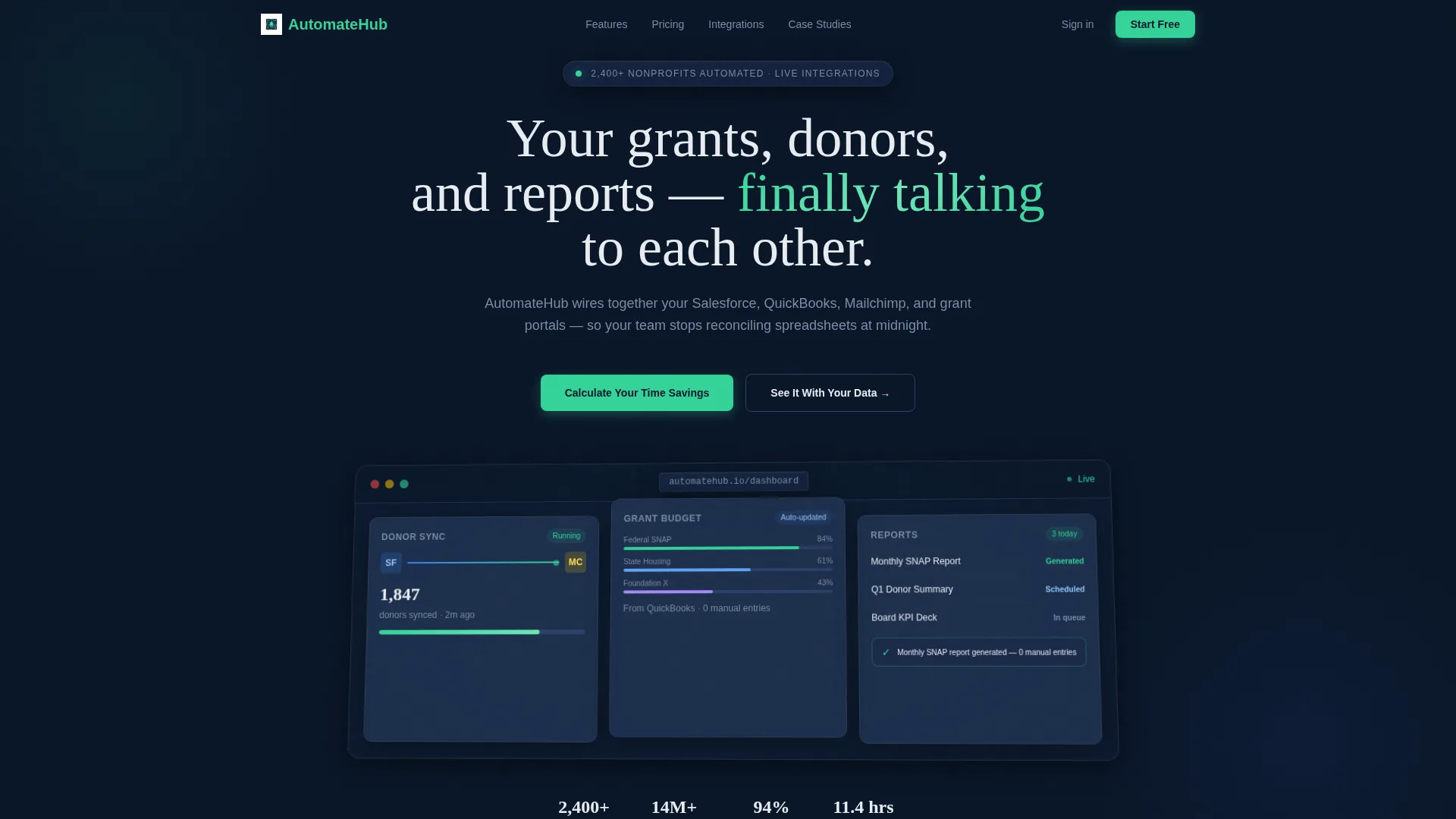
- A tilted product screenshot header showing a live dashboard workflow mid-run
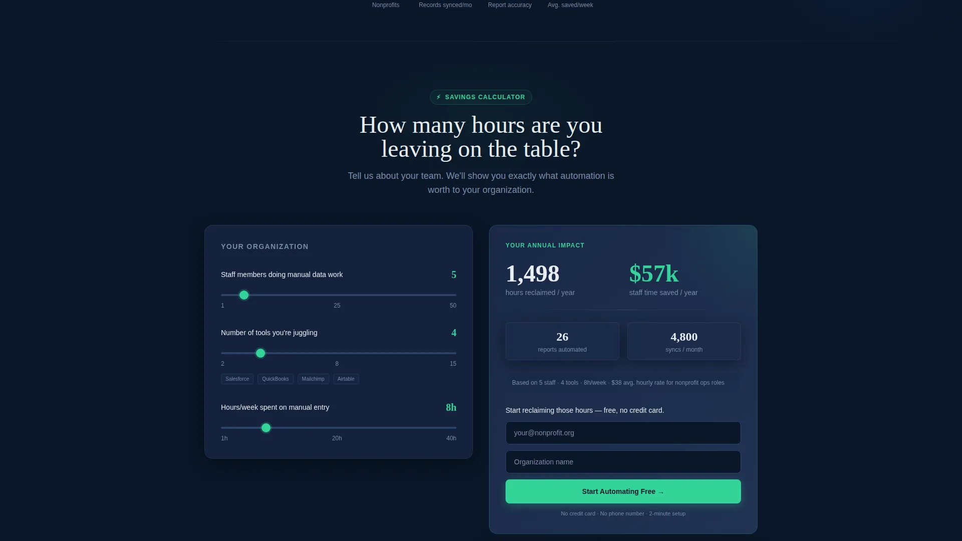
- An interactive savings calculator that personalizes the comparison table with each visitor's own inputs
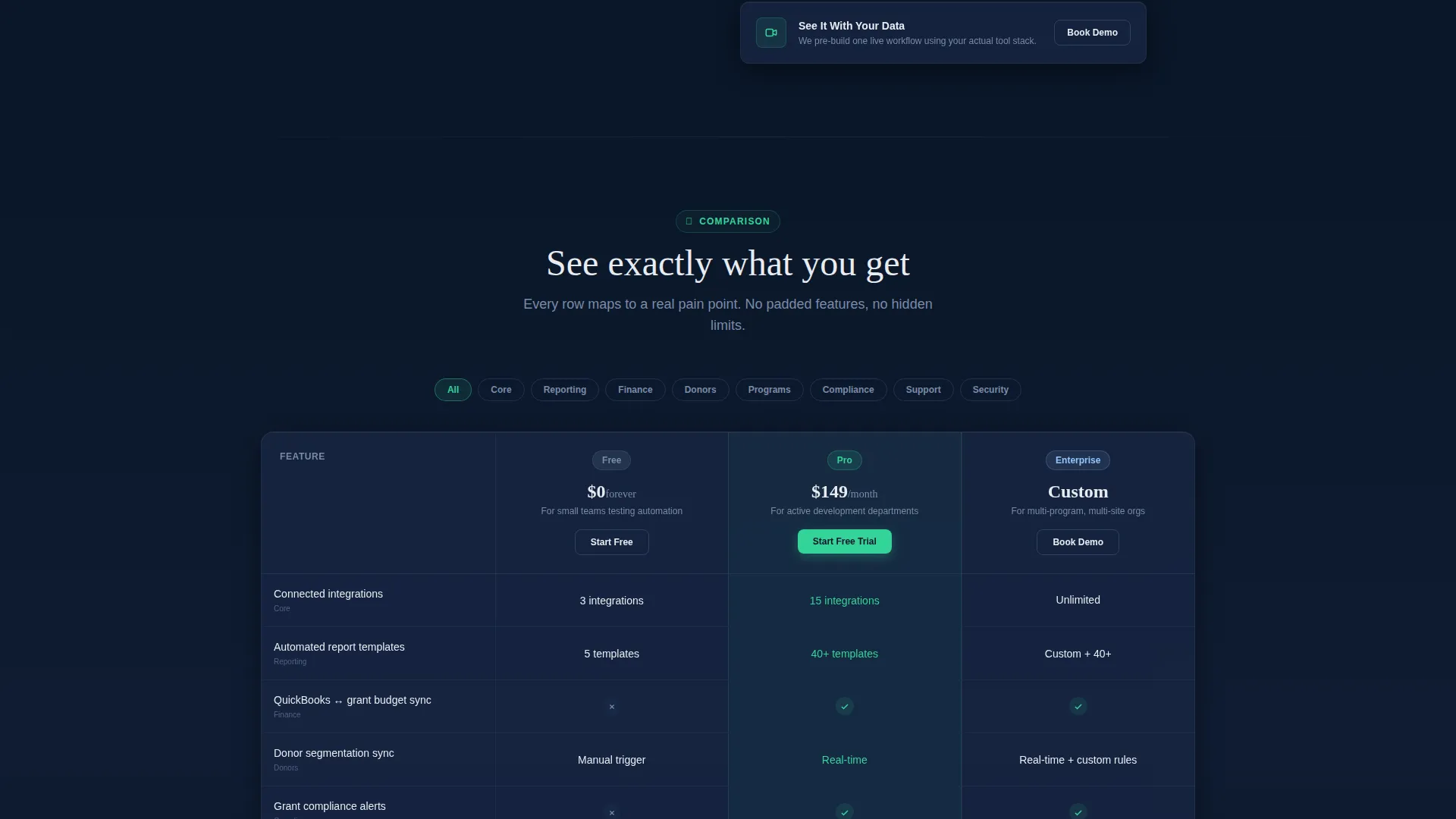
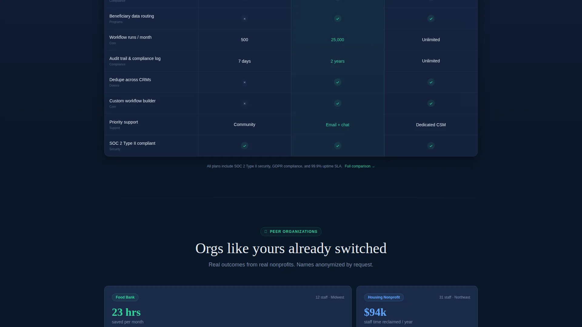
- A three-tier comparison table covering free, Pro, and Enterprise plans with nonprofit-relevant rows
- A sticky bottom call-to-action bar and a two-field signup form with no credit card required
Feature list
This template includes purpose-built components that work together to move a skeptical nonprofit buyer from curiosity to commitment.
Interactive Savings Calculator
Visitors enter their staff count, number of tools, and weekly manual hours. The calculator instantly returns projected hours reclaimed and a dollar equivalent in staff time saved per year. The result is the emotional anchor that makes every row of the comparison table feel personal.
Three-Tier Comparison Table
The table compares free, Pro, and Enterprise plans across rows mapped to real nonprofit pain points. Rows cover connected integrations, automated report templates, grant compliance alerts, and donor segmentation syncs. Each row reflects the visitor's calculator inputs to show personalized value.
Dashboard Screenshot Header
A full-width, pixel-perfect product screenshot sits on a slight three-dimensional tilt against the midnight background. It shows a donor sync in progress, a grant budget chart auto-populating, and a green toast notification confirming a report was generated with zero manual entries.
Dual Conversion Paths
The primary call-to-action button appears first inside the calculator results panel, then again in a sticky bottom bar after the comparison table. A secondary path books a personalized demo where the team pre-builds a live workflow using the visitor's actual tool stack.
Peer Organization Case Metrics
The page closes with anonymized performance metrics from similar organizations. These metrics follow a scroll narrative that moves from "see what you're losing" to "see what you'd gain" to "see who already switched."
Minimal Signup Form
The signup form captures only a work email address and organization name. There is no credit card field and no phone number required, removing the two most common reasons a nonprofit buyer abandons a free-trial form.
Page sections overview
| Section | Purpose |
|---|---|
| Dashboard screenshot header | Shows the platform mid-workflow to establish immediate product credibility |
| Savings calculator tool | Lets visitors input their own data and see personalized time and cost projections |
| Calculator results panel | Anchors the emotional case and surfaces the primary free-trial call-to-action |
| Comparison table | Compares three plan tiers across rows tied to real nonprofit workflow pain |
| Peer case metrics | Closes the trust gap with anonymized results from similar organizations |
| Free-trial signup form | Captures work email and organization name with no credit card required |
| Demo booking path | Offers a secondary conversion for visitors who want a live, personalized walkthrough |
| Sticky call to action bar | Keeps the primary call-to-action visible after the visitor passes the comparison table |
Design & branding system
The template uses a Dashboard Pro visual identity built on the Midnight Blue color system. Every color choice has a specific role, and nothing is decorative.
- Deep terminal navy (#0A1628) fills the primary background, anchoring the page in a calm, authoritative tone
- Steel-panel gray (#1B2A4A) surfaces card components including the comparison table and calculator panel
- Cool interface white (#E8ECF1) handles all body and headline typography against dark backgrounds
- Signal green (#34D399) fires exclusively on active states, toggle elements, and every call-to-action button
Mobile & speed optimization
The template layout is structured to remain clear and functional at every viewport size. The comparison table and calculator panel adapt so visitors on smaller screens lose no critical information.
- The comparison table scrolls horizontally on narrow screens, keeping all three plan columns accessible
- The sticky call-to-action bar repositions gracefully at mobile viewport heights so it never obscures key content
- The calculator inputs are sized for touch interaction, reducing friction for visitors arriving from email or social links
How this template helps you convert
The page is engineered as a Freemium and Trial conversion funnel. Each section hands off to the next with a clear purpose in the persuasion arc.
- The calculator creates a personalized, dollar-quantified reason to act before the visitor reaches any pricing or plan detail, making the comparison table feel like confirmation rather than a sales pitch.
- The dual call-to-action placement, inside the calculator results and again in the sticky bar, means the primary action is always one tap away without feeling aggressive.
- The two-field signup form removes every common barrier to starting a free trial, so the momentum built by the calculator lands on the lowest-friction conversion point possible.
Other information about this template
This template is categorized under Technology and Nonprofit Software, and it is suited for platforms operating in the nonprofit workflow automation space. It is built for a single-page, section-led layout rather than a multi-page site structure.
- The template style is a Comparison Table layout, ideal for platforms offering tiered plans
- The header concept follows a Product Screenshot direction, grounding the page in real product evidence from the first scroll
- The creative direction is Calculator and Tool First, meaning the interactive element carries the primary persuasion load
- The landing page direction is Freemium and Trial, optimizing for low-commitment entry points over direct purchase
- The theme is Dashboard Pro, referencing a design language familiar to data-focused operations audiences
Theme
Dashboard Pro
Creative direction
Calculator/Tool First
Color system
Midnight Blue
Style
Comparison Table
Direction
Freemium/Trial
Page Sections
Interactive Savings Calculator
Three-tier Comparison Table
Dashboard Screenshot Header
Dual Call-to-action Placement
Minimal Free-trial Signup Form
Peer Organization Case Metrics
Related questions
Does this template require coding knowledge to set up?
Can I adjust the comparison table rows to match my actual plan features?
Is the savings calculator pre-built, or do I connect my own logic?
Can I use this template if my platform serves both nonprofit and for-profit clients?
What does the demo booking path look like in practice?



