Open-Source Enterprise Software Complete Professional Website Template
Automate is a split-screen landing page template built for an open-source robotic process automation (RPA) platform. It follows a Problem-to-Solution narrative arc with a dark full-bleed header, teal glow aesthetics, and a sticky comparison tool that lets visitors benchmark their current vendor against the open-source alternative in real time.
by Rocket studio
Quick summary
Automate is a single-page template designed for an open-source RPA platform targeting developers, IT managers, and founders. The 50/50 split-screen layout walks visitors through a Problem-to-Solution arc, pairing vendor pain points on the left with open-source answers on the right. A sticky comparison bar and GitHub social proof drive conversion throughout.
Who this template is for
This template is built for teams and individuals who are done paying enterprise licensing fees and want to show the world a better path. It speaks directly to technical buyers who evaluate tools with a critical eye.
- DevOps engineers who maintain fragile automation scripts and need a cleaner, scriptable alternative
- IT managers at mid-market firms who have received six-figure vendor quotes and need a credible open-source case to present internally
- Solo founders and small teams who need reliable automation running at odd hours without adding headcount
What problem this template solves
Enterprise RPA tools are expensive, opaque, and difficult to audit. Vendor lock-in makes migration painful, and proprietary bots often fail silently with no clear error trail. This template gives an open-source RPA platform the visual credibility and conversion structure to win that argument on a single page.
- Vendors present complex dashboards and steep pricing; this layout counters each pain point with a clear open-source equivalent side by side
- Developers have no easy way to compare feature parity and cost savings at a glance; the built-in comparison tool solves that directly
- Trust is hard to build quickly for open-source tools; the GitHub contributor graph and social proof elements address that friction head-on
What you get with this template
You get a fully structured, single-page layout that carries a visitor from awareness to action. Every section is purposeful, and every visual choice reinforces the platform's credibility and openness.
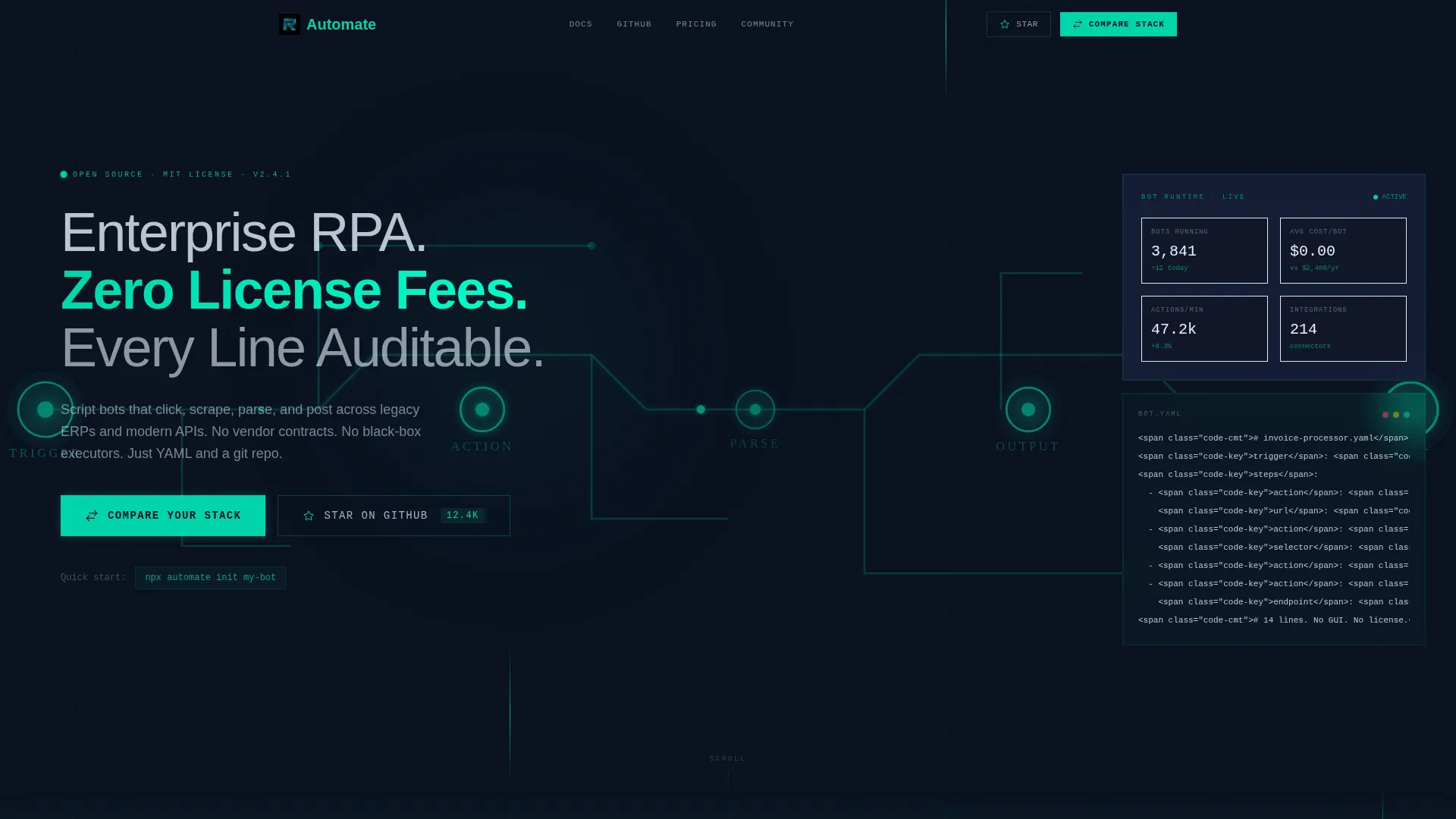
- A dark full-bleed header with an animated bot-workflow diagram rendered in teal lines, tracing a trigger-to-output path
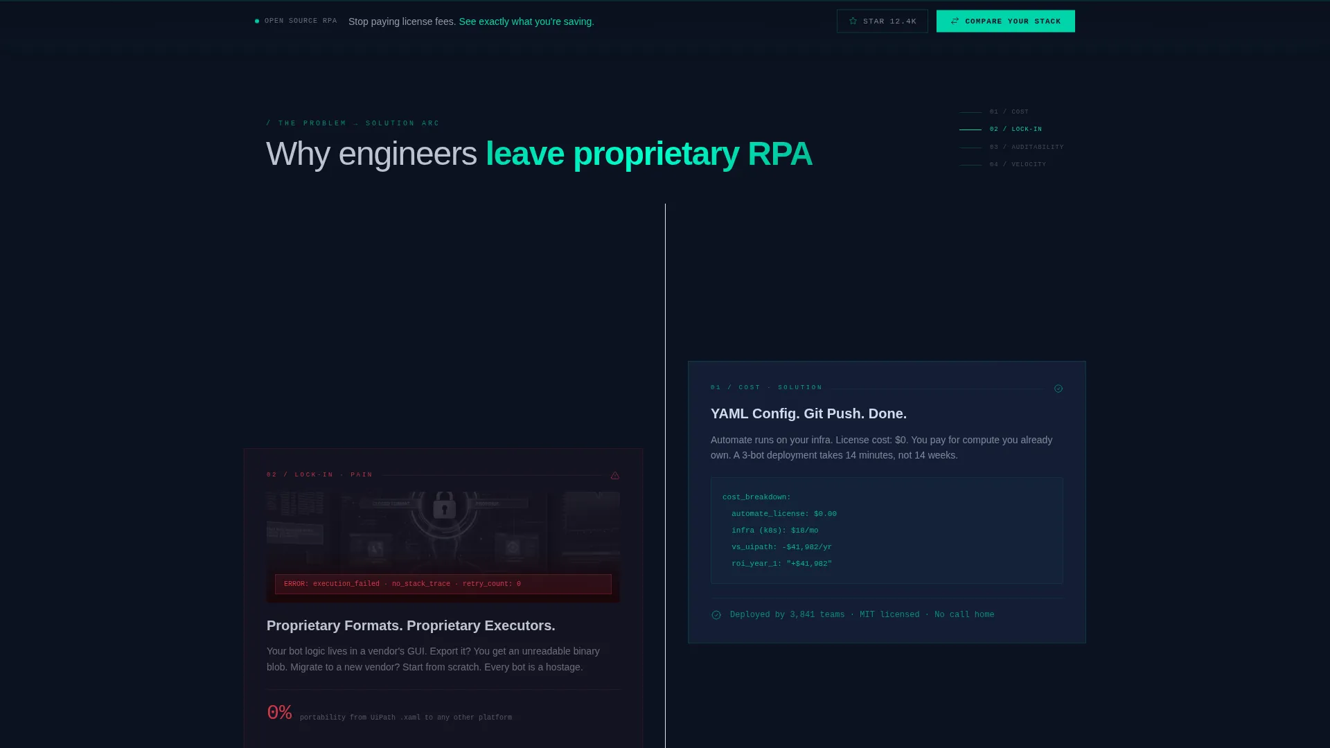
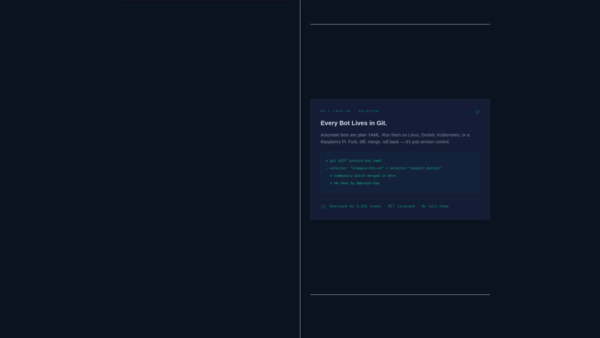
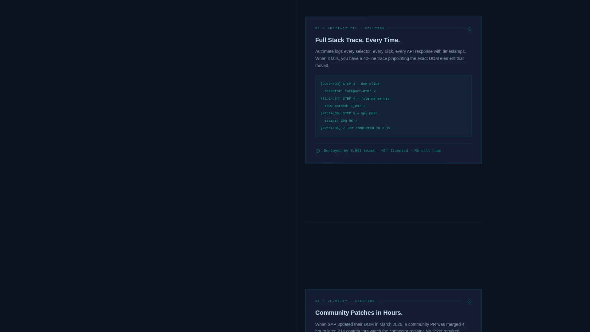
- A scrolling 50/50 split-screen arc that pairs vendor pain screenshots with open-source YAML configs, GitHub diffs, and a live cost calculator
- A sticky bottom bar with a "Compare Your Stack" call to action and a secondary "Star on GitHub" button for lower-commitment engagement
Feature list
This template includes a focused set of built-in components and layout patterns, each serving the open-source RPA conversion goal directly.
Animated Bot-Workflow Header
The header canvas is saturated in deep void black with a bot-workflow diagram drawn in thin reactive teal lines. The diagram pulses softly, tracing a path from trigger to action to output, with glow radiating from connection nodes. No stock imagery is used, keeping the visual identity purely technical and intentional.
Problem-to-Solution Split Screen
Each scroll row pairs a left-panel pain point with a right-panel open-source answer. The escalation moves through cost, vendor lock-in, auditability, and community velocity. In the final row, the left panel goes dark and the right panel expands to full width, revealing a live-embed GitHub contributor graph.
Sticky Comparison Bar
A persistent bottom bar holds the primary call to action throughout the scroll. Clicking "Compare Your Stack" opens a two-column tool selector where the visitor chooses their current RPA vendor from a dropdown and receives an instant feature-by-feature and cost-by-cost breakdown.
Vendor Dropdown Comparison Tool
The comparison tool includes a dropdown populated with major RPA vendors. The visitor selects their current tool and sees a structured side-by-side table generated against the open-source platform. This makes the value proposition concrete and personalized without requiring a sales call.
GitHub Social Proof Integration
A "Star on GitHub" secondary call to action reduces commitment friction before the deeper conversion step. The live-embed contributor graph in the final section reinforces community activity and project health visually, giving technical buyers a signal they trust.
Tech Glass Visual System
The frosted glass panel style uses layered translucent surfaces floating over a dark background. Interactive states such as hover borders, toggle switches, and comparison checkmarks are all rendered in reactive teal. The palette creates a server-rack aesthetic that resonates with the target technical audience.
Page sections overview
| Section | Purpose |
|---|---|
| Full-Bleed Header | Introduce the platform with the animated workflow diagram and headline |
| Cost Pain Row | Show bloated vendor pricing against the open-source cost calculator |
| Lock-In Pain Row | Contrast proprietary dependency with a clean YAML config and GitHub diff |
| Auditability Pain Row | Pair silent failure logs with an auditable open-source equivalent |
| Community Velocity Row | Show community patch speed against slow vendor release cycles |
| GitHub Contributor Finale | Expand full-width with a live contributor graph as social proof |
| Sticky Comparison Bar | Hold the "Compare Your Stack" call to action throughout the scroll |
| Vendor Comparison Tool | Let visitors select a vendor and generate a live feature breakdown |
Design & branding system
The visual identity follows the Tech Glass theme using the Teal Catalyst color system. Every design decision reinforces the feeling of a server rack viewed through tempered glass at night, with cool teal light bleeding through dark architecture.
- Core palette: deep void black (#0B1120) as the base canvas, reactive teal (#00D4AA) for all interactive and glow states, frosted glass panel (#1A2744 at 60% opacity) for floating surface layers, and signal white (#E8F0FE) for body text
- Teal dominates all interactive states including hover borders, toggle switches, and comparison checkmarks, keeping the brand color functionally meaningful throughout
- No stock photography is used anywhere; visual elements are purely schematic, including the header diagram, panel screenshots, and GitHub embed
Mobile & speed optimization
The split-screen layout is structured to adapt gracefully across screen sizes. The stacked mobile view preserves the Problem-to-Solution narrative without losing the emotional arc or the comparison tool functionality.
- The 50/50 split panels collapse to a single-column stacked layout on smaller screens, keeping each pain-and-answer pair readable in sequence
- The sticky comparison bar remains accessible at the bottom of the viewport on mobile, preserving the primary call to action at all scroll depths
- The teal glow and frosted panel effects are CSS-based visual treatments that maintain the design intent without relying on heavy image assets
How this template helps you convert
The entire page is structured around a single conversion thesis: show the real cost of staying with a proprietary vendor, then make switching to the open-source alternative feel obvious and low-risk.
- The Problem-to-Solution arc builds cumulative tension across four escalating pain rows, so by the time the visitor reaches the comparison tool, they are already sold on the question and looking for the answer
- The sticky "Compare Your Stack" call to action stays visible at every scroll depth, capturing intent at the exact moment it peaks rather than waiting for the visitor to reach a footer
- The "Star on GitHub" secondary path lowers the commitment bar, converting hesitant visitors into community members and keeping them in the funnel before they are ready for the deeper step of downloading the CLI or booking a migration consult
Other information about this template
This template is specifically built for the open-source RPA market, where the primary conversion barrier is trust and cost transparency rather than feature awareness. The design and layout choices reflect that context directly.
- The template is categorized under Technology and Open-Source Enterprise Software, making it suitable for developer-facing product pages and technical platform launches
- The comparison dropdown is pre-scoped to major enterprise RPA vendors, which makes the template immediately relevant for teams evaluating alternatives to tools such as UiPath, Automation Anywhere, Blue Prism, and Power Automate
- The open-source framing, GitHub integration, and CLI download path make this template well-suited for developer community pages, product hunt launches, and technical conference landing pages
Theme
Tech Glass
Creative direction
Problem→Solution Arc
Color system
Teal Catalyst
Style
Split Screen (50/50)
Direction
Comparison/Versus
Page Sections
Animated Bot-workflow Header Diagram
50/50 Split-screen Problem Arc
Sticky Comparison Bar Call to Action
Vendor Dropdown Comparison Tool
Github Social Proof Components
Tech Glass Frosted Panel System
Related questions
Can I customize the vendor options in the comparison dropdown?
Does the template include the actual GitHub embed or is it a placeholder?
Is coding knowledge required to use this template?
Can the split-screen layout work for a product other than RPA?
What is the primary call to action this template is built around?



