AutoML Technology Reviews Website Template
A dark, IDE-style landing page template built for AutoML tools and frameworks. It walks visitors through a Problem-to-Solution arc, morphing a 90-plus-hour manual machine learning workflow into a single-digit automated one. Animated dashboard previews, benchmark comparison tables, and two clear calls to action make the case before a visitor reaches the footer.
by Rocket studio
Quick summary
This is a single-page, comparison-table landing page template designed for AutoML frameworks. It opens with an animated dashboard mock, moves through a pain-to-solution narrative, and closes with a full-width call to action. The visual system uses a deep slate and sky blue palette that feels like a well-configured development environment.
Who this template is for
This template is built for technical founders, developer-tool marketers, and data science teams who need to communicate a complex product quickly. If your tool removes pipeline boilerplate from a machine learning workflow, this page structure fits.
- Machine learning engineers at growth-stage startups who need a conversion page that speaks their language
- Solo data scientists launching or promoting an automated machine learning tool to a technical audience
- University research teams or open-source maintainers who want a credible, professional presence for their framework
What problem this template solves
Most landing pages for developer tools either oversimplify the product or drown visitors in technical detail. Neither approach converts. This template solves that by using a structured narrative arc that shows the pain first, then the fix, then the proof.
- Visitors abandon pages that make them work to understand the value proposition
- Manual machine learning workflows are hard to explain without a visual contrast, and this template provides exactly that
- Generic SaaS templates lack the IDE aesthetic and technical credibility that machine learning engineers expect
What you get with this template
You get a fully structured, single-page layout with every section pre-built and sequenced for maximum narrative impact. The template is desktop-first with responsive behavior for smaller screens.
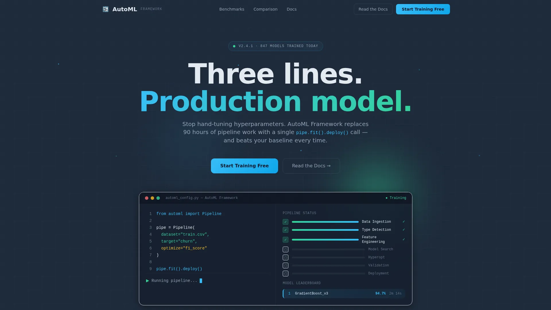
- An animated hero section with a typewriter code editor and a live-style pipeline dashboard mock
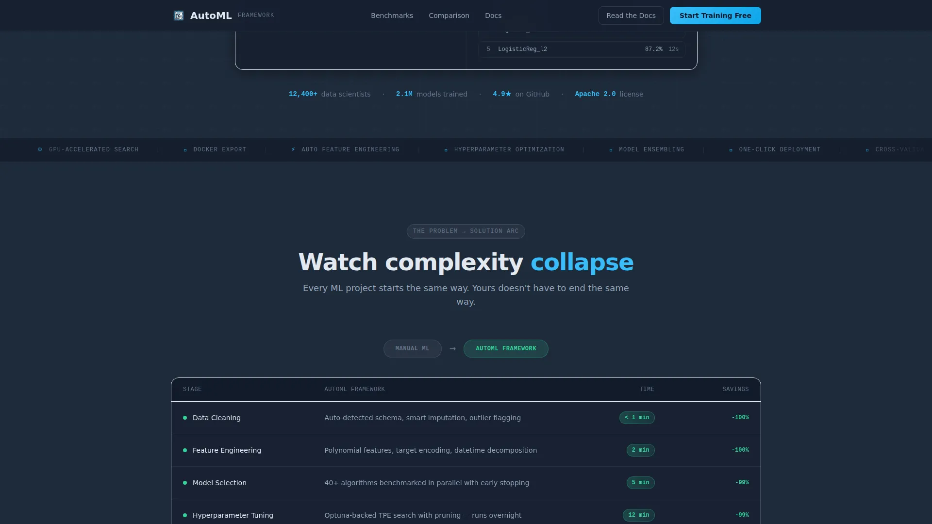
- A morphing comparison table that transitions from a 90-plus-hour manual workflow to an automated one with collapsed steps
- Benchmark tables, a social proof section, dual call-to-action placements, and a footer in the Vercel horizontal flow pattern
Feature list
This template packages several high-interactivity components that are uncommon in standard landing page kits.
Animated Interactive Hero
The header drops visitors into a functioning dashboard mock. A dataset loads, columns auto-detect their types, and a model leaderboard populates with accuracy scores ticking upward. A blinking cursor in a minimal code editor types a three-line configuration character by character while pipeline stages light up green on the right panel.
Morphing Comparison Table
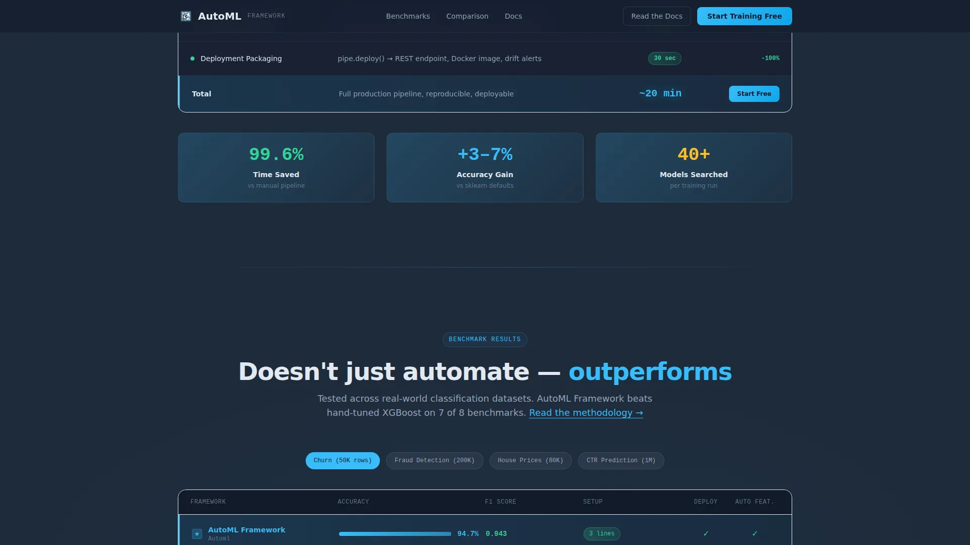
The pain-sequence table lists every stage of a manual machine learning workflow, from data cleaning and feature engineering through hyperparameter search and deployment, with time estimates that stack to over 90 hours. The table then transitions: the same stages reappear with automated badges, collapsed steps, and a total time column that shrinks to single digits.
Benchmark Section with Highlighted Row
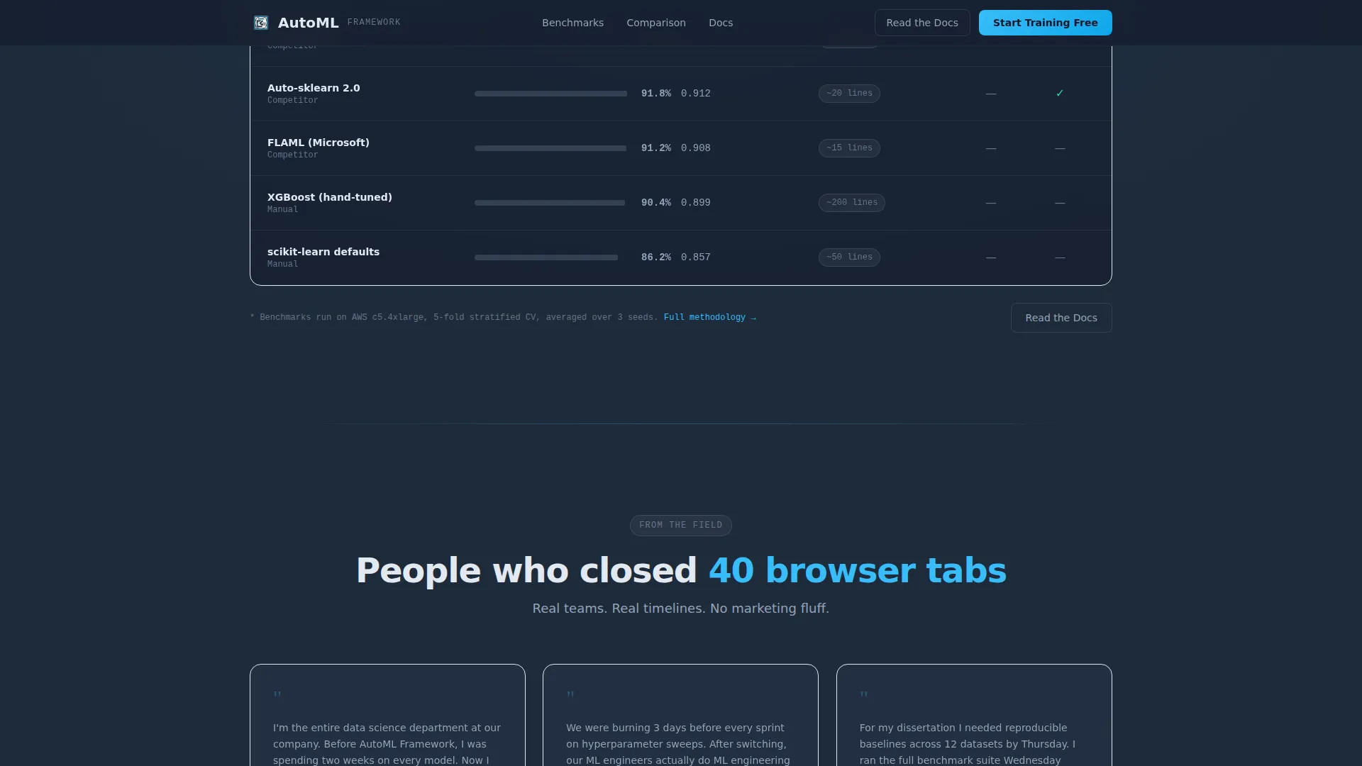
A structured benchmark table compares framework performance against common alternatives. The winning row is highlighted in sky blue, making the value difference immediately visible without requiring the visitor to interpret raw numbers.
Scroll-Triggered Section Reveals
Pipeline stage reveals, counter animations, and hover spotlight effects are triggered by scroll position using an Intersection Observer approach. Animations use GPU-accelerated transforms to keep motion smooth and purposeful.
Dual Call-to-Action System
The primary call to action, labeled "Start Training Free," appears in three locations: pinned in the header navigation, inside the comparison table's winning row, and as a full-width block after the benchmark section. A secondary "Read the Docs" link sits beside every technical claim.
Social Proof with Role-Specific Testimonials
A dedicated testimonials section includes specific metrics, company logos, and role titles. This gives the page credibility signals that resonate with a technical audience evaluating a production tool.
Page sections overview
| Section | Purpose |
|---|---|
| Hero Dashboard Mock | Demonstrates the framework live with animated typewriter config and pipeline visualization |
| Pain Workflow Table | Shows the 90-plus-hour manual machine learning process in detail |
| Solution Table Morph | Transforms the pain table into the automated equivalent with time collapse |
| Benchmark Comparison | Compares accuracy and speed against common alternatives, with the winning row highlighted |
| Social Proof | Builds trust through testimonials with metrics, titles, and logos |
| Call to Action Block | Full-width "Start Training Free" section with secondary "Read the Docs" link |
| Footer Pattern | Vercel horizontal flow with dot separators |
Design & branding system
The visual identity follows a Dashboard Pro theme built around a Slate and Sky color system. Every design decision reinforces the IDE-at-2-AM aesthetic: dark enough to live in, precise enough to read every edge.
- Deep graphite slate (#1E2A3A) for primary backgrounds, mid-tone steel (#475569) for secondary panels, sky blue (#38BDF8) for interactive accents and active table cells, and pale cloud white (#F0F4F8) for surface cards and table rows
- Typography uses DM Sans for body text and JetBrains Mono for code samples and numerical data, keeping the technical tone consistent throughout
- The single electric blue accent pulls the eye to every point of execution: active benchmark rows, call-to-action buttons, and pipeline stage indicators
Mobile & speed optimization
The template is desktop-first, reflecting the working environment of its primary audience. Machine learning engineers and data scientists typically evaluate tools on large screens, so the layout prioritizes wide viewport clarity.
- Responsive behavior is built in so the page remains usable and readable on smaller screens without breaking the comparison table structure
- Animations rely on GPU-accelerated transforms and Intersection Observer triggers, keeping motion lazy-loaded and tied to scroll position rather than running all at once on page load
How this template helps you convert
Every structural decision in this template is designed to reduce friction and move a skeptical technical visitor toward signup.
- The hero animation demonstrates the product in the first seconds without requiring the visitor to read a word, establishing immediate credibility with an audience that values showing over telling.
- The morphing comparison table makes the value proposition visceral: watching 90-plus hours collapse to single digits is more persuasive than any headline claim, and it positions "Start Training Free" as the natural next step.
- The dual call-to-action system with a pinned header button and a full-width closing block means a motivated visitor never has to scroll back up to convert, while the "Read the Docs" secondary link keeps trust-sensitive engineers engaged rather than bouncing.
Other information about this template
This template is part of a broader category of developer tool and machine learning infrastructure landing pages. It is particularly well-suited for automated machine learning platforms, AutoML tools, and artificial intelligence framework products targeting technical buyers.
- The page routes the primary call to action to a signup flow with GitHub OAuth, keeping friction low for developers who already use version control as their identity layer
- The footer uses a Vercel-inspired horizontal flow pattern with dot separators, a visual reference that signals modern developer-tool credibility to the target audience
- The template style is classified as a Comparison Table layout, meaning the narrative spine is built around structured data contrasts rather than feature grids or storytelling prose
- Color tokens and typography choices are designed to be swapped at the system level, so teams can retheme the page to match their own brand while preserving the layout logic
Theme
Dashboard Pro
Creative direction
Problem→Solution Arc
Color system
Slate & Sky
Style
Comparison Table
Direction
Click-Through
Page Sections
Animated Hero Dashboard Mock
Morphing Pain-to-solution Table
Benchmark Comparison Table
Scroll-triggered Reveal Animations
Dual Call-to-action Placement
Role-specific Social Proof Section
Related questions
Is this template suitable for a technical product with complex features?
Does this template include a lead capture form?
Can I update the comparison tables with my own workflow stages and benchmark data?
What animation effects are included in this template?
Is this template desktop-first or mobile-first?



