Managed Service Landing Page Template
The AutoML landing page template is built for managed machine learning service providers. It opens with an animated metrics dashboard, flows through an interactive card grid comparing automated pipelines against manual approaches, and closes every section with a benchmark conversion path. The design follows a Tech Glass aesthetic in Midnight Blue, cold, purposeful, and built to earn trust from technical buyers fast.
by Rocket studio
Quick summary
This single-page template is designed for AutoML managed service providers targeting data-science leads, machine learning engineers, and technology decision-makers. It opens with live animated metrics, walks visitors through a versus-style card grid, and converts through a personalized benchmark qualifier. The visual language is dark, precise, and technical, built to resonate with people who live in terminals.
Who this template is for
This template speaks directly to teams that know the cost of unfinished pipelines. It is designed for companies offering automated machine learning services to a technical, skeptical audience.
- Data-science leads at mid-market software-as-a-service companies who are understaffed and overcommitted
- Machine learning engineers buried in pipeline maintenance and infrastructure debt
- Chief technology officers who have watched proof-of-concept projects fail before reaching a usable endpoint
What problem this template solves
Selling a technical managed service is hard when buyers have already been burned by manual pipelines. This template addresses that skepticism visually and structurally before asking for anything.
- Visitors arrive already frustrated, the page shows the cost of their current approach through live metrics and comparison cards, not marketing claims
- Generic landing pages fail technical buyers who want to assess capability, not read copy, the interactive explorer lets visitors build conviction with their own hands
- Conversion forms often appear too early, this template earns the click by making the gap between manual and automated pipelines undeniable first
What you get with this template
You get a fully structured, single-page layout built around one conversion goal: booking a personalized pipeline benchmark. Every section is a deliberate step toward that outcome.
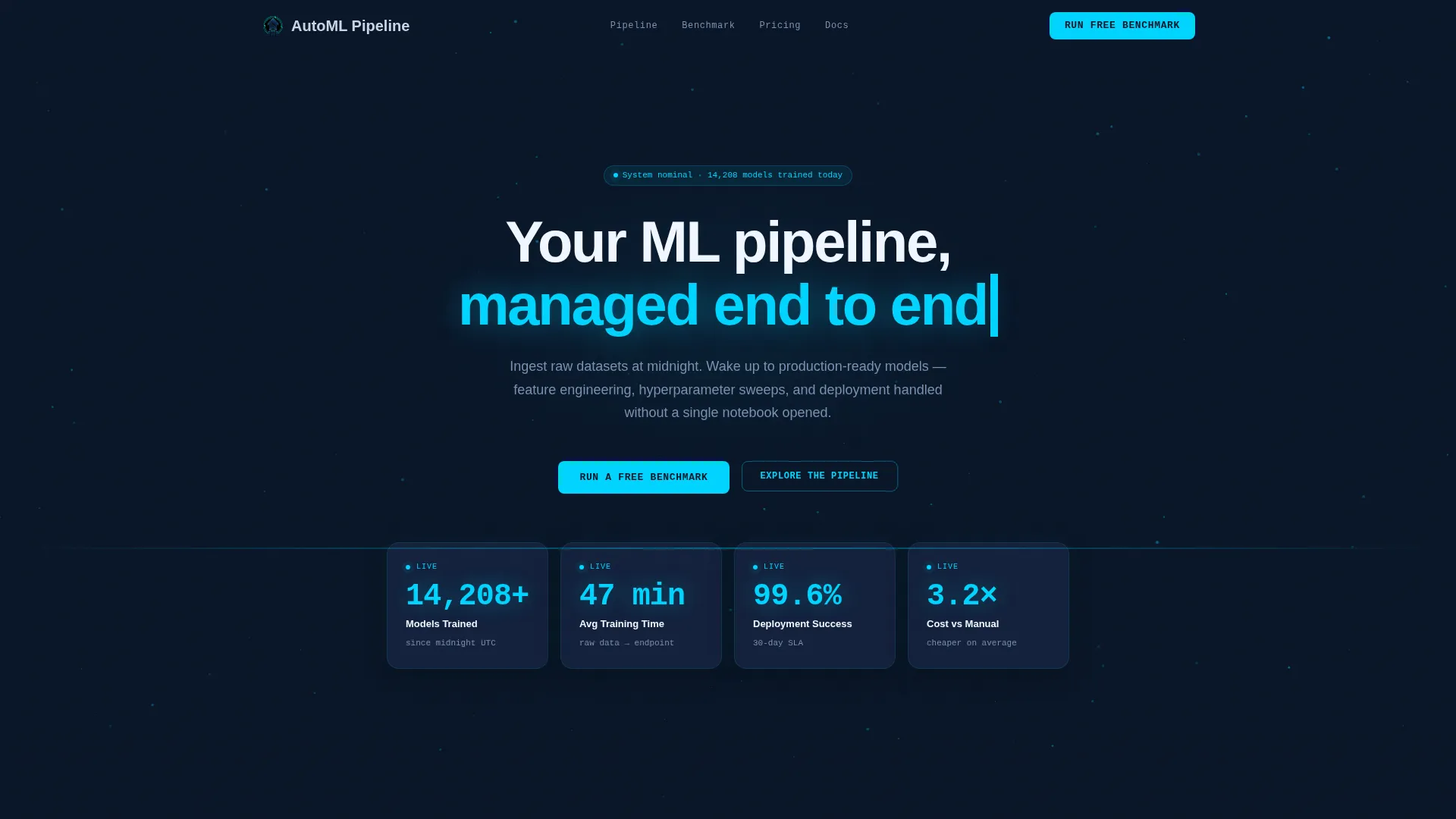
- An animated Stats and Metrics header with four live-counter cards showing models trained, average training time, deployment success rate, and cost comparison
- A modular card grid with a versus section, a drag-to-arrange architecture explorer, and secondary calls to action on every comparison card
- A persistent sticky bar and qualifier form that generates a personalized benchmark report delivered to the visitor's inbox
Feature list
This template ships with a set of purpose-built components tied directly to the AutoML managed service use case.
Animated Metrics Dashboard Header
The header is not a static hero. It displays four frosted-glass metric cards with eased counter animations: models trained at 14,208 and counting, average training time of 47 minutes, deployment success rate at 99.6 percent, and cost at 3.2 times cheaper than manual pipelines. A particle grid drifts behind the cards to reinforce the sense of live data in motion.
AutoML versus Manual Pipeline Card Grid
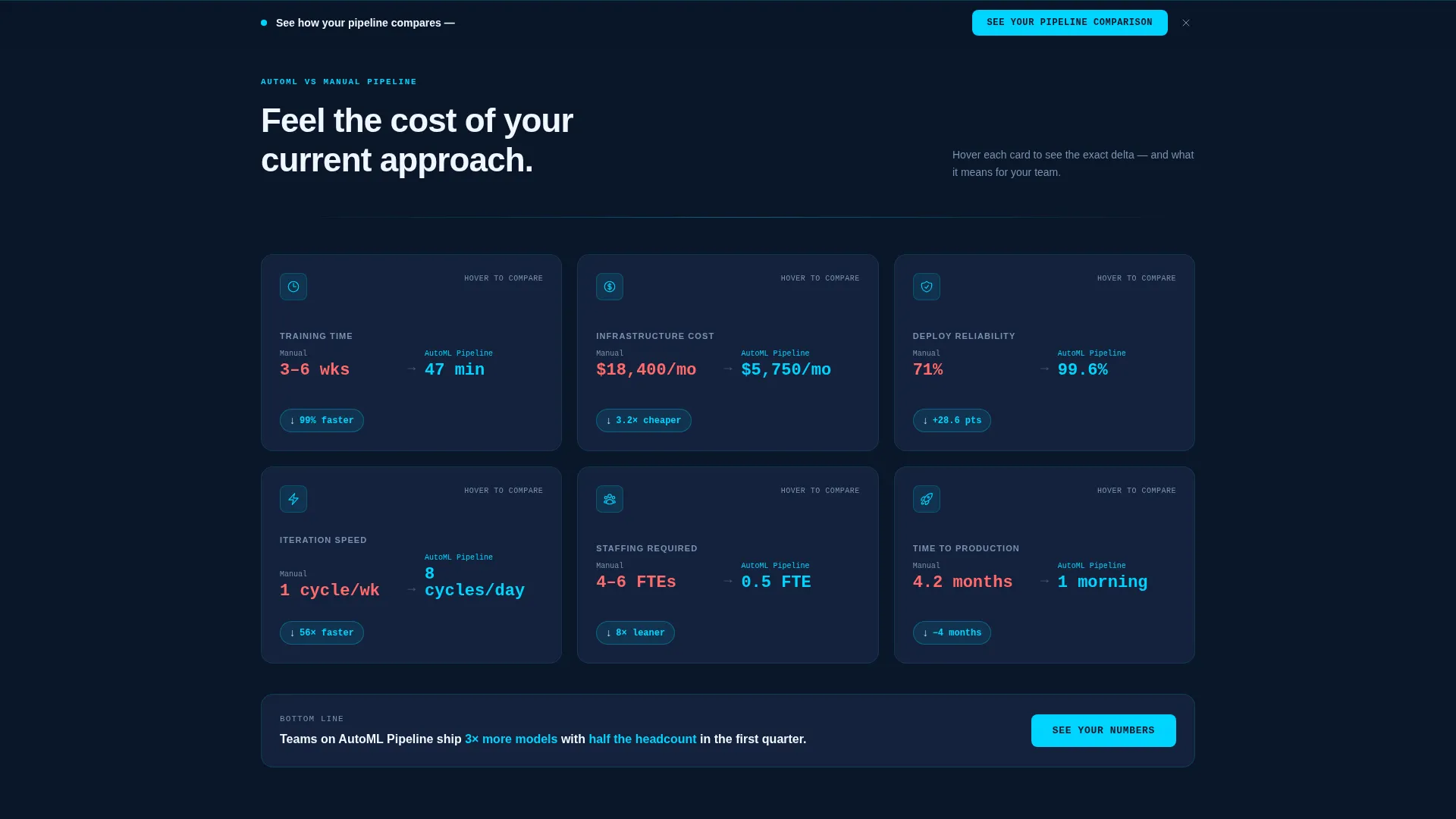
The first card row presents six head-to-head comparison dimensions: training time, infrastructure cost, deployment reliability, iteration speed, staffing requirement, and time to production. Each card flips on hover to reveal the performance delta. The layout is modular so each card works independently in the grid.
Drag-and-Arrange Architecture Explorer
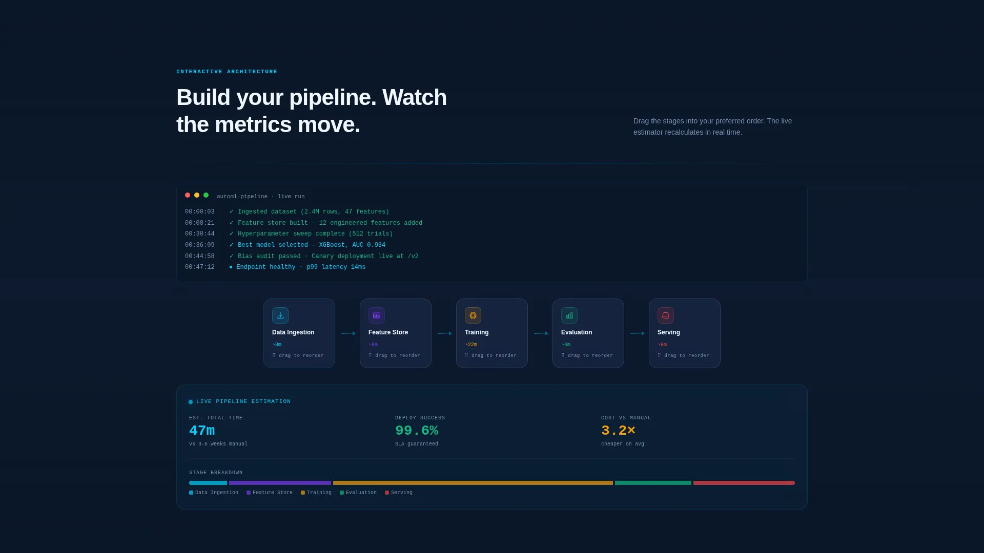
Visitors can rearrange pipeline architecture cards covering ingestion, feature store, training, evaluation, and serving into a custom sequence. As they reorder the components, estimated metrics update live. This interaction replaces a static product explainer with a hands-on demonstration.
Persistent Sticky Conversion Bar
A sticky bar stays visible throughout the scroll and reads "See Your Pipeline Comparison." Clicking it opens a short qualifier asking for current stack, team size, and monthly training runs. Submitting the form triggers a personalized benchmark report sent directly to the visitor's inbox.
Frosted-Glass Card Surfaces
Every content card uses a translucent panel surface with a frosted-glass blur effect. The treatment creates visual depth without photography. Cards feel like they are floating inside a dark server room, which reinforces the premium, technical brand identity of the service.
Secondary Call-to-Action on Every Versus Card
Each comparison card carries a secondary "Run a Free Benchmark" link that feeds into the same qualifier form as the sticky bar. This gives technically-minded visitors a low-friction entry point while they are already engaged with the data.
Page sections overview
| Section | Purpose |
|---|---|
| Animated Metrics Header | Opens with live counters to establish credibility immediately |
| AutoML versus. Manual Grid | Shows the performance gap across six pipeline dimensions |
| Card Flip Comparison | Reveals delta values on hover to make the cost of status quo tangible |
| Architecture Explorer | Lets visitors drag pipeline stages and see estimated metrics update |
| Sticky Benchmark Bar | Keeps the primary conversion path visible throughout the entire scroll |
| Benchmark Qualifier Form | Captures stack, team size, and training volume to generate a report |
Design & branding system
The template uses a Tech Glass visual identity built entirely on the Midnight Blue color system. The palette is intentional and technical, nothing decorative, every glow functional.
- Deep terminal navy (#0A1628) as the primary page background, translucent panel blue (#1B2A4A) for card surfaces with frosted-glass blur, electric cyan (#00D4FF) for live data accents and interactive hover states, and cool silver (#C8D6E5) for body text
- No hero images or stock photography, the animated metrics dashboard and interactive card grid serve as the primary visual content
- Particle grid animation drifts behind the header metrics to suggest live data in transit without adding visual noise
Mobile & speed optimization
The card grid layout is modular by design. Each component is self-contained, which keeps the layout adaptable across screen sizes without breaking the interaction hierarchy.
- The frosted-glass card system scales cleanly across viewport widths, with each card maintaining its flip and hover behavior at smaller sizes
- The sticky conversion bar remains accessible throughout the scroll on both desktop and mobile viewports
- The particle grid and counter animations are lightweight visual effects, not media-heavy assets, which keeps the page feeling fast even on the first load
How this template helps you convert
Every design and layout decision in this template feeds the same outcome: getting the right visitor to submit the benchmark qualifier form.
- The animated header metrics establish instant credibility by showing real numbers before the visitor reads a single marketing sentence, lowering skepticism at the earliest possible moment.
- The versus card grid and architecture explorer let visitors diagnose their own pipeline gap through interaction rather than persuasion, so by the time they reach the sticky bar they already understand the value.
- The persistent sticky bar and secondary card-level calls to action create multiple low-friction entry points to the same qualifier form, removing the need for a visitor to scroll back to convert.
Other information about this template
This template is built specifically for the AutoML managed service category within the broader AutoML technology space. It is suitable for teams positioning against both build-it-yourself pipeline approaches and competing managed platforms.
- The qualifier form dropdown covers common current-stack options including SageMaker, Vertex AI, Databricks, and custom-built pipeline environments, making the benchmark feel immediately relevant to real buyers
- The six-dimension versus framework maps directly to the metrics technical buyers use to justify platform decisions: cost, time, reliability, speed, staffing, and time to production
- The template supports a comparison-led landing page strategy where the product demonstrates its own value through live data before making any direct ask
Theme
Tech Glass
Creative direction
Interactive Explorer
Color system
Midnight Blue
Style
Card Grid (Modular)
Direction
Comparison/Versus
Page Sections
Animated Metrics Dashboard Header
Automl Versus. Manual Pipeline Card Grid
Drag-and-arrange Architecture Explorer
Persistent Sticky Conversion Bar
Secondary Call to Action on Every Versus Card
Frosted-glass Modular Card System
Related questions
Who is this template designed for?
Does this template include real data or placeholder metrics?
How does the benchmark qualifier form work in this template?
Can I update the color scheme to match my brand?
Is this a one-page layout or a multi-page website?



