AVet — Animal Care System Landing Page Template
Triage is a modular, card-grid landing page template built for veterinary point-of-sale software. It combines a Data Command visual identity with an Interactive Explorer layout, letting clinic buyers tap through live-feeling demo cards before committing. The page drives app downloads with zero form friction, making it ideal for practice managers and clinic owners ready to modernize their checkout flow.
by Rocket studio
Quick summary
Triage is a single-page, card-grid landing page template designed for a veterinary point-of-sale system. It opens with a full-viewport product screenshot and unfolds into a modular interactive grid. Each card behaves like a mini-demo, letting visitors explore features before the primary call to action ever appears. The result is a page that earns trust through demonstration rather than description.
Who this template is for
This template speaks directly to the people running veterinary clinics day to day. It addresses their specific operational pressures without generic SaaS language.
- Practice managers coordinating multi-doctor schedules and high-volume patient checkout flows
- Clinic owners scaling from one location to two or three sites who need consistent tooling across all desks
- Front-desk veterinary technicians handling simultaneous transactions, prescription queues, and follow-up bookings
What problem this template solves
Veterinary software landing pages often look like generic tech products. They fail to show clinic staff how the tool actually fits their workflow. Triage fixes that.
- Visitors cannot visualize how a POS system handles insurance splits, pharmacy queues, and microchip lookups in one transaction
- Generic feature lists do not build the hands-on confidence that clinic buyers need before downloading or trialing new software
- Long sign-up forms create friction for front-desk staff visiting the page from a clinic device during a shift
What you get with this template
You get a fully structured, single-page layout built around interactive demonstration and a frictionless app-download path. Every section is purposeful and prompt-backed.
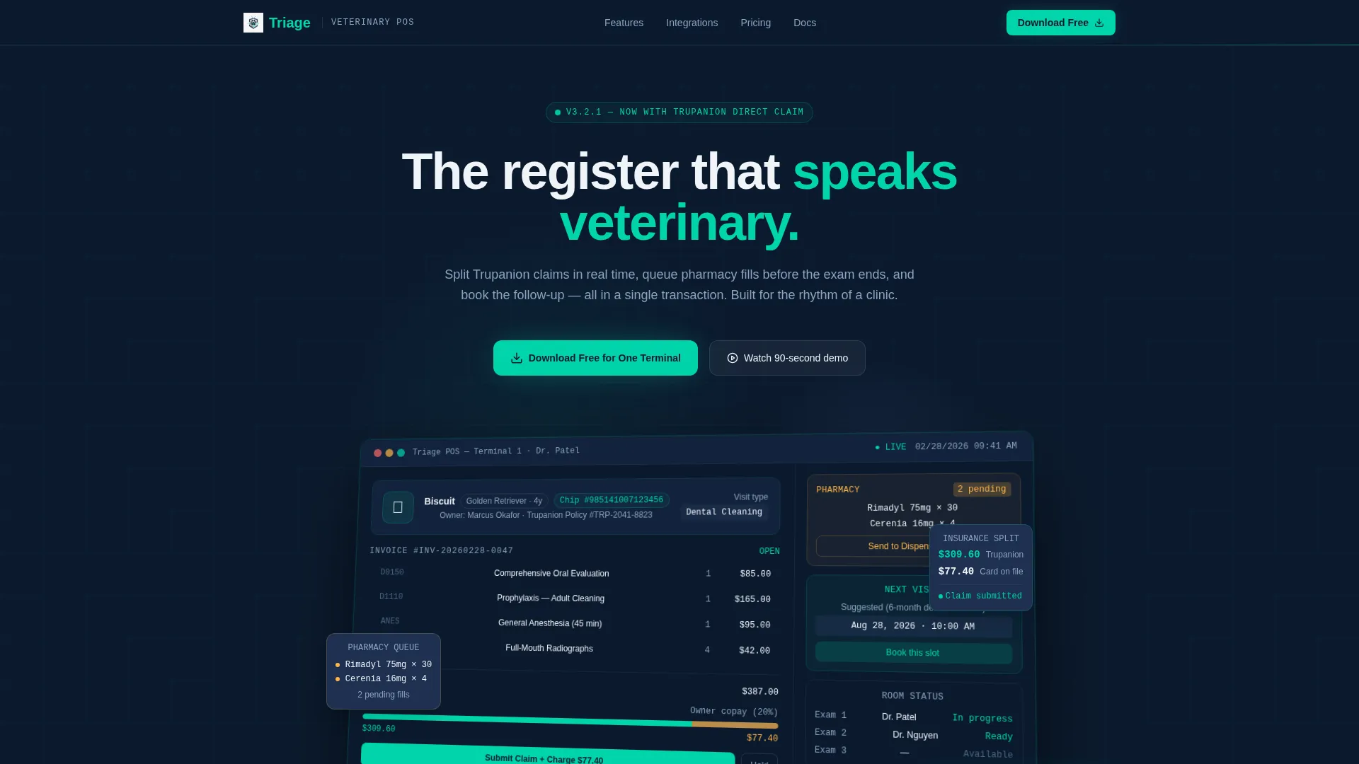
- A full-viewport product screenshot header showing a real mid-transaction POS dashboard with patient name, insurance split, pharmacy queue, and appointment widget
- A modular card grid where each card is a self-contained, clickable demo covering inventory, insurance split-payment, and multi-location sync
- A sticky bottom call-to-action bar and an inline QR code card, both directing visitors to download the app with no form fields required
Feature list
This template ships with purpose-built components drawn directly from the veterinary POS use case. Each one does a specific job.
Full-Viewport POS Screenshot Header
The header fills the entire screen with a product dashboard screenshot showing a live-looking transaction. It features patient data for "Biscuit (Golden Retriever, 4y)", a $387 invoice split between Trupanion insurance and owner card-on-file, a pharmacy queue badge with two pending fills, and a next-appointment suggestion widget. The screenshot sits on a subtle isometric tilt with a soft shadow lifting it off the midnight background.
Interactive Modular Card Grid
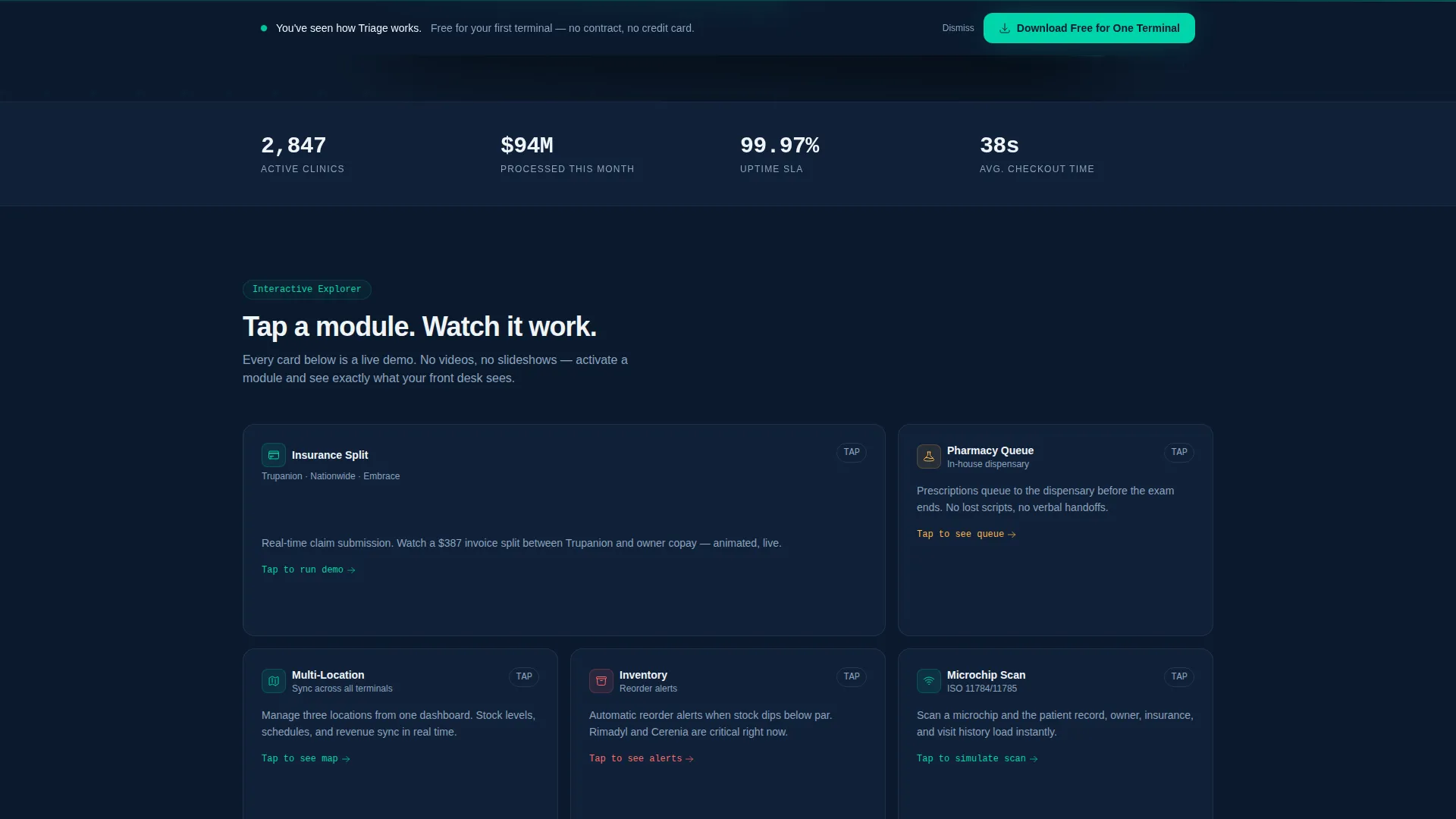
The core of the page is a grid of clickable demo cards. Each card expands or animates when tapped, revealing a self-contained feature demo. The Inventory card shows reorder alerts for specific medications. The Insurance card plays a split-payment animation. The Multi-Location card renders a mini-map with three clinic pins and synced stock levels.
Sticky App Download Call to Action
After the visitor has interacted with three or more cards, a pinned bar appears at the bottom of the viewport. It carries the primary call to action: "Download Free for One Terminal." The placement rewards exploration and targets visitors who have already self-qualified through engagement.
Inline QR Code Install Card
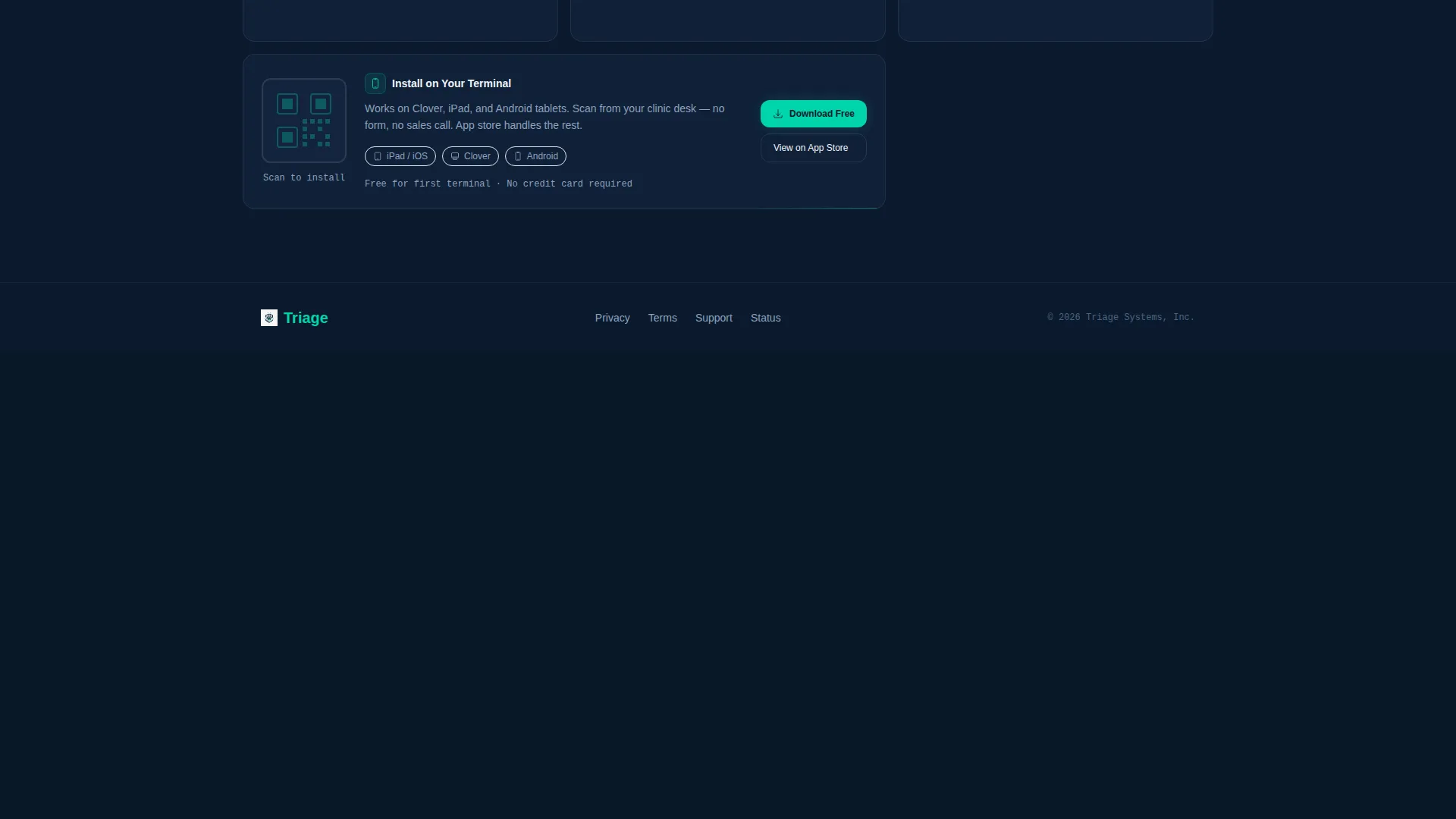
A dedicated card inside the grid displays a QR code labeled "Scan to install on your Clover or iPad." This removes all friction for clinic staff visiting the page from a mobile device or tablet already at their desk. No redirects, no forms.
Data Command Visual Theme
The template applies a midnight-blue color system built for information density and clinical authority. Teal highlights fire on interactive states only, keeping the visual hierarchy clear and purposeful throughout the page.
Page sections overview
| Section | Purpose |
|---|---|
| Viewport Header Screenshot | Anchors the page with a real-looking mid-transaction POS dashboard |
| Interactive Card Grid | Lets visitors self-explore feature demos by tapping modular cards |
| Inventory Demo Card | Shows live reorder alerts for clinic medications |
| Insurance Split Card | Animates a real-time insurance and copay split-payment flow |
| Multi-Location Map Card | Renders a three-clinic pin map with synced stock levels |
| QR Code Install Card | Provides a direct scan-to-install path for Clover and iPad |
| Sticky call to action Bar | Pins the primary app download prompt after card exploration |
Design & branding system
The visual identity follows a Data Command theme. Every color decision supports clarity, authority, and interactivity without visual noise.
- The midnight-blue palette uses four values: deep terminal navy (#0B1A2E) for backgrounds, clinical slate (#1E3050) for content-tier separation, sterile white (#F0F4F8) for all body text and labels, and pulse-bright teal (#00D4AA) reserved strictly for interactive states and live data accents
- Teal appears only on toggles, hover states, and active metric cards, keeping the page calm until the visitor takes action
- The isometric header tilt and soft card shadows create physical depth against the dark background, giving the layout a sense of weight and precision
Mobile & speed optimization
The modular card grid is built to work across device sizes. Clinic staff often visit on a tablet or phone during a shift, so the layout adapts naturally.
- Cards reflow into a single-column stack on smaller screens, keeping each demo interaction accessible without horizontal scrolling
- The QR code card is placed within the natural scroll path so mobile visitors encounter it before reaching the sticky call-to-action bar
- The isometric header image uses a soft shadow treatment that scales cleanly across both retina displays and standard clinic monitors
How this template helps you convert
This template is engineered to convert through demonstration, not persuasion. Visitors play before they commit.
- The interactive card grid lets buyers experience the product's core capabilities firsthand, building hands-on confidence that a static feature list cannot replicate
- The sticky call-to-action bar appears only after meaningful engagement, targeting visitors who have already shown intent through card interactions rather than interrupting cold visitors
- The inline QR code card eliminates the biggest barrier for clinic staff by turning a tablet visit into an immediate install with a single scan
Other information about this template
This template is part of a broader veterinary software and SaaS category. It is well suited to any POS product serving the animal health space.
- The card grid layout is modular, meaning individual cards can be reordered, swapped, or expanded to highlight different features depending on the product's current marketing focus
- The page is designed for an app-download conversion path, making it a natural fit for software distributed through mobile app stores or device-specific marketplaces like the Clover App Market or the Apple App Store for iPad
- The template style aligns with the Data Command theme and Interactive Explorer creative direction, a combination suited to data-dense software products where showing beats telling

Theme
Data Command
Creative direction
Interactive Explorer
Color system
Midnight Blue
Style
Card Grid (Modular)
Direction
App Download
Page Sections
Full-viewport POS Screenshot Header
Interactive Modular Card Grid
Sticky App Download Call to Action
Inline QR Code Install Card
Data Command Visual Identity
Related questions
What type of businesses is this template designed for?
Does this template require a sign-up form to convert visitors?
Can the interactive card grid be customized for different features?
What devices does this landing page layout support?



