Physics Education Advanced Professional Website Template
Axiom is a single-page physics practice landing page template built for apps that put serious exam preparation front and centre. It opens with a three-step diagnostic form, then walks visitors through a personalised study sequence using an alternating zigzag layout. The result is a page that demonstrates the product's intelligence before it asks for anything.
by Rocket studio
Quick summary
Axiom is a physics practice and quiz app landing page template with a strong institutional feel. It opens with a compact multi-step diagnostic form and unfolds through four alternating content sections. Each section moves the visitor from diagnosis to mastery, mirroring the study loop the app itself delivers. The design is calm, purposeful, and built around the student's workflow.
Who this template is for
This template is designed for education products that need to earn trust before they ask for a sign-up. It speaks directly to the people who built the app and the people who will use it.
- Physics app founders and developers who want a landing page that shows the product in action rather than describing it.
- Students at secondary, undergraduate, and postgraduate levels who are evaluating whether a practice tool is worth their time.
- Lecturers and educators who need a vetted question bank and want to see the depth of the content before committing.
What problem this template solves
Physics students often land on app pages that feel like marketing brochures. They see feature lists and testimonials but never get a sense of how the tool actually works under pressure. This template solves that gap.
- It replaces a passive sales page with an active diagnostic experience, so visitors feel the product working from the first scroll.
- It removes friction from the sign-up path by offering a free 200-question sample before asking for an email address.
- It gives educators a clear view of question depth, tagging logic, and exam-simulation capability without requiring a full trial.
What you get with this template
You get a fully structured, single-page layout built around the specific workflow of a physics exam preparation app. Every section has a defined purpose and a clear visual treatment.
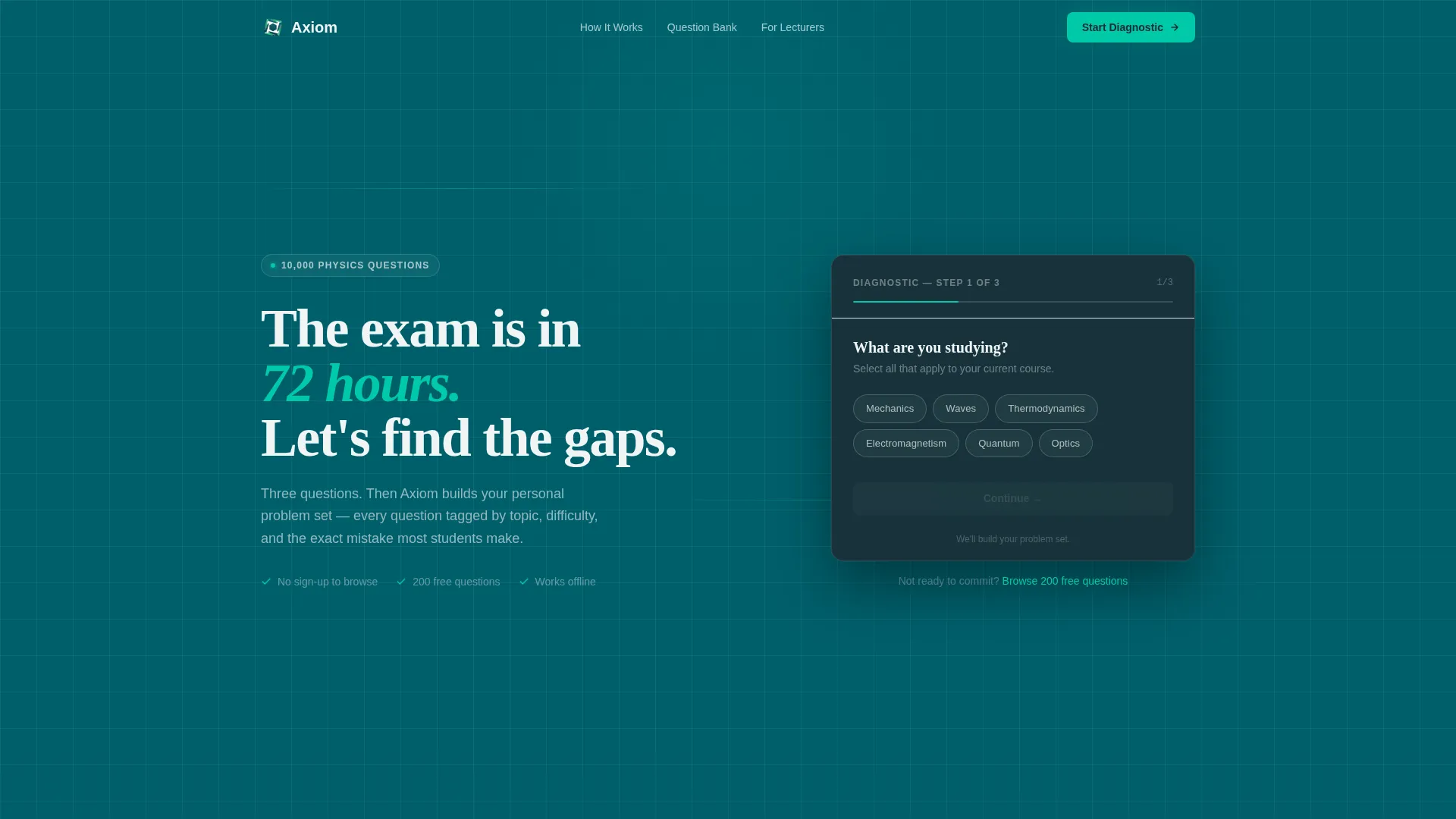
- A three-step multi-step form in the header that collects topic, level, and exam date before surfacing the primary call to action.
- Four zigzag content sections covering topic mapping, the hint system, progress tracking, and exam simulation mode.
- A sticky bottom bar call to action and a secondary free-access path woven into each topic section.
Feature list
The following features are built into this template's layout and interaction design.
Three-Step Diagnostic Header Form
The header replaces a standard hero with a compact, horizontal progress bar form. Step one selects a physics topic using pill-shaped buttons. Step two sets the student's level. Step three picks an exam date. The final step surfaces the primary call to action: "Start Your Diagnostic."
Zigzag Alternating Section Layout
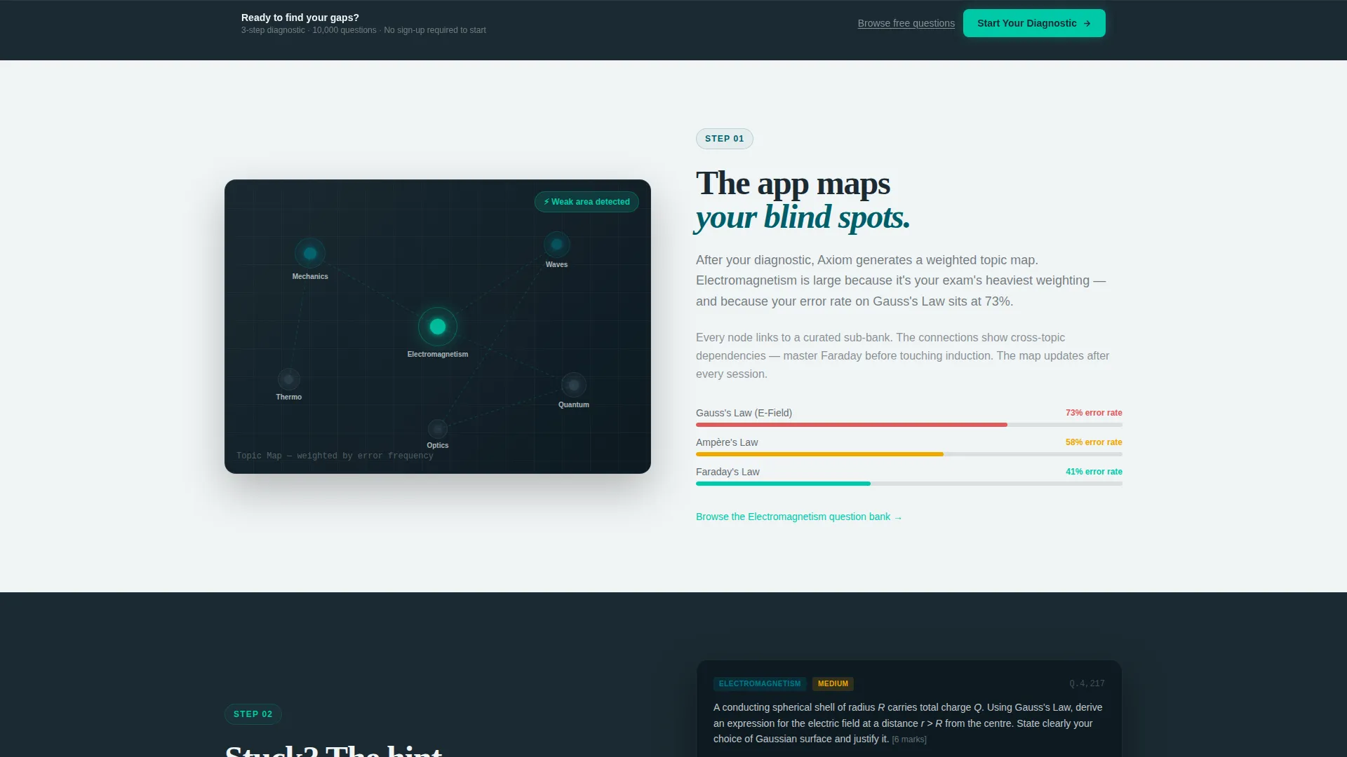
Four content sections alternate left and right across the page. Each section represents one stage of the app's study loop: topic mapping, layered hints, progress dashboards, and exam simulation. The rhythm mirrors how the app itself works, making the layout feel like a demonstration rather than a description.
Layered Hint System Showcase
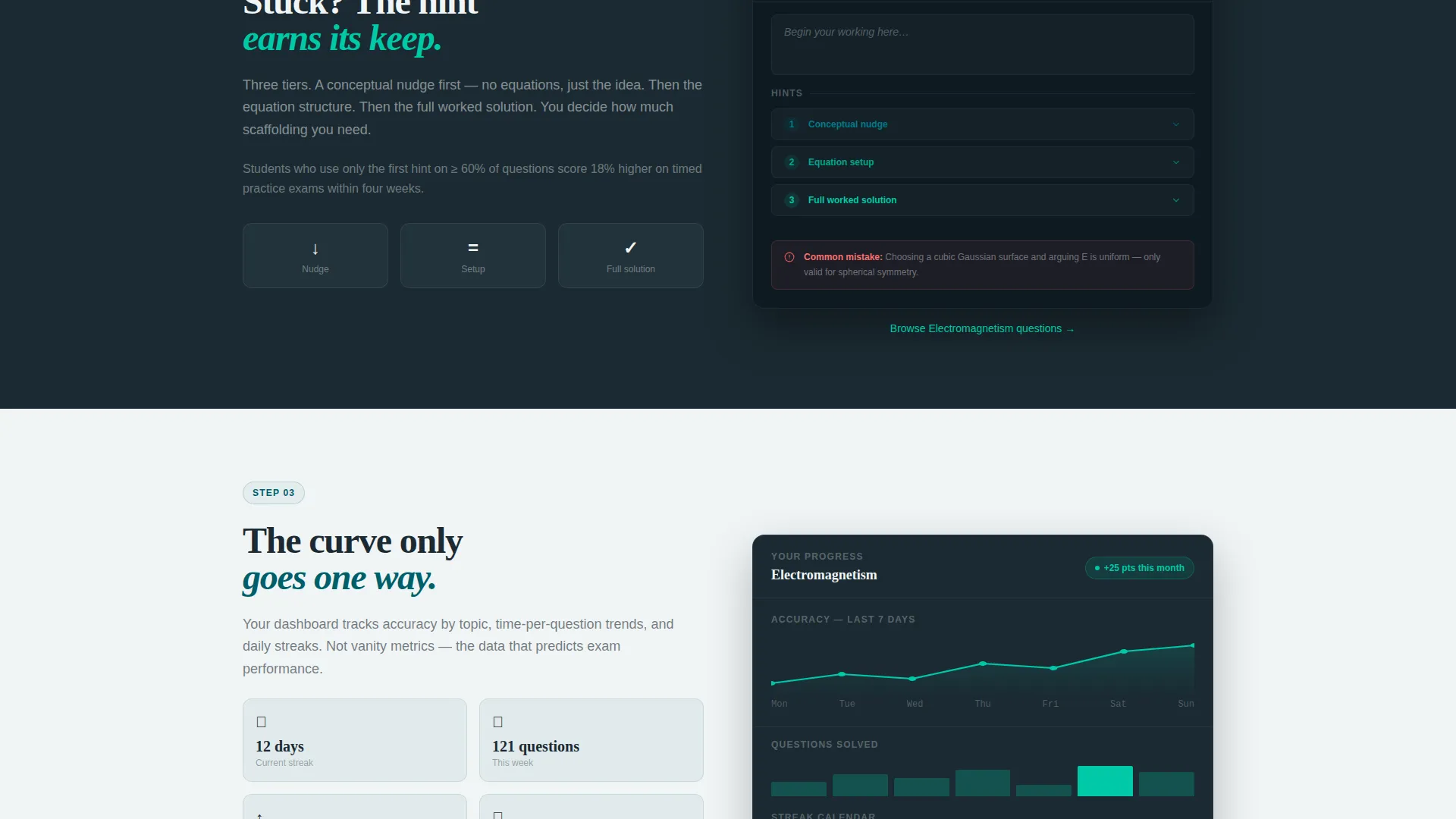
One section displays a sample question mid-solve with a hint drawer visibly open. The drawer shows three hint levels: a conceptual nudge, an equation setup, and a full worked solution. This gives visitors a direct view of how the app supports learning without giving answers away.
Progress Dashboard Visual
A dedicated section shows a simulated progress dashboard with streaks, accuracy curves, and time-per-question trends plotted over a representative month. This communicates long-term value to students who are deciding whether consistent practice will produce measurable improvement.
Exam Simulator Section
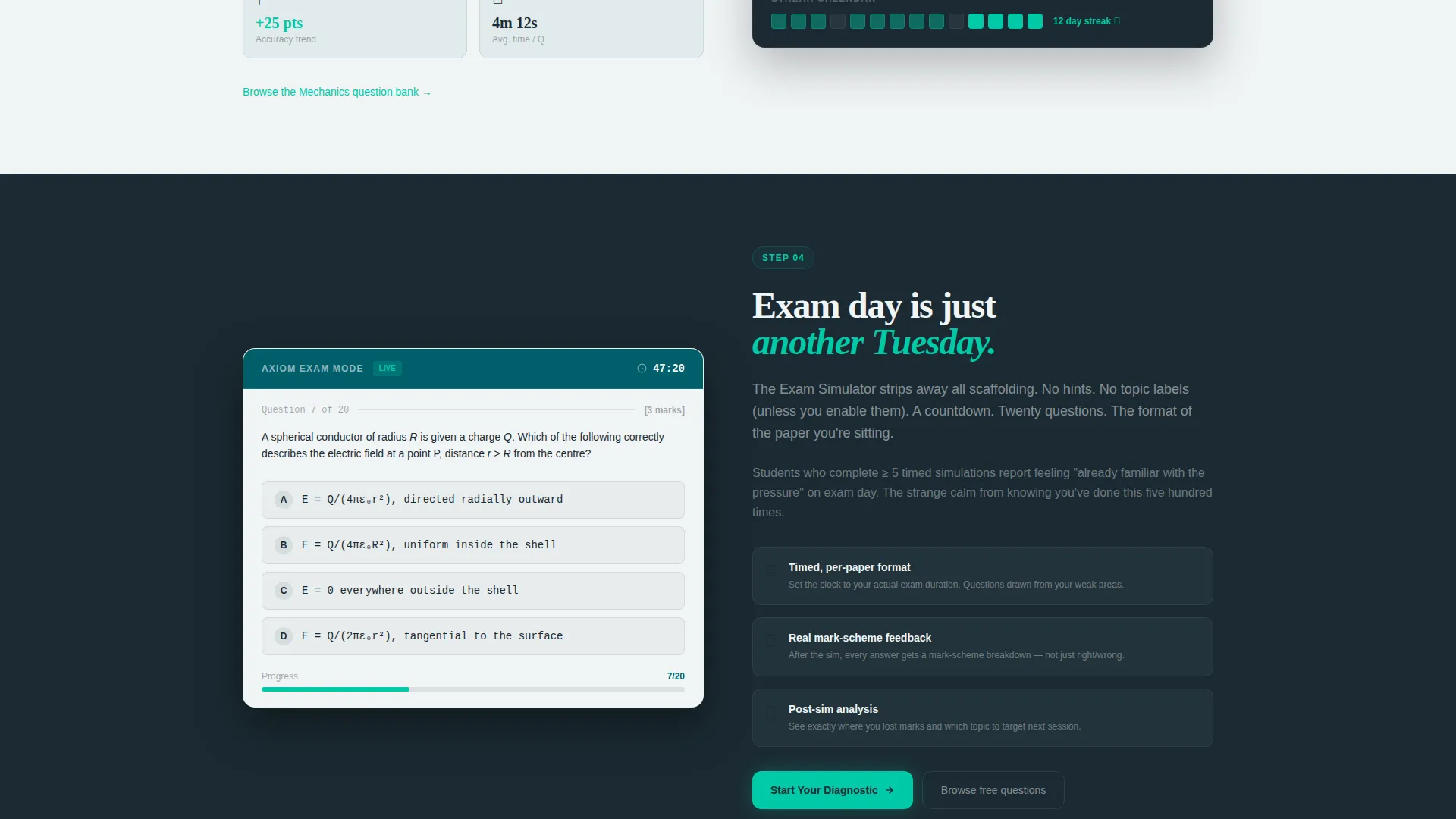
The final zigzag section presents the Exam Simulator mode with a visible countdown clock and a question formatted to match a real exam paper. It reassures students and educators that the timed practice environment is authentic, not a simplified version of the real thing.
Sticky Call-to-Action Bar
After the visitor scrolls past the second content section, a sticky bar appears at the bottom of the viewport. It carries the primary call to action in catalyst green and stays visible throughout the remainder of the page without obscuring content.
Page sections overview
| Section | Purpose |
|---|---|
| Diagnostic header form | Captures topic, level, and exam date in three steps before showing the primary call to action |
| Topic map section | Shows the app generating a weighted topic map from the diagnostic results |
| Hint drawer section | Displays a sample question mid-solve with the three-tier hint system visible |
| Progress dashboard section | Presents simulated accuracy and streak data to communicate long-term study value |
| Exam simulator section | Shows the timed exam mode with a real-paper-style question and countdown clock |
| Sticky call to action bar | Persists the primary call to action after the visitor passes the second content section |
Design & branding system
The visual identity follows an Institutional Authority theme. It feels like a university science building at dusk: ordered, serious, and quietly alive.
- The colour palette uses deep lecture-hall teal (#005F6B) for headers and section dividers, chalkboard slate (#1B2A32) for text-heavy areas, bright catalyst green (#00C9A7) for interactive states and correct-answer moments, and chalk-dust white (#F0F4F5) for backgrounds and breathing room.
- Teal dominates the structural elements, slate grounds the body text, and catalyst green fires only when something is accomplished or interactive, keeping the page from ever feeling cluttered.
Mobile & speed optimization
The template is structured to remain usable and readable on smaller screens without sacrificing the density of information that serious students expect.
- The three-step header form collapses cleanly on mobile, keeping the progress bar and pill selectors tappable and clearly spaced.
- The zigzag alternating layout stacks vertically on narrow viewports, preserving the step-by-step narrative flow even when left-right placement is not available.
How this template helps you convert
This template earns the conversion before it asks for one. Every section is ordered to lower resistance and build confidence in the product.
- The diagnostic form in the header puts the visitor inside the app's logic immediately. They select a topic, set their level, and choose an exam date before they have read a single line of marketing copy. By the time they reach "Start Your Diagnostic," the call to action feels like a natural next step, not a cold ask.
- The secondary free-access path, "Browse the Question Bank," appears as an underlined text link beneath each topic section. It directs visitors to a sample of 200 questions across all topics with no sign-up required. This path serves students who need proof before commitment and educators who are evaluating content quality.
Other information about this template
This template is part of a focused set of education and training landing page templates designed for content and resource destinations. A few additional details worth noting:
- The page is classified as a Content/Resource destination, meaning its primary job is to demonstrate value rather than describe it.
- The email capture is deliberately deferred. It is framed as "Save your results and pick up tomorrow," reducing the perceived cost of signing up.
- The template style is Zigzag/Alternating, a layout pattern well suited to step-by-step guides where each section builds on the previous one.
- The intersection match between the Institutional Authority theme, the Step-by-Step Guide creative direction, and the Physics Education subcategory is intentional and reinforced throughout the copy and colour choices.
Theme
Institutional Authority
Creative direction
Step-by-Step Guide
Color system
Teal Catalyst
Style
Zigzag/Alternating
Direction
Content/Resource
Page Sections
Three-step Diagnostic Header Form
Zigzag Alternating Section Layout
Layered Hint System Showcase
Progress Dashboard Visual
Exam Simulator Section
Sticky Call-to-action Bar
Related questions
Who is this landing page template designed for?
Can I customise the topic options in the diagnostic form?
Does the page require visitors to sign up before accessing content?
How does the sticky call-to-action bar behave?
Is this template suitable for a lecturer evaluating a question bank?



