Backbone — Enterprise IT Solutions Landing Page Template
Uptime is a dark-themed, modular landing page built for managed IT service providers targeting mid-market businesses. It opens with an interactive cost-comparison calculator, unfolds into a card grid packed with evidence, and closes prospects with a pinned call-to-action bar. The Dashboard Pro visual system makes every section feel like a live operations console.
by Rocket studio
Quick summary
Uptime is a single-page template designed for IT service companies competing for mid-market managed service contracts. The page opens with a real-time cost-comparison calculator, then walks visitors through a modular card grid that compares in-house IT against a managed partner across response time, security, scalability, and hidden costs. The result feels less like a brochure and more like a working dashboard.
Who this template is for
This template is built for managed IT service providers who sell to decision-makers at growing companies. It speaks directly to buyers who are weighing real operational risk, not just browsing for vendors.
- Operations directors at firms of roughly 200 people who recently lost their dedicated IT administrator
- Chief Financial Officers comparing the total annual cost of an internal hire against a managed IT contract
- Startup Chief Technology Officers who need compliance frameworks in place quickly but cannot justify building an in-house security team
What problem this template solves
Most IT services pages describe capabilities without helping the visitor quantify their own situation. Prospects arrive with a specific anxiety, such as cost uncertainty or security exposure, and leave without answers. This template addresses that gap head-on.
- Visitors rarely convert because they cannot see how managed IT costs compare to an internal hire in their specific context
- Generic service pages do not give procurement-minded buyers the structured evidence they need to build an internal business case
- Top-of-funnel visitors who want data but are not ready for a sales call have no low-friction path to stay engaged
What you get with this template
The template delivers a complete, conversion-focused landing page layout with every major section pre-structured and ready to customize. You get a coherent visual system and a logical content flow from first impression to lead capture.
- An interactive calculator header, a modular comparison card grid, quote blocks, and a sticky conversion bar all included as named sections
- A dark Dashboard Pro color system using deep terminal black, electric indigo, cool slate, and sharp cyan applied consistently across every element
- Two distinct conversion paths: a primary gated cost report request and a secondary PDF download requiring only an email address
Feature list
This template is built around a small set of carefully considered components. Each one earns its place by moving a skeptical buyer one step closer to a decision.
Interactive Cost-Comparison Calculator
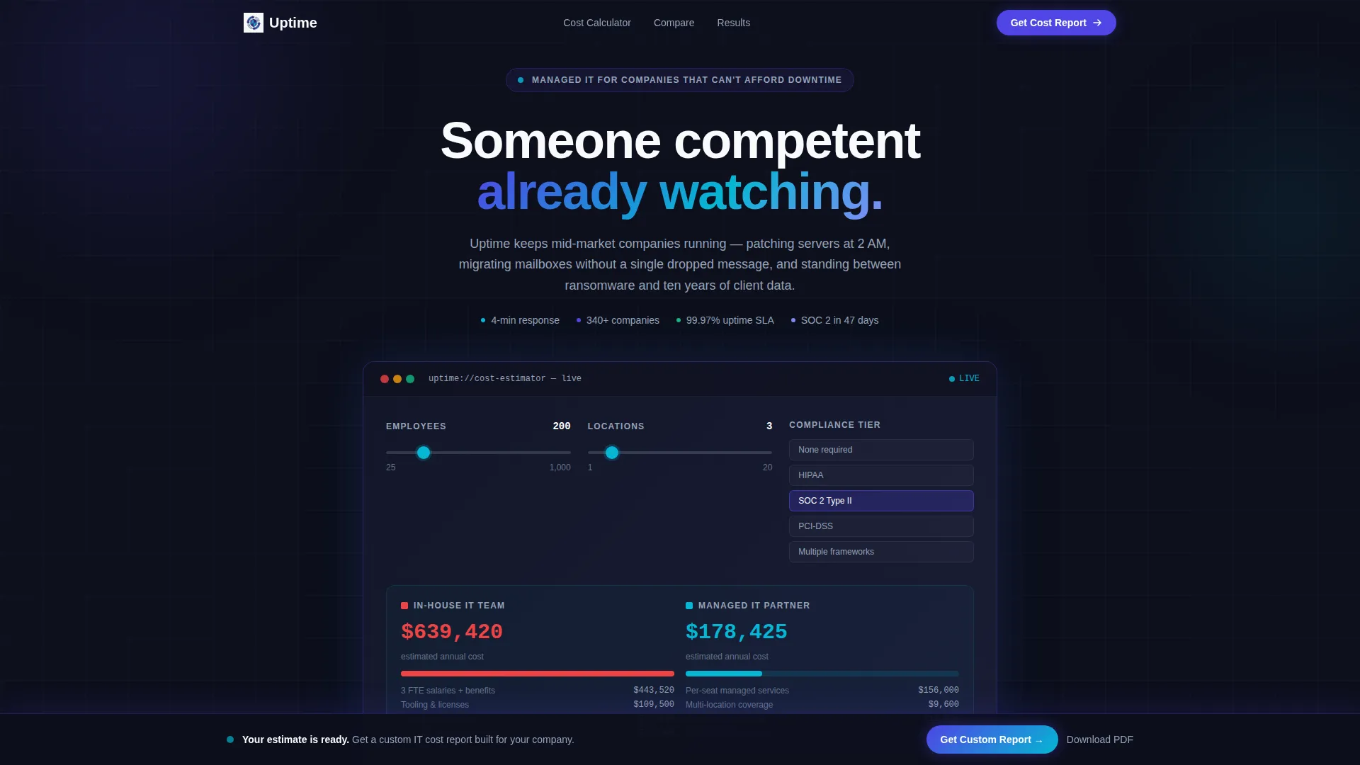
The header section contains a compact, two-column estimator tool. Visitors set employee count, number of locations, and compliance requirements using sliders, and the estimated annual cost updates in real time. A cyan accent pulses on each recalculation to confirm the update. A social-proof line below the tool reads "2,140 companies have run this estimate."
Modular Comparison Card Grid
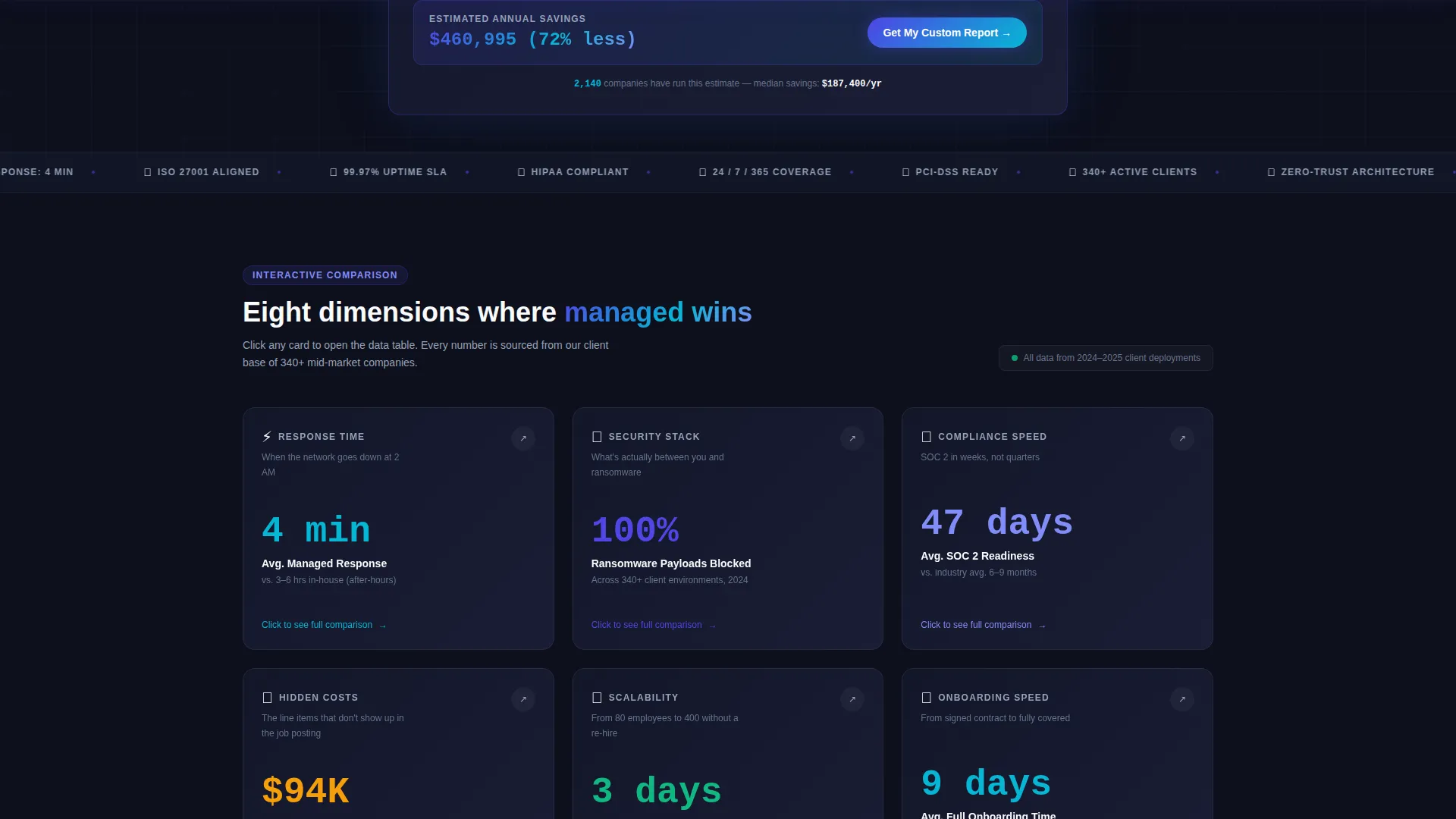
After the calculator, the page unfolds into a card grid where each card represents one comparison dimension: response time, security stack, scalability, hidden costs, and onboarding speed. Cards flip or expand on click to reveal data tables, mini-charts, and short case fragments. The rhythm alternates between evidence cards and quote blocks so the scroll feels like an investigation.
Sticky Primary Call-to-Action Bar
A slim sticky bar appears after the calculator interaction. It asks for company size, current IT setup via a dropdown, and a work email address. The primary action is "Get Your Custom IT Cost Report," keeping the highest-intent conversion path always visible.
Secondary PDF Download Path
Visitors who are not ready for a direct conversation can download a full comparison PDF by entering only their email address. This lower-friction path keeps top-of-funnel readers engaged without forcing a sales interaction before they are ready.
Quote Block Rhythm
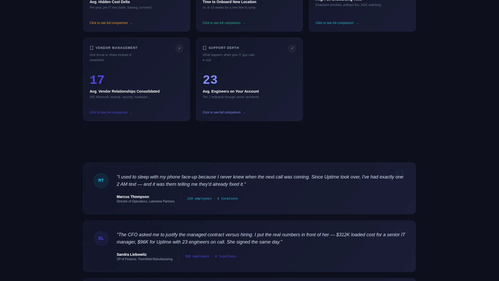
Interspersed between the dense evidence cards are breathing-room quote blocks attributed to operations directors. These provide human context that balances the data-heavy card sections and helps prospective buyers see themselves in the scenarios described.
Page sections overview
| Section | Purpose |
|---|---|
| Calculator / Estimator Header | Let visitors model their own in-house versus managed IT cost in real time |
| Social Proof Line | Reinforce calculator credibility with usage count |
| Comparison Card Grid | Present key decision dimensions as expandable, data-backed cards |
| Quote Blocks | Provide peer-level reassurance between dense evidence sections |
| Sticky call to action Bar | Keep the primary lead-capture action visible throughout the scroll |
| PDF Download Gate | Offer a low-friction email-only path for top-of-funnel visitors |
Design & branding system
The visual identity follows a Dashboard Pro theme built entirely around the Electric Indigo color system. Every color choice is functional: it signals state, hierarchy, or live data rather than decoration.
- Deep terminal black (#0D0F1C) forms the base field, electric indigo (#4F46E5) activates interactive surfaces and hover states, cool slate (#94A3B8) handles secondary text and divider lines, and sharp cyan (#06B6D4) fires on status badges and live-data accents
- The overall palette evokes a network operations center at midnight, where each color communicates something specific about the content it wraps
- Typography and spacing reinforce the dashboard metaphor, keeping sections skimmable and dense without feeling cluttered
Mobile & speed optimization
The modular card grid layout is structured to reflow cleanly at smaller viewport widths. The calculator and sticky bar are both designed with compact, touch-friendly controls in mind.
- The card grid collapses from a multi-column layout to a single-column stack on smaller screens, preserving the flip-and-expand interaction
- The sticky call to action bar is sized to remain usable on mobile without obscuring critical page content
- Lightweight visual choices, such as flat color fields and minimal decorative assets, keep the layout lean across devices
How this template helps you convert
The page is built around a Comparison/Versus conversion strategy. Every section is sequenced to move a cautious, analytical buyer from curiosity to commitment.
- The calculator personalizes the pitch immediately. Visitors input their own numbers and see a cost gap specific to their situation, which creates a reason to keep reading before any sales copy appears.
- The modular card grid lets buyers investigate at their own pace. Because each card is a drawer they choose to open, they feel in control of the discovery process rather than being sold to.
- Two conversion paths match two different levels of buyer readiness. The sticky call to action bar captures high-intent leads, while the PDF download captures researchers who need more time, keeping both audiences moving forward.
Other information about this template
This template is categorized under IT Services Company Website Templates and is specifically designed to serve the IT services company blog page niche within the broader Technology category. It is a strong fit for managed service providers who publish comparison content or cost-analysis resources alongside their main service offer.
- The template style is Card Grid (Modular), making it straightforward to add, remove, or reorder comparison cards as your service offering evolves
- The creative direction is Interactive Explorer, meaning the page rewards engaged visitors with progressively richer data rather than front-loading everything at once
- The header concept is Calculator/Estimator, a format that consistently outperforms static hero sections for high-consideration B2B service offers
- The landing page direction is Comparison/Versus, which aligns with how mid-market buyers actually research managed IT decisions
Theme
Dashboard Pro
Creative direction
Interactive Explorer
Color system
Electric Indigo
Style
Card Grid (Modular)
Direction
Comparison/Versus
Page Sections
Real-time Cost-comparison Calculator
Modular Comparison Card Grid
Sticky Conversion Bar
Low-friction PDF Download Gate
Quote Block Sections
Related questions
Can I change the calculator sliders to match my own service tiers?
Is the card grid limited to the five comparison dimensions shown in the template?
How does the sticky call to action bar behave on mobile screens?
What makes this template different from a standard IT services page?
Do I need to use both conversion paths, or can I keep just one?



