Online Skill Courses Portfolio Website Template
Backlog is a landing page template built for Node.js and backend online courses. It uses a card grid layout, a diagnostic quiz flow, and case study narrative cards to convert frontend developers and bootcamp graduates into enrolled students. The Electric Indigo color system and terminal-black aesthetic give the page an institutional authority feel that matches the course's serious technical ambition.
by Rocket studio
Quick summary
Backlog is a single-page landing page template designed for deep-dive backend courses. It pairs a striking terminal-black header with a modular case study card grid and a five-question diagnostic quiz. The layout is built to make frontend developers and bootcamp graduates feel the gap in their knowledge, then immediately offer a path forward.
Who this template is for
This template is built for course creators, educators, and independent instructors who teach backend development, server-side engineering, or Node.js at an intermediate to advanced level. It works especially well when your audience already knows one side of the stack and needs a strong reason to cross over.
- Self-taught frontend developers who want backend fluency without starting from scratch
- Bootcamp graduates who can build with React but feel lost when backend concepts come up
- Mid-level engineers quietly filling gaps in their understanding of server-side systems
What problem this template solves
Most course landing pages list features and topics. They do not show proof. Visitors leave without understanding what they will actually be able to build. This template solves that by replacing generic benefit bullets with real student outcomes displayed as case study cards.
- Visitors have no way to self-assess their level, so they hesitate to enroll
- Generic course pages fail to connect technical topics to real, tangible problems solved
- The typical page does not give the visitor a reason to act before scrolling away
What you get with this template
You get a fully structured landing page template with a modular card grid, a terminal-inspired hero section, a quiz-driven primary call to action, and a case study narrative layout. Every section is designed to build trust and move the visitor toward enrollment.
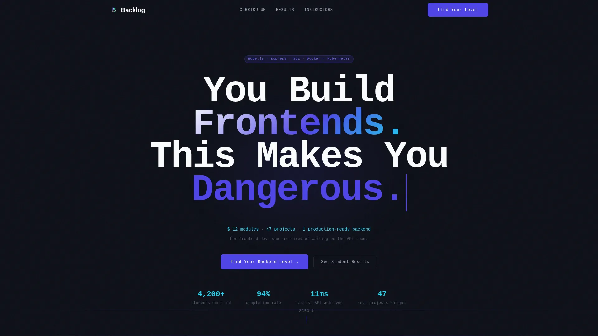
- A giant centered headline hero with a blinking cursor animation and terminal subline
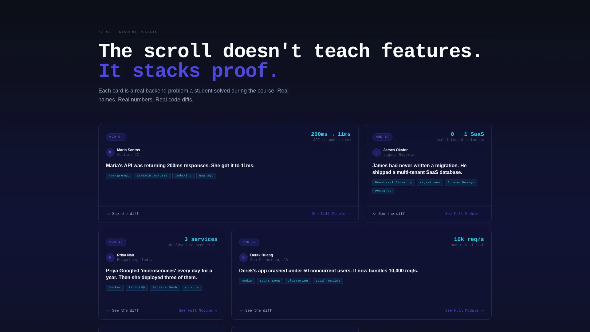
- A growing modular card grid where each card represents a real student problem and outcome
- A five-question diagnostic quiz that segments visitors into Beginner, Intermediate, or Advanced tracks
Feature list
This template includes a focused set of purpose-built components that work together to create a high-trust, high-intent course landing page.
Terminal Hero Section
The header uses white monospaced type on a deep terminal black background. A blinking cursor animation precedes a slate-colored subline styled as terminal output, listing course scope at a glance. The emptiness of the layout is intentional and sets a serious tone immediately.
Modular Case Study Card Grid
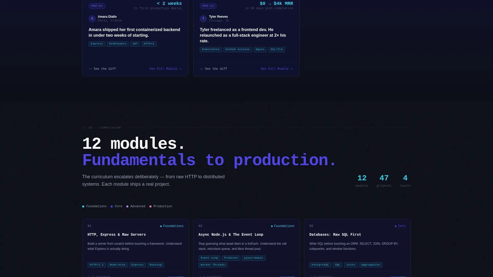
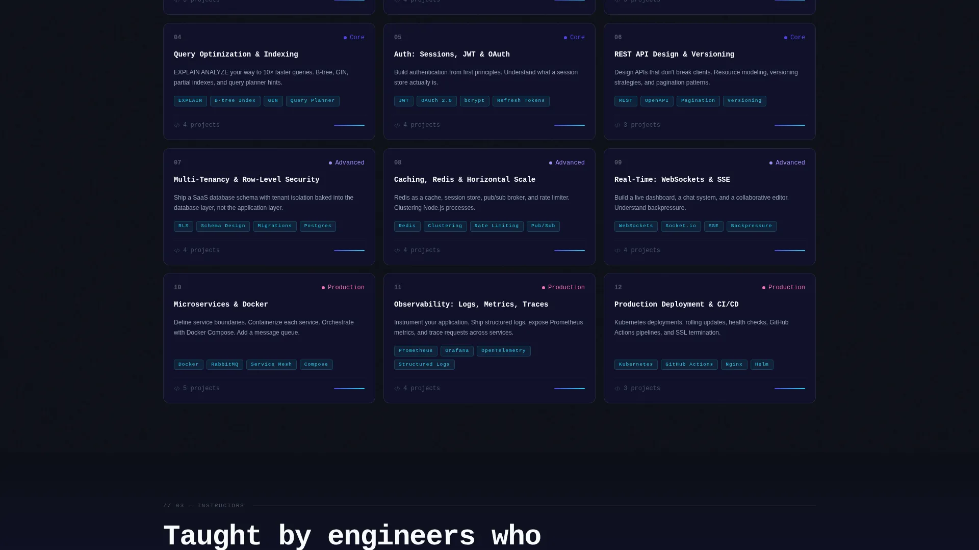
Each card in the grid represents a real student outcome from the course. Cards display the problem, the result, and a link to the originating module. The grid grows denser as visitors scroll, visually mirroring the curriculum's escalation from fundamentals to distributed systems.
Five-Question Diagnostic Quiz
The primary call to action launches a short technical quiz that asks real questions. Results segment the visitor into one of three learning tracks and serve a personalized curriculum recommendation with a module map. The quiz creates enrollment motivation by surfacing what the visitor does not yet know.
Email-Gated Module Deep Dives
Each case study card includes a secondary call to action labeled "See the Full Module." Clicking it prompts an email capture before revealing the architecture diagram and code diff for that module. This creates a low-friction lead generation touchpoint throughout the page.
Alternating Background Wash System
Section backgrounds alternate between terminal black and a barely-there indigo wash. This gives the page visual rhythm without relying on images or illustrations. Cards float on subtle elevation with slate-colored borders for a clean, layered appearance.
Page sections overview
| Section | Purpose |
|---|---|
| Terminal Hero Header | Establishes tone and course scope with centered headline and blinking cursor |
| Diagnostic Quiz call to action | Invites visitors to self-assess their backend level before committing |
| Case Study Card Grid | Stacks student proof from single-service wins to distributed systems |
| Module Deep Dive Gates | Captures emails via secondary call to action on each individual case study card |
| Curriculum Track Results | Delivers a personalized module map based on quiz responses |
Design & branding system
The visual identity follows an Institutional Authority theme. The palette combines the seriousness of an academic environment with the energy of modern developer tooling. Every color choice is deliberate and functional.
- Deep terminal black (#0D0F17) as the primary background, shifting to an indigo wash (#111336) for section variety
- Electric indigo (#4F46E5) saturating all clickable surfaces, primary actions, and section anchors
- Muted slate (#94A3B8) for secondary text and card borders, with bright console green (#22D3EE) as a syntax-highlight accent on code snippets and progress indicators
Mobile & speed optimization
The card grid layout is modular and adapts naturally to smaller viewports. Each component is self-contained, which keeps the layout from breaking when the grid reflows on mobile screens.
- The modular card structure reflows gracefully from multi-column grid to single-column stack on narrow screens
- The quiz flow is designed as a linear, step-by-step sequence that works well on touch devices
- Alternating section backgrounds reduce the need for heavy image assets, keeping the visual load lightweight
How this template helps you convert
The page is built around two specific conversion mechanisms that work at different stages of visitor intent. Neither relies on a generic "Buy Now" button or an inflated feature list.
- The diagnostic quiz earns the primary click by making the visitor confront a real knowledge gap. Once they see their result, enrollment feels like the logical next step rather than a sales decision.
- The email-gated module cards create repeated micro-conversions throughout the scroll, capturing leads from visitors who are not yet ready to enroll but want to see more.
Other information about this template
This template is part of a broader category of landing page templates designed for technical education products. It is particularly well-suited for Node.js courses, backend architecture programs, and server-side engineering curricula sold directly by instructors or through course platforms.
- The template style is Card Grid (Modular), making it straightforward to add, remove, or reorder case study cards as your course content evolves
- The quiz and email-gate components are structural placeholders in the template; connecting them to a form backend or quiz logic tool requires your own setup
- The Institutional Authority theme and Electric Indigo color system can be adapted to match an existing course brand while preserving the terminal aesthetic
Theme
Institutional Authority
Creative direction
Case Study Narrative
Color system
Electric Indigo
Style
Card Grid (Modular)
Direction
Quiz/Assessment
Page Sections
Terminal Hero with Blinking Cursor
Modular Case Study Card Grid
Five-question Diagnostic Quiz
Email-gated Module Deep Dives
Alternating Indigo Wash Backgrounds
Related questions
Who is this landing page template designed for?
Does the quiz functionality work out of the box?
Can I customize the case study cards for my own course?
Do I need a Node.js course specifically to use this template?
What happens after a visitor submits their email on a module card?



