Data-Driven Finance App Landing Page Template
The Ledger Stats-First Finance App Comparison Landing Page template is a dark, data-driven single landing page designed for fintech SaaS products. It opens with a pulsing stat, leads into a teal-checkmark comparison table, and closes with a frictionless email signup form. Every section is built to turn finance app visitors into trial leads through clear data and minimal friction.
by Rocket studio
Quick summary
This finance landing page template presents a unified financial dashboard app through hard numbers and direct comparisons. It is designed for freemium SaaS conversion, placing a pulsing hero stat above a side-by-side comparison table. The Tech Glass visual identity keeps every design decision purposeful, allowing data to carry the persuasion.
Who this template is for
This template is built for fintech founders, product teams, and indie developers who need a high-trust landing page that converts visitors quickly. It suits anyone launching or promoting a personal finance app targeting everyday users who are tired of scattered accounts and slow legacy banking tools.
- Freelancers and small-business owners who want to showcase a unified dashboard app to prospects who manage complex payments across multiple platforms
- Finance SaaS teams that need a comparison-first landing page to highlight their app's edge over legacy services
- Developers and designers who want a ready-to-launch finance landing page with a clear, data-driven approach
What problem this template solves
Finance app landing pages often fail because they lead with feelings instead of facts. Visitors leave before they understand the real difference between your app and the competition. This template solves that by putting key metrics front and center, allowing the data to do the selling.
- Most finance landing pages bury their value inside long paragraphs, losing leads before the comparison table appears
- Users browsing comparison pages need to evaluate specific features side by side to make confident decisions
- Generic templates lack the high-trust design signals that finance prospects expect, such as partner logo bars and clear pricing transparency
What you get with this template
You get a fully structured, single landing page designed to capture leads for a finance or banking app. Every section is set up to build trust, present the product's strengths, and guide visitors toward a signup form with minimal friction.
- A hero section with a logo bar featuring partner icons and a pulsing display-scale stat that immediately establishes credibility
- A structured comparison table designed to showcase the difference between your app and three competing services, row by row
- A sticky bottom bar and inline form that capture email leads at peak scroll engagement, with Google and Apple sign-in options
Feature list
This landing page template includes carefully designed sections and interactive elements that serve one purpose: converting finance app visitors into trial users.
Stats-First Hero with Logo Bar
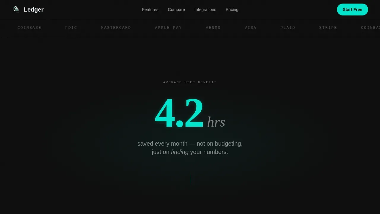
The hero opens with a horizontal ribbon of monochrome partner icons against a carbon black background. Beneath it, a single large stat fades in at display scale. The "4.2" figure pulses once in electric teal, giving the page immediate authority without a single word of sales copy.
Interactive Comparison Table
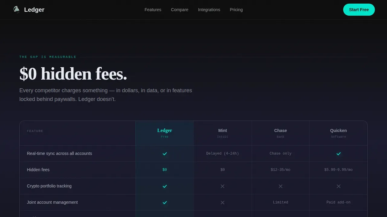
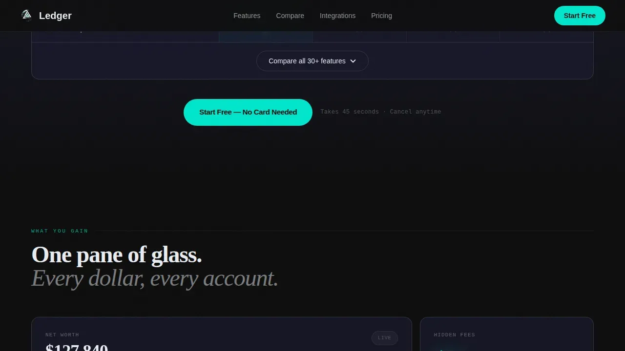
The comparison table is the page's core conversion engine. It places your app against three legacy banking services, using teal checkmarks and muted graphite gaps to highlight every feature difference. A secondary call-to-action expands the table inline, allowing researchers to explore the full 30-plus feature analysis before they commit.
Asymmetric Feature Bento Grid
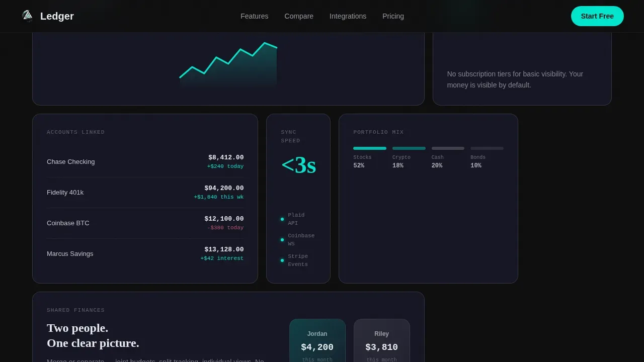
The bento grid section follows the comparison table, showcasing what users gain beyond the basics. Each bento card can present a dashboard benefit, a cash flow insight, or a tracking metric in a visual, scannable form. Subtle micro-animations highlight progress indicators and confirm data updates as the user scrolls.
Testimonials and Social Proof Section
Three testimonials represent the core audience segments: a freelancer, a couple merging finances, and a small-business owner. Alongside the testimonials, hard stats such as "$0 hidden fees" and "2M+ accounts linked" reinforce trust. This section is designed to address any remaining hesitation before the final call-to-action form appears.
Sticky Conversion Bar and Email Form
A sticky bottom bar appears at sixty percent scroll depth, keeping the primary call-to-action visible without interrupting the reading experience. The signup form asks only for an email address, then offers Google and Apple single sign-on as the fastest path to the trial. This approach is designed to maximize lead capture while minimizing form friction.
Horizontal Integrations Scroll
A horizontally scrolling strip of connected platform icons shows the breadth of services the app works with. This section builds confidence that the financial dashboard can integrate data from multiple sources, covering checking, savings, investments, and crypto in one view.
Page sections overview
| Section | Purpose |
|---|---|
| Partner Logo Bar | Establish trust with recognizable integration icons |
| Pulsing Hero Stat | Lead with a hard metric to capture immediate attention |
| Comparison Table | Showcase feature differences against legacy competitors |
| Feature Bento Grid | Present key benefits in scannable, visual card format |
| Integrations Scroll | Highlight platform connections and data source breadth |
| Testimonials Block | Provide social proof across three core audience types |
| Email Capture Form | Convert visitors into leads with a minimal signup form |
| Sticky call to action Bar | Keep the primary call-to-action visible during deep scroll |
| Footer | Single-row linear footer with essential links |
Design & branding system
The visual identity follows a Tech Glass direction built on the Carbon Fiber color system. The palette feels intentionally restrained, allowing every teal accent to carry real meaning. Backgrounds stay dark, text stays crisp, and interactive elements stand out without competing.
- Color palette: deep carbon black (#0D0D0D) for backgrounds, woven graphite (#1A1A2E) for panel surfaces, frosted glass white (#E8ECF1) for body text, and electric teal (#00E5CC) reserved exclusively for live data points, interactive states, and call-to-action surfaces
- Typography system: DM Sans for body copy, Fraunces for display numerals and hero headings, and JetBrains Mono for data values and stats throughout the financial dashboard sections
- Icons and visual elements are rendered in monochrome frosted white across the logo bar, with teal used sparingly so every glow carries visual weight
Mobile & speed optimization
This landing page is designed mobile-first, reflecting how most finance app users check their accounts on a handheld device early in the morning. Every section reflows cleanly at smaller breakpoints, keeping the comparison table readable and the sticky conversion bar functional across screen sizes.
- GSAP scroll triggers power the teal pulse animation and section transitions, with client-side logic reserved for interactive elements like the table expand and sticky bar
- The signup form and single sign-on buttons are sized and spaced for easy thumb interaction on any mobile device
- Static server components handle non-interactive sections, keeping the initial page load lean while scroll-dependent features load progressively
How this template helps you convert
Finance landing pages earn conversions by removing doubt at every step. This template is built around a clear escalation: what you save, what you gain, what competitors cannot offer. Every section moves the visitor closer to the form.
- The hero stat and logo bar set immediate credibility, giving prospects a reason to keep reading before any feature description appears
- The comparison table makes the value difference visible in black-and-teal arithmetic, letting the data build the case so the copy does not have to
- The sticky conversion bar and low-friction email form capture leads at the moment of highest confidence, when the visitor has seen the full analysis and is ready to act
Other information about this template
This landing page template is designed to align with how finance app landing pages in 2026 have evolved: from static screenshots to dynamic data storytelling built around calm, minimalist design principles that reduce user anxiety. The template is a strong example of that shift, prioritizing insights over illustration and metrics over marketing language.
- The comparison table approach helps prospects evaluate the real difference between services without relying on subjective reviews or brand promises
- Transaction summary sections can showcase enriched data fields including date, time, parties involved, and a clear distinction between credits and debits, helping users understand the dashboard's tracking depth
- The template supports ideas from high-trust finance design: prominent net worth or total balance cards above the fold, color-coded data for expenses analysis, and revenue tracking visuals that give at-a-glance budget clarity
- It is a practical solution for any company that needs to build qualified leads from prospects who are ready to learn but need one clear reason to sign up
- Compatible with analytics tools including Google Analytics, so your team can measure engagement, form completions, and scroll depth from day one
- Resources such as the inline table expand and social proof section are designed to address the full range of prospect questions, from pricing to platform coverage, without requiring a separate page
Theme
Tech Glass
Creative direction
Stats-First Impact
Color system
Carbon Fiber
Style
Comparison Table
Direction
Freemium/Trial
Page Sections
Stats-first Hero and Logo Bar
Teal Checkmark Comparison Table
Asymmetric Feature Bento Grid
Testimonials with Hard Stats
Sticky Call to Action Bar and Email Form
Horizontal Integrations Scroll
Related questions
Who is this landing page template best suited for?
Can I customize the comparison table features and competitors shown?
Does the template include the sticky call-to-action bar behavior?
Is this template suitable for a business promoting multiple finance services?
What level of animation is included in this template?



