Chiropractic Digital Presence Advanced Careers Website Template
Align is a bold brutalist bento grid landing page template built for a chiropractic mobile app. It guides visitors through a visceral problem-to-solution arc, using a carbon-black and electric-cyan palette to mirror the tension-to-relief experience of an adjustment. One clear call to action drives every scroll: download the app and start feeling better.
by Rocket studio
Quick summary
Align is a single-page, click-through landing page template designed for a chiropractic mobile app. It opens with a cinematic full-bleed header, moves through a pain-first bento grid, then pivots to the app's core features. Every design decision serves one goal: get a hurting visitor to tap "download" before they scroll away.
Who this template is for
This template is built for mobile app founders, chiropractic clinics, and digital health startups promoting a spinal health or posture tracking app. It works best when the audience already feels the pain and just needs the right exit.
- Chiropractic app developers launching a consumer-facing download campaign
- Digital health marketers targeting desk workers, athletes, and chronic pain sufferers
- Clinic owners adding a self-serve app acquisition channel to their digital presence
What problem this template solves
Most health app landing pages look clinical and cold. They list features before a visitor feels understood. Align flips that. It opens with the visitor's pain, makes it visible in hard data and uncomfortable imagery, then reveals the app as the natural relief.
- Visitors bounce before they trust, because the page never acknowledges their specific pain
- Generic layouts fail to communicate urgency for people already in discomfort
- Weak call-to-action placement lets motivated visitors lose momentum mid-scroll
What you get with this template
Align delivers a fully structured, single-page bento grid layout with every section pre-built and ready to customize. The visual hierarchy is deliberate, the copy direction is clear, and the conversion path is hardwired into the scroll flow.
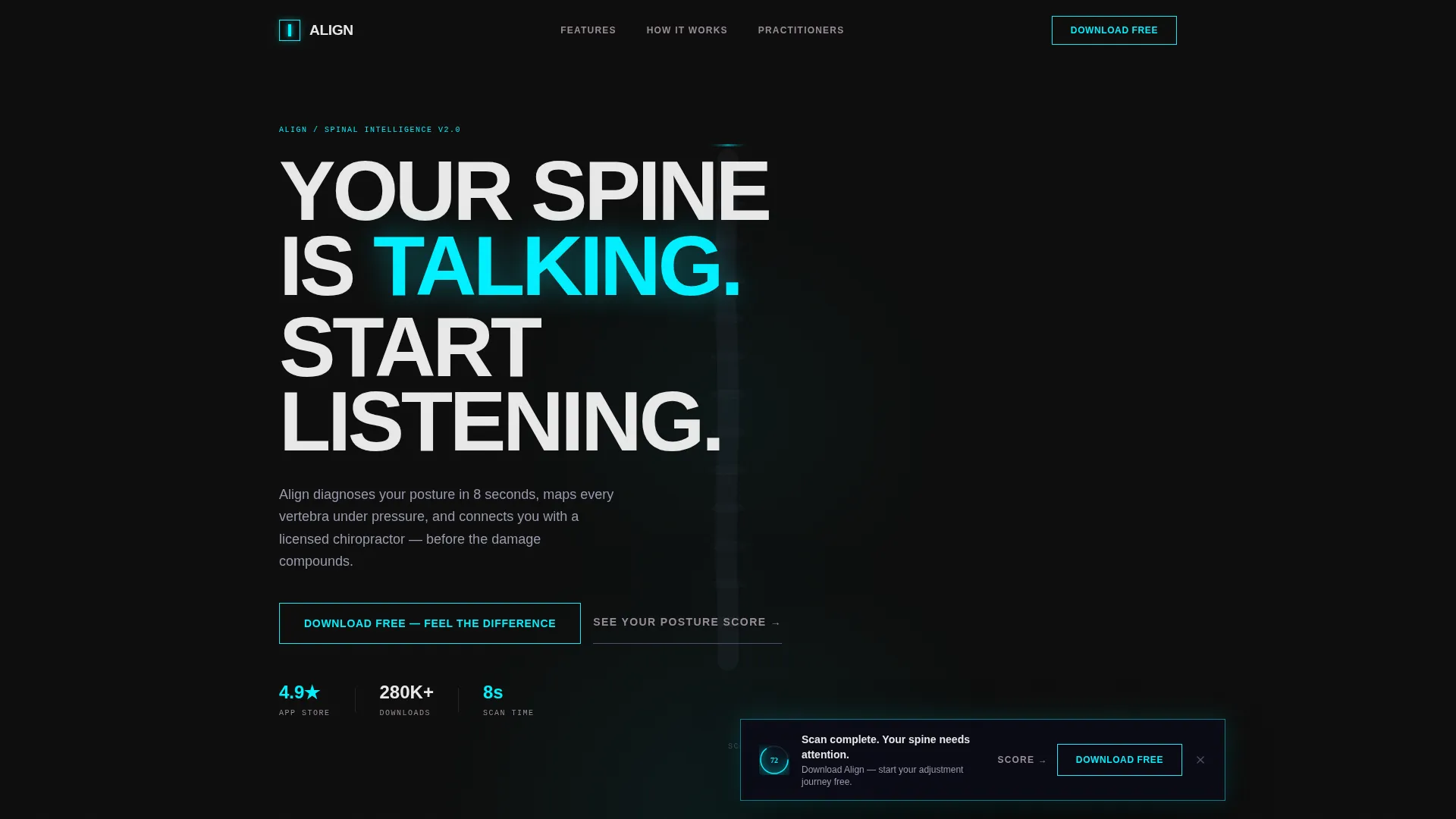
- A dark full-bleed hero section with a wireframe spine animation concept and headline space for your primary message
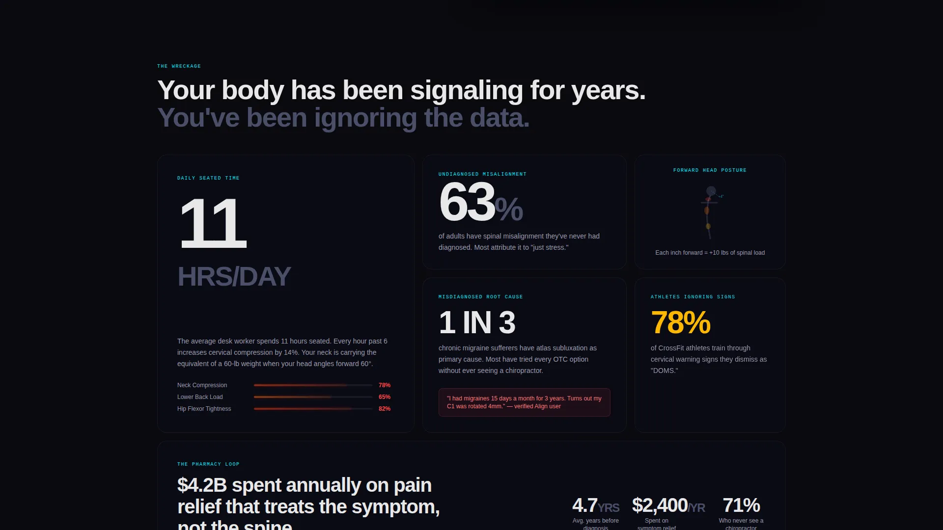
- An asymmetric problem grid with oversized numeral cards, posture imagery slots, and a full-width cyan divider that marks the pivot
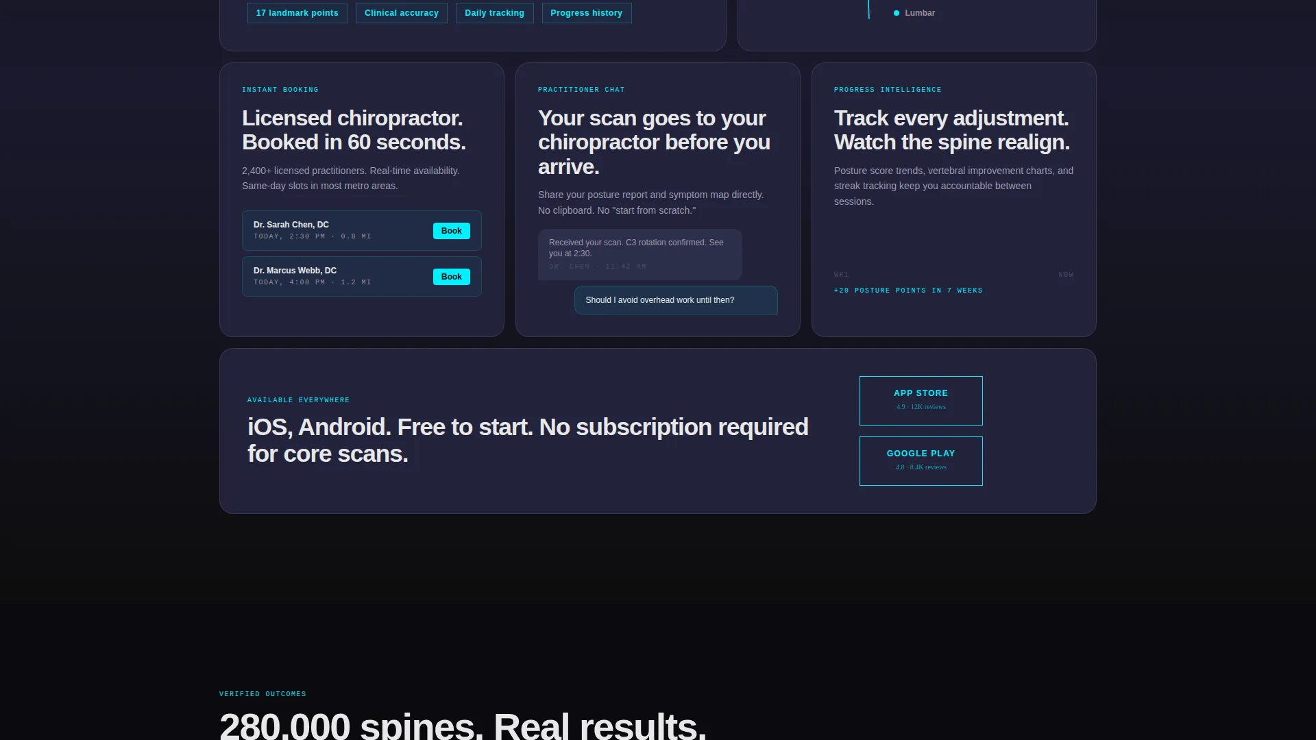
- A solution bento grid showcasing the app's posture tracking, appointment booking, symptom mapping, and practitioner chat features
- A floating bottom-bar call-to-action and a massive full-width download button after the solution grid
- A secondary conversion path with a "See Your Posture Score" webcam assessment link for email capture before app redirect
Feature list
This template packages a precise set of built-in components, each designed to move a skeptical visitor toward a confident download tap.
Full-Bleed Diagnostic Hero
The header fills the entire screen with matte black and a ghostly graphite wireframe spine. A cyan glow traces up the vertebrae on load, and the app interface floats forward from the darkness. The headline zone is sized for heavy brutalist type.
Asymmetric Problem Bento Grid
The first content row uses an uneven card layout to present alarming statistics, pain heat map image slots, and posture data in oversized numerals. Cards are dark, dense, and deliberately uncomfortable to communicate urgency.
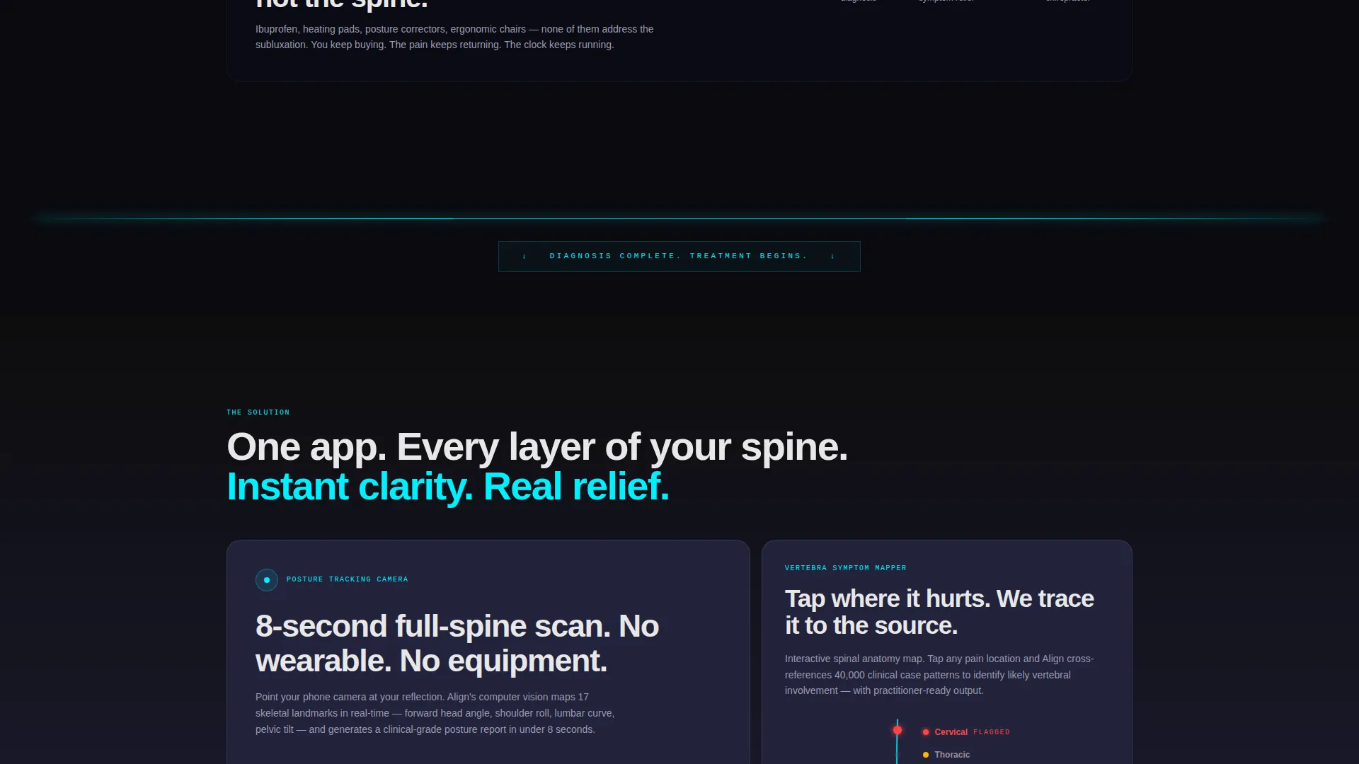
Cyan Pivot Divider
A single full-width pulsing cyan bar separates the problem section from the solution section. It acts as a visual and emotional reset, signaling the shift from pain awareness to relief.
Solution Feature Grid
Below the divider, the bento grid restructures into balanced, lighter cards. Each card maps to a core app feature: posture camera, booking flow, vertebra-by-vertebra symptom mapper, and practitioner chat. Spacing opens as the visitor scrolls down.
Floating Download Call-to-Action Bar
After the hero animation, a bottom bar locks to the viewport and surfaces the primary download prompt. It stays visible without interrupting reading, giving motivated visitors a tap target at any moment.
Webcam Assessment Secondary Path
A secondary link invites visitors to check their posture score via a webcam-based assessment. This path captures an email address before redirecting to the app store, creating an optional lead-generation step alongside the direct download flow.
Page sections overview
| Section | Purpose |
|---|---|
| Full-bleed hero | Hooks with cinematic spine animation and headline |
| Problem bento row | Surfaces pain data in dark, urgent card layout |
| Cyan pivot divider | Marks the emotional turn from pain to solution |
| Solution feature grid | Presents app capabilities in clean bento cards |
| Floating call to action bar | Keeps download prompt visible throughout scroll |
| Posture score link | Captures emails via secondary assessment path |
| Full-width call to action button | Delivers final high-impact download prompt |
Design & branding system
The visual identity follows a bold brutalist theme built on a carbon fiber color system. Every color decision is intentional: darkness creates tension, and cyan creates release.
- Background and card surfaces use deep carbon black (#0D0D0D) and woven graphite (#1A1A2E), keeping the mood matte and heavy throughout the problem section
- Typography and secondary text land in titanium mid-tone (#4A4E69) for legibility without softening the edge
- Electric cyan (#00F0FF) appears only as an outline, border, active-state edge, or motion path, never filling a surface, so it reads like a nerve signal firing through a dark spine
Mobile & speed optimization
The template is structured for a mobile-first audience. The primary action is a single tap to an app store, and the layout honors that intent from the first pixel to the last button.
- The bento grid reflows into a stacked single-column layout on smaller screens, keeping card hierarchy and readability intact
- The floating download bar is positioned for thumb reach on mobile viewports, reducing friction for the most common visitor device
- Heavy visual elements like the hero animation concept and full-bleed background use matte solid fills and CSS-compatible techniques to avoid unnecessary load overhead
How this template helps you convert
Align is engineered as a click-through funnel. There are no forms in the main flow and no distractions between the visitor's pain and the download button.
- The problem section uses hard statistics and uncomfortable imagery to make the visitor's own pain feel seen, building enough emotional charge to carry them past the pivot divider
- The solution grid then presents the app as the direct, immediate answer, with lighter card spacing that physically mirrors relief, so the download call to action lands at the moment of highest motivation
- The secondary posture score path gives hesitant visitors a low-commitment next step that still moves them toward the app store while capturing their email address
Other information about this template
Align is a purpose-built template for the chiropractic digital presence space. It sits at the intersection of technology product marketing and consumer health app promotion.
- The template style is bento grid, which organizes dense information into scannable, modular cards without feeling cluttered
- The creative direction is a problem-to-solution arc, a proven narrative structure for pain-point-driven health products
- The header concept is dark full-bleed with a glow effect, making it particularly effective for app showcase pages that need immediate visual impact
- This template is delivered as a design-ready layout; copy, images, and app store links are replaced with your own brand assets during setup
Theme
Bold Brutalist
Creative direction
Problem→Solution Arc
Color system
Carbon Fiber
Style
Bento Grid
Direction
Click-Through
Page Sections
Full-bleed Diagnostic Hero Section
Asymmetric Problem Bento Grid
Full-width Cyan Pivot Divider
Balanced Solution Feature Grid
Dual Call-to-action Conversion Path
Related questions
Is this template designed for a single-page layout?
Do I need a live app to use this template?
How does the secondary posture score path work?
Can I update the colors to fit my own brand?
Who is this landing page template best suited for?



