Accounting Vertical SaaS Professional Website Template
The Ledger real time accounting analytics dashboard landing page template is a hub-and-spoke, single-page layout built for accounting SaaS products. It converts raw general ledger and trial balance data into animated, real-time financial dashboard visuals. Six live metric tiles, a fixed anchor nav, stat-first section reveals, and a two-step freemium modal work together to move controllers, CFOs, and outsourced accounting firms from first scroll to trial signup.
by Rocket studio
Quick summary
Ledger is a dark-theme, stats-first landing page template for accounting analytics SaaS products. It opens with a living metrics wall of six animated dashboard tiles, guides visitors through four spoke sections via a fixed anchor nav, and closes every spoke with a "Start Your Free Dashboard" call to action. The design turns raw accounting data into a compelling, conversion-focused story.
Who this template is for
This template is built for B2B SaaS teams in the accounting and financial management space. It suits any product that transforms ledger data into a real-time financial dashboard experience.
- Controllers and finance leads who need to show prospects how consolidation actually works
- CFOs and finance directors preparing board-ready reporting dashboard demos
- Outsourced accounting firms marketing multi-client financial management capabilities to new prospects
What problem this template solves
Finance teams waste hours pulling data from multiple sources, reconciling spreadsheets, and assembling charts before a board meeting. A well-designed dashboard landing page has to communicate speed and clarity instantly, before a visitor reads a single word of body copy.
- Visitors land and immediately doubt whether the product is faster than their current workflow
- Generic SaaS templates fail to show financial data in a way that resonates with financial analysts and controllers
- Most templates bury the value proposition; this one leads every section with an oversized metric so the numbers do the convincing
What you get with this template
You get a complete, ready to use single-page layout with every section pre-built and aligned to a dark, data-dense visual identity. The layout integrates a living header, anchor navigation, and a freemium conversion modal.
- A six-tile animated metrics wall header with real accounting key performance indicators such as gross margin, accounts receivable aging, and a cash flow waterfall chart
- Four anchor-linked spoke sections covering consolidation, forecasting, client portal management, and platform integrations
- A two-step onboarding modal and a live sandbox path so skeptical visitors can explore before committing
Feature list
This template ships with a structured set of built-in components. Each one is designed to communicate financial performance quickly and earn the trial.
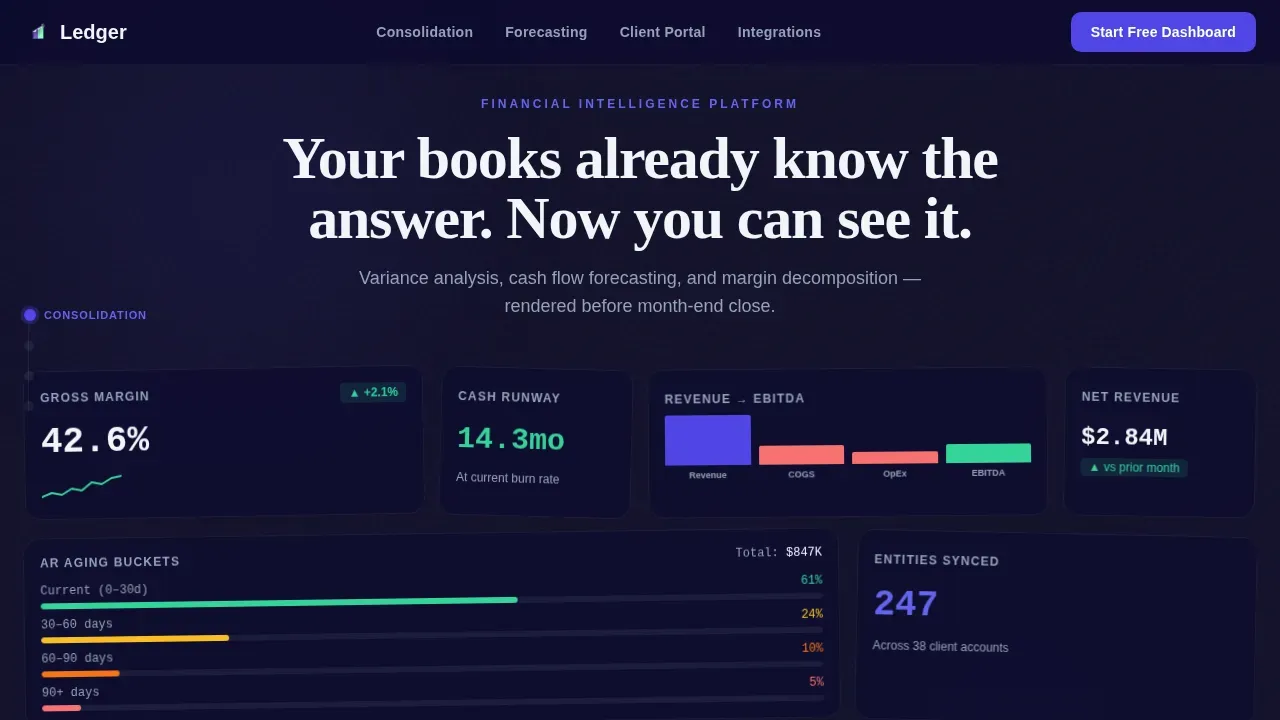
Animated Stats Wall Header
The header skips illustrations entirely. Six real dashboard tiles animate in using staggered reveals and number tick-up counters. Tiles display key financial metrics including gross margin at 42.6%, accounts receivable aging buckets color-coded by 30, 60, and 90 days, a revenue-to-EBITDA waterfall chart, and a 14.3-month cash runway indicator. A typing headline appears between the tiles, giving the page immediate narrative energy.
Fixed Anchor Navigation with Active States
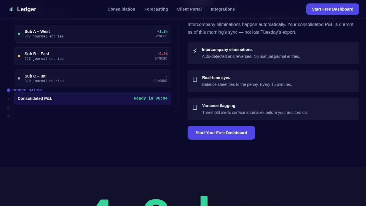
A left-rail anchor nav stays fixed as users scroll through each spoke. Each node pulses with electric indigo on the active state, labeling the four sections: Consolidation, Forecasting, Client Portal, and Integrations. This keeps users oriented and encourages drill-down exploration, much like clicking through layers of a live reporting dashboard.
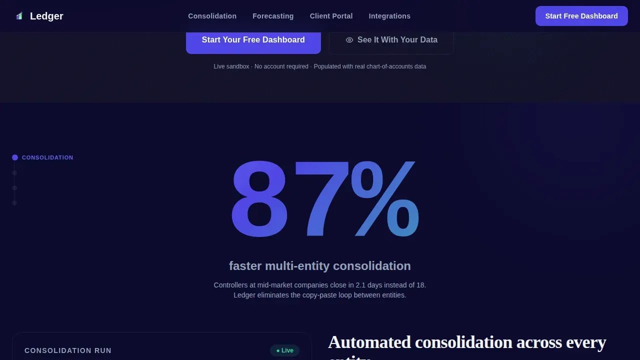
Stat-First Spoke Sections
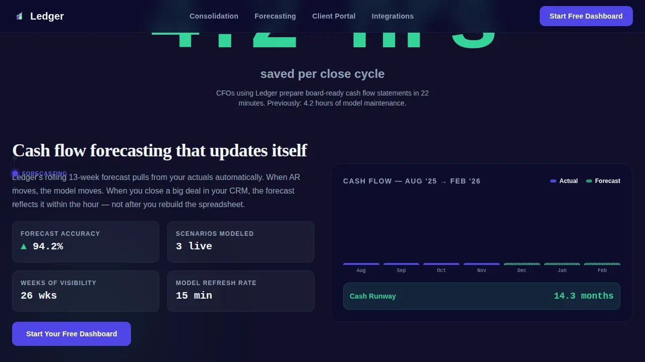
Every spoke opens with a single oversized metric rendered in a display typeface before the explanatory content appears. "87% faster" anchors the consolidation module. "4.2 hours saved per close cycle" opens the reconciliation section. This data visualization approach makes the value concrete before the feature description begins, supporting informed financial decisions without marketing language.
Two-Step Freemium Conversion Modal
The primary call to action, "Start Your Free Dashboard," triggers a two-step modal. Step one captures accounting platform preference and number of entities. Step two collects email and company name. This staged approach reduces friction and keeps conversion rates high by asking for context before contact details.
Live Sandbox Demo Path
A secondary call to action, "See It With Your Data," opens a live sandbox pre-loaded with sample chart-of-accounts data. Visitors can interact with dashboard examples, explore line graphs, and experience the data visualization before entering any personal information. This path directly addresses the skeptical controller who needs to see outputs first.
Platform Integration Display
The integrations spoke displays accounting platform connection options with logos arranged in a clean layout. The section supports the two-step modal's first question and reinforces that the product can integrate data from the accounting tools already in use across the visitor's organization.
Page sections overview
| Section | Purpose |
|---|---|
| Animated Metrics Wall | Live header tiles display real-time financial KPIs and typing headline |
| Fixed Anchor Nav | Left-rail navigation keeps users oriented across all four spokes |
| Consolidation Spoke | "87% faster" stat reveal introduces automated multi-entity consolidation |
| Forecasting Spoke | "4.2 hours saved" anchors cash flow and runway visualization module |
| Client Portal Spoke | Bento layout shows multi-client management for outsourced accounting firms |
| Integrations Spoke | Platform logos and two-step onboarding modal drive trial signup |
| Linear Footer | Single-row footer closes the page with minimal distraction |
Design & branding system
The visual identity follows a Dashboard Pro theme. The palette is built for long sessions in front of financial data, dark enough to reduce eye strain, with color appearing only when a metric demands attention.
- Canvas is near-black (#111029) with deep navy (#0D0B2E) for data field backgrounds; electric indigo (#4F46E5) activates on chart accents, button states, and the anchor nav pulse; phosphor mint (#34D399) marks positive-variance indicators so users can spot patterns at a glance
- Typography uses DM Sans for interface labels, JetBrains Mono for all numbers and code-style metrics, and Fraunces for the hero display headline, giving the page a Bloomberg-terminal feel reimagined through a design studio lens
- Positive and negative variance states use distinct colors so financial ratios, gross profit margin, net profit margin, and quick ratio values communicate their direction before a user reads the label
Mobile & speed optimization
The template is desktop-first, reflecting how controllers and CFOs work at large monitors during daily operations. It is fully responsive so that charts and key performance indicator cards scale correctly on smaller screens.
- Scroll-triggered animations use Intersection Observer, and transforms are GPU-accelerated so the tile reveals and number counters remain smooth across devices
- Complex charts, line graphs, and KPI scorecards reflow cleanly at tablet and mobile breakpoints so the reporting dashboard remains readable without horizontal scrolling
- Mobile responsiveness ensures the data visualization stays functional even when a CFO checks a cash balance or cash flow figure away from their desk
How this template helps you convert
This layout is structured so the visitor feels like a product user before they reach the sign-up step. Every scroll deepens that familiarity.
- The metrics wall shows real financial dashboard outputs immediately, so visitors experience the product's value inside the first three seconds rather than reading about it
- Stat-first spoke reveals build credibility section by section, giving financial professionals specific evidence to weigh rather than abstract promises about financial management capabilities
- The sandbox demo path lets skeptical users explore dashboard examples and verify data accuracy before committing, which shortens the decision making cycle and raises the quality of trial signups
Other information about this template
This template covers a wide range of data visualization needs for accounting SaaS products. It is designed to work as a performance dashboard showcase for any tool serving financial analysts, controllers, or outsourced accounting teams.
- The layout supports dashboard examples drawn from several types of finance dashboards: a cash flow dashboard showing cash inflows and cash balance, a balance sheet dashboard for tracking financial health, a CFO dashboard consolidating multiple business unit views, and a reporting dashboard visualizing revenue by division
- Each spoke section can highlight different financial performance scenarios such as operating expenses by cost centers, net income trends, gross profit analysis, or sales performance by region, depending on what the product actually delivers
- The template is compatible in spirit with platforms that integrate data from multiple sources, so teams that already use a data source like an accounting platform can reference that connection in the integrations spoke
- Pre built templates like this one save time during the build phase and let SaaS teams focus on copy and product-specific dashboard examples rather than layout construction
- The two-step modal and sandbox demo are pre-wired for freemium and trial flows; teams can adjust the modal fields and connect a real data source without rebuilding the conversion architecture
- Google analytics event tracking and Google Ads conversion pixels can be added to the modal steps to measure trial signup conversion rates and attribute them to paid campaigns
- The page is structured so that future reference materials, such as case studies or product documentation, can be linked from spoke footers without disrupting the anchor nav flow
- Trust signals such as compliance badges, client testimonials, and partner logos can be placed within each spoke to reinforce data accuracy and product credibility for financial professionals evaluating the platform
- The user friendly dashboard layout uses an easy to understand format so visitors from finance backgrounds can read the data without needing a design or technical background
- Interactive dashboards are demonstrated through the sandbox path, where filters and slicers let users view accounting data by date range, department, or account type, supporting informed decisions before sign-up
- The template enables users to see strategic decisions-level outputs such as variance analysis and margin decomposition rendered visually, positioning the product as an active strategic tool rather than a passive reporting tool
Theme
Dashboard Pro
Creative direction
Stats-First Impact
Color system
Electric Indigo
Style
Hub & Spoke (Anchor Nav)
Direction
Freemium/Trial
Page Sections
Animated Six-tile Metrics Wall Header
Fixed Anchor Nav with Indigo Active States
Stat-first Spoke Section Reveals
Two-step Freemium Conversion Modal
Live Sandbox Demo Path
Platform Integration Spoke with Logos
Related questions
What kinds of financial dashboard layouts does this template include?
Can I adapt the spoke sections to show different financial KPIs?
Is the two-step modal pre-built and ready to connect to a backend?
How does the anchor nav work across the page sections?
Who is the target audience this template is designed to attract?


