Bandwidth — Comms Landing Page Template
Signal is a bold brutalist telecommunications landing page template built around a card grid layout and a bandwidth-cost calculator. It targets IT directors, operations managers, and startup CTOs shopping for fiber, 5G, and cloud voice services. The design uses monochrome steel tones and a signal-green accent to move visitors from calculator result to free network audit in a single scroll.
by Rocket studio
Quick summary
Signal is a single-page telecommunications landing page template built for providers selling fiber, 5G, and cloud voice services. Its calculator-first layout lets visitors calculate potential savings before seeing a single product card. The bold brutalist design and modular card grid make every section feel purposeful and infrastructure-grade.
Who this template is for
This template is built for telecommunications providers who need to convert technically savvy buyers fast. It speaks directly to professionals who evaluate infrastructure on data, not decoration.
- IT directors managing legacy PBX migrations to modern cloud voice systems
- Operations managers overseeing connectivity across many retail or commercial sites
- Startup CTOs who need flexible contracts and straightforward proof of value
What problem this template solves
Generic provider pages waste a visitor's time with features they never asked about. Signal flips that experience by anchoring every section to the visitor's own numbers.
- Visitors arrive skeptical; the calculator gives them a concrete savings figure before any sales pitch begins
- Multi-site buyers can not quickly map a generic offer to their specific scale; the personalized card grid solves that
- Leads who are not ready to talk still leave an email by downloading the gated comparison data PDF
What you get with this template
Signal delivers a fully structured, modular landing page ready to represent a modern telecommunications provider. Every component is defined and purposeful.
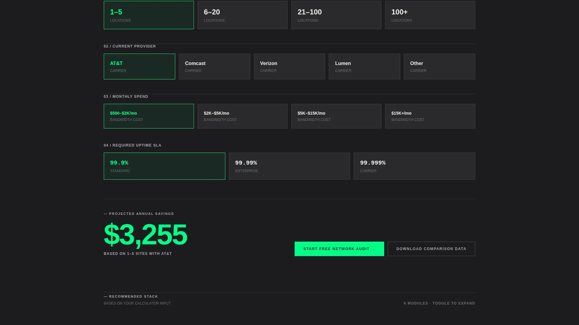
- A bandwidth-cost calculator with toggle card inputs and instant signal-green results output
- A modular card grid covering SD-WAN, unified communications as a service (UCaaS), security, and case studies
- A progressive three-step lead capture form and a secondary PDF download conversion path
Feature list
This template ships with six interconnected components that work as a unified sales flow. Each one is grounded in the source brief and designed to earn the visitor's next click.
Bandwidth-Cost Calculator
The first interactive element on the page. Visitors select number of sites, current provider, average monthly spend, and required uptime service level agreement (SLA) using chunky industrial toggle cards. Results render instantly as a bold green savings figure, making the value case before any product copy appears.
Personalized Card Grid Sections
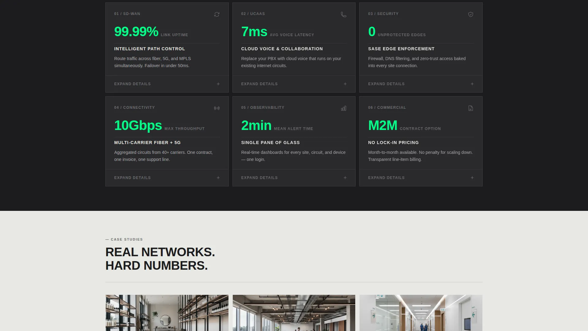
Each card grid module below the calculator is contextualized by the calculator output. A line like "Based on 14 sites, here's your recommended stack" makes SD-WAN, UCaaS, security, and case-study cards feel tailored rather than templated. Cards use raw edges, hairline dividers, an icon, a stat, and one sentence with a toggle to expand.
Progressive Lead Capture Form
The primary call to action, "Start Your Free Network Audit," triggers a three-step form. The first card asks only for a company email. The second reveals fields for number of locations and current provider. The third offers an optional calendar embed to book a live audit call.
Gated PDF Download Path
A secondary conversion path lets visitors download raw comparison data as a PDF. This captures leads who want proof before committing to a conversation. It works alongside the audit form without competing for the same intent.
Logo Bar Header
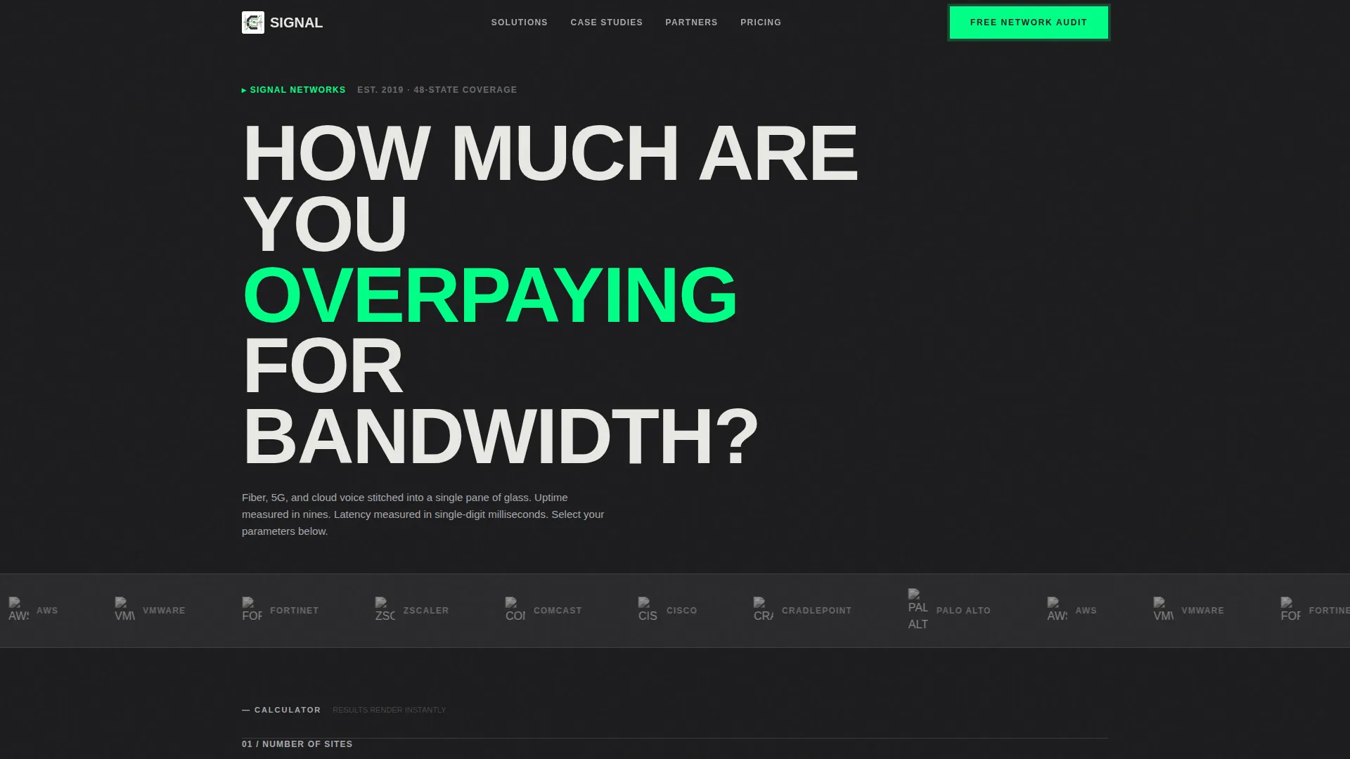
The page opens with a horizontal strip of carrier, cloud, and hardware partner logos rendered in monochrome steel on charcoal, scrolling at a deliberate pace. A single brutalist headline sits above the strip, and a blinking cursor below it draws the visitor directly into the calculator.
Persistent Mobile call to action Bar
On mobile, the "Start Your Free Network Audit" call to action stays fixed at the bottom of the screen throughout the scroll. This ensures the primary conversion action is always one tap away, regardless of where the visitor is on the page.
Page sections overview
| Section | Purpose |
|---|---|
| Logo Bar Header | Establishes credibility with partner logos and pulls visitors into the calculator |
| Bandwidth Cost Calculator | Delivers a personalized savings figure using visitor-supplied inputs |
| SD-WAN Card Grid | Presents wide-area network options contextualized by calculator output |
| UCaaS Card Grid | Shows cloud voice and unified communications cards matched to site count |
| Security Card Grid | Surfaces relevant security stack cards based on visitor profile |
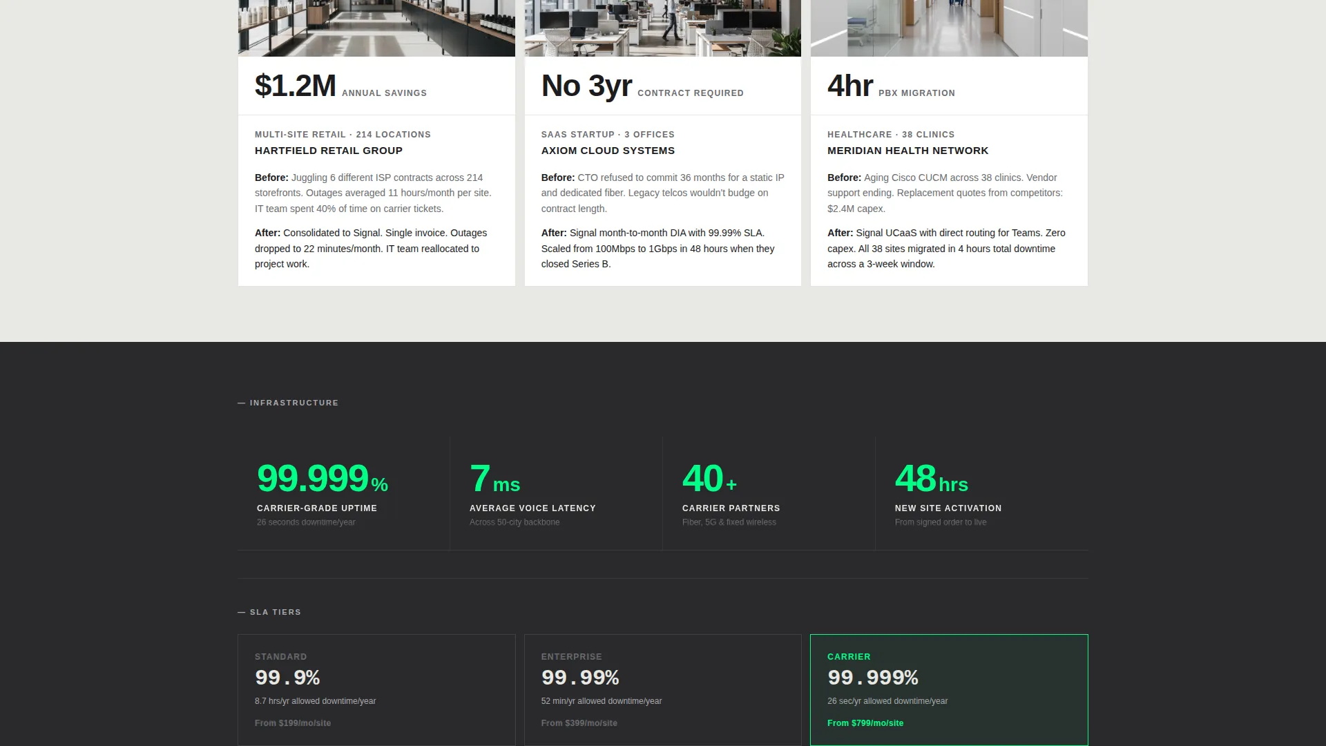
| Case Study Cards | Provides social proof through self-contained brutalist case-study blocks |
| Free Audit call to action | Anchors the primary conversion action below the calculator result |
| Progressive Lead Form | Captures company email, location count, and provider in three steps |
| PDF Download Gate | Offers gated comparison data for visitors not ready to speak with sales |
| Persistent Mobile Bar | Keeps the audit call to action visible on mobile throughout the full scroll |
Design & branding system
Signal uses a bold brutalist visual language built for an audience that respects infrastructure over aesthetics. Every design choice signals reliability and zero compromise.
- Color system: structural charcoal (#1C1C1E) for backgrounds, mill-finish aluminum (#A8A9AD) for body text and dividers, bare concrete white (#E8E8E3) for section alternates, and signal-green (#00FF87) reserved strictly for interactive states, toggle switches, and call-to-action pulses
- Typography: oversized grotesque set in all-caps with visible letter tracking; no decorative typefaces anywhere on the page
- Cards carry no border-radius and no shadows; raw edges and hairline dividers define every block; backgrounds alternate between charcoal and concrete white in hard, frameless transitions
Mobile & speed optimization
The layout is engineered for mobile visitors who are evaluating a provider on a phone during a busy workday. Every interactive element is sized and positioned for fast, confident taps.
- Toggle cards in the calculator are chunky and thumb-friendly, designed for accurate selection without zooming
- The persistent bottom bar keeps the primary call to action visible without disrupting the scroll on any screen size
- The card grid breathes with generous gutters that reflow cleanly on smaller viewports, keeping each brutalist block self-contained and readable
How this template helps you convert
Signal is built around the principle that a visitor who has already calculated their savings is far closer to saying yes. Every layout decision reinforces that momentum.
- The calculator does the selling first, so by the time a visitor sees the signal-green savings figure, the free network audit feels like the obvious and logical next step
- The progressive form lowers entry friction by asking only for an email on the first card, then gathering richer detail across two additional steps only after initial commitment
- The gated PDF path captures a second tier of leads, turning visitors who are not yet ready to talk into contactable prospects with a single download action
Other information about this template
Signal is a card grid modular landing page template styled in the bold brutalist tradition. It sits at the intersection of telecommunications digital presence and practical conversion design. A few additional details worth knowing:
- The template is categorized under Technology, with a subcategory of Telecommunications Digital Presence
- The header concept is a Logo Bar designed to display carrier, cloud, and hardware partner logos; the brief specifically references Cisco, Cradlepoint, Palo Alto, and AWS as example logo types rendered in monochrome steel
- The creative direction is Calculator/Tool First, meaning the bandwidth-cost calculator is the structural anchor of the entire page experience
- The landing page direction is Freemium/Trial, with "Start Your Free Network Audit" as the primary call to action throughout
- The template style is Card Grid Modular, making individual sections straightforward to reorder or swap without breaking the overall visual rhythm
Theme
Bold Brutalist
Creative direction
Calculator/Tool First
Color system
Monochrome Steel
Style
Card Grid (Modular)
Direction
Freemium/Trial
Page Sections
Bandwidth-cost Calculator with Toggle Cards
Personalized Modular Card Grid
Progressive Three-step Lead Form
Gated PDF Comparison Download
Logo Bar with Scrolling Partner Strip
Persistent Mobile Call-to-action Bar
Related questions
Who is the Signal template designed for?
How does the bandwidth-cost calculator work within the template?
What are the two conversion paths available in this template?
Can I use this template for a single-product telecom offer?
Is the bold brutalist design easy to adapt to an existing brand?



