Cloud & DevOps Professional Website Template
Bare is a bento grid landing page template built for bare metal hosting providers. It pairs a Monochrome Steel visual identity with Launch Energy micro-animations to create a high-impact, comparison-driven page. Visitors move from a live-feel server dashboard header through spec cards, cloud cost comparisons, and a server configurator, all designed to make the switch decision feel obvious.
by Rocket studio
Quick summary
Bare is a single-page bento grid template for bare metal hosting providers. It opens with a product screenshot header showing a provisioned server dashboard, then guides visitors through animated spec cards, a cloud-cost comparison engine, and a live server configurator. The design runs on a Monochrome Steel palette that lights up in status-green only when something is interactive or live.
Who this template is for
This template was built for teams selling dedicated server infrastructure to a technical, cost-conscious audience. If your buyers already know what a hypervisor is, this page speaks their language.
- Bare metal hosting providers targeting DevOps leads migrating away from expensive cloud bills
- Infrastructure vendors serving game studio technical leads spinning up dedicated match servers
- GPU compute providers whose customers include machine learning engineers requiring direct hardware access
What problem this template solves
Most hosting landing pages bury the value in generic feature lists. Engineers and technical buyers want hard numbers, not marketing copy. This template replaces soft claims with visual proof.
- Visitors cannot immediately compare their current cloud bill against bare metal pricing, so they leave without converting
- Pages with no live configurator force buyers to contact sales for basic pricing, adding friction
- Generic hosting templates fail to convey raw performance credibility to a technical audience
What you get with this template
You get a fully structured, single-page bento grid layout with every section pre-designed for a bare metal hosting use case. The template covers the full buyer journey from first impression to configuration.
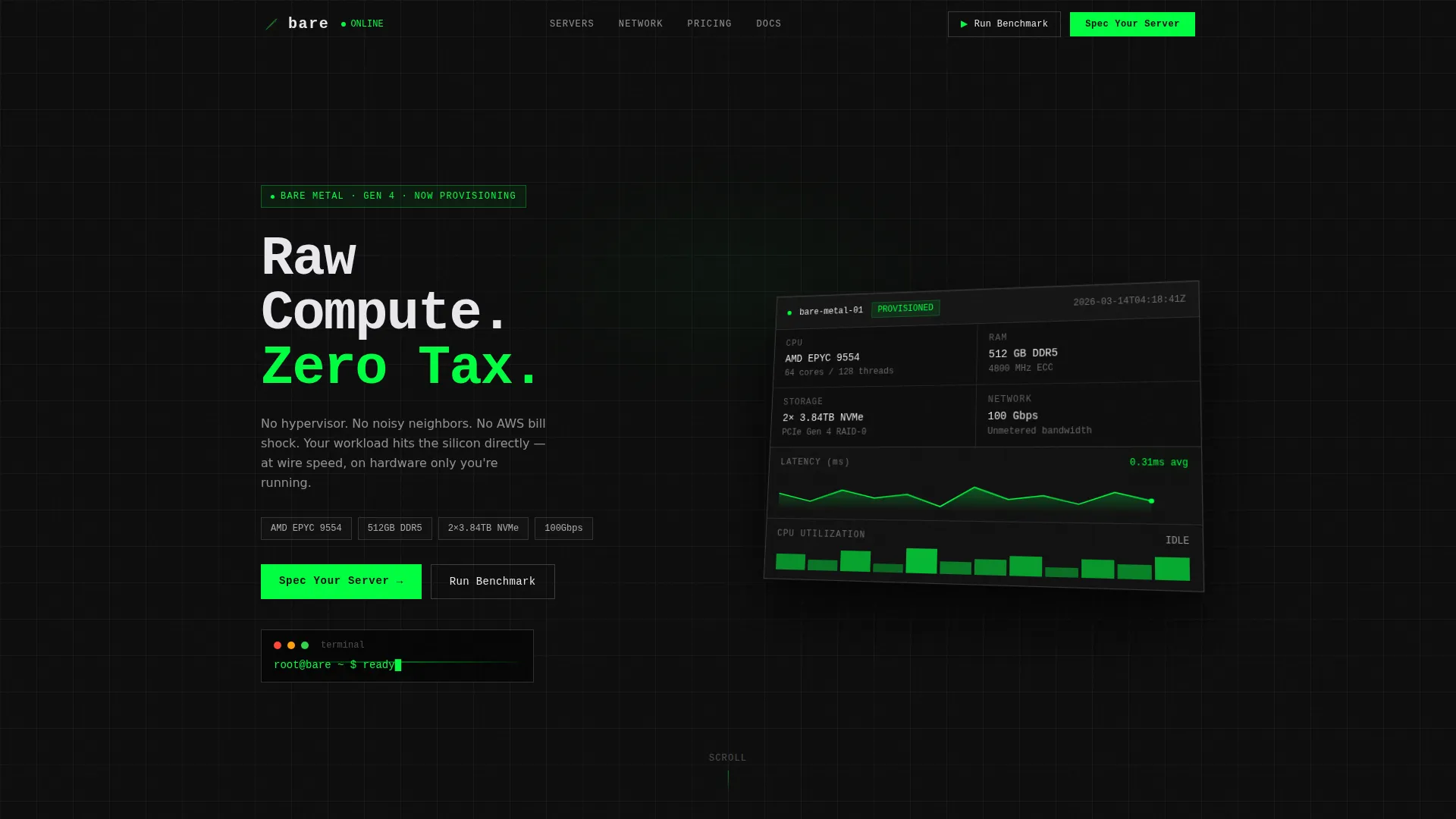
- An isometric product screenshot header with parallax mouse drift and a blinking terminal prompt
- Scroll-triggered bento cells with flip animations, a cloud comparison table, deploy timer, region map, and OS selector
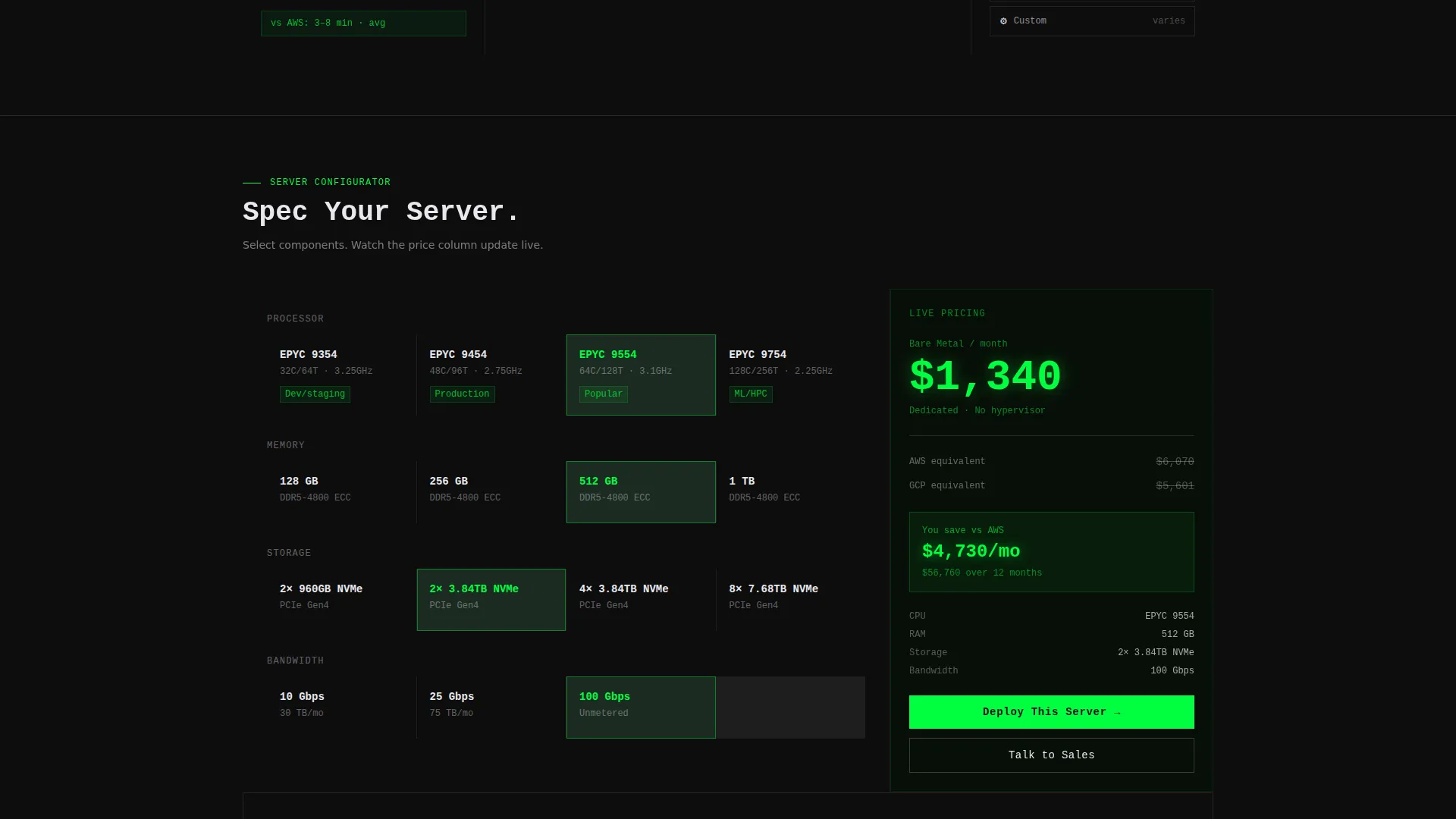
- A server configurator section with a live price column showing bare metal cost versus equivalent cloud provider monthly spend
Feature list
This template is built around six core components, each serving a specific conversion role in the bare metal sales flow.
Isometric Dashboard Header
The header renders a pixel-perfect server dashboard at a slight isometric tilt. Real specs are visible on screen, including processor model, memory, and storage figures. A parallax drift responds to mouse movement, and a blinking terminal line sits beneath the dashboard to reinforce the live-system feel.
Scroll-Triggered Spec Cards
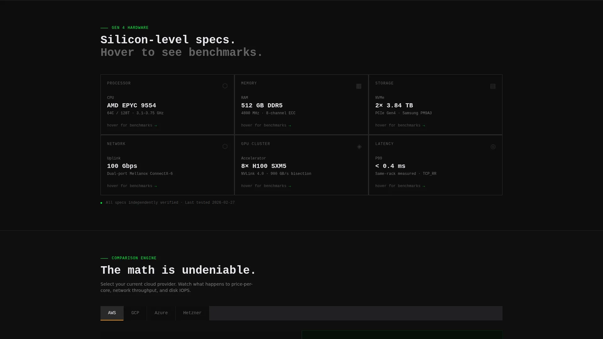
The first bento row contains raw spec cards that flip on scroll to reveal benchmark numbers on the reverse side. Each flip animation snaps into place like a system coming online, keeping the scroll experience energetic and purposeful.
Cloud Provider Comparison Engine
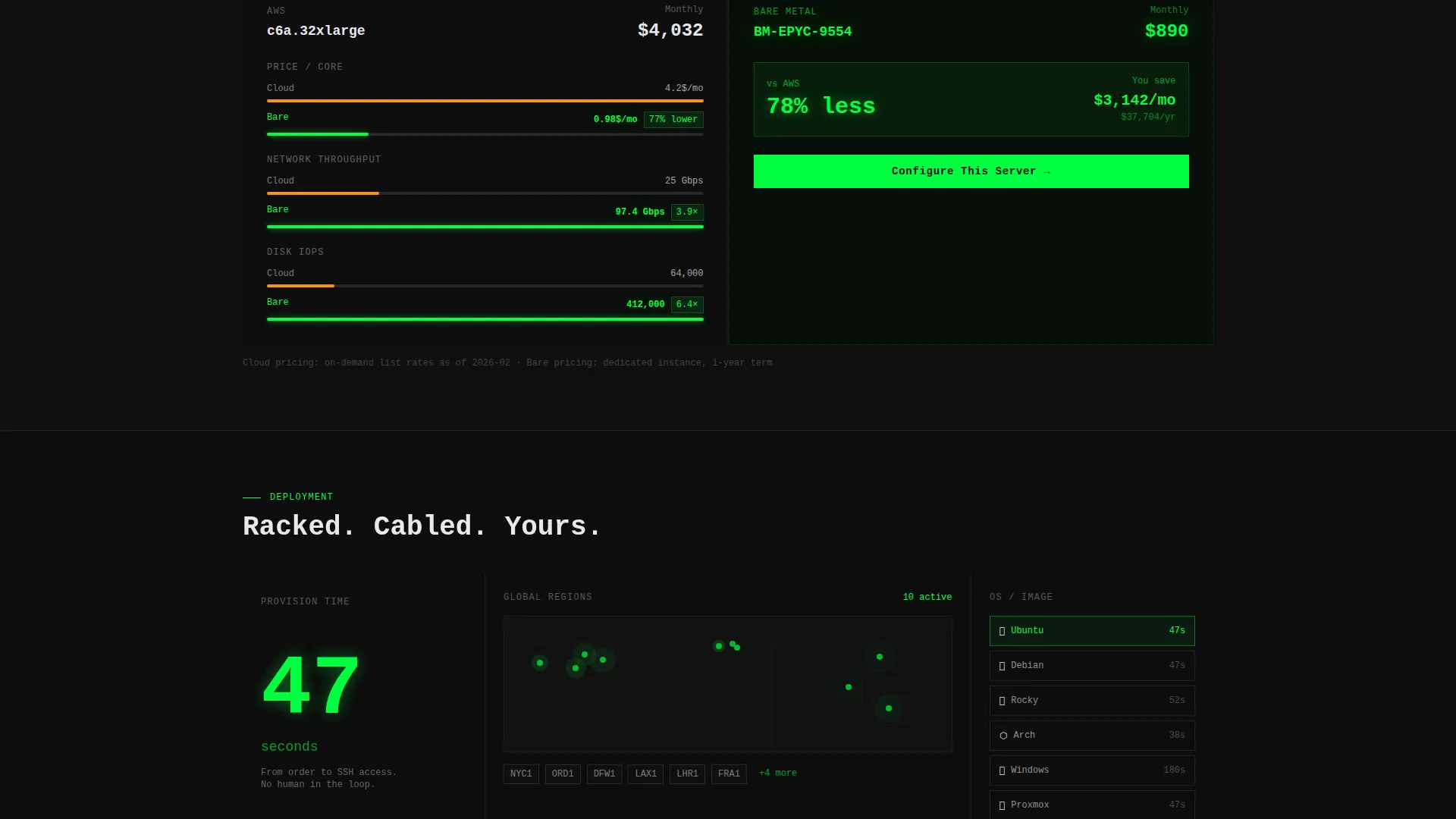
A wide bento cell lets visitors select their current cloud provider using tabbed controls. Animated bars then race to compare price-per-core, network throughput, and disk input/output operations per second side by side against bare metal. The math is visible and immediate.
Live Server Configurator
Visitors select CPU, RAM, storage, and bandwidth inside a configurator anchored to the primary call to action. A live price column updates beside the equivalent monthly cost from a major cloud provider, with savings highlighted in status-green.
Free Benchmark Cell
A secondary conversion cell invites visitors to enter an IP address and run a latency and throughput test against the nearest bare metal node. This gives hesitant buyers a low-commitment proof point before they commit.
Deploy Timer and Region Map
A bento cell displays a live deploy counter set at 47 seconds. Alongside it, a global region map shows ping dots, and a one-click operating system selector carousel lets visitors browse supported options at a glance.
Page sections overview
| Section | Purpose |
|---|---|
| Dashboard Header | Opens with a provisioned server screenshot and blinking terminal line |
| Spec Cards Row | Flip-on-scroll cards revealing raw specs and benchmark results |
| Cloud Comparison Cell | Side-by-side animated cost and performance comparison by provider tab |
| Server Configurator | Live pricing tool anchored to the primary call to action |
| Free Benchmark Cell | Low-friction secondary conversion with IP-based latency test |
| Deploy Timer Block | Live 47-second counter reinforcing fast provisioning |
| Region Map Cell | Global node map with ping indicators |
| OS Selector Carousel | One-click operating system browsing component |
Design & branding system
The visual identity runs on a Monochrome Steel color system. The palette feels deliberately restrained until an interactive element fires.
- Core colors: deep rack black (#0D0D0D) for the field, brushed chassis gray (#3A3A3C) for hairline cell borders, and indicator LED white (#E8E8ED) for primary text
- Status-green (#00FF41) is reserved exclusively for interactive states, hover pulses, and live data highlights, it never appears as a passive decoration
- The Dynamic Motion theme drives the page rhythm, with each bento cell loading via a micro-animation that snaps into place like a system coming online during a boot sequence
Mobile & speed optimization
The bento grid layout is structured to reflow cleanly across screen sizes. The micro-animations and parallax effects are scoped to the components that carry the most visual weight.
- Bento cells restack into a single-column flow on smaller screens, preserving the section hierarchy and conversion path
- Parallax and flip animations are contained within individual grid cells, keeping the layout stable during scroll on touch devices
- The live price column and comparison bars are built as in-page interactions, avoiding external dependencies that could slow initial load
How this template helps you convert
The page is structured as a Comparison and Versus engine. Every section moves a skeptical technical buyer one step closer to a decision.
- The cloud comparison cell makes the cost and performance gap between cloud and bare metal visible immediately, removing the need for buyers to do their own research
- The live configurator anchors the primary call to action to a real number, so visitors see their exact price before they ever speak to sales
- The free benchmark cell gives cautious buyers a zero-risk proof point, reducing the distance between interest and commitment
Other information about this template
This template is designed specifically for the bare metal hosting and dedicated server market. It suits providers who want a high-credibility, technically fluent page without custom development.
- The template style is a bento grid, which suits a technical audience that scans information in structured blocks rather than reading long-form prose
- The creative direction follows a Launch Energy sequence, meaning the scroll pacing builds momentum from the header all the way to the configurator
- The header concept is a Product Screenshot, which grounds the page in a real provisioned instance rather than abstract marketing imagery
- The landing page direction is Comparison and Versus, making it well-suited for providers competing against hyperscale cloud platforms on price and performance transparency
Theme
Dynamic Motion
Creative direction
Launch Energy
Color system
Monochrome Steel
Style
Bento Grid
Direction
Comparison/Versus
Page Sections
Isometric Dashboard Header with Parallax
Flip-on-scroll Spec Cards
Tabbed Cloud Cost Comparison
Live Server Configurator
Free Benchmark Entry Cell
Deploy Timer, Region Map, and OS Selector
Related questions
Who is this landing page template designed for?
Can I swap in my own server specs and pricing?
What makes the bento grid layout a good fit for hosting providers?
Does the page include more than one call to action?
Is the status-green color used throughout the design?



