Comprehensive Pet Training Landing Page Template
Kennel is a glassmorphic pet care client management landing page built for groomers, walkers, and boarding facilities. It uses a hub-and-spoke anchor navigation, a spec-sheet creative direction, and a dark Tech Glass visual identity to present scheduling, client records, and a competitor comparison table, all driving visitors toward a free signup or sandbox demo.
by Rocket studio
Quick summary
Kennel is a single-page, anchor-navigated landing page template for a pet care client management platform. It pairs a frosted-glass visual identity with a spec-sheet content style, giving solo groomers, boutique kennels, and mobile operators a polished digital home that feels engineered rather than assembled. The primary call to action drives free signups, while a sandbox demo reduces commitment friction.
Who this template is for
This template is built for pet care professionals who want a credible, product-led online presence without starting from scratch. It suits operators who manage real client volume and need a page that matches the quality of their service.
- Solo dog groomers handling dozens of recurring appointments every week
- Boutique boarding kennels tracking vaccination records and feeding schedules
- Mobile pet care operators who need route-optimized day plans on their phone
What problem this template solves
Managing pet care appointments with generic tools creates friction at every step. Sticky notes, basic calendar apps, and legacy salon software were not built for the specific demands of client records, recurring schedules, and mobile access. This template addresses that gap visually and functionally.
- No dedicated starting point for launching a pet care software product page
- Generic designs that fail to communicate the precision of a scheduling-focused platform
- Lack of a clear comparison section that shows why purpose-built tools outperform spreadsheets and calendar apps
What you get with this template
You get a fully structured, single-page landing page with an anchor navigation system that connects every section of the page. The layout is designed around a Comparison/Versus conversion strategy and a spec-sheet content cadence.
- A sticky hub-and-spoke anchor nav linking to Client Records, Smart Scheduling, Compare, and other key sections
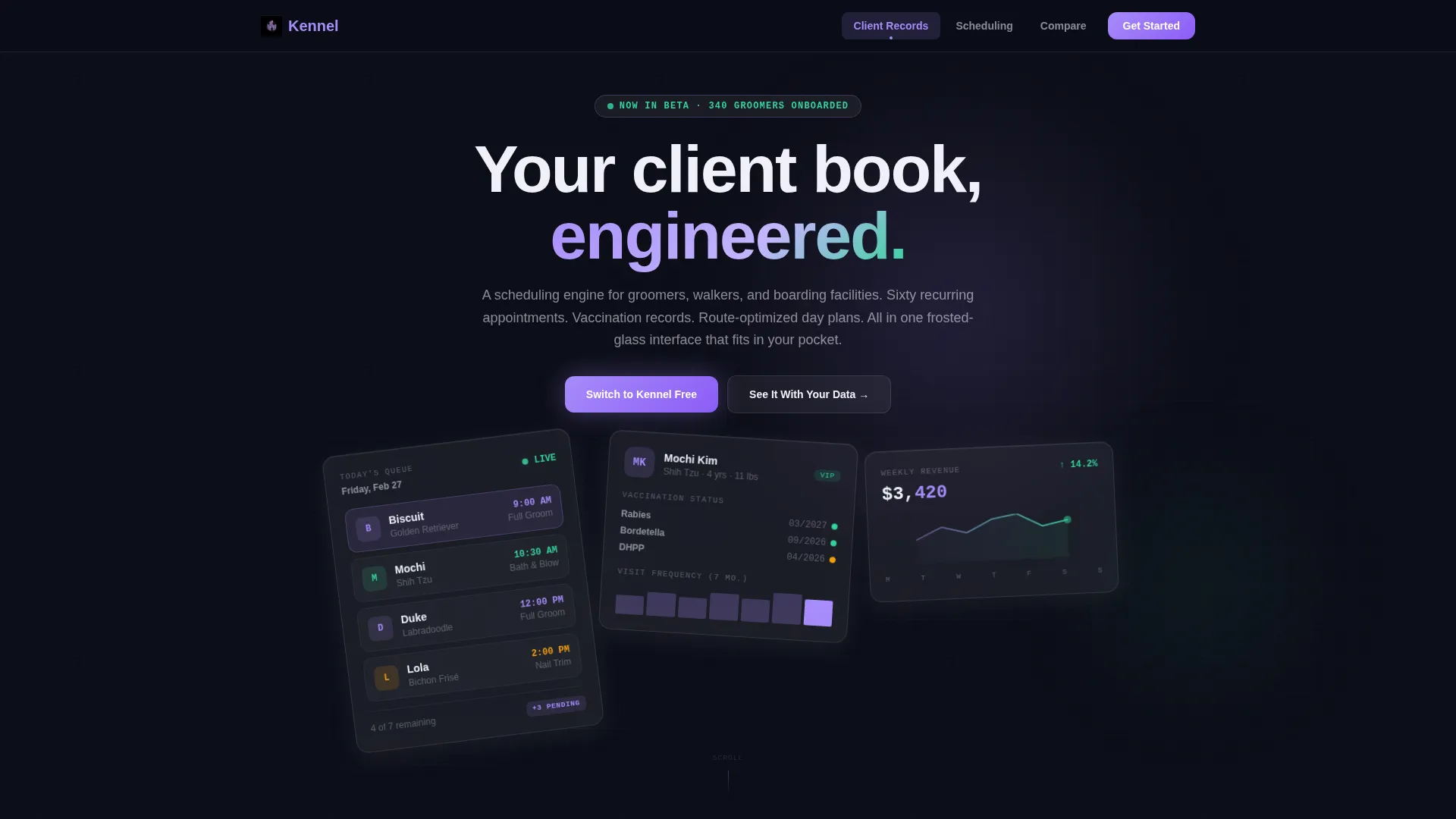
- Three floating Dark Glass Panel header cards showing live-data snapshots of appointments, client profiles, and revenue
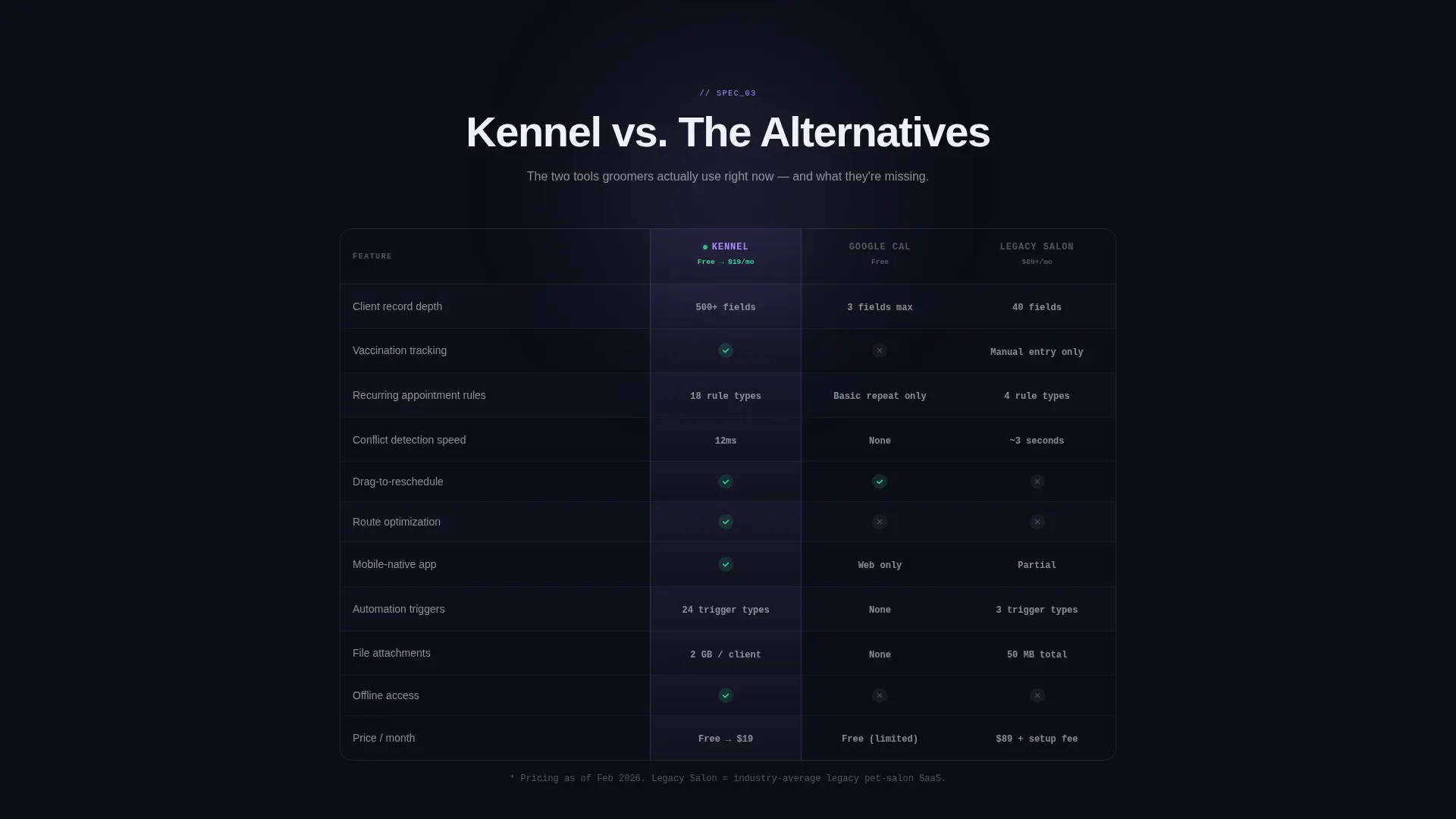
- A frosted-glass competitor comparison table with a primary call-to-action and a single-field email input at its base
Feature list
This template delivers a focused set of purpose-built components. Each one is designed to communicate platform credibility and move visitors toward action.
Dark Glass Panel Header
Three translucent, slightly tilted cards float against a void-black background. Each panel displays a different live-data snapshot: today's appointment stack with breed thumbnails and time slots, a client profile with vaccination badges and visit history, and a weekly revenue chart with a glowing trend line. The panels respond to scroll with a subtle top-light shift that implies physical depth.
Hub and Spoke Anchor Navigation
A sticky navigation bar links to every spoke section of the page. Visitors can jump directly to Client Records, Smart Scheduling, or the Compare section without losing their place. The nav stays visible as the user scrolls, keeping the primary call to action always within reach.
Spec Sheet Section Layout
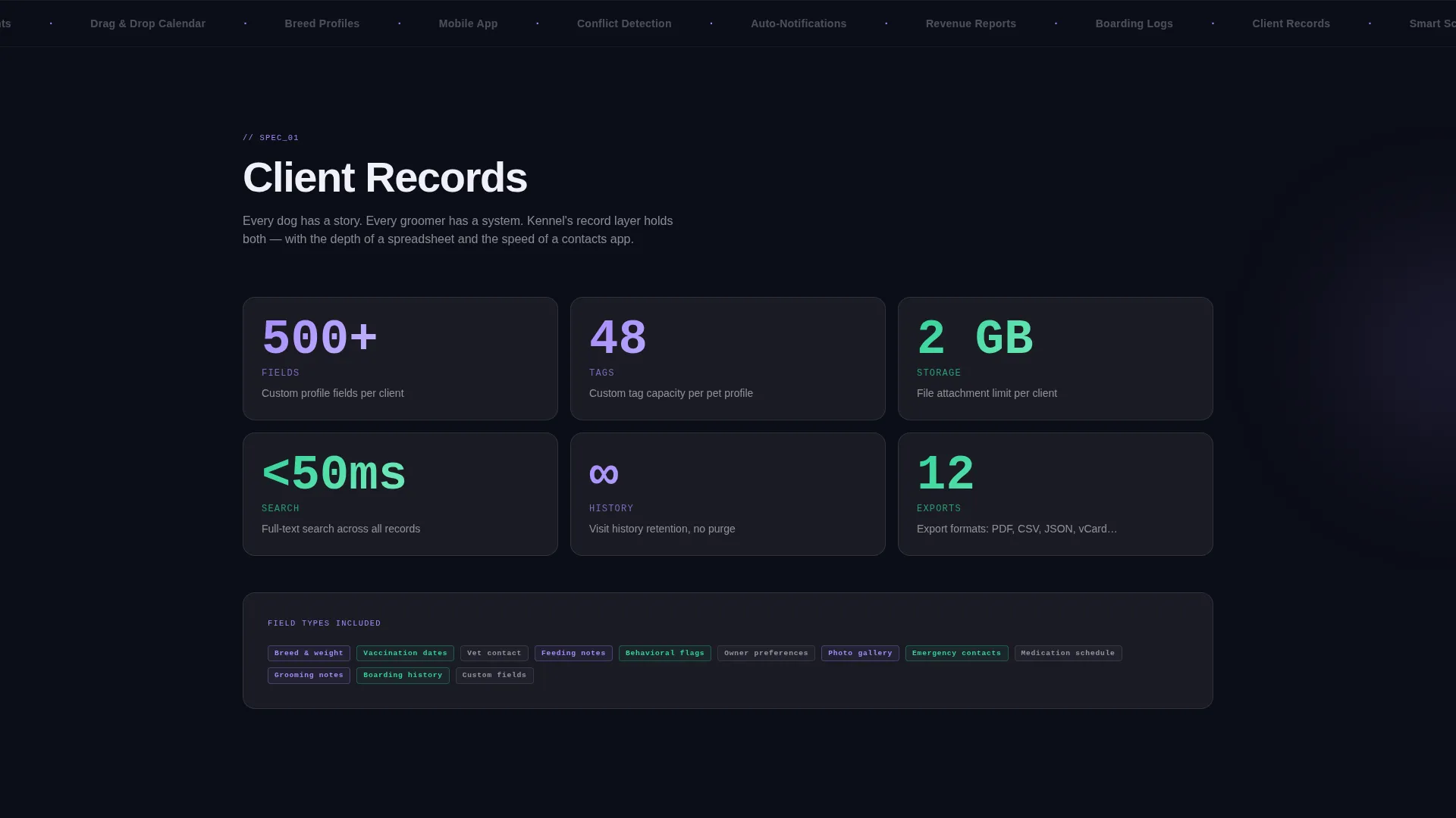
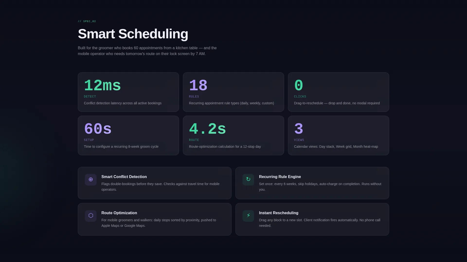
Each spoke section presents a single feature as a technical specification. Field counts, conflict detection speed, recurring-rule options, and drag-to-reschedule latency replace generic paragraph copy. The cadence feels like reading the back of a product box, each line confirming the platform was engineered with care.
Frosted Glass Comparison Table
A dedicated Compare section uses a frosted-glass table to pit the platform against a generic calendar app and a legacy pet-salon system. Columns cover client record limits, automation triggers, and mobile access. This layout is built specifically for Comparison/Versus conversion.
Dual Call-to-Action System
The primary call to action reads "Switch to Kennel Free" and anchors at the base of the comparison table alongside a single-field email input. A secondary call to action, "See It With Your Data," offers a sandbox demo pre-loaded with sample pet profiles. Together, they serve both ready-to-convert visitors and those who need one more nudge.
Glassmorphic Color System
The entire template uses a four-tone palette: void black, translucent frost, soft lilac glow, and status-green. Cards sit on frosted panels with backdrop-blur. Lilac appears only where the user's eye should land next, and status-green is reserved for active-state indicators and confirmation pulses.
Page sections overview
| Section | Purpose |
|---|---|
| Header Panel Cards | Show live-data snapshots of appointments, client profiles, and revenue |
| Sticky Anchor Nav | Let visitors jump to any spoke section instantly |
| Client Records Spoke | Present field count, custom tags, and file attachment specs |
| Smart Scheduling Spoke | Detail conflict detection, recurring rules, and drag-to-reschedule |
| Compare Section | Contrast platform against generic calendar and legacy salon tools |
| Primary call to action Block | Drive free signups with email input at comparison table base |
| Sandbox Demo call to action | Offer low-commitment demo pre-loaded with sample pet profiles |
Design & branding system
The visual identity follows a Tech Glass theme built on glassmorphism. Every layer is designed to feel like a smartphone screen floating in a dark room, with edges catching light and cards hovering above the background.
- Four-tone palette: void black (#0B0D17), translucent frost (white at 8% opacity), soft lilac glow (#A78BFA), and status-green (#34D399)
- Frosted card panels use backdrop-blur to create depth without adding visual weight
- Lilac is used sparingly as a directional signal, guiding the visitor's eye toward the next interaction point
Mobile & speed optimization
The template is structured with mobile pet care operators in mind. Its layout is designed to remain readable and functional on smaller screens, supporting operators who check their day plans from a phone.
- Anchor navigation stays persistent and accessible as users scroll on any screen size
- Dark backgrounds and frosted panels maintain visual clarity without relying on image-heavy assets
- The single-field email input at the call-to-action block keeps conversion steps minimal on touch devices
How this template helps you convert
The conversion architecture in this template is deliberate. Every structural decision reduces friction and reinforces trust before the visitor makes a commitment.
- The spec-sheet content cadence builds confidence early by presenting the platform as precisely engineered, not generically assembled.
- The frosted-glass comparison table gives undecided visitors a direct reason to choose this platform over the tools they already use.
- The dual call-to-action system captures both high-intent visitors ready to sign up and cautious visitors who want to explore the sandbox demo first.
Other information about this template
This template is part of a broader set of Tech Glass themed designs built for software and SaaS products in service-based niches. It is a strong fit for teams positioning a pet care client management tool in a market dominated by general-purpose scheduling software.
- The template style is Hub and Spoke with Anchor Navigation, making it well-suited for product-led landing pages with multiple feature sections
- The creative direction follows a Spec Sheet cadence, which is particularly effective for pet care software and SaaS audiences comparing tools before purchase
- The Comparison/Versus landing page direction is one of the most effective formats for converting visitors who are already using a competing solution
- This template is available in a marketplace context where designers and developers can customize every section to match a specific brand or product offering
Theme
Tech Glass
Creative direction
Spec Sheet
Color system
Glassmorphic
Style
Hub & Spoke (Anchor Nav)
Direction
Comparison/Versus
Page Sections
Dark Glass Panel Header
Hub and Spoke Anchor Navigation
Spec Sheet Section Cadence
Frosted Glass Comparison Table
Dual Call-to-action System
Glassmorphic Color and Depth System
Related questions
Can I customize the color palette in this template?
Does this template include the actual scheduling software?
Who is the comparison table designed to target?
Can the sandbox demo call to action be linked to a real demo environment?
Is this template suitable for a mobile grooming business?



