Backend-as-a-Service Landing Page Template
Base is a backend-as-a-service landing page template built for developer tool platforms. It features a live cost estimator hero, an interactive comparison table, and a frictionless freemium signup flow. The Tech Glass visual system and signal-green calls to action create a focused, conversion-ready experience for solo developers, startup teams, and agency leads evaluating backend infrastructure.
by Rocket studio
Quick summary
Base is a single-page landing page template for backend-as-a-service platforms. It opens with a functioning cost estimator and flows into an interactive comparison table. The design uses a Monochrome Steel palette with frosted glass cards, subtle noise textures, and signal-green calls to action. Every section invites interaction before the visitor ever reaches a signup form.
Who this template is for
This template is built for teams and individuals launching or marketing a backend-as-a-service platform. It speaks directly to technical decision-makers who evaluate tools quickly and distrust fluff.
- Solo developers building side projects who need to see real numbers before committing
- Startup CTOs and small engineering teams who want backend infrastructure without a dedicated DevOps hire
- Agency leads managing multiple client backends who need a clear, scannable case for choosing one platform
What problem this template solves
Backend platforms are hard to evaluate without hands-on time. Most landing pages rely on feature bullet lists that mean nothing until a developer runs a query or checks a price. This template replaces passive reading with active discovery.
- Visitors spend time with a live cost estimator instead of skimming a pricing page
- The interactive comparison table makes feature gaps visible at a glance, reducing decision friction
- A frictionless signup flow with no credit card field lowers the barrier to starting a free trial
What you get with this template
You get a fully structured, single-page landing page designed for a developer-focused backend platform. Every section is interactive by design, and the visual system is ready to carry a technical brand with confidence.
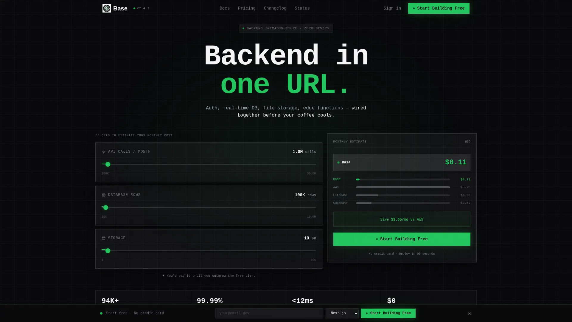
- A live calculator hero with three real-time sliders comparing estimated costs across platforms
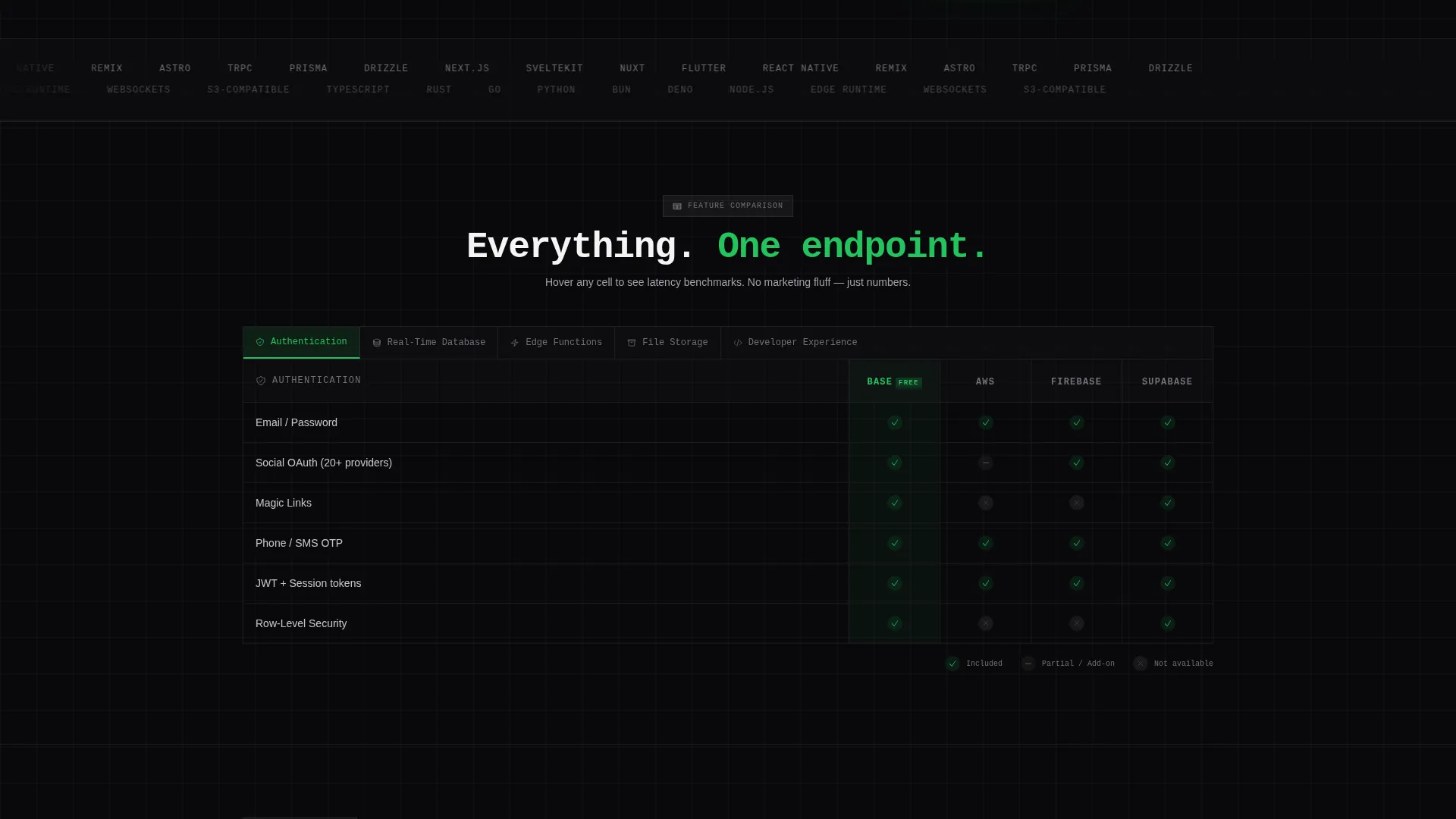
- A tabbed comparison table with hover tooltips, latency benchmarks, and a highlighted free-tier column
- Interactive explorers including a live query playground, a drag-and-drop schema builder preview, and a region-picker map showing global edge latency in milliseconds
Feature list
This template is built around a set of purpose-designed components. Each one is grounded in the brief and serves a specific role in moving visitors from curiosity to commitment.
Live Cost Estimator Hero
Three sliders sit on frosted glass cards inside the hero section. Visitors adjust monthly API calls, database rows, and storage in gigabytes. A price ticker updates in real time, displaying results in large monospaced numbers with a mechanical counter-roll animation. A compact spark-line chart compares the estimated monthly cost across competing platforms.
Interactive Comparison Table
A tabbed table organizes feature categories into rows and competing platforms into columns. Cells are not static checkmarks. Hovering any cell reveals a tooltip with a one-sentence explanation and a latency benchmark, turning a passive table into an active evaluation tool.
Sticky Freemium call to action Bar
A slim sticky bar appears after the visitor interacts with the estimator. It carries a single primary call to action in signal green with no credit card field. The signup form asks only for email address and preferred framework, keeping the path to a free trial as short as possible.
Live Query Playground
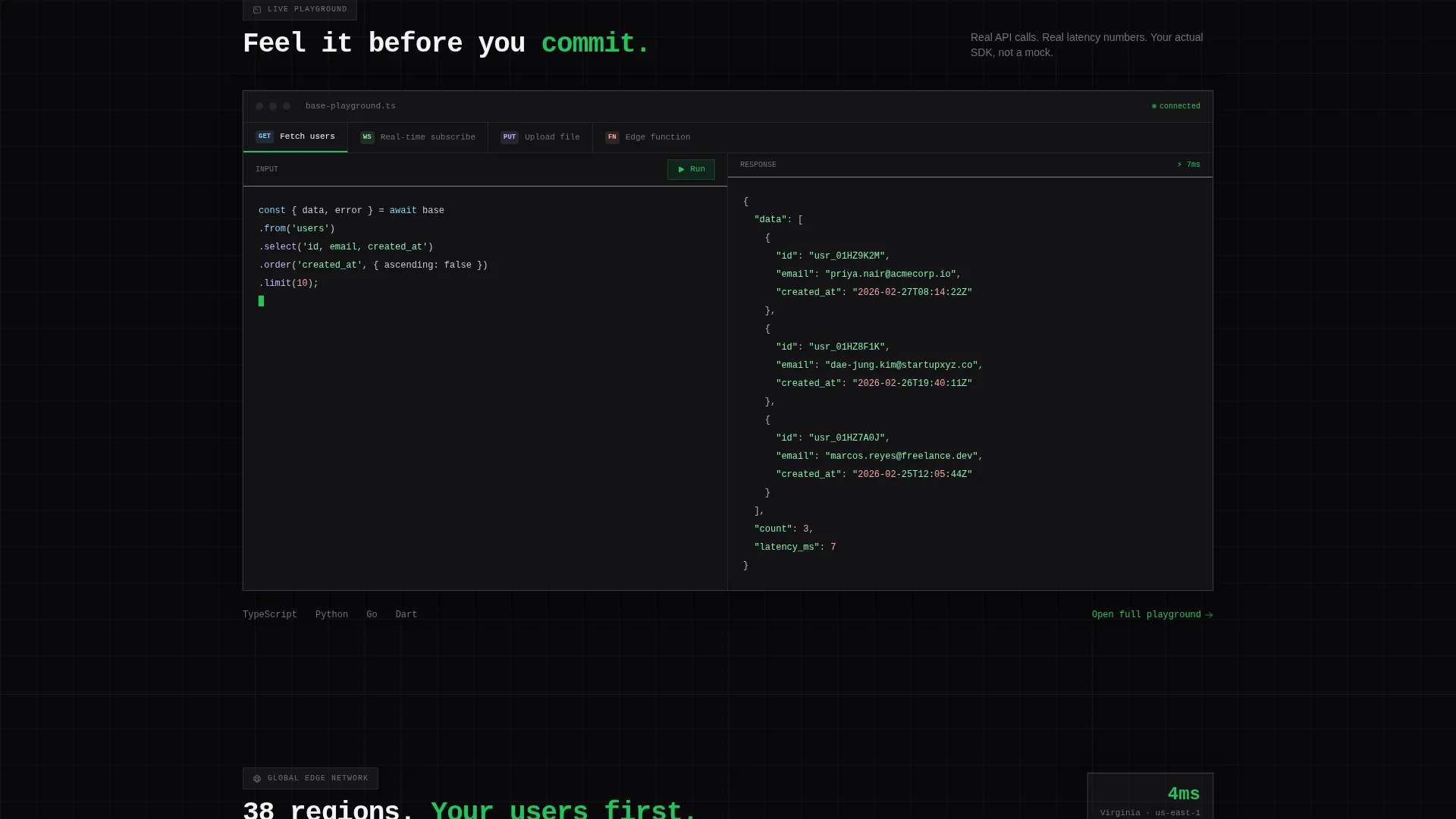
A scrollable interactive section lets visitors run a sample query directly on the page. This component demonstrates the platform's real-time database capability without requiring a signup, reinforcing trust before the conversion ask.
Region Picker Latency Map
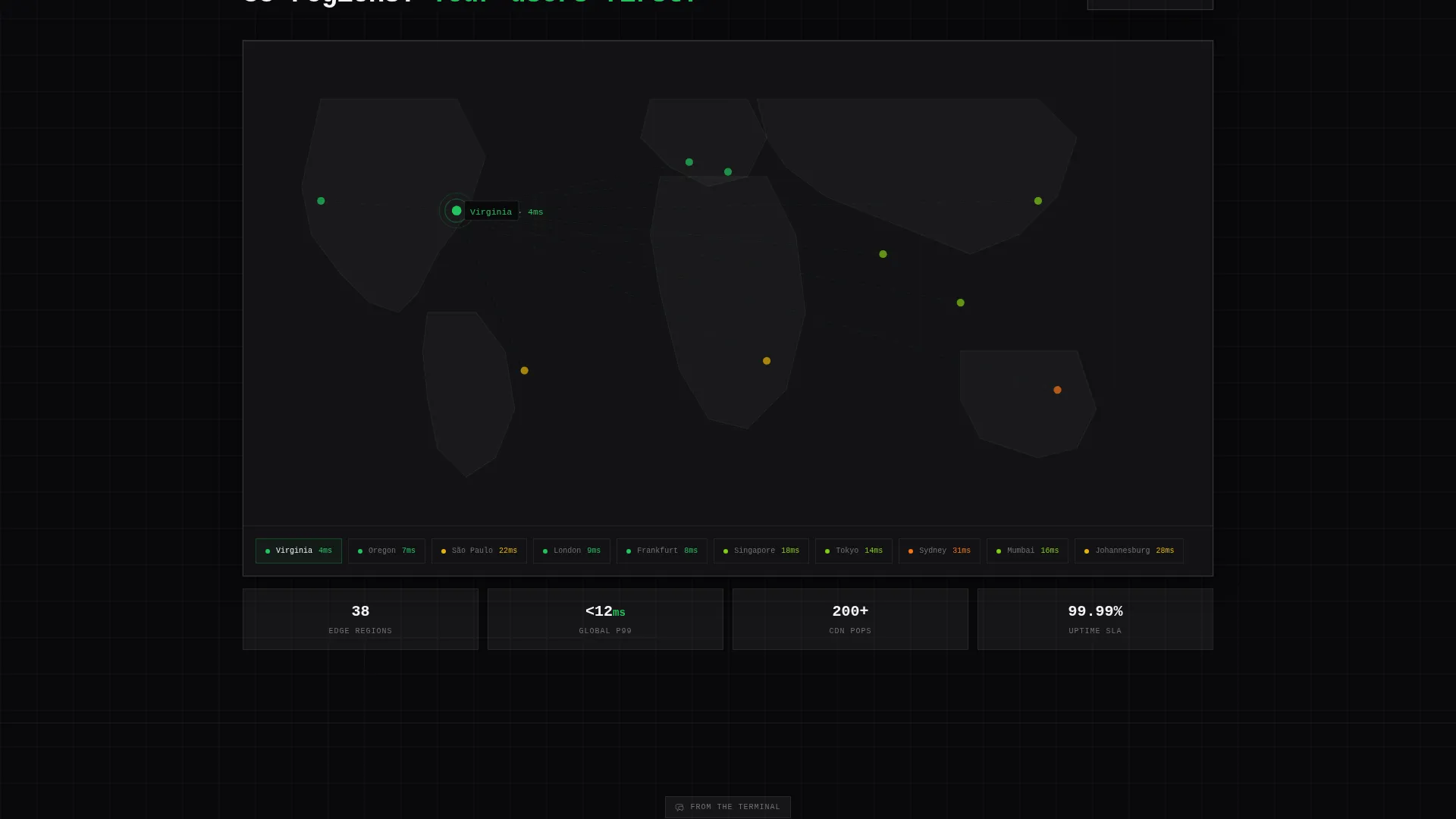
An interactive map lets visitors select a region and see global edge latency values displayed in milliseconds. This component makes infrastructure reach tangible and supports the platform's positioning as a globally distributed backend service.
Schema Builder Preview
A drag-and-drop schema builder preview gives visitors a tactile sense of the platform's database tooling. It is a preview interaction, not a full editor, but it is enough to communicate the interface quality and reduce onboarding anxiety.
Page sections overview
| Section | Purpose |
|---|---|
| Hero Estimator | Live cost calculator with real-time price comparison across platforms |
| Spark-Line Chart | Visual cost comparison using animated monospaced counter numbers |
| Comparison Table | Tabbed feature matrix with hover tooltips and latency benchmarks |
| Query Playground | In-page live query demo reinforcing real-time database capability |
| Schema Builder | Drag-and-drop preview communicating database tooling quality |
| Latency Map | Region picker showing global edge latency values in milliseconds |
| Sticky call to action Bar | Persistent signup prompt with framework selector and no credit card field |
| Pricing Free Tier | Highlighted free-tier column with smooth-scroll link from comparison call to action |
Design & branding system
The visual identity follows a Tech Glass theme using a Monochrome Steel color system. Every surface feels slightly reflective, and every edge carries a 1px luminous border that suggests depth without breaking the monochrome discipline.
- Four core colors: void black (#09090B), brushed chromium (#71717A), frosted panel white (#F4F4F5), and signal green (#22C55E) reserved for active states and calls to action
- Backgrounds layer in subtle noise textures; cards float on soft box-shadows that mimic light refracting through translucent steel
- Typography uses large monospaced numerals in the estimator and counter-roll animations to reinforce the terminal-inspired, developer-native aesthetic
Mobile & speed optimization
The layout is designed to remain scannable and usable across screen sizes. Interactive components are built to feel responsive without sacrificing the visual weight of the desktop experience.
- Frosted glass cards and layered shadow effects are structured to translate cleanly to narrower viewports
- Slider controls and tabbed table navigation are sized and spaced for touch interaction
- The sticky call to action bar remains accessible at the bottom of the screen on mobile, keeping the primary conversion path visible throughout the session
How this template helps you convert
Every section of this template is designed to earn trust before asking for a commitment. The conversion logic follows a deliberate sequence that uses the visitor's own data as the primary persuasion tool.
- The live cost estimator lets visitors input their own usage numbers and see a personalized price comparison, making the value case feel self-generated rather than marketing-driven
- The interactive comparison table and in-page playground give technical visitors enough hands-on evidence to move forward without a sales call
- The sticky call to action bar and low-friction signup form capture intent the moment it peaks, with a two-field form that removes every common drop-off point
Other information about this template
This template is structured around the Comparison Table template style, which works especially well for developer tool platforms that compete on features, pricing, and developer experience. The Interactive Explorer creative direction means every scroll rewards the visitor with something to manipulate rather than something to read passively.
- The header concept is a Calculator or Estimator, a proven pattern for backend-as-a-service and cloud infrastructure platforms where pricing complexity is a real buyer concern
- The Freemium or Trial landing page direction aligns with how most developer tool platforms acquire users today: remove friction first, prove value second, convert later
- The Tech Glass theme and Monochrome Steel color system position the platform as a serious, modern infrastructure product without relying on color-heavy branding that can feel misaligned in developer contexts
Theme
Tech Glass
Creative direction
Interactive Explorer
Color system
Monochrome Steel
Style
Comparison Table
Direction
Freemium/Trial
Page Sections
Live Cost Estimator with Real-time Comparison
Interactive Tabbed Comparison Table
Sticky Freemium Signup Bar
In-page Query Playground
Global Edge Latency Map
Drag-and-drop Schema Builder Preview
Related questions
Can I customize the estimator slider ranges and platform names in the comparison?
Does the comparison table support adding or removing feature rows?
Is the sticky call to action bar always visible, or does it appear conditionally?
What frameworks are listed in the signup form dropdown?
Can the region picker map be updated to show my platform's actual server locations?



