No-Code Platform Documentation Directory Website Template
Basecamp is a card grid landing page template built for Airtable developer blogs. It combines a Directory and Discovery theme with an Interactive Explorer experience, letting visitors filter and browse content in real time. The dark Void and Violet color system gives it the feel of a polished code editor. The page drives toward app downloads with smart, engagement-triggered calls to action.
by Rocket studio
Quick summary
Basecamp is a modular card grid landing page template designed for Airtable developer blogs. It features real-time filter chips, hover-depth article cards, and a persistent download prompt that appears only after meaningful visitor engagement. The dark void aesthetic and violet accent system make every interactive element feel deliberate and alive.
Who this template is for
This template is built for builders who live inside Airtable and want to share what they know. Whether you are packaging expertise into a productized service or documenting workflows for a growing team, Basecamp gives your content a home that feels as technical as your audience expects.
- Solo developers building and documenting client-facing Airtable bases
- Operations leads who want to share scripting hacks and automation workflows
- Agency builders creating repeatable, productized Airtable services
What problem this template solves
Developer knowledge is messy to present. A flat list of blog posts does not communicate depth, difficulty, or discovery. Readers leave before they find the article that would have made them stay. Basecamp structures that knowledge into a browsable, filterable experience that rewards exploration.
- No clear way to signal content depth or category without a structured layout
- Visitors cannot self-sort by interest, so high-value content stays buried
- Generic blog layouts fail to establish credibility with technical audiences
What you get with this template
You get a fully designed, single-page layout built around the card grid structure. Every section is purposeful and leads the visitor from first impression to download intent. The template is ready to adapt with your own content and branding.
- A full-width product screenshot header with isometric tilt and ambient violet shadow
- An interactive card grid with real-time category filter chips and smooth layout animations
- A smart, engagement-triggered floating download pill that appears after three filter interactions
Feature list
This template ships with a clear set of designed components. Each one connects to a specific stage of the visitor journey, from first glance to download.
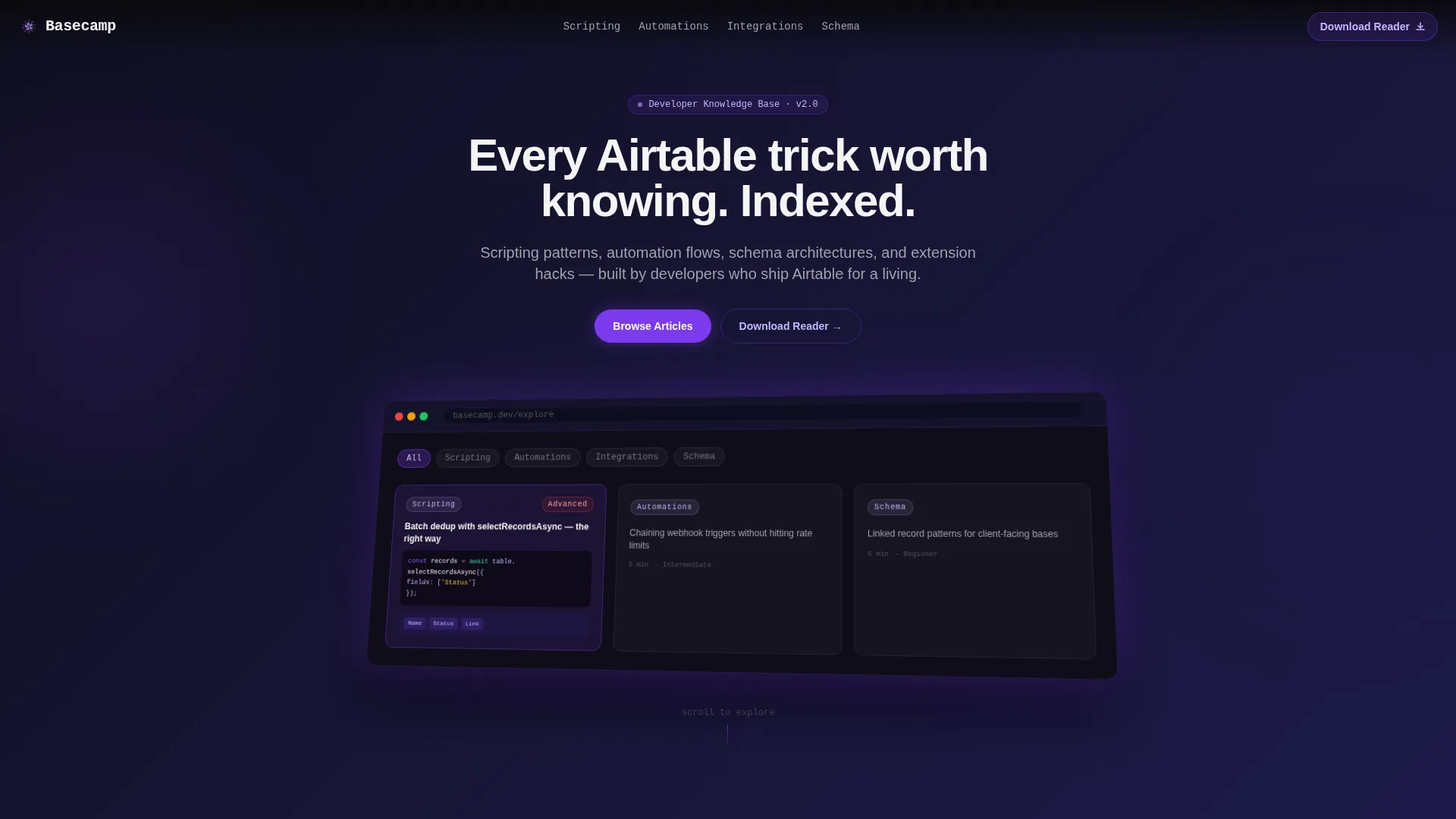
Full-Width Product Screenshot Header
The header displays a pixel-crisp capture of the blog interface mid-browse. One card is shown expanded, revealing a code snippet, a base schema thumbnail, and a difficulty tag glowing in violet. The screenshot sits on a subtle isometric tilt above the void background, with a soft violet ambient shadow beneath it. A headline animates letter by letter: "Every Airtable trick worth knowing. Indexed."
Real-Time Filter Chip Navigation
Four category chips sit below the header: Scripting, Automations, Integrations, and Schema Design. Clicking any chip rearranges the card grid instantly with smooth layout animations. Visitors explore content by interest without leaving the page or waiting for a reload.
Hover-Depth Article Cards
Each card in the grid responds to hover with layered reveals. A two-line summary slides up, a read-time badge appears, and the card border transitions from void black to electric violet. This micro-interaction teaches visitors what to expect inside the article before they click.
Curated Collection Sections
Deeper in the page, the grid tightens into named collections. Sections like "Most Forked Bases," "Weekend Builds," and "Advanced Scripting Series" group content by theme and difficulty. These collections guide visitors toward high-value content they might not have found through filters alone.
Engagement-Triggered Download Prompt
The primary call to action is a floating violet pill labeled "Download the Reader." It appears only after the visitor has interacted with three or more filter chips. This timing proves engagement before asking for commitment. The prompt captures platform choice first (iOS or Android toggle), then email, making it feel like a product decision rather than a form.
Card-Level Secondary calls to action
Each article card carries a secondary call to action: "Read in App" with a subtle lock icon. This framing positions the app as the premium reading experience. It creates consistent micro-conversions across the entire grid without interrupting the browsing flow.
Page sections overview
| Section | Purpose |
|---|---|
| Animated Headline Header | Introduce the blog with a typed headline and isometric product screenshot |
| Category Filter Chips | Let visitors sort the card grid by Scripting, Automations, Integrations, or Schema Design |
| Main Article Grid | Display browsable article cards with hover-depth reveals and read-time badges |
| Curated Collections Row | Group content into themed sets like Weekend Builds and Advanced Scripting Series |
| Floating Download Pill | Surface the primary app download call to action after three filter interactions |
| Download Prompt Form | Capture platform preference and email to complete the app download flow |
Design & branding system
The visual identity follows a Directory and Discovery theme built on the Void and Violet color system. The palette is intentionally dark and loaded, designed to feel like a code editor running a custom midnight theme. Every violet pulse is a visual signal that something is interactive.
- Absolute void black (#09090B) and deep space indigo (#1E1B4B) form the dark base layers
- Electric violet (#7C3AED) activates on hover states and selected filter chips
- Phosphor lilac (#C4B5FD) is reserved for tags, read-time metadata, and secondary text
Mobile & speed optimization
The card grid layout is designed to reflow cleanly across screen sizes. The modular structure means individual components stack and resize without losing the visual hierarchy that makes the layout work on desktop.
- Modular card blocks reflow into single-column stacks on smaller screens
- Filter chips remain accessible and tappable at mobile viewport widths
- The floating download pill is positioned to stay visible without blocking card content on touch devices
How this template helps you convert
The conversion strategy is built into the interaction design itself. The page does not ask for anything until the visitor has already demonstrated intent. Each step earns the next.
- Hover-depth cards and real-time filters keep visitors engaged long enough to identify the content most relevant to them.
- The floating download pill appears only after three filter interactions, so the ask arrives at the moment of highest engagement.
- The two-step download prompt (platform toggle, then email) frames the conversion as a product choice rather than a lead capture form.
Other information about this template
This template was designed specifically for the Airtable developer blog niche, where audiences are technical and skeptical of generic layouts. The Directory and Discovery theme reflects how developers actually navigate knowledge: by category, difficulty, and relevance, not by chronological post order.
- The template style is Card Grid (Modular), making it straightforward to swap in your own article data
- The creative direction is Interactive Explorer, meaning the page teaches visitors how to use the app by mirroring its browsing experience
- The header concept is Product Screenshot, which builds trust by showing the actual interface before asking for a download
- The landing page direction is App Download, with every section contributing to that single conversion goal


Theme
Directory & Discovery
Creative direction
Interactive Explorer
Color system
Void & Violet
Style
Card Grid (Modular)
Direction
App Download
Page Sections
Animated Product Screenshot Header
Real-time Category Filter Chips
Hover-depth Article Cards
Curated Collection Groupings
Engagement-triggered Download Call to Action
Card-level App Read Ctas
Related questions
Can I change the filter chip categories?
Does the floating download pill require a specific trigger setup?
Can I use this template without an app download goal?
Is the product screenshot header customizable?
Who gets the most value from this template?


