Restaurant Knowledge Base App Landing Page Template
Basecamp is a hub-and-spoke landing page template built for a restaurant knowledge base app. It uses a Feature Tab Switcher header, a spec-sheet scroll cadence, and an AI Iridescent color palette to show operators exactly what the app delivers. The primary call to action drives app downloads, with a secondary path for multi-unit demo bookings.
by Rocket studio
Quick summary
Basecamp is a single-page, anchor-nav landing page template designed for a restaurant knowledge base app. It opens with a Feature Tab Switcher hero, flows through a dense spec-sheet layout, and closes on a two-step app download flow. The design feels technological and warm at once, built to convert head chefs, floor managers, and multi-unit operators.
Who this template is for
This template is built for teams marketing a restaurant operations app to working hospitality professionals. It speaks to people who need proof before they commit to a new tool.
- Head chefs and kitchen managers who update prep lists and recipes daily
- Front-of-house managers onboarding new staff during busy service periods
- Multi-unit restaurant operators who need consistent playbooks across every location
What problem this template solves
Restaurant teams lose time searching for information that should be instant. Printed SOPs go missing, allergen charts live in someone's email, and training docs are outdated before the ink dries. This template solves the problem of communicating that complexity in a page that feels as fast and organized as the app it promotes.
- Visitors cannot quickly evaluate whether the app handles their specific workflow
- Dense feature sets are hard to absorb without a clear, scannable structure
- Desktop users browsing on a laptop still need a friction-free path to a mobile app download
What you get with this template
You get a fully structured landing page built around five anchor-nav spokes and a hero section that demonstrates the app interactively. Every section is designed to prove capability before asking for a commitment.
- A Feature Tab Switcher header with three app-state tabs: Recipes, Training, and SOPs
- A sticky anchor navigation bar linking to Features, Integrations, Security, Pricing, and Download sections
- A two-step download flow and a secondary "Book a Kitchen Demo" conversion path
Feature list
This template packs five major layout capabilities into a single, fast-reading page. Each one is designed to reduce friction for an operator who is evaluating the app under time pressure.
Feature Tab Switcher Hero
The header places three tabs labeled Recipes, Training, and SOPs directly above a device mockup. Each tab click swaps the visible screen content: a scaling recipe card grid, a new-hire checklist with completion rings, and a cleaning schedule with real-time checkoffs and timestamps. The mockup rests on a dark surface with an iridescent glow beneath it.
Anchor Navigation Bar
A sticky five-spoke nav bar pins to the top of the page on scroll. The five links, Features, Integrations, Security, Pricing, and Download, let operators jump directly to the section they care about most. This mirrors the app's own promise of instant access without scrolling through content they do not need.
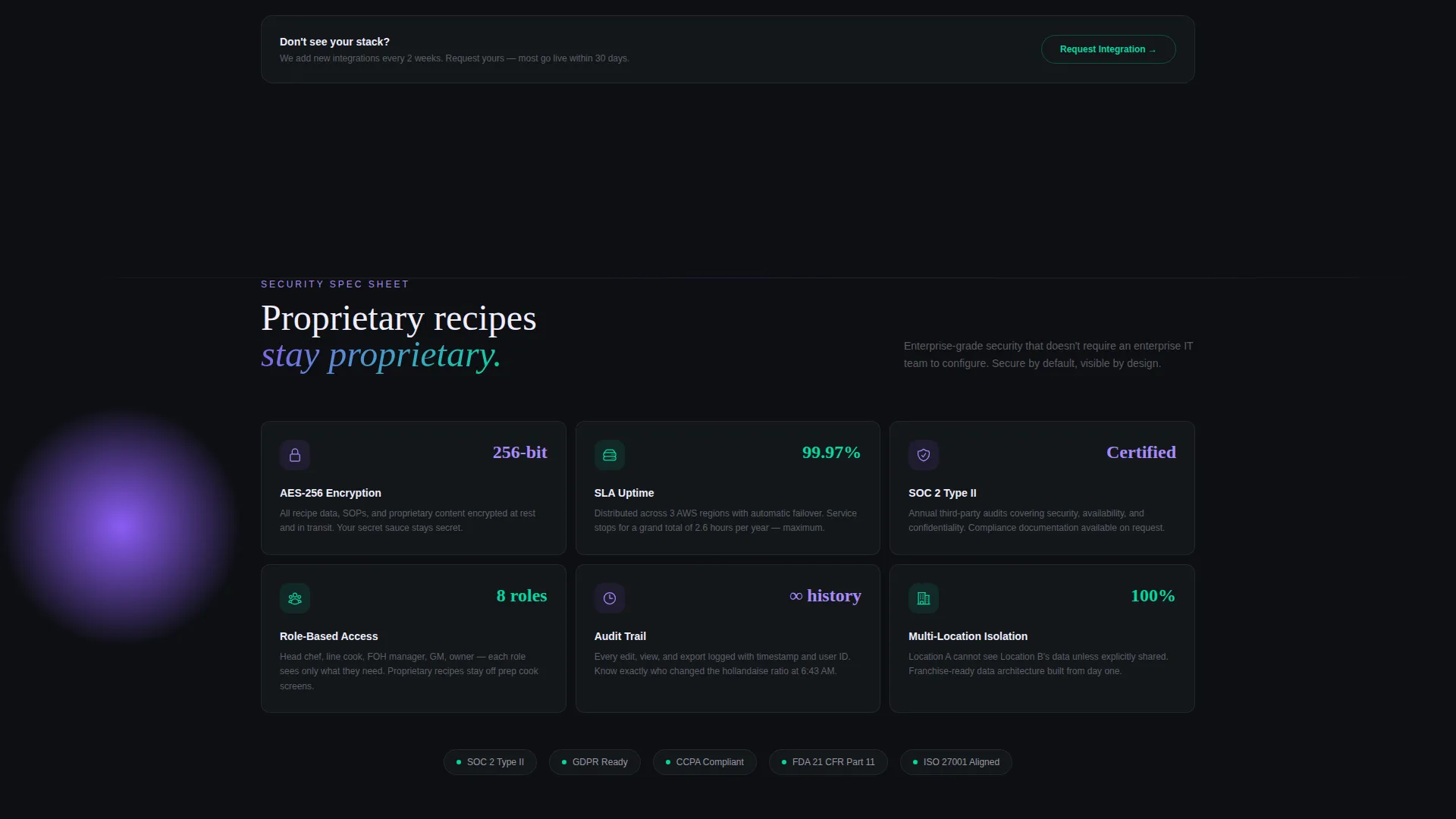
Spec Sheet Content Cadence
Each section reads like a product data sheet with tight feature grids, icon rows, and stat callouts. Numbers do the persuading: search speed figures, uptime percentages, supported languages, and POS integration logos are surfaced without storytelling padding. Density builds confidence as the user scrolls.
Two-Step App Download Flow
The primary call to action, labeled "Get It On the Line," triggers a two-step modal: choose iOS or Android, then enter a phone number to receive the download link. This solves the desktop-to-mobile handoff problem for operators who discover the app on a laptop but need it on the kitchen floor.
Sticky Mobile Download Bar
On mobile viewports, a persistent bottom bar keeps the download call to action visible throughout the entire scroll. This ensures that a floor manager browsing between services always has a one-tap path to the app without having to scroll back up to the header.
Page sections overview
| Section | Purpose |
|---|---|
| Feature Tab Hero | Demonstrate app states interactively |
| Anchor Nav Bar | Jump to any spoke instantly |
| Features Grid | Show packed capability at a glance |
| Integrations Row | Display POS and tool logos |
| Security Section | Build trust with operators |
| Pricing Section | Let operators compare plans |
| Download Section | Drive two-step app install |
| Demo Booking Path | Convert multi-unit prospects |
Design & branding system
The visual identity is built on an AI Iridescent color system that channels a Startup Velocity theme. Deep kitchen black dominates backgrounds, pearl handles body text in dark sections, holographic violet marks primary actions, and electric teal highlights data points and success states.
- Core palette: deep kitchen black (#0D0F12), holographic violet (#8B5CF6), electric teal (#06D6A0), and soft pearl (#F0EEFF)
- A shifting gradient accent blends violet-to-teal across hover states and progress indicators
- The overall visual tone resembles a neon open sign reflected on a rain-wet window, blending technological glow with late-night hospitality warmth
Mobile & speed optimization
The template is built with mobile-first hospitality users in mind. A floor manager or head chef is rarely at a desk when they decide to act, so every interaction is designed for a small screen under pressure.
- The sticky bottom download bar keeps the primary call to action accessible without scrolling on mobile
- The two-step phone-number flow solves the desktop-to-mobile handoff so operators can get the app on the right device
- Tab switching, checkoff animations, and stat callouts are lightweight interactions that keep the page feeling snappy
How this template helps you convert
The spec-sheet format earns the download before the call to action appears. By the time a visitor reaches the bottom of the page, they have already seen their POS logo, their relevant stat, and a demonstration of the exact feature they needed.
- The Feature Tab Switcher shows the app working in the visitor's context before a single word of body copy is read, reducing skepticism immediately.
- Dense stat callouts and integration logos answer the two most common objections, "Does it scale?" and "Does it work with my stack?", without requiring a sales call.
- The "Book a Kitchen Demo" secondary path gives multi-unit operators a low-commitment next step, keeping prospects in the funnel even if they are not ready to download today.
Other information about this template
This template is part of a broader restaurant digital presence category under the Technology intersection. It is suited for SaaS founders, product marketers, and agency teams building go-to-market pages for hospitality-tech products.
- The creative direction follows a Spec Sheet style, keeping every section dense, scannable, and data-forward
- The Hub and Spoke anchor-nav structure makes it straightforward to adapt section order or swap individual spokes without restructuring the whole page
- The template theme is Startup Velocity, meaning the visual and content pacing are calibrated to communicate speed and reliability to a skeptical B2B buyer
- The header concept is a Feature Tab Switcher, a pattern well-suited to apps with multiple core modules that need equal visibility above the fold


Theme
Startup Velocity
Creative direction
Spec Sheet
Color system
AI Iridescent
Style
Hub & Spoke (Anchor Nav)
Direction
App Download
Page Sections
Feature Tab Switcher Hero
Five-spoke Anchor Navigation
Spec Sheet Content Layout
Two-step App Download Flow
Sticky Mobile Bottom Bar
Secondary Demo Booking Path
Related questions
What kind of product is this template designed for?
How does the desktop-to-mobile download flow work?
Can the anchor navigation spokes be changed or reordered?
Is the demo booking path a separate section from the download flow?
What design style does this template use?


