Beacon - Authoritative Seniorcare Landing Page Template
Beacon is a comparison table landing page template built for senior care AI voice assistant providers. It uses a Carbon Fiber color system and a Spec Sheet creative direction to help facilities and care managers evaluate options side by side. The layout leads buyers through verifiable performance data, then moves them toward a structured inquiry form or a downloadable specification document.
by Rocket studio
Quick summary
Beacon is a single-page comparison landing page for a senior care AI voice assistant. It is designed around a procurement-style Spec Sheet layout with Dark Glass Panel header visuals and a Carbon Fiber palette. The page guides three distinct buyer profiles through detailed side-by-side data, then converts them through a two-step facility inquiry form or a gated PDF download.
Who this template is for
This template is built for teams selling or evaluating AI-powered voice assistants in senior care environments. It speaks directly to buyers who need more than a brochure before they commit.
- Adult children managing aging parents remotely and researching options independently
- Assisted living directors assessing technology for mid-to-large residential facilities
- Geriatric care managers building monitoring solutions for clients aging in place
What problem this template solves
Evaluation cycles in senior care technology stall when buyers cannot compare options on equal terms. A general product page does not answer the hard questions a procurement committee asks on Thursday afternoon.
- Buyers leave pages that lead with emotion but bury the technical specifications
- Facility directors need structured data, not storytelling, to justify a board-level purchase
- Care managers evaluating multiple vendors waste time chasing PDFs and spec sheets from different sources
What you get with this template
You get a fully structured comparison landing page that puts your product's capabilities next to competitors in a format buyers already trust. Every section is organized to reduce friction and increase confidence.
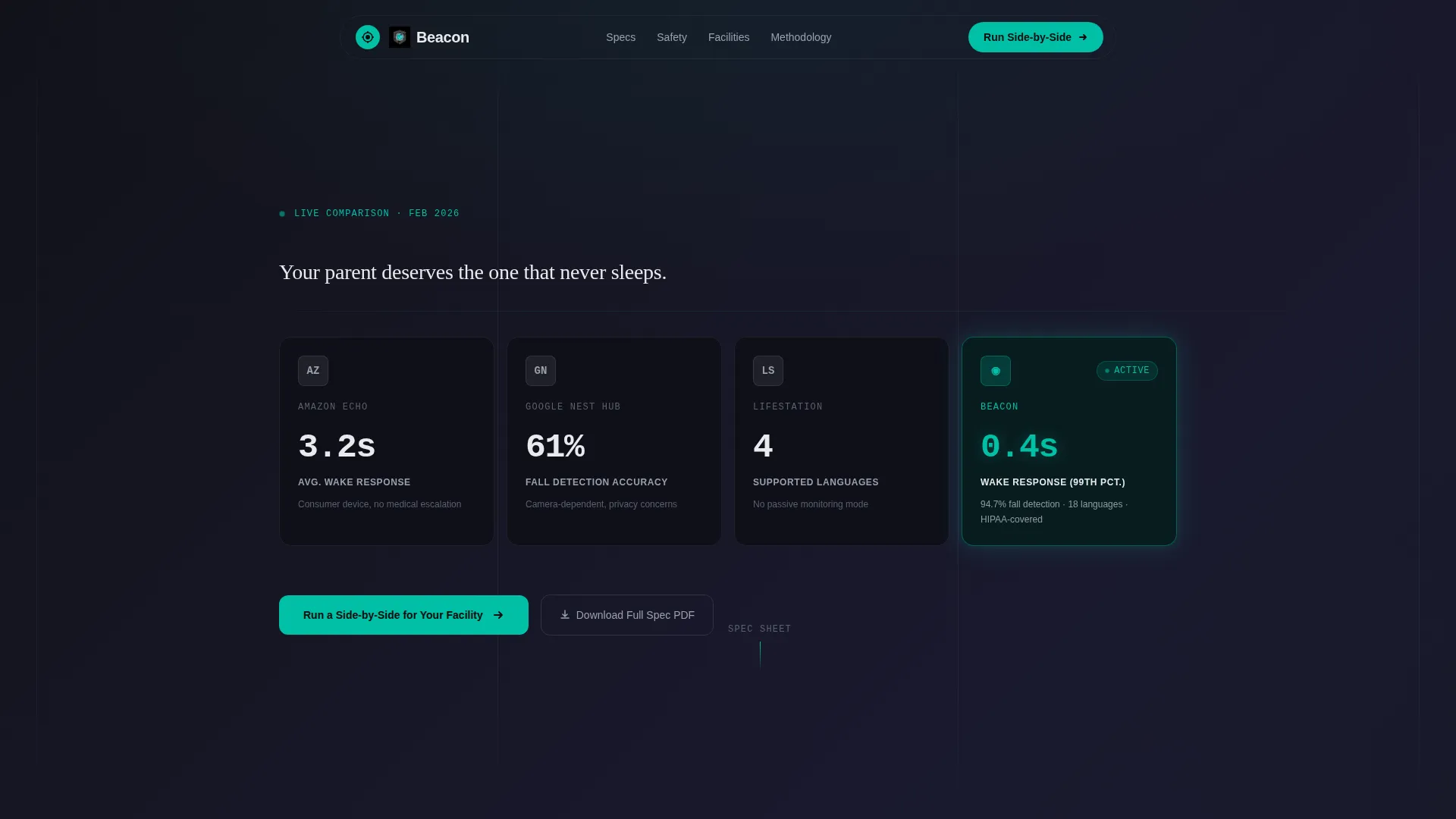
- A Dark Glass Panel header featuring four side-by-side competitor panels with Beacon's panel highlighted in status-pulse teal
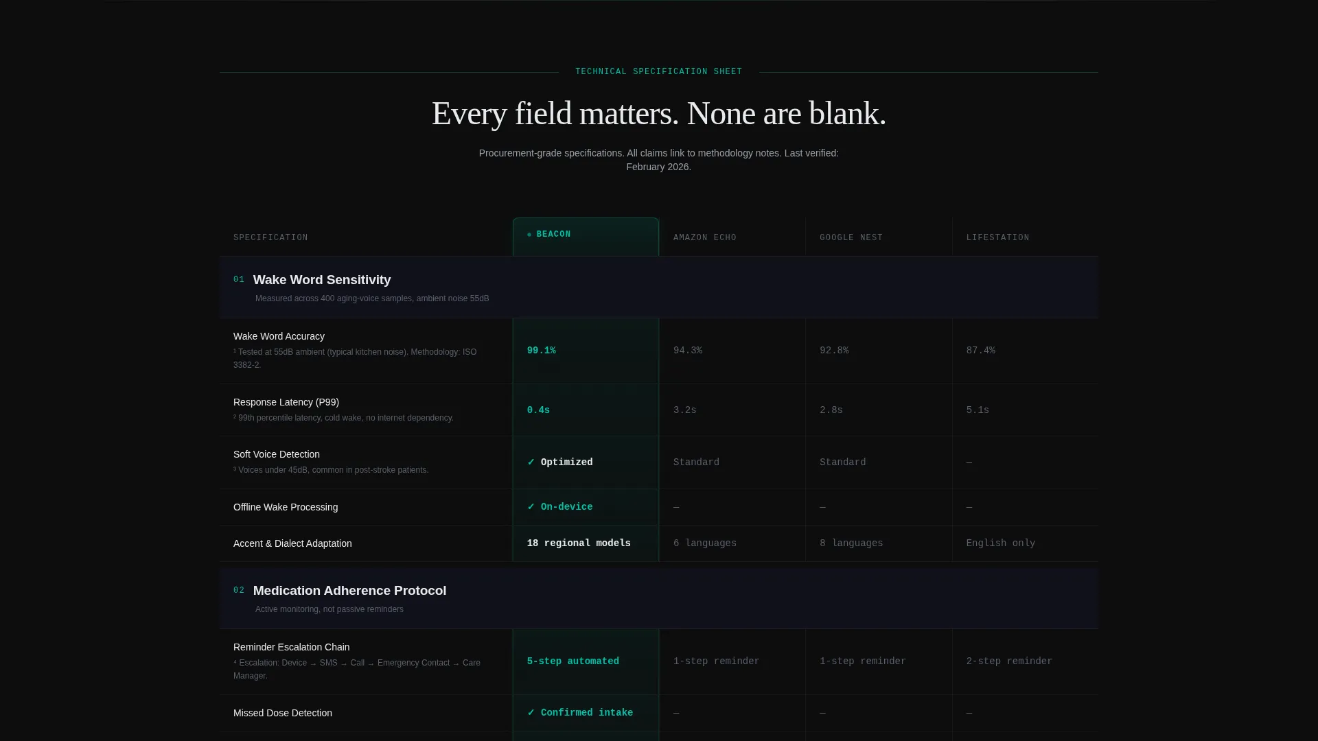
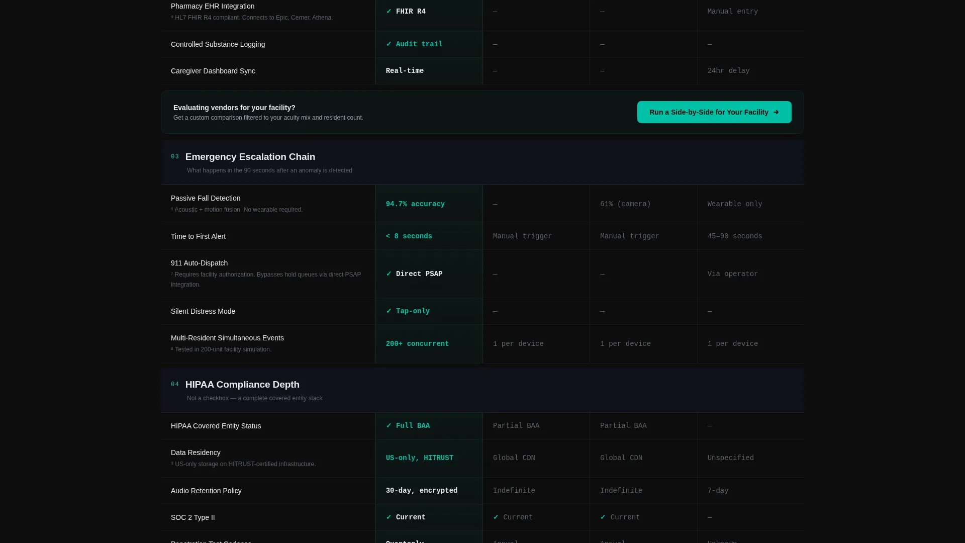
- Horizontal comparison table rows across five technical categories, each with Beacon's column subtly backlit
- A floating conversion bar, a two-step facility inquiry form, and a gated PDF download path
Feature list
This template includes purpose-built components aligned with how senior care technology buyers evaluate and decide.
Dark Glass Panel Header
Three competitor panels and one Beacon panel float on a pure black field. Each panel surfaces a single limiting stat for that product. Beacon's panel glows with a teal edge trace, and a single typewritten headline appears after a two-second pause.
Animated Typewriter Headline
The opening line types itself across the header after the panels have settled. This pacing creates a moment of attention before the data begins. The headline reads: "Your parent deserves the one that never sleeps."
Spec Sheet Comparison Table
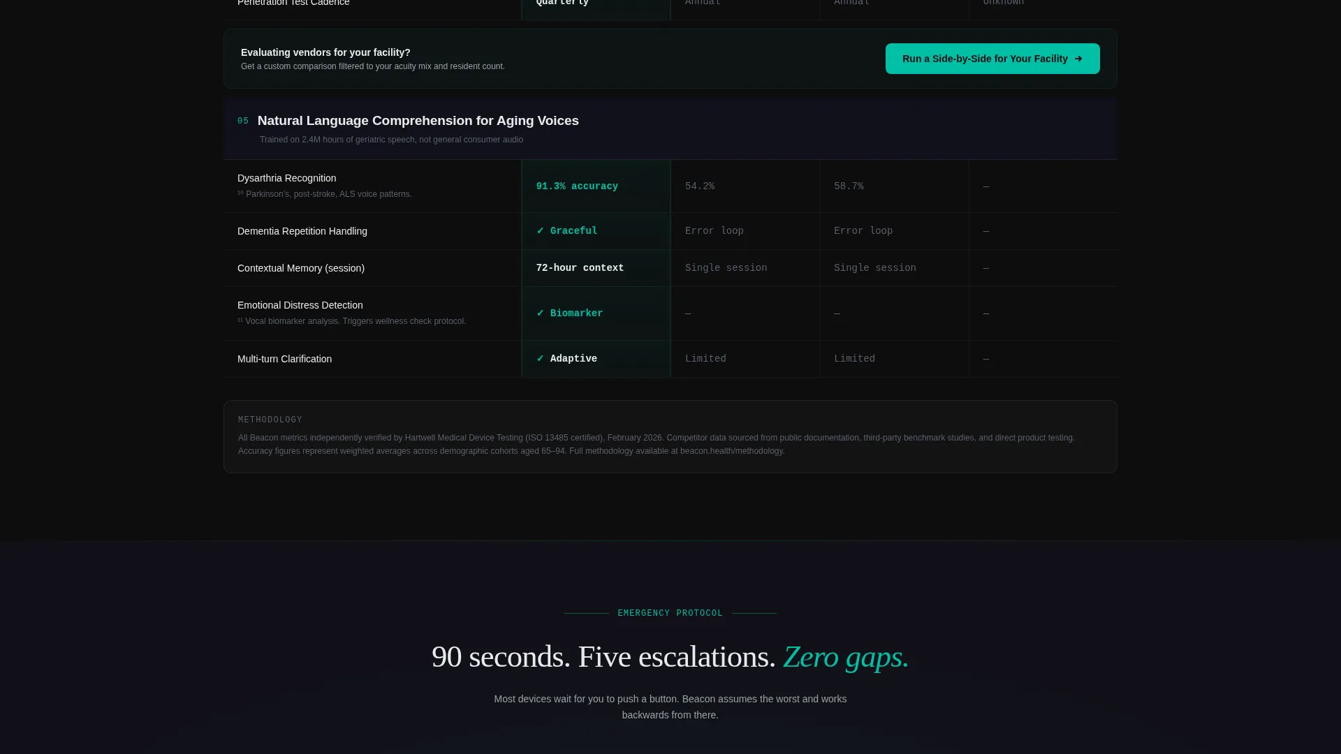
Each scroll section is a comparison category rendered as a horizontal table row. Categories include Wake Word Sensitivity, Medication Adherence Protocol, Emergency Escalation Chain, HIPAA Compliance Depth, and Natural Language Comprehension for Aging Voices. Beacon's column is backlit in teal while competitor columns sit in neutral graphite.
Floating Conversion Bar
After the first scroll, a persistent conversion bar pins to the viewport. It carries the primary call to action at all times. This ensures the prompt to act is always visible without interrupting the data review.
Two-Step Facility Inquiry Form
The primary conversion opens a two-step modal. Step one asks the buyer to select which competitors they are currently evaluating using checkboxes with logos. Step two collects facility size, resident acuity mix, and a work email address.
Gated PDF Download Path
A secondary conversion path offers the full specification document behind an email gate. This serves the care manager who needs a shareable attachment for a board memo or internal review meeting.
Page sections overview
| Section | Purpose |
|---|---|
| Dark Glass Header | Introduces competitor comparison with animated headline |
| Wake Word Sensitivity | Compares voice trigger accuracy across all evaluated products |
| Medication Adherence Protocol | Details each product's medication reminder and confirmation approach |
| Emergency Escalation Chain | Shows how each product handles fall detection and alert routing |
| HIPAA Compliance Depth | Lays out the compliance posture of each option in the comparison |
| Natural Language Comprehension | Compares how each product handles aging voice patterns |
| Mid-Scroll call to action Bar | Repeats the primary call to action after every third table section |
| Two-Step Inquiry Form | Captures facility details and competitor context from qualified buyers |
| PDF Download Gate | Collects email in exchange for the full specification document |
Design & branding system
The visual identity follows a Directory and Discovery theme built on the Carbon Fiber color system. Every color choice reinforces the feeling of a medical-grade instrument panel, not a consumer app.
- Deep cockpit black (#0D0D0D) and woven graphite (#1A1A2E) form the base layer for all panels and table rows
- Instrument white (#E8EAED) carries all body text, numbers, and footnote labels for high-contrast legibility
- Status-pulse teal (#00BFA6) is reserved for active states, checkmarks, Beacon's backlit column, and primary call-to-action buttons
Mobile & speed optimization
The Spec Sheet layout is designed to remain readable and navigable on smaller screens. Horizontal comparison tables adapt to the viewport without losing the visual hierarchy that makes data meaningful.
- Table rows reflow to prioritize Beacon's column and the category label on narrow screens
- The floating conversion bar adjusts its position and sizing to remain tappable on touch devices
- The two-step form modal is sized and spaced for comfortable input on mobile keyboards
How this template helps you convert
The page is built around a Comparison and Versus conversion model. Every layout decision pushes a qualified buyer toward a specific next action.
- The persistent floating bar keeps the primary call to action visible throughout the entire data review, removing the need to scroll back up to act.
- The two-step inquiry form qualifies the buyer before they submit, capturing competitor context and facility details that make follow-up conversations more productive.
- The gated PDF download creates a second conversion path for buyers who are not ready to request a comparison but are willing to share an email for a document they can attach to a report.
Other information about this template
This template is purpose-built for the senior care AI voice assistant category, where purchase decisions are rarely made by a single person. The Spec Sheet creative direction mirrors how technology procurement documents are structured in healthcare and residential care settings.
- The template style is a Comparison Table, making it well suited for any AI for senior care product that competes on measurable specifications
- The header concept, Dark Glass Panels, is a visual pattern that signals precision and authority before a single data point is read
- Footnotes and methodology note links are built into the table structure so every claim in the comparison can be traced to a source
Theme
Directory & Discovery
Creative direction
Spec Sheet
Color system
Carbon Fiber
Style
Comparison Table
Direction
Comparison/Versus
Page Sections
Dark Glass Panel Competitor Header
Animated Typewriter Headline
Spec Sheet Comparison Table
Persistent Floating Conversion Bar
Two-step Facility Inquiry Form
Gated Specification PDF Download
Related questions
Who is this landing page template designed for?
Can I update the competitor panels in the header?
How does the two-step inquiry form qualify buyers?
What is the gated PDF download path used for?
Can I add more comparison categories to the Spec Sheet table?



