Contemporary Worship Landing Page Template
Tithe is a church and religious subscription management landing page template built around a living dashboard interface. It consolidates recurring donations, membership renewals, and ministry fund allocations into one transparent view. Designed for executive pastors, church administrators, and megachurch financial leaders, the template uses a Tech Glass visual system to make complex giving data feel organized and approachable.
by Rocket studio
Quick summary
Tithe is a single-page dashboard landing page template purpose-built for church and religious subscription management platforms. It transforms scattered pledge records and multi-platform giving data into one unified, interactive view. The design language draws from a Tech Glass aesthetic, dark, luminous, and cathedral-calm, guiding financial leaders toward a free interactive demo.
Who this template is for
This template speaks directly to the people who carry the financial weight of a growing congregation. It is built for professionals who need clarity fast and credibility immediately.
- Executive pastors managing giving across multiple platforms simultaneously
- Church administrators transitioning from paper-based pledge systems to digital dashboards
- Megachurch chief financial officers reporting donation transparency to elder boards
What problem this template solves
Managing church finances across disconnected tools creates confusion, delays, and accountability gaps. This template addresses the real pressure points that church financial leaders face every week.
- Recurring donation records spread across too many platforms with no unified view
- Pledge card data that lives in filing cabinets rather than searchable, filterable grids
- Elder board reporting that demands penny-level transparency but lacks a reliable data source
What you get with this template
You get a fully structured, scroll-driven landing page that teaches visitors how the platform works by letting them interact with it directly. Every section is a hands-on demonstration, not a static description.
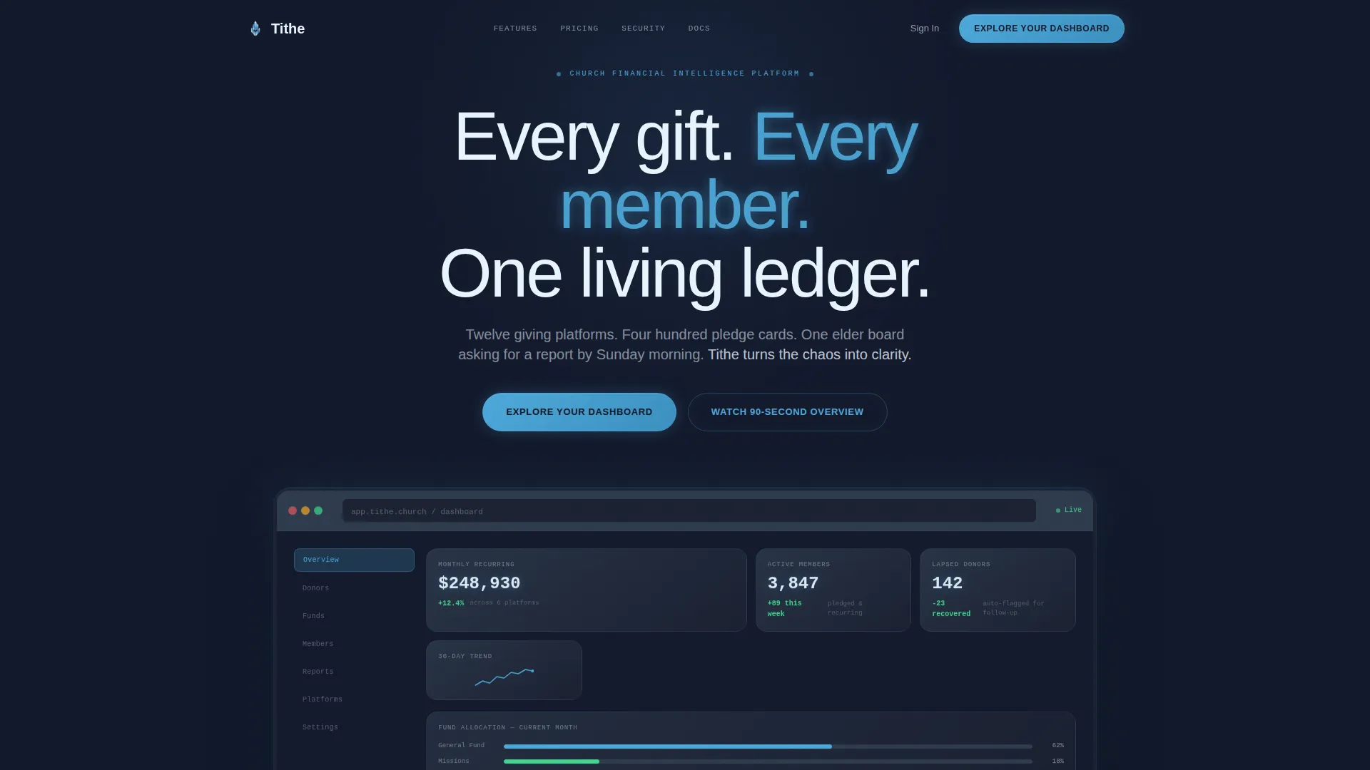
- A dark full-bleed hero section with a glowing dashboard interface as the centrepiece
- Three interactive explorer sections covering donor grids, subscription timelines, and fund allocation diagrams
- A persistent click-through call-to-action bar that appears after the second scroll section
Feature list
This template packages a focused set of interactive and visual components. Each one is designed to build platform trust before a visitor ever clicks a button.
Glowing Hero Dashboard Interface
The header section fills the full viewport with a near-black background. A softly luminous dashboard interface emerges from the darkness, with data points such as recurring gift totals, active member counts, and ministry fund allocations glowing as if backlit by stained glass. The headline materializes in thin white type above the floating interface.
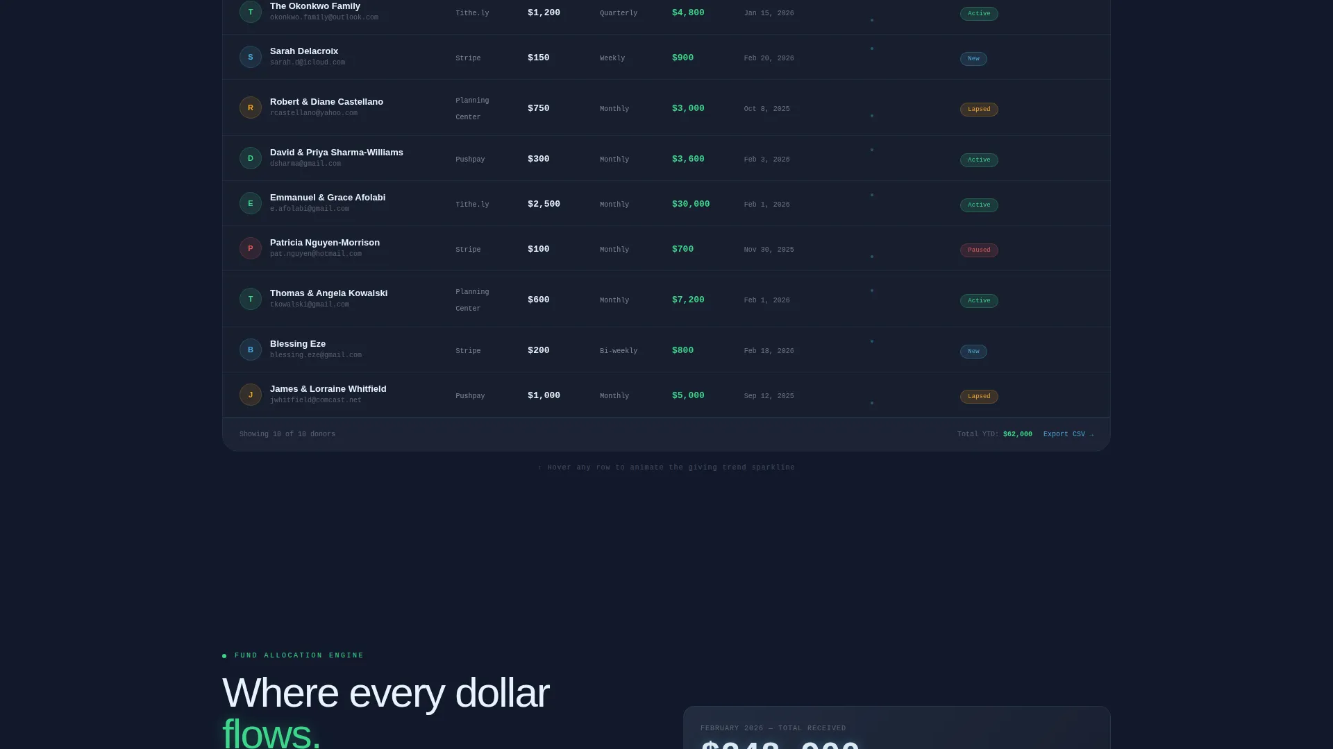
Filterable Donor Data Grid
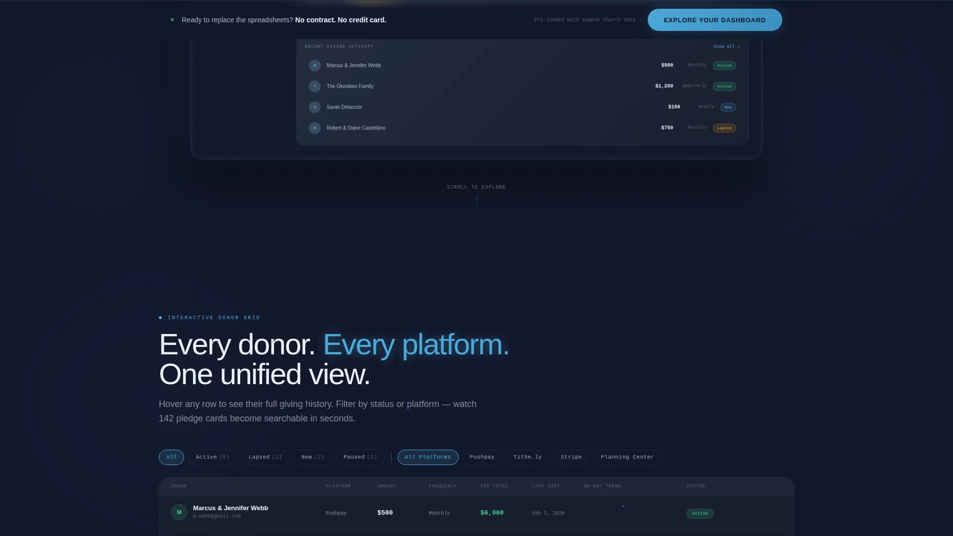
The first interactive section presents a scrollable, filterable grid of donor records. Hovering over any row reveals giving history sparklines inline, letting visitors explore real data behaviour without leaving the page.
Subscription Lifecycle Timeline
Visitors can scrub through a timeline that traces a member's journey from first-time visitor to monthly tither. The interactive scrubbing mechanic makes the subscription lifecycle tangible and immediately understandable.
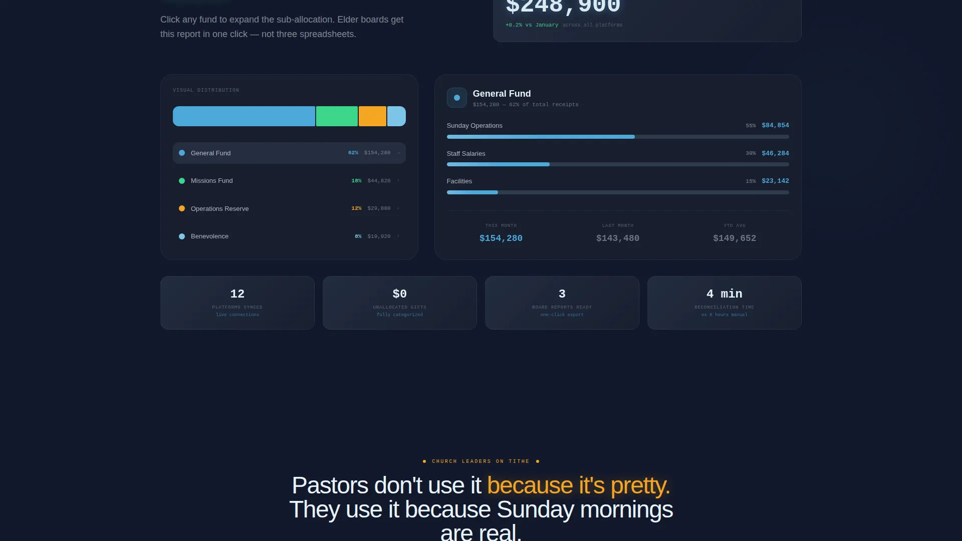
Animated Fund Allocation Diagram
A Sankey-style diagram animates as the visitor scrolls, showing how general offerings split across missions, operations, and benevolence. The scroll-triggered animation makes fund allocation logic visual and intuitive.
Persistent Click-Through call to action Bar
After the second scroll section, a fixed bottom bar appears with the primary call-to-action. The bar stays visible as visitors continue exploring, keeping the conversion path accessible without interrupting the interactive tour.
Glass-Panel Section Layout
Every section uses a glass-panel visual system with slate, gray, sky blue, and spirit-glow white layers. The layered depth creates a weightless, crystalline interface feel throughout the entire page.
Page sections overview
| Section | Purpose |
|---|---|
| Dark Hero Header | Introduce the platform with a glowing dashboard interface and primary call to action |
| Filterable Donor Grid | Let visitors interact with a live-style giving data grid with sparkline previews |
| Subscription Lifecycle Timeline | Show member journey progression through an interactive scrub timeline |
| Fund Allocation Diagram | Animate offering splits across ministry categories on scroll |
| Persistent call to action Bar | Keep the demo conversion path visible after the second scroll section |
Design & branding system
The visual identity follows a Tech Glass theme built on the Slate and Sky color system. The palette is reverential and modern, evoking moonlight filtering through cathedral clerestory windows onto polished granite.
- Core colors: deep pulpit slate (#1B2131), brushed altar gray (#2E3A4D), stained-glass sky blue (#4DA8DA), and spirit-glow white (#E8F4FD)
- Typography uses thin white headline type against dark backgrounds, with data labels rendered in sky blue and white for maximum contrast
- Interactive states use spirit-glow white highlights and ethereal blue edge lighting to signal hover and active conditions
Mobile & speed optimization
The dashboard-first layout is structured so that the interactive components translate clearly to smaller screens. The glass-panel system maintains visual depth without relying on heavy background images.
- The hero section uses a CSS-driven dark background with glow effects rather than large image assets, keeping the initial load lightweight
- Interactive sections are built to reflow gracefully, stacking timeline and grid components vertically on narrower viewports
- The persistent call to action bar is designed to remain usable and unobtrusive on both desktop and mobile screen sizes
How this template helps you convert
This template is optimized as a click-through landing page. The entire page structure is designed to move qualified visitors into a free interactive demo without asking them to fill out a form.
- The interactive explorer sections function as an embedded product demonstration, building trust through hands-on use before any call to action pressure appears
- The persistent bottom call to action bar activates after the second scroll section, catching visitors at the moment their curiosity is highest
- The primary call to action button reads "Explore Your Dashboard" and links directly to a pre-populated sandbox environment with sample church data already loaded
Other information about this template
This template is a strong fit for any church and religious software product that wants to communicate platform depth without relying on traditional marketing copy. A few additional details worth noting:
- The template is category-matched to the Technology and Church and Religious Software segment, making it directly relevant to modern ministry finance tools
- The no-form click-through structure is intentional: trust is established through the interactive sections, so visitors arrive at the call to action already engaged
- The sandbox demo destination is referenced in the brief as pre-populated with sample church data, reinforcing the low-friction entry model
- The template style is classified as a Dashboard and Data Grid landing page, making it suitable for platforms where data visualization is a core product differentiator
Theme
Tech Glass
Creative direction
Interactive Explorer
Color system
Slate & Sky
Style
Dashboard/Data Grid
Direction
Click-Through
Page Sections
Glowing Hero Dashboard Interface
Filterable Donor Data Grid
Subscription Lifecycle Timeline
Scroll-animated Fund Allocation Diagram
Persistent Click-through Call to Action Bar
Related questions
Who is this landing page template designed for?
Does this template include a contact form or lead capture form?
Can I customize the color palette and visual theme?
What makes the interactive sections different from static feature descriptions?
Is this template suitable for a platform that serves smaller churches, not just megachurches?



