Dynamic Travel Sentiment Landing Page Template
Pulse is a single-page landing page template built for travel-tech businesses that collect post-trip feedback automatically. It features a three-tab hero switcher, a head-to-head comparison table, animated telemetry counters, and a two-step freemium signup form. The Data Command visual theme pairs deep slate backgrounds with sky blue calls-to-action and radar green status indicators for an authoritative, mission-control feel.
by Rocket studio
Quick summary
Pulse is the pulse real time travel feedback request landing page template for hospitality operators who need fresh survey data the moment a traveler lands. The page runs on a Data Command theme, guides visitors through a feature tab switcher, and converts them with a no-credit-card freemium form. Every section builds persuasive momentum from hero to call-to-action.
Who this template is for
This template is built for travel and hospitality businesses that rely on structured feedback to improve their services and earn better reviews. It suits operators who need to collect feedback at scale and act on it quickly.
- Boutique hotel managers who want to refresh their review standing and track guest sentiment after each trip
- Tour operators and airline customer experience teams who need Net Promoter Score (NPS) data across multiple time zones on one platform
- Enterprise hospitality groups whose employees route sentiment data into business intelligence dashboards before board meetings
What problem this template solves
Most hospitality businesses lose feedback because they follow up too late. Manual emails go out days after a trip ends, generic survey tools offer no personalization, and many operators skip follow-up entirely. Pulse addresses this gap head-on with a page that shows exactly what clients are missing and why timing matters.
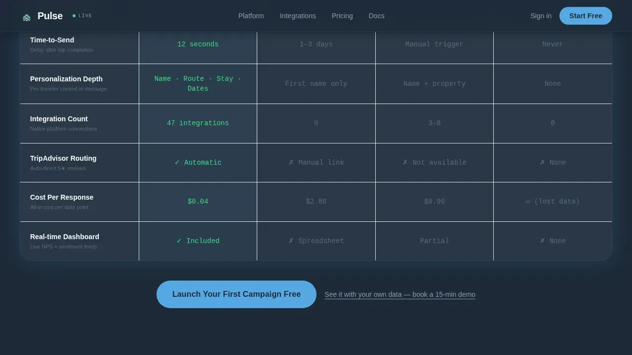
- Response rates for manual emails average around 4%, while automated, personalized feedback sent at the right moment can reach 38% or higher
- Survey data collected days after a trip lacks the emotional freshness that produces specific, useful insights
- Teams waste time trying to manage feedback across separate tools instead of handling analysis, reporting, and routing in one place
What you get with this template
This template gives you a fully structured, single-page layout designed around the needs of travel feedback software. No deep coding knowledge is required to customize it. Every section is purposeful and persuasion-driven.
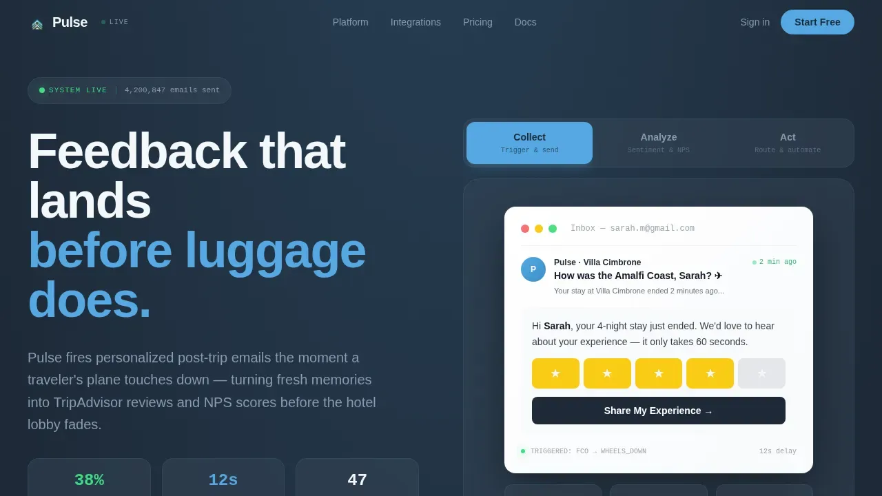
- A three-tab hero header (Collect, Analyze, Act) that lets users preview different product views with a snappy horizontal slide transition
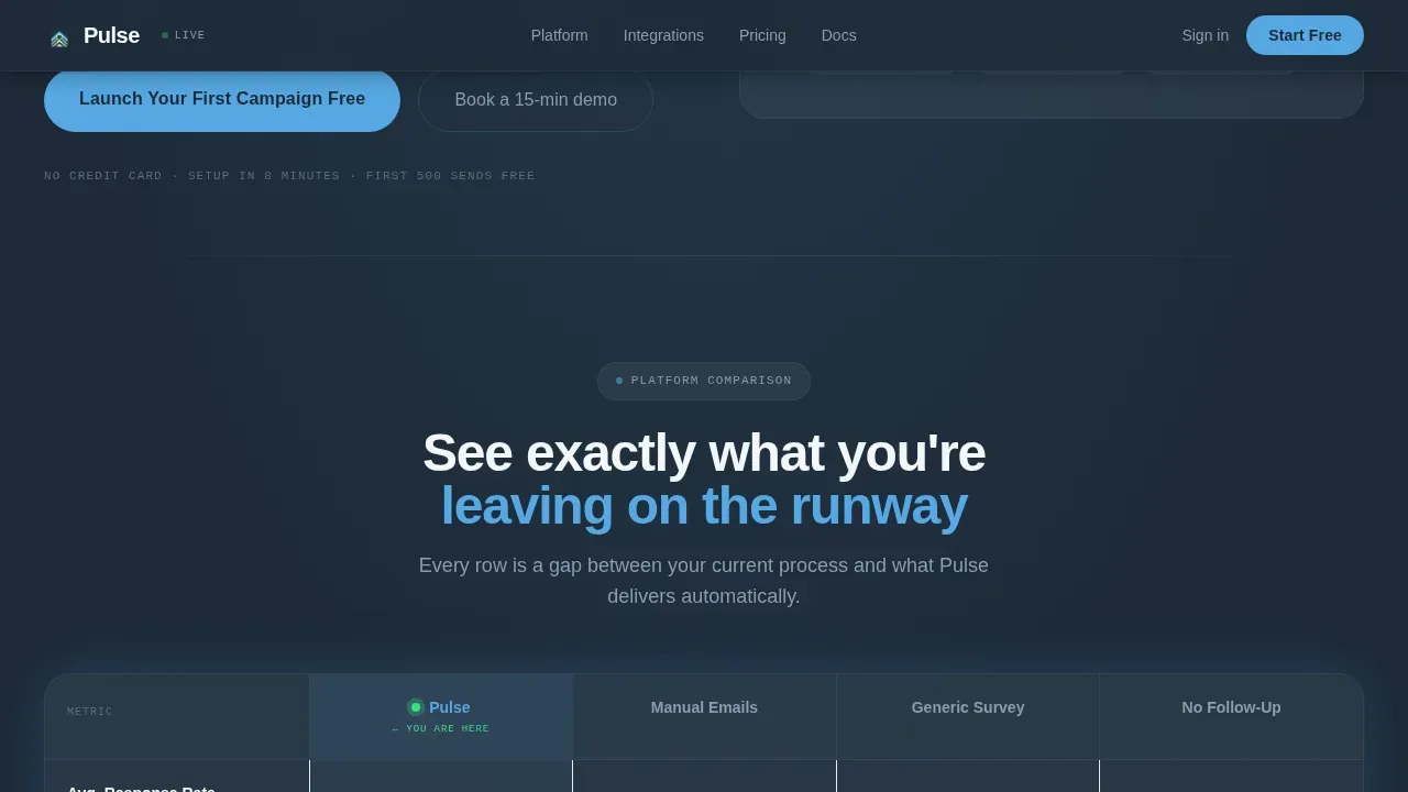
- A head-to-head comparison table that benchmarks the platform against manual emails, generic survey tools, and no follow-up across rows like response rate, personalization depth, and cost-per-response
- Animated telemetry counters, social proof testimonial cards, and a two-step freemium signup form with a demo booking link
Feature list
This template packages several purpose-built components that work together to inform, persuade, and convert hospitality decision-makers visiting the page.
Feature Tab Switcher with Live Previews
The hero section features three clickable tabs labeled Collect, Analyze, and Act. Each tab reveals a different product view: a simulated inbox email, a sentiment dashboard with NPS dials and a response-rate gauge, and an automated workflow diagram. Tabs switch with a horizontal slide so visitors can evaluate each capability without leaving the page.
Head-to-Head Comparison Table
The comparison table lets visitors directly evaluate the platform against manual emails, generic survey tools, and no follow-up across key rows. Radar green checkmarks highlight platform advantages while muted slate gap markers show what competitors lack. This form of side-by-side analysis helps clients make informed decisions before they reach the signup form.
Animated Metrics Ticker
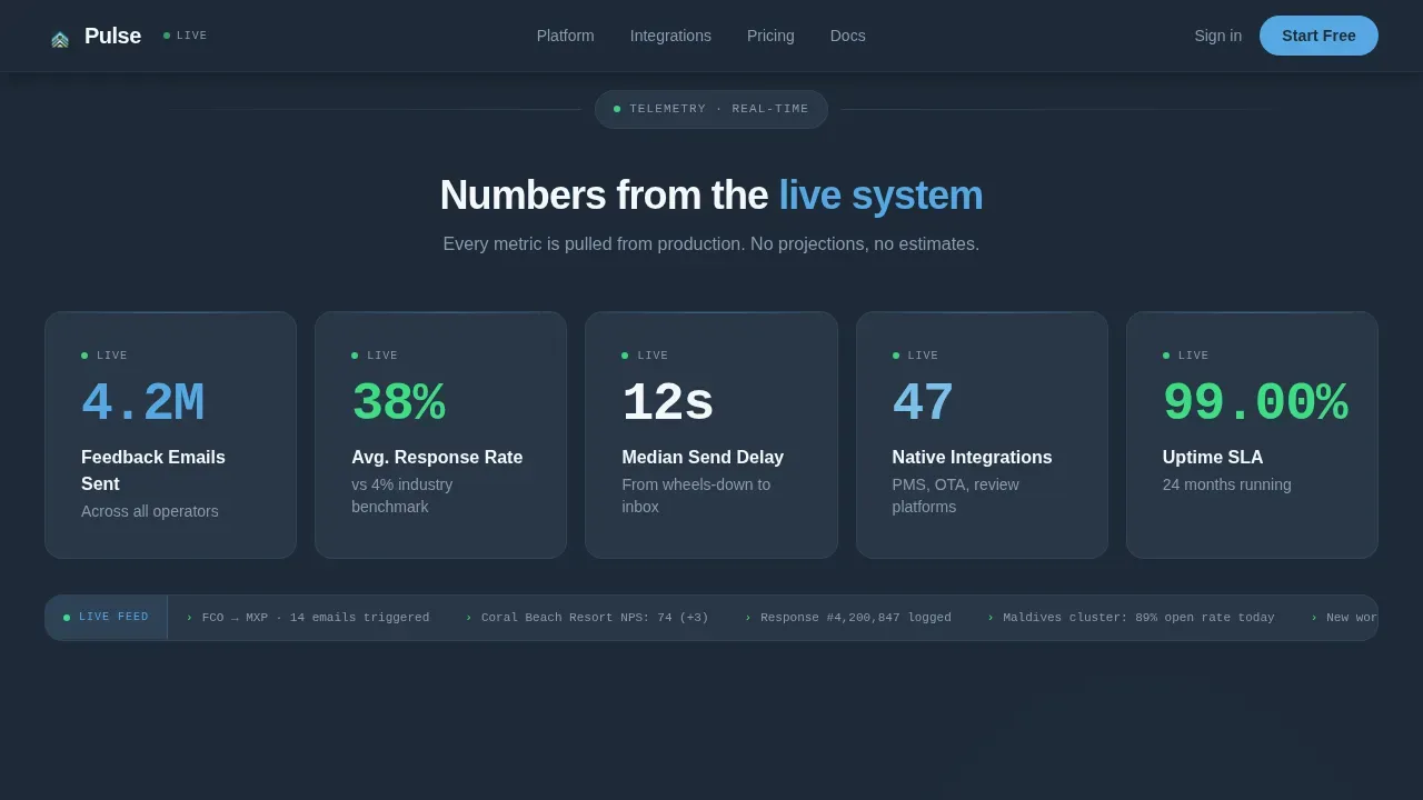
A telemetry-style ticker animates live counters upward, displaying figures like 4.2 million feedback emails sent, 38% average response rate, and a 12-second median send delay. These real time updates give the page a sense of momentum and reinforce platform credibility with concrete data.
Two-Step Freemium Signup Form
The conversion form collects a work email and company name in step one. Step two offers a dropdown for monthly traveler volume and a toggle to connect a review platform account. There is no credit card field. A secondary text link beneath the form assists enterprise leads by offering a 15-minute demo booking option.
Testimonial Cards with Named Properties
Two testimonial cards from a Lisbon hostel chain and a Maldives resort group add real-world social proof. The cards appear before the final call-to-action block and give potential clients confidence that the software delivers results across different industry segments and property types.
Sticky Mobile Call-to-Action Bar
On mobile phones, the primary call-to-action reappears as a sticky bottom bar so the signup prompt stays visible as users scroll. This ensures the form is always one tap away on any mobile device without interrupting the reading flow on desktop.
Page sections overview
| Section | Purpose |
|---|---|
| Tab Switcher Hero | Introduce Collect, Analyze, Act product views |
| Comparison Table | Benchmark against competing approaches |
| Metrics Ticker | Display live telemetry counters |
| Testimonial Cards | Add social proof from named properties |
| Call-to-Action Block | Drive freemium signups and demo requests |
| Footer | Linear single-row navigation and links |
Design & branding system
The visual identity follows a Data Command theme that feels like an air-traffic control tower at dusk. Deep slate dominates backgrounds and navigation while sky blue drives calls-to-action and active tab states. Signal white lifts comparison rows off the dark field so the eye parses data quickly, and radar green marks live status indicators throughout the page layout.
- Color palette: deep operations-room slate (#1E2A38), brushed gunmetal (#3B4A5C), high-altitude sky blue (#56A8E2), signal white (#F4F7FA), and radar green (#3DDC84) for success states
- Typography: DM Sans for headings and body, paired with JetBrains Mono for data metrics and ticker counters to reinforce the command-center aesthetic
- The brand tone is cool and authoritative, projecting confidence without clutter so visitors focus on the data and the form
Mobile & speed optimization
The template is built desktop-first to prioritize the comparison table layout, with full responsiveness across every screen size. Hospitality decision-makers who access the page on mobile phones still get a clean, readable experience with no broken layouts.
- Every section stacks cleanly on a mobile device, and the sticky bottom bar keeps the call-to-action visible throughout the scroll journey
- Interactive components such as the tab switcher and the signup form modal are handled as client-side components, while static sections use server-side rendering to keep the page load efficient
- The minimalist layout avoids unnecessary menus and irrelevant links, keeping completion rates high for the feedback form and the signup flow
How this template helps you convert
The page is structured as a countdown sequence where each section builds on the last, so visitors arrive at the form already persuaded. The comparison table does the persuasion work before the call-to-action even appears.
- The tab switcher lets prospects engage with three specific aspects of the product (collect, analyze, act) before they read a single claim, creating instant product familiarity that reduces signup friction
- The comparison table and metrics ticker together give visitors the data and context they need to identify areas where their current approach falls short, moving them closer to a decision
- The two-step form removes barriers by asking for only an email and company name first, then surfacing volume and integration options in step two, so the form feels easy to fill and never overwhelming
Other information about this template
The template is designed to suit travel and hospitality businesses that want to develop a professional feedback collection page without writing code from scratch. It supports customization through drag and drop editing, so teams can customize sections, swap copy, and adjust the layout to match their desired brand identity. Users can also embed custom widgets using JavaScript, HTML, or CSS to extend functionality beyond the default template components.
- The template includes over 500 pre-designed layouts so teams can choose a starting point that aligns with their company goals and publish quickly
- Drag and drop tools let non-technical users customize the form, reorder sections, and link components without touching code
- Built-in analytics and A/B testing tools help organizations track performance, analyze collective responses, and develop a bigger picture view of how each page variant performs
- The pulse survey form supports between 1 and 25 questions; teams can add multiple choice questions, rating scales using stars or emojis, and open-ended comment boxes to collect richer feedback
- Email notifications alert team members when new survey responses arrive, so no feedback goes unread and employees can respond to flagged reviews quickly
- Feedback forms can integrate with platforms and CRM systems, and the template seamlessly integrates with various marketing tools so the whole organization can access insights from one dashboard
- For teams evaluating different types of survey tools: Typeform suits interactive one-question-at-a-time formats, Zigpoll is built for quick sentiment capture, and Jotform offers highly customizable templates; Pulse is purpose-built for post-trip hospitality feedback at scale
Theme
Data Command
Creative direction
Launch Energy
Color system
Slate & Sky
Style
Comparison Table
Direction
Freemium/Trial
Page Sections
Three-tab Hero Feature Switcher
Head-to-head Comparison Table
Animated Telemetry Metrics Ticker
Two-step Freemium Signup Form
Social Proof Testimonial Cards
Sticky Mobile Call-to-action Bar
Related questions
Do I need coding knowledge to customize this template?
What survey question types does the feedback form support?
Does the freemium signup form require a credit card?
Does the landing page work on mobile phones?
How does the comparison table help persuade visitors?



