Beacon — Home Services Landing Page Template
Dispatch is a card grid landing page template built for home services analytics dashboards. It presents a mission-control interface where job tickets, crew schedules, and revenue data surface as actionable cards. The design uses a dark Void and Violet color system, a Feature Tab Switcher header, and a freemium trial conversion flow built to move owner-operators from curiosity to signup in a single scroll.
by Rocket studio
Quick summary
Dispatch is a single-page, modular card grid template designed for home services analytics dashboards. It combines a Feature Tab Switcher header, a momentum-driven scroll layout, and a two-step inline signup form. The dark Void and Violet visual identity makes data feel alive. The result is a landing page that doubles as a live product demo before asking for anything.
Who this template is for
This template is built for SaaS founders, product marketers, and growth teams launching home services software. It speaks directly to the operators those products serve, so the page resonates with buyers and end users alike.
- Owner-operators running fleets of trucks who still manage margins in spreadsheets
- Office managers juggling multiple browser tabs to track crew availability
- Franchise general managers who need Monday-morning rollup reports without extra phone calls
What problem this template solves
Home services businesses lose time and money to scattered information. Job tickets live in one place, crew schedules in another, and invoice threads somewhere else entirely. A landing page that mirrors that chaos will never convert a visitor who already lives inside it.
- Disconnected tools make it hard to show prospects what "one screen" actually looks like
- Generic software landing pages fail to speak the language of dispatchers and field managers
- Visitors leave before converting because the product value is explained instead of shown
What you get with this template
You get a fully structured, section-led landing page ready to populate with your own brand, copy, and data. Every section is purpose-built for a home services analytics audience.
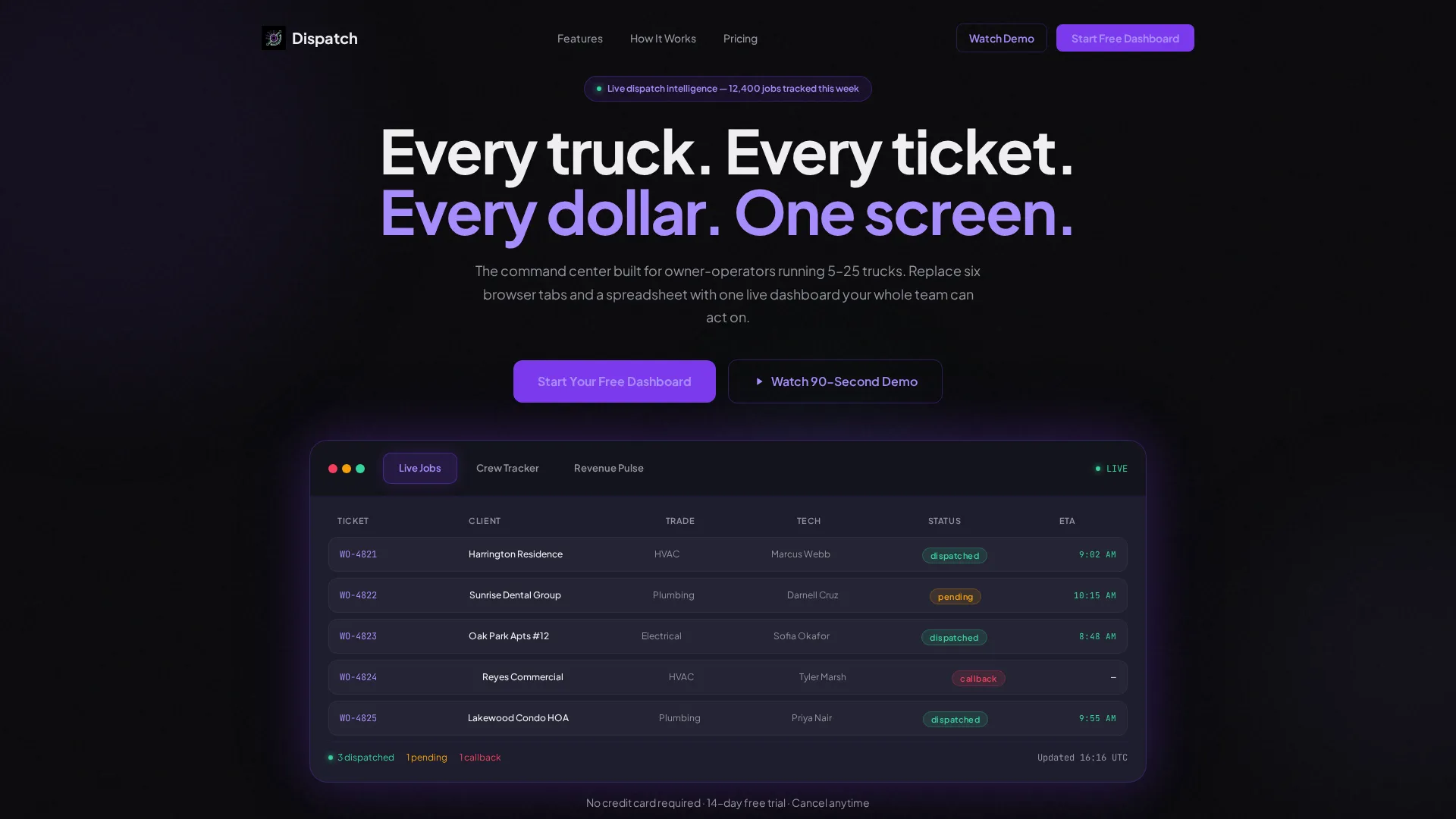
- A Feature Tab Switcher header with three realistic mock-dashboard views and micro-animations
- A modular feature card grid, a comparison grid, a social proof bar, and a testimonial trio
- A two-step inline freemium signup form and a secondary ghost-button demo trigger
Feature list
This template is built around components that work together to demonstrate, persuade, and convert. Each section earns the next scroll rather than demanding it.
Feature Tab Switcher Header
The header leads with three clickable tabs: "Live Jobs," "Crew Tracker," and "Revenue Pulse." Each tab swaps in a different mock-dashboard card layout beneath a single bold headline. The active tab glows violet, and micro-animations on tab switch make the data feel live rather than decorative.
Modular Feature Card Grid
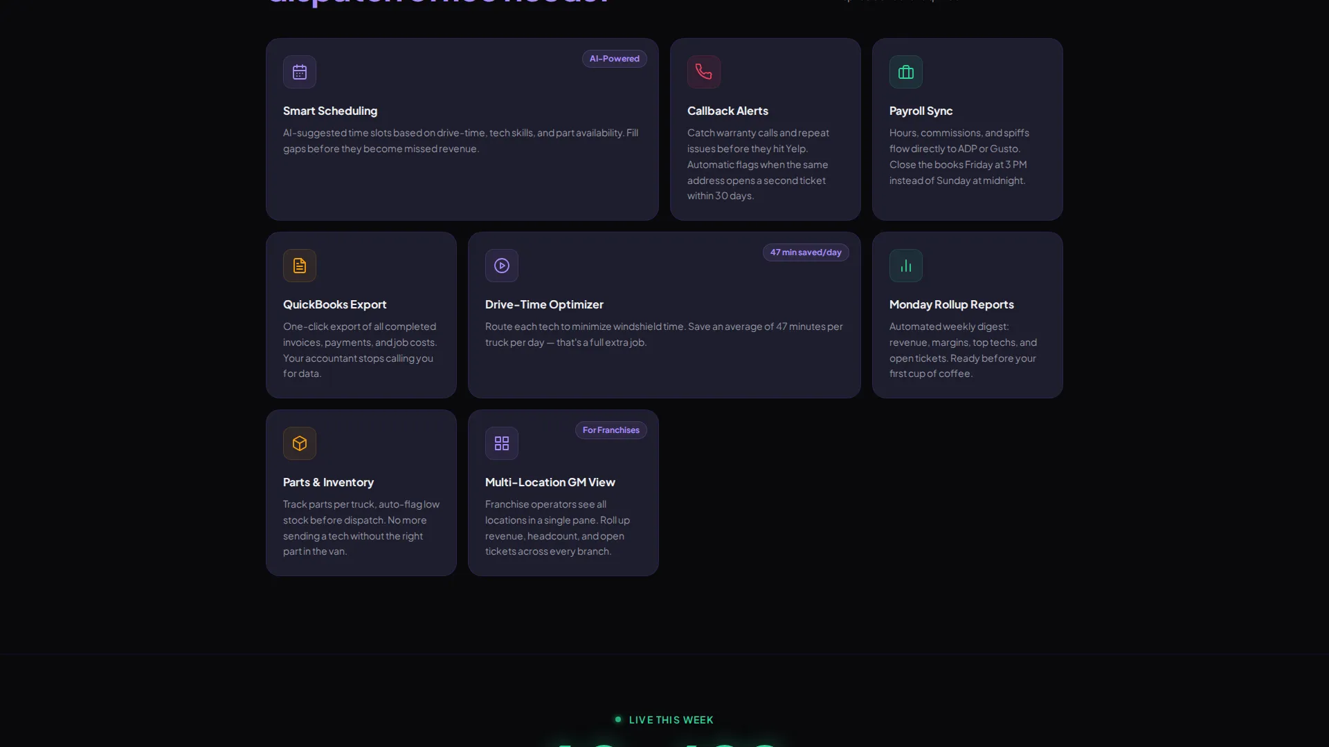
A scannable directory-style grid presents individual capabilities as standalone cards. Each card carries a single feature title, a one-line description, and a small animated icon. Visitors can absorb the product's scope at a glance without reading long paragraphs.
How It Works Row
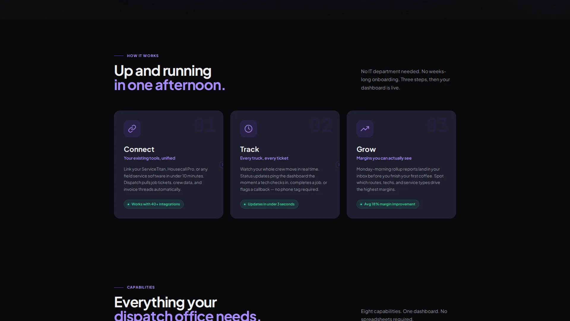
Three icon-cards labeled "Connect," "Track," and "Grow" form a sequential flow that orients first-time visitors quickly. The row builds confidence before prospects reach the feature grid. It answers the "but how does it actually work?" question early in the scroll.
Social Proof Counter Bar
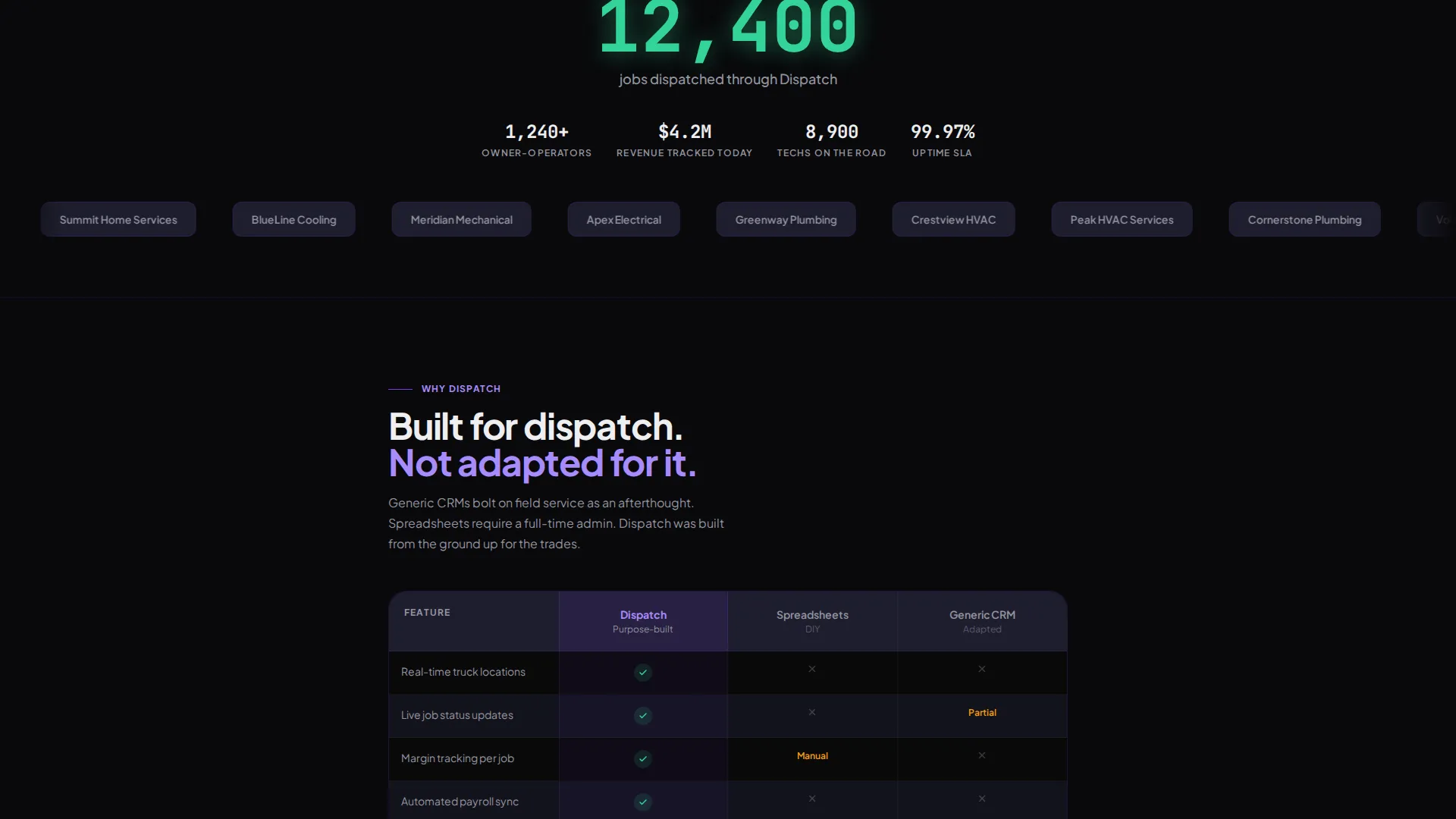
A live-style counter bar displays a running dispatch total, creating real-time credibility. The bar sits between the feature grid and the comparison section, maintaining scroll momentum. It gives fence-sitters a concrete, quantified reason to keep reading.
Comparison Grid Card
A structured comparison card sets Dispatch against spreadsheets and generic customer relationship management tools. Each column highlights the gap clearly without being combative. Visitors who are still on the fence can see the difference mapped out in one view.
Two-Step Inline Conversion Form
The signup form splits across two steps to reduce friction. Step one collects company name and trade type via a dropdown. Step two asks for crew size and email, with no credit card required.
Page sections overview
| Section | Purpose |
|---|---|
| Tab Switcher Header | Hook curiosity with live mock-dashboard views |
| Headline and call to action | Deliver the core value statement and primary action |
| How It Works Row | Orient visitors with a three-step icon flow |
| Feature Card Grid | Show individual capabilities in scannable card format |
| Social Proof Bar | Build credibility with a live dispatch counter |
| Comparison Grid | Contrast Dispatch against spreadsheets and generic tools |
| Testimonial Card Trio | Provide real-world proof from field operators |
| Inline Signup Form | Convert visitors with a two-step, no-card-required form |
| Sticky Mobile call to action | Ensure conversion access persists on smaller screens |
Design & branding system
The visual identity uses a Void and Violet color system that feels like a premium mission-control interface glowing in a dark room. Every color choice has a functional role, not just an aesthetic one.
- Backgrounds sit in true void black (#09090B), with card surfaces on muted graphite (#1E1E2E) and a 1px violet border glow (#7C3AED) on hover
- Primary calls to action use solid deep violet with electric lavender (#A78BFA) text, and positive data indicators use cool mint (#34D399) for an instant green-means-go read
- Chalk white (#EEEEF0) body text maintains legibility across all card surfaces and dark backgrounds
Mobile & speed optimization
The card grid layout is designed to reflow cleanly on smaller viewports. The sticky bottom bar keeps the primary call to action within reach throughout the entire mobile scroll.
- Modular card components stack vertically on mobile without losing visual hierarchy
- The sticky "Start Your Free Dashboard" bar persists at the bottom of the screen on mobile devices
- Tab switcher interactions and micro-animations are contained within the header to keep the rest of the scroll light and focused
How this template helps you convert
The conversion architecture is built around showing the product before asking for anything. Every section earns the next action rather than demanding it.
- The Feature Tab Switcher acts as an interactive product demo in the header, so visitors have already imagined using the dashboard before they reach the signup form.
- The social proof counter bar and comparison grid remove the two most common objections, credibility and switching cost, before they can slow the visitor down.
- The two-step inline form with no credit card requirement lowers commitment to the minimum, and the ghost-button demo path catches visitors who need one more reason before they sign up.
Other information about this template
This template is categorized under Technology and sits within the Home Services Software and Software as a Service subcategory. It is designed specifically for the Home Services Analytics Dashboard niche, making it a focused fit for teams marketing field service management, dispatch software, or crew tracking tools.
- The template style is Card Grid (Modular), following a Directory and Discovery theme for easy visual scanning
- Creative direction follows a Launch Energy principle, where each scroll section builds momentum toward the conversion form
- The header concept is a Feature Tab Switcher, a pattern that works well when the product itself is the best argument for signing up
- The freemium and trial landing page direction means the primary goal is low-friction signup, with a secondary video demo path for warmer consideration
Theme
Directory & Discovery
Creative direction
Launch Energy
Color system
Void & Violet
Style
Card Grid (Modular)
Direction
Freemium/Trial
Page Sections
Feature Tab Switcher Header
Modular Feature Card Grid
How It Works Icon Row
Comparison Grid Card
Two-step Inline Signup Form
Social Proof and Testimonial Sections
Related questions
Who is this landing page template designed for?
Can I replace the mock-dashboard data with my own content?
Does the signup form require a credit card from visitors?
What is the secondary conversion path in this template?
Is this template suited for a single trade or multiple home service trades?



