University Vertical SaaS Directory Website Template
The Metrics Institutional Intelligence Command Center landing page template gives university leaders one screen instead of fourteen spreadsheets. Built for IR directors, deans, provosts, and presidents, it turns raw enrollment figures, retention curves, and research output into real-time institutional intelligence. The Data Command aesthetic makes every key metric readable at a glance, day or night.
by Rocket studio
Quick summary
This dashboard template is purpose-built for higher education decision makers who need key metrics surfaced instantly. A Feature Tab Switcher hero, a Spec Sheet capability teardown, a head-to-head comparison table, and a peer benchmarks section guide every visitor toward one action: downloading the Metrics app. The layout is a cockpit, not a brochure.
Who this template is for
This landing page is designed for a very specific target audience inside higher education. It speaks directly to people who live inside complex data every day and need a faster path to informed decision making.
- Institutional Research (IR) directors managing Integrated Postsecondary Education Data System (IPEDS) submissions and compliance reporting
- Deans and provosts tracking DFW (Drop, Fail, Withdraw) rates across hundreds of course sections, retention curves, and research grant output
- Presidents and provosts preparing board presentations who need anonymized peer benchmarks and strategic key performance indicators on demand
What problem this template solves
Most university analytics environments are fragmented. Leaders open multiple dashboards, export spreadsheets, and manually compile slides before every board meeting. The time cost is enormous, and the risk of presenting stale numbers is real.
- Fragmented reporting forces leaders to toggle between many systems just to see a unified view of enrollment, retention, and research performance metrics
- Manual compilation introduces errors and delays, making it harder to track progress on strategic priorities before the next accreditation cycle or trustee meeting
- Legacy business intelligence tools require data analysts to run every query, creating bottlenecks that slow down decision making when speed matters most
What you get with this template
This metrics institutional intelligence command center landing page template delivers a complete, production-ready landing page structured around five core sections. Every section earns its place by moving a skeptical university administrator closer to downloading the app.
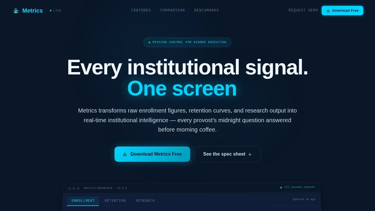
- A Feature Tab Switcher hero section with an isometric dashboard mockup showing live Enrollment, Retention, and Research tabs that swap data in real time
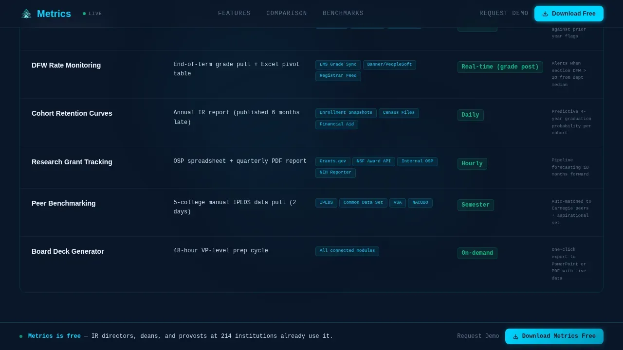
- A Spec Sheet capability teardown that presents each feature with an engineering-datasheet format, including what it replaces, data sources it connects, and refresh frequency
- A full Comparison Table pitting the dashboard against manual reporting and legacy BI tools, with glowing cyan checkmarks and empty competitor cells that create urgency at a glance
Feature list
This template ships with a tightly sequenced set of design and layout capabilities. Each one reflects a deliberate choice about how university leaders consume complex data under real pressure.
Feature Tab Switcher Hero
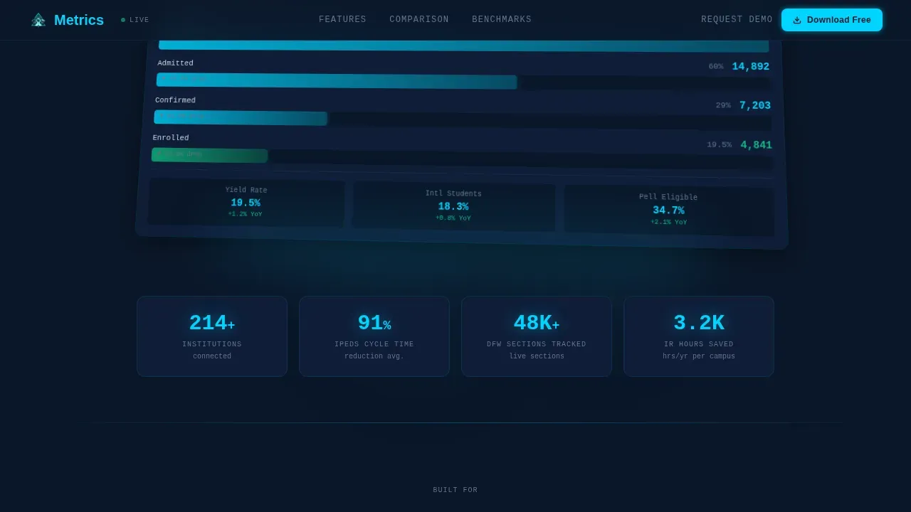
The hero section centers on a live dashboard mockup set on a slight isometric tilt against a deep navy void. Three clickable tabs labeled Enrollment, Retention, and Research sit across the top. Each tab swaps the visible data: Enrollment shows an application-to-yield funnel with real numbers cascading; Retention displays a cohort survival curve with semester-by-semester drop-off points glowing amber where intervention is needed; Research surfaces grant dollars by college in a treemap where each block pulses faintly. This design gives user engagement an immediate focal point and communicates the app's depth without a single word of explanation.
Spec Sheet Capability Teardown
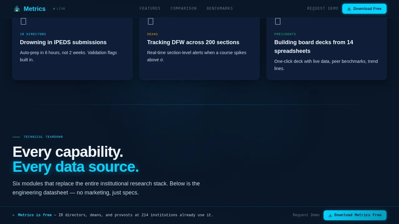
Below the hero, each capability is isolated and presented with the rigor of an engineering datasheet. Columns show the feature name, what it replaces, the data sources it connects, and the refresh frequency. This easy to understand format lets an IR director scan the page and immediately recognize which of their current complex tasks this tool eliminates. The layout accelerates the customer journey from awareness to conviction in a single scroll.
Head-to-Head Comparison Table
The comparison table is the page's sharpest conversion tool. Metrics sits in the left column; manual reporting and legacy BI tools occupy the right columns. Cyan checkmarks glow for every Metrics capability; competitor cells sit as empty voids. Visitors see at a glance how far behind peer institutions their current workflow has already fallen. This visual contrast drives data driven decisions faster than any paragraph of copy could.
Peer Benchmark Section
The peer benchmarks section surfaces anonymized real institutional data. Visitors can see how their peers perform across key metrics like yield rates, first-year retention, and research revenue generated per college. The only way to filter that data for their own institution is inside the app. This creates a lead generation mechanic built directly into the page content rather than bolted on at the end.
Persistent Call-to-Action Bar and Download Modal
A persistent call-to-action bar locks to the bottom of the viewport throughout the scroll, always showing "Download Metrics Free." After the comparison table, a full-width call-to-action section repeats the offer. Clicking either opens a modal with a platform selector for iOS, Android, and Desktop, an institutional email field, and a role dropdown. A secondary path reads "Request a Campus Demo" for institutions that want a guided walkthrough before committing.
Data Command Visual Identity
The entire template uses a Data Command color system: deep terminal navy for the background, desaturated slate for card surfaces, cool silver for body text and axis labels, and electric cyan for live-data accents and active states. Typography pairs Manrope for headings with JetBrains Mono for data labels. The result is visually appealing in the way mission control rooms are, where every pixel of light carries meaning and nothing is decorative.
Page sections overview
| Section | Purpose |
|---|---|
| Tab Switcher Hero | Showcase live dashboard tabs with isometric depth |
| Spec Sheet Teardown | Detail each capability in engineering-datasheet format |
| Comparison Table | Contrast Metrics against manual and legacy tools |
| Peer Benchmarks | Surface anonymized institutional data to drive app downloads |
| Download Call-to-Action | Convert visitors with persistent bar and full-width call to action section |
| Footer Pattern | Close with a clean linear single-row footer |
Design & branding system
The visual identity is built around the Data Command theme. Every design decision reinforces the feeling of a mission control room at 2 a.m., where phosphor glow on dark glass makes real time data feel alive and authoritative.
- Color system: deep terminal navy (#0A1628) as primary background; desaturated slate (#1B2A4A) for card surfaces; cool silver (#CBD5E1) for body text and axis labels; electric cyan (#00D4FF) for accents, active states, and chart highlights
- Typography: Manrope for all display headings and navigation labels; JetBrains Mono for data values, axis labels, and table cells, reinforcing the command-center aesthetic across every key metric display
- Animation and interactivity: high-intensity scroll-linked reveals, isometric tilt on the dashboard mockup, tab-switching transitions with data animations, pulsing treemap cells, and hover states on comparison table rows
Mobile & speed optimization
The template is structured desktop-first, reflecting how IR directors and provosts consume dense dashboard data on large monitors. However, the layout is also built to adapt cleanly to smaller viewports so the landing page performs across all devices.
- Desktop-first layout prioritizes data density and wide-viewport readability for the comparison table, treemap, and cohort survival curve sections
- Mobile-responsive design ensures that the landing page remains navigable and legible on tablets and phones, keeping the persistent call-to-action bar visible on every screen size
- Server Components handle all static content sections for reliable rendering, while Client Components power the interactive dashboard mockup, tab switcher, and download modal
How this template helps you convert
A landing page for an institutional intelligence command center must act as a cockpit, providing a high-level, real-time overview of organizational health to drive immediate, data driven decisions. Every scroll event on this template is engineered to reduce hesitation and increase the desire to download.
- The isometric hero with live tab switching gives visitors an immediate sense of what the app looks and feels like, dramatically reducing uncertainty and lifting user engagement before a single feature is explained.
- The Spec Sheet and comparison table create a compounding urgency effect: first visitors see what the tool does, then they see what they are currently missing, then they see how peer institutions have already moved ahead, making the decision to download feel overdue rather than optional.
- The peer benchmark data embedded in the page functions as gated intelligence: visitors see real anonymized numbers they cannot get anywhere else, and the only path to filtering those numbers for their own institution is through the app download modal, converting curiosity into a completed lead generation action.
Other information about this template
This template is versatile beyond its primary higher education use case. The Data Command structure and Spec Sheet creative direction make it adaptable for any analytics tools platform that needs to demonstrate superiority over manual reporting or legacy systems. The comparison table format works equally well for marketing dashboards, project management platforms, and IT operations tools.
- The dashboard template layout supports customization: teams can swap branding colors, update data labels, and replace anonymized benchmarks with industry-specific figures to serve new verticals without rebuilding from scratch
- Platforms that track campaign performance, ad spend, click through rate, or marketing performance across multiple channels will find the comparison table and tab switcher pattern immediately transferable to their own landing pages
- The Spec Sheet format is well suited for any product that replaces complex tasks previously handled in google sheets, replacing manual exports with automated, real-time data views that data analysts and marketing strategist roles can both use confidently
- The persistent call-to-action bar and download modal pattern applies cleanly to any app download landing page, whether the product is a unified dashboard for social media platforms, a project tracking tool, or a lead generation platform connecting ad campaigns across google ads, meta ads, and linkedin ads
- The peer benchmarks section concept translates to any domain where customer data, customer feedback, or customer behavior comparisons create competitive urgency, including logistics operations, delivery performance platforms, and revenue generated tracking tools
- The landing page structure supports quick analysis: visitors can assess key components, read performance metrics in an easy to understand format, and reach the call-to-action in a single focused scroll, which is consistent with best practices for landing page performance and conversion optimization
- Command centers built on this template pattern can serve industries ranging from emergency services and IT operations to project management and proactive maintenance platforms, since the core structure of real time data, custom alerts, and actionable insights is domain-agnostic
- For teams exploring analytics tools beyond the university vertical, the comparison table naturally accommodates columns for google analytics and google data studio, making it straightforward to position a newer platform against familiar incumbent tools that many marketing strategy teams already use
- The template is structured to support informed decision making at a glance, placing the most critical key performance indicators at the top in large, color-coded formats, which reflects the Actionable Layout principle that the most important key metrics should never require scrolling to find
Theme
Data Command
Creative direction
Spec Sheet
Color system
Midnight Blue
Style
Comparison Table
Direction
App Download
Page Sections
Feature Tab Switcher Hero with Isometric Dashboard
Spec Sheet Capability Teardown
Head-to-head Comparison Table
Peer Benchmark Data Section
Persistent Call to Action Bar and Download Modal
Data Command Visual Identity System
Related questions
Who is the primary target audience for this template?
What sections does this landing page include?
Can the comparison table be customized for a different industry?
Does the template include a lead capture mechanism?
How does the peer benchmarks section drive conversions?



