AI for Senior Care Professional Website Template
Beacon is a senior care AI chatbot landing page template built on a split-screen layout with a dark Dashboard Pro aesthetic. It targets adult children, assisted-living administrators, and geriatric care managers. The template uses a Feature Matrix structure, Acid Digital color system, and dark glass panel headers to present critical care capabilities as working product proof rather than marketing copy.
by Rocket studio
Quick summary
Beacon is a single-page template for a senior care AI chatbot. It uses a 50/50 split-screen layout, a dark glass panel header, and a Feature Matrix scroll structure to demonstrate real product capability. Every section pairs a feature cluster on the left with a live user interface state on the right, building trust before the app download call to action appears.
Who this template is for
This template serves three distinct audiences. Adult children coordinating a parent's care across multiple time zones need a fast, trustworthy interface that reassures them without extra logins. Assisted-living administrators managing large resident rosters need enterprise-grade proof before requesting a demo. Geriatric care managers need a single dashboard view that reflects the product's actual reliability.
- Adult children managing remote parent care across time zones
- Assisted-living facility administrators evaluating AI tools for staff workflows
- Geriatric care managers who need a consolidated, dependable resident overview
What problem this template solves
Most health technology landing pages bury their product behind stock photography and vague benefit statements. Beacon's audience does not have time for that. They are making decisions about someone's safety at midnight, often under stress. The template solves the credibility gap by making the product itself the visual hero.
- Replaces generic hero imagery with live-style product user interface panels that show the app working
- Removes ambiguity about feature depth by pairing each capability with a matching user interface proof state
- Reduces friction for two separate buyer types by offering a direct download path and a facility demo path on the same page
What you get with this template
You get a complete single-page layout designed specifically for a senior care AI chatbot product. The template is structured to move a first-time visitor from curiosity to conversion without overwhelming them. Both a consumer download funnel and an enterprise lead qualification form are included in the same page flow.
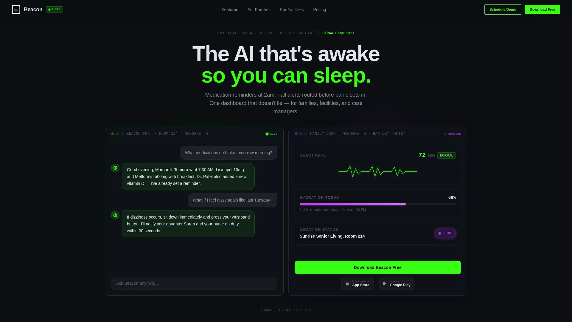
- A dark glass panel header with a chat transcript panel on the left and a family dashboard panel on the right
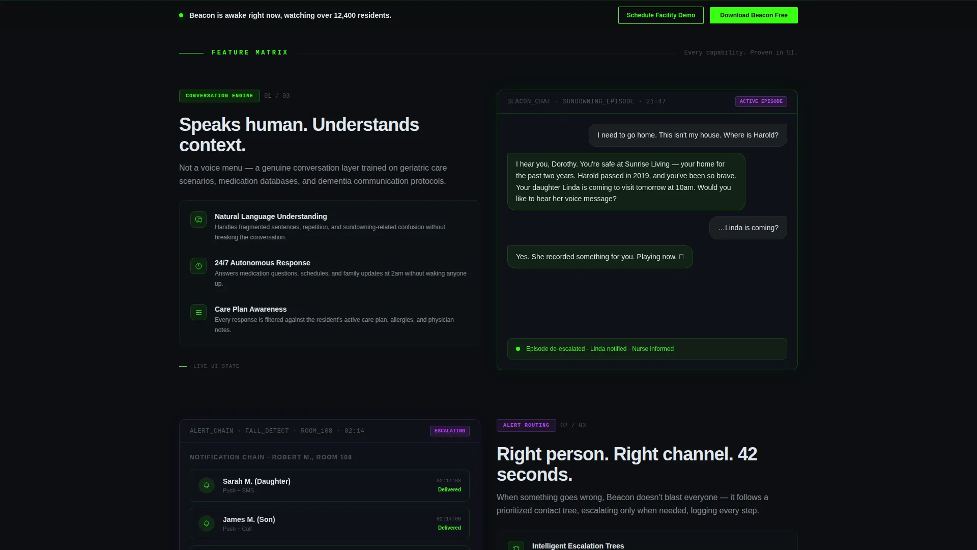
- A four-cluster Feature Matrix with left-side capability descriptions and right-side live user interface screenshots
- A primary app download call to action with App Store and Google Play badge pairs, plus a sticky bottom bar repeat after the third matrix row
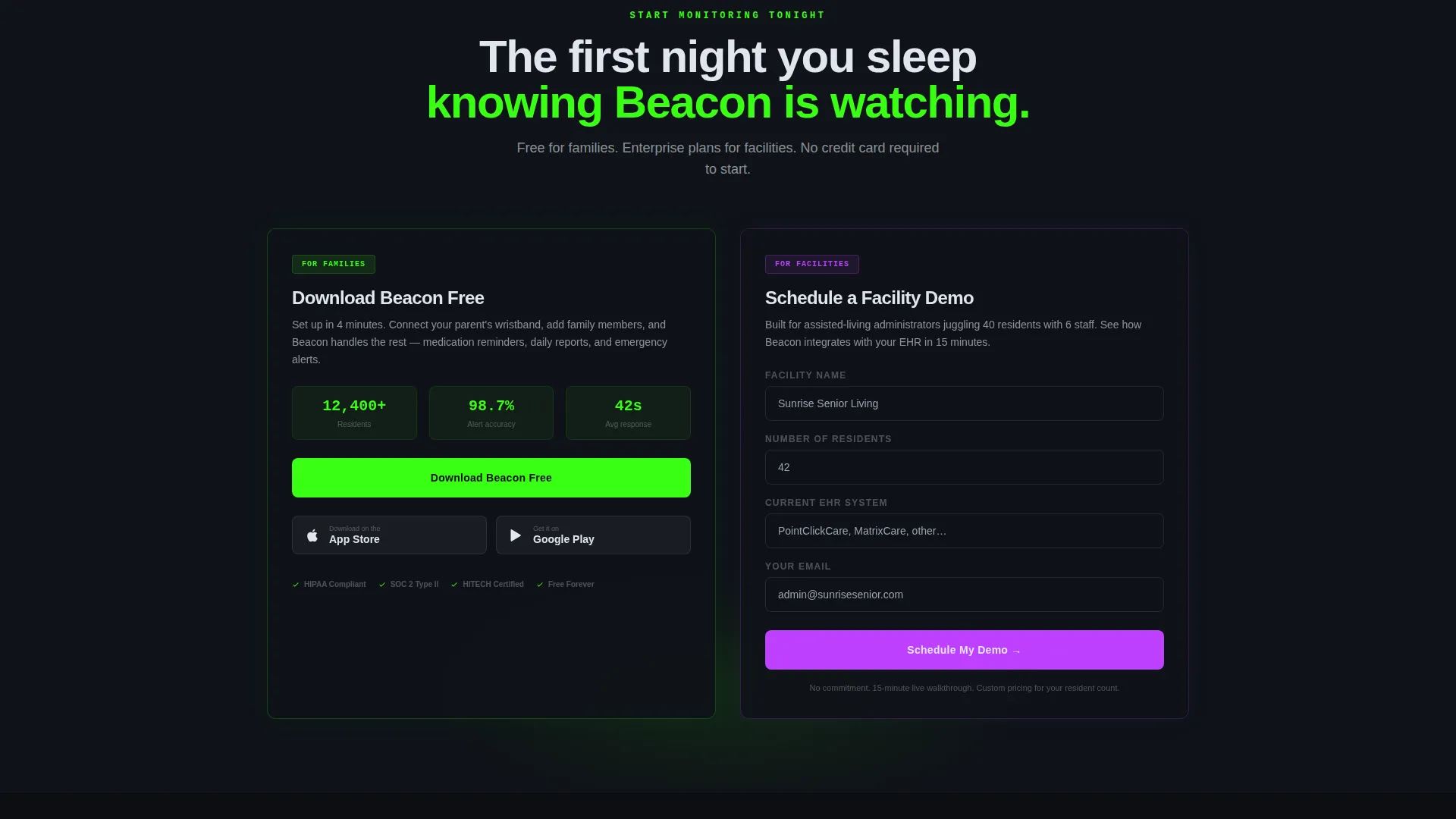
- A secondary enterprise lead form capturing facility name, resident count, and current electronic health record system
Feature list
This template's layout and component set are built around one goal: proving that Beacon is critical infrastructure, not a novelty. Each feature below reflects a defined element from the design brief.
Dark Glass Panel Header
Two frosted-glass panels float edge to edge over a void-black field. The left panel shows a live-style AI chat transcript with soft green cursor blink animations. The right panel displays a family dashboard including a heart-rate trend line, a hydration tracker, and a geofenced location badge glowing in electric violet.
Feature Matrix Scroll Sections
After the header, each scroll section splits the screen 50/50. The left panel names a feature cluster with three icon-and-label sub-feature rows on dark cards. The right panel shows the corresponding live user interface state, making abstract capabilities visually concrete before the visitor reaches any call to action.
Dual Conversion Paths
The template serves two audiences without forcing either into the wrong funnel. A primary download call to action with paired app store badges targets family users directly. A secondary short form targets facility administrators and qualifies enterprise leads with three focused fields.
Sticky Bottom Bar call to action
A sticky bottom bar with the primary app download call to action appears after the third feature matrix row. This keeps the conversion option visible as a visitor scrolls through product proof sections without interrupting the reading flow.
Acid Digital Color System
The full Acid Digital palette is baked into the template. Void black owns all backgrounds. Terminal green marks active states and primary buttons. Electric violet signals escalation alerts and premium feature labels. Cool white carries all body text and labels for comfortable reading on dark surfaces.
Alert Routing and Compliance user interface States
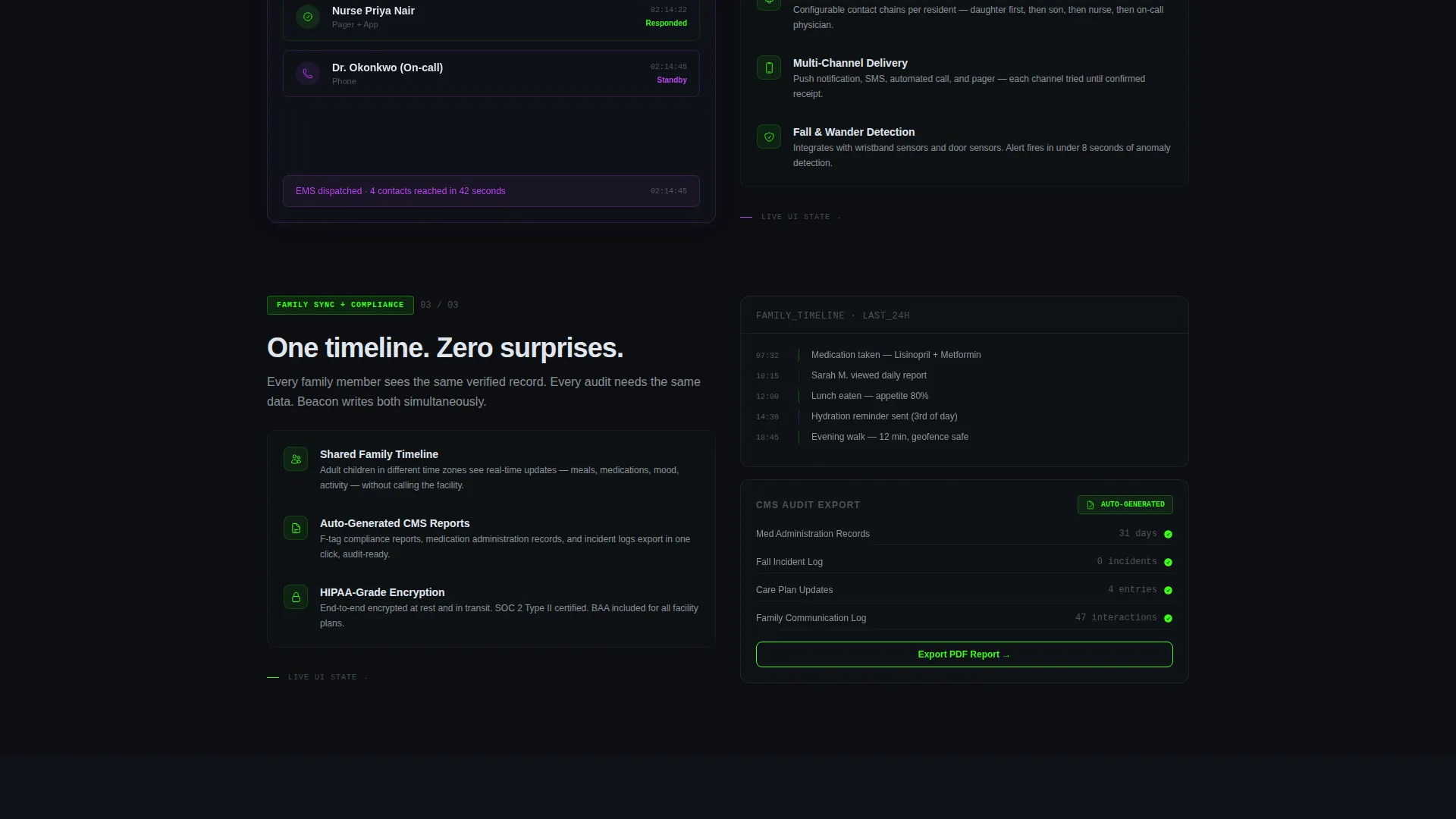
Dedicated right-panel user interface states show a push notification chain reaching family members in sequence, a shared family timeline, and an auto-generated compliance audit export. These panels are not static mockups but styled live-user interface representations that demonstrate emergency-grade reliability.
Page sections overview
| Section | Purpose |
|---|---|
| Dark Glass Header | Introduces the product through live-style chat and dashboard panels |
| Conversation Engine | Shows AI chat resolving a medication reminder interaction |
| Alert Routing | Displays push notification chain reaching family and care staff |
| Family Sync | Presents shared family timeline with real-time status updates |
| Compliance Logging | Demonstrates auto-generated audit export for facility administrators |
| Primary App Download | Drives consumer downloads with App Store and Google Play badges |
| Facility Demo Form | Captures enterprise leads with a three-field qualification form |
| Sticky call to action Bar | Repeats download call to action after third matrix row |
Design & branding system
The template uses the Acid Digital color system inside a Dashboard Pro theme. Every color has a defined role, and nothing is decorative without purpose. The overall effect is described in the brief as a cardiac monitor in a dim room: clinical but alive.
- Void black (#0B0E11) for all backgrounds and panel interiors
- Terminal green (#39FF14) for active indicators, primary buttons, and app badge hover states
- Electric violet (#BF40FF) for escalation alerts, geofence badges, and premium feature labels
- Cool white (#E0E6ED) for all body text and user interface labels to reduce eye strain on dark surfaces
Mobile & speed optimization
The template is designed with a split-screen 50/50 desktop layout as its primary format. The dark glass panel components and sticky bottom bar are built to reflow cleanly for smaller screen sizes, keeping both conversion paths accessible on any device.
- Split-screen panels are structured to stack vertically on mobile viewports
- Sticky bottom bar keeps the primary call to action visible without covering content
- Dark backgrounds reduce visual noise and keep focus on panel content on smaller screens
How this template helps you convert
The template is engineered so that by the time a visitor reaches the final call to action, they have already watched the product work six times across six right-panel user interface states. Conversion is earned through proof, not persuasion.
- The header panels put the product in motion immediately, replacing any need for a written pitch above the fold
- The Feature Matrix escalates from everyday convenience to emergency-grade reliability, building trust progressively with each scroll section
- Two conversion paths prevent funnel leakage by matching the right offer to the right visitor type without page clutter
Other information about this template
Beacon is built as a single-page template intended for teams launching or marketing a senior care AI chatbot product. The template is a starting point that a designer or developer can adapt to match a specific product's branding and content needs.
- The four feature clusters included are Conversation Engine, Alert Routing, Family Sync, and Compliance Logging
- The secondary demo form fields, facility name, resident count, and current electronic health record system, are designed to qualify enterprise leads without slowing down the consumer download flow
- The template visual language is intentionally clinical and purposeful, drawing from instrument panel and ICU monitor aesthetics to signal reliability to a high-stakes audience
- This template is well suited to product teams, digital health agencies, or no-code builders working in the senior care technology space
Theme
Dashboard Pro
Creative direction
Feature Matrix
Color system
Acid Digital
Style
Split Screen (50/50)
Direction
App Download
Page Sections
Dark Glass Panel Header
50/50 Feature Matrix Layout
Dual Conversion Funnels
Sticky Bottom Bar Call to Action
Acid Digital Color System
Compliance and Alert User Interface States
Related questions
Who is this landing page template designed for?
Can the template handle two different types of visitors at once?
What are the four feature clusters shown in the Feature Matrix?
What colors and visual style does this template use?
Does this template include a sticky call-to-action element?



