Hospitality Software Comparison Website Template
The Steward smart hospitality donor management landing page template is built for development directors, hospitality GMs, and nonprofit fundraising teams who need every pledged dollar reconciled before the night ends. It pairs a data-driven comparison table layout with animated feature tabs, electric-green calls to action, and a two-field app download form to turn event chaos into a clean, credible donor ledger.
by Rocket studio
Quick summary
This landing page template helps hospitality-focused nonprofits and event teams present Steward as the definitive fix for pledge reconciliation chaos. It uses an industrial monochrome steel visual system, an animated Feature Tab Switcher, and a hard-data comparison table to prove the cost of manual tracking, then drives visitors straight to an app download form.
Who this template is for
Fundraising events run on tight timelines, and the people managing them rarely have the luxury of errors. This template is designed for real people who carry the weight of donor data after the lights go down. It speaks to them directly and gives their platform a credible, authoritative stage.
- Development directors at boutique hotels and event-driven nonprofits who manage fundraiser weekends
- Hospitality GMs who have been tasked with running a charity tournament and need to look competent fast
- Event coordinators and CFOs responsible for post-event revenue reporting and donor reconciliation
What problem this template solves
Manual pledge tracking creates gaps. Pledge cards get lost. Venmo screenshots pile up in inboxes. Donors who gave generously walk away without a proper thank you because no one could match their name to a gift in time. These gaps are not just inconvenient, they cost organizations real money.
- 73% of hospitality-hosted fundraisers lose between 12 and 18% of pledged revenue to reconciliation gaps
- Duplicate donor errors, missed follow-ups, and slow post-event reports damage donor trust and suppress the donor retention rate
- Development teams spend hours after every event manually cross-referencing a scattered donor list instead of stewarding relationships
What you get with this template
This template is a fully structured single-page layout built around one clear goal: get qualified visitors to download the Steward app or request the benchmark report. Every section is purposeful, every animation earns its place, and the copy hierarchy is designed to make the manual alternative feel inadequate before the call to action even appears.
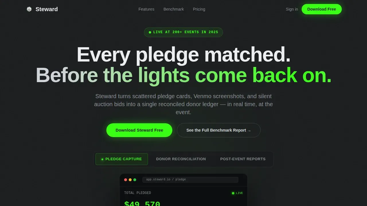
- A Feature Tab Switcher hero with three animated app screens covering Pledge Capture, Donor Reconciliation, and Post-Event Reports
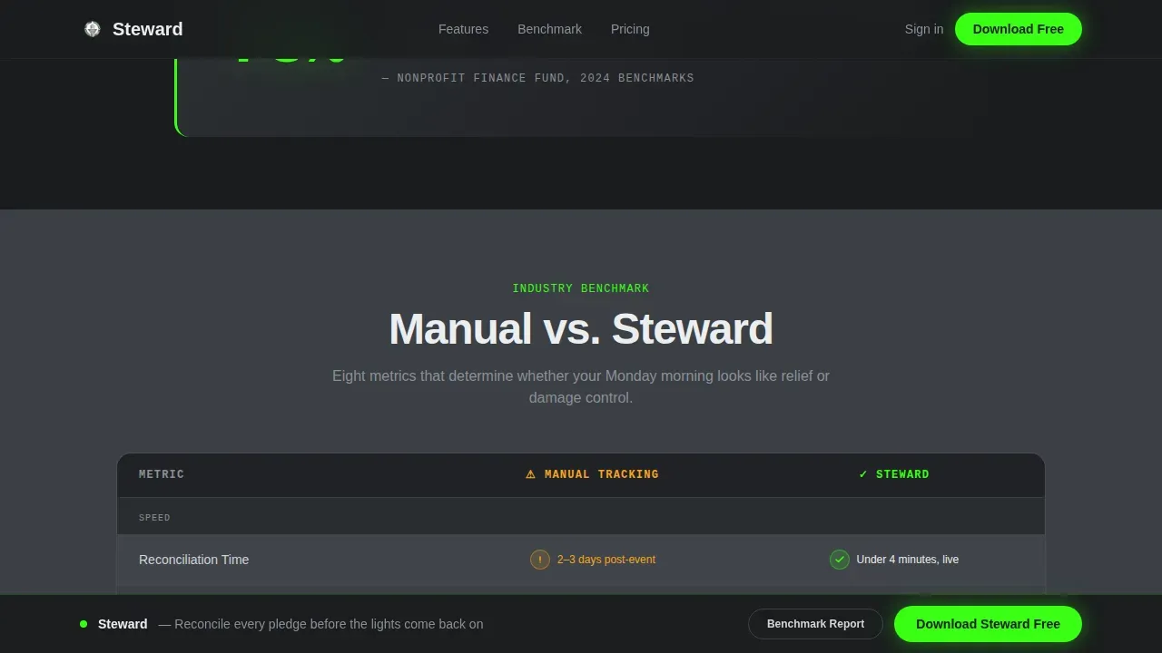
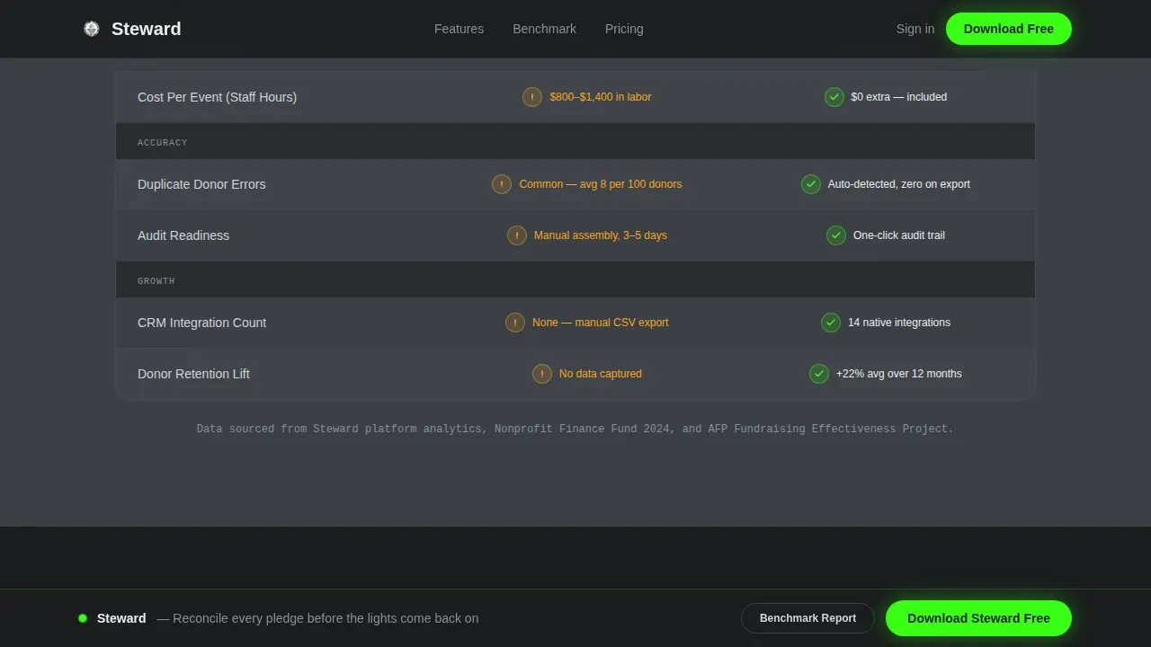
- A staggered-row comparison table contrasting Manual Tracking against Steward across eight concrete metrics
- A pinned sticky bottom bar with a two-field app download form (work email and event type)
Feature list
This template packages several purpose-built components that work together to build trust, present hard data, and drive action.
Animated Feature Tab Switcher
The hero section features three tabs labeled Pledge Capture, Donor Reconciliation, and Post-Event Reports. Each tab reveals a different device mockup screen with live-feeling data animations: pledge amounts ticking upward, donor names auto-matching, and a pie chart assembling in real time. The active tab pulses with an electric-green accent to signal live activity.
Eight-Metric Comparison Table
Below the fold, a full comparison table contrasts Manual Tracking against Steward across eight performance metrics. These include reconciliation time, pledge recovery rate, duplicate donor errors, post-event reporting speed, integration count, cost per event, donor retention lift, and audit readiness. Rows animate on scroll entry, with the Steward column showing green checkmarks and the manual column displaying amber warnings.
Pull-Stat Callout Blocks
Between table sections, McKinsey-style authority statements land as standalone scroll moments. For example, the stat that 73% of hospitality fundraisers lose 12 to 18% of pledged revenue escalates urgency with every scroll. These callouts build the case before the download prompt appears and keep donors engaged with hard, credible metrics.
Pinned App Download Bar
After the first scroll, a sticky bottom bar appears and stays pinned to the viewport. Tapping it opens a modal with a two-field form: work email and event type (gala, tournament, auction, or other). The primary call to action reads "Download Steward Free" and the secondary path offers "See the Full Benchmark Report" gated behind the same email field.
Social Proof Strip
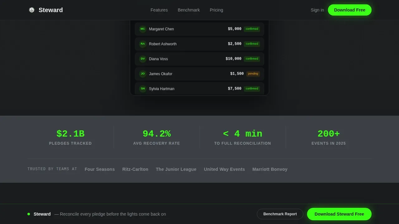
A dedicated strip below the hero displays authority stats and partner logos. This section provides social proof to visitors early in the scroll journey, supporting donor trust before the comparison data begins. Fundraising thermometers, donor counts, and partner logos help donors engage with confidence.
Streamlined Donation Forms
The template includes clear, simplified donation forms with minimal fields to reduce friction and abandonment. Only essential information is requested, keeping the donation process fast and focused. The page also supports confirmation messaging after a visitor submits a form, reinforcing transparency and trust.
Page sections overview
| Section | Purpose |
|---|---|
| Hero Tab Switcher | Present three animated app feature screens with live data pulses |
| Social Proof Strip | Display authority stats and partner logos for immediate credibility |
| Comparison Table | Contrast manual tracking against Steward across eight metrics |
| Pull-Stat Callouts | Deliver McKinsey-style urgency statistics between table sections |
| Download call to action Section | Drive app downloads and benchmark report leads via two-field form |
| Footer (Linear) | Single-row footer with links and minimal navigation |
Design & branding system
The visual identity channels Startup Velocity energy through a Monochrome Steel color palette that feels like brushed stainless steel under halogen light. The system is industrial, fast, and entirely without sentimentality. Typography pairs DM Sans for headings and body copy with JetBrains Mono for data values and numbers throughout the comparison table.
- Colors: foundry black (#1A1C1E) and gunmetal (#3B3F45) alternate as backgrounds; chrome (#D0D3D8) stripes comparison table rows; electric green (#39FF14) fires exclusively on interactive calls to action and live data pulses
- Typography: DM Sans handles all heading and body text; JetBrains Mono renders all numeric and data-layer content for a precision, dashboard feel
- Animation style: high-energy tab switcher with live data ticks, staggered row animations on scroll, and a soft green heartbeat pulse on the active tab and sticky call to action bar
Mobile & speed optimization
This template is built desktop-first, reflecting the reality that development directors are often at a laptop late at night when they land on this page. The layout prioritizes a wide-screen comparison table experience and full-bleed device mockup staging. It also accounts for donors and event staff who may access the page from a phone during or after an event.
- Responsive layout adjusts the comparison table and tab switcher for smaller screens without losing readability
- Client-side animations are isolated to interactive components; static sections use server components to keep the page load lean
- The sticky download bar remains accessible on all screen sizes, keeping the primary call to action reachable without scrolling back to the top
How this template helps you convert
The page is structured so that by the time a visitor reaches the download prompt, the comparison table has already made the manual alternative feel embarrassing. Conversion is earned, not requested.
- The comparison table builds the rational case first, eight metrics with visual contrast make the value of Steward undeniable before any call to action appears
- The pull-stat callouts escalate emotional urgency, turning abstract data into felt cost; visitors who nodded at the stats are already motivated when the secondary "See the Full Benchmark Report" path appears
- The two-path form captures both ready-to-install users and benchmark-curious leads with a single two-field entry, keeping friction minimal and the donor list growing from day one
Other information about this template
The Steward smart hospitality donor management landing page template is built for teams that run event-driven fundraising programs and need a platform presentation that matches the professionalism of the data it promises. A strong donor stewardship plan is the foundation of any successful fundraising strategy, and this template helps nonprofits communicate that plan with authority.
- A clear stewardship plan helps organizations build trust with supporters, improve the donor retention rate, and make fundraising campaigns more effective over time
- Good donor stewardship begins immediately after a donor makes a gift; the template positions Steward as the tool that makes this possible at scale, even for new donors who gave at a one-night gala
- Donor segmentation allows nonprofits to tailor messaging to different groups, for example, major donor recognition differs from outreach to recurring donors or one time gifts, and the template's comparison table illustrates how manual tracking fails every segment
- A donor stewardship matrix helps organizations map specific stewardship tasks to donor segments defined by gift size, frequency, and type; this template can support teams looking to present that matrix-based approach to board members and volunteers
- The effective donor stewardship plan your organization needs includes specific timelines, donor-centric language, and segmented outreach that respects communication preferences, all of which Steward is positioned to power
- Donor stewardship practices should work alongside your overall communication strategy, covering social media and social media platforms, thank you messaging, and post-event feedback to keep donors engaged
- Many nonprofits use this page as a committee-facing presentation site, inviting board members to review the benchmark data before approving the platform as a responsible stewardship investment
- Volunteers and event staff who are involved in pledge capture can also be onboarded through this page; the template supports transparency about how gifts are tracked and reconciled
- The template's donation landing structure follows proven donation landing page best practices: impact-driven headlines, simplified donation forms above the fold, social proof early in the scroll, a secure donation process, and a thank you confirmation after form submission
- Recurring donors and major donor stewardship both benefit when the platform behind the page can deliver personalized follow-up; this template establishes that credibility before the download tap
- Using the right tools to track engagement metrics is crucial; the template's comparison table illustrates this point across every metric row, from reconciliation time to audit readiness
- Donors gifts recorded through Steward flow into a reconciled ledger, helping the organization save time, recover money, and build the kind of donor trust that turns one-time guests into recurring donors
Theme
Startup Velocity
Creative direction
Industry Report
Color system
Monochrome Steel
Style
Comparison Table
Direction
App Download
Page Sections
Animated Feature Tab Switcher Hero
Eight-metric Comparison Table
Mckinsey-style Pull-stat Callouts
Pinned Sticky Download Bar
Social Proof Strip
Streamlined Donation Forms and Confirmation Flow
Related questions
Who is this landing page template designed for?
What sections are included in this template?
Can this template support a donor stewardship plan presentation?
How does the two-path conversion work?
Is this template suitable for small nonprofit teams?



