Beacon — Network Infrastructure Landing Page Template
Uplink is a scroll-reveal landing page template built for telecom tower booking platforms. It opens with four animating stat counters, then progressively reveals a live tower-density map, a three-step booking flow, and carrier social proof. The design uses a Void and Violet color system with glass-morphism panels, orchid-glow data points, and two clear conversion paths driving visitors into the live platform.
by Rocket studio
Quick summary
Uplink is a single-page, scroll-reveal template designed for telecom tower booking and site acquisition platforms. It leads with hard numbers, then layers in how the platform works. Every section stays hidden until the visitor scrolls into it, building trust through scale and speed before asking for a click.
Who this template is for
This template is built for vertical software-as-a-service (SaaS) platforms operating in the telecom tower space. If your product sits between tower owners and the teams trying to book rack space or frequency bands, Uplink was designed for you.
- Wireless carrier site acquisition managers handling large volumes of municipal permits
- Towerco asset managers optimizing tenancy ratios across multi-structure portfolios
- Mobile virtual network operator (MVNO) operations leads securing rooftop access in new markets
What problem this template solves
Tower lease negotiations and site acquisition workflows are traditionally slow, fragmented, and dependent on phone calls and spreadsheets. Prospects landing on your platform page need to understand, within seconds, that you have replaced that chaos with a single dashboard.
- Visitors cannot quickly grasp platform scale without concrete numbers up front
- Complex booking steps feel intimidating without a clear, visual walkthrough
- High-intent buyers like towerco managers and carrier leads abandon pages that bury proof
What you get with this template
You get a fully structured, conversion-optimized landing page that presents your telecom tower platform with authority and precision. Every visual choice reinforces the idea of a live, data-dense system operating at scale.
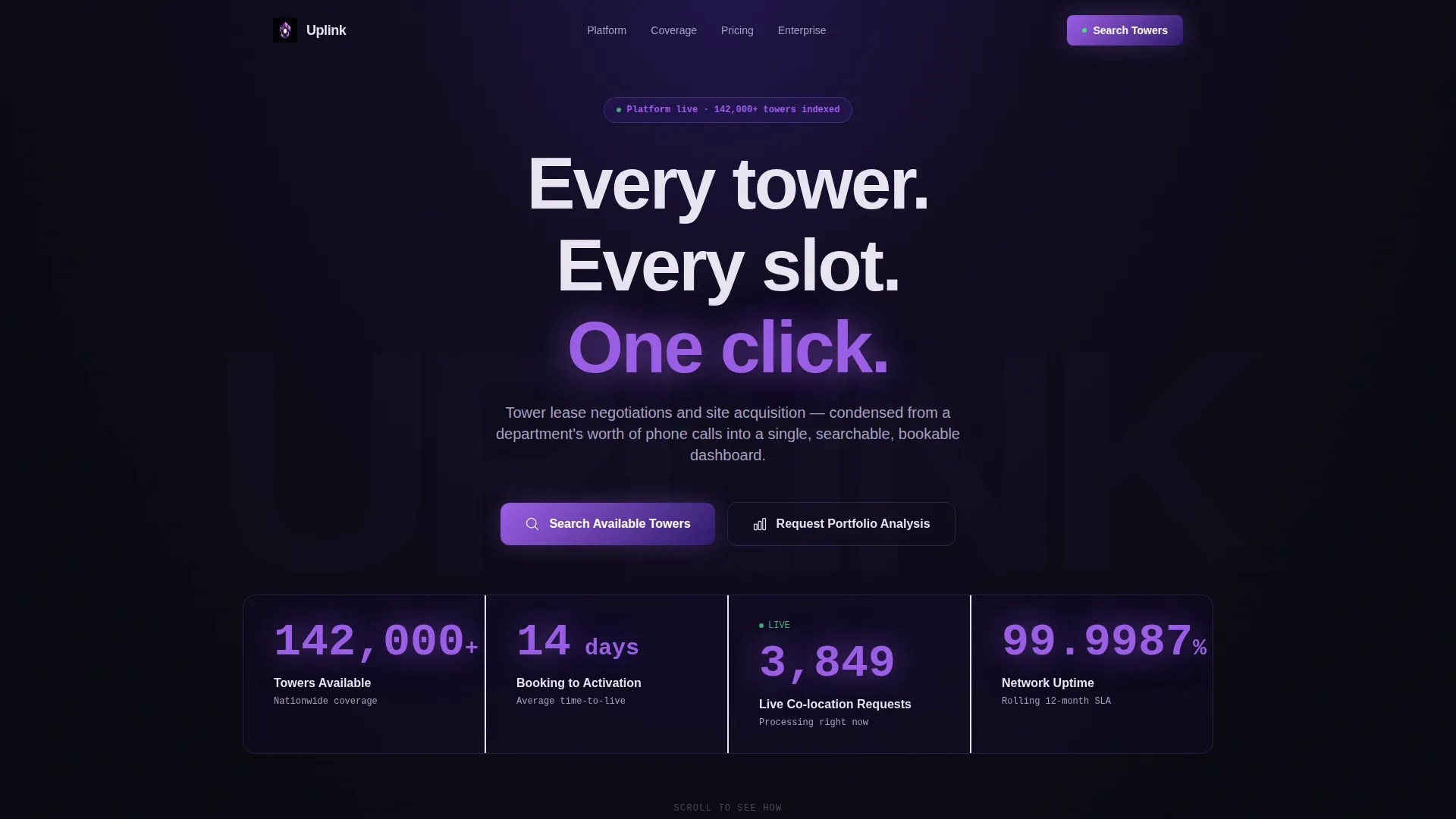
- A stats-wall header with four animated counters displaying real platform metrics
- A scroll-reveal page flow that progressively exposes the map, booking steps, and social proof
- Two distinct conversion paths: a primary search call-to-action (call to action) and a secondary portfolio analysis request
Feature list
This section describes the core built-in components and interaction patterns included in the Uplink template.
Animated Stats Header
Four massive counters animate upward against a void-black background on page load. The metrics displayed are towers available nationwide (142,000 plus), average booking-to-activation time (14 days), live co-location requests processing in real time, and network uptime carried to four decimal places (99.9987%). Each counter renders in orchid on a faint glass card, creating immediate credibility before a single word of copy is read.
Scroll-Reveal Section Architecture
Each content section remains visually hidden until the visitor reaches the appropriate scroll depth. This progressive disclosure structure means the stats hit first, then the map, then the booking flow, then the social proof. The experience feels earned rather than dumped on the visitor at once.
Live Tower Density Map Panel
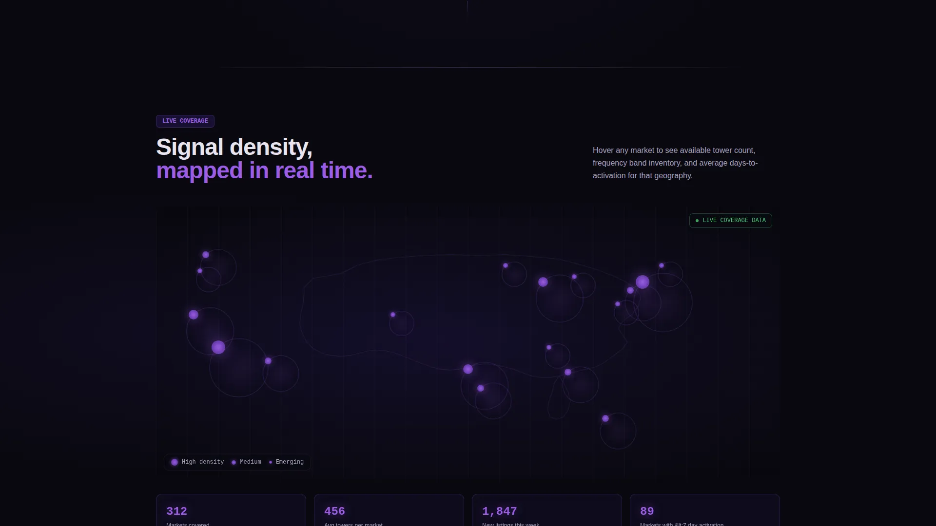
Section two slides in a market map showing tower availability by geographic cluster. High-availability zones pulse in violet, giving site acquisition managers an instant visual read on where inventory is concentrated. The map reinforces platform scale without requiring the visitor to read a single data table.
Three-Step Booking Flow
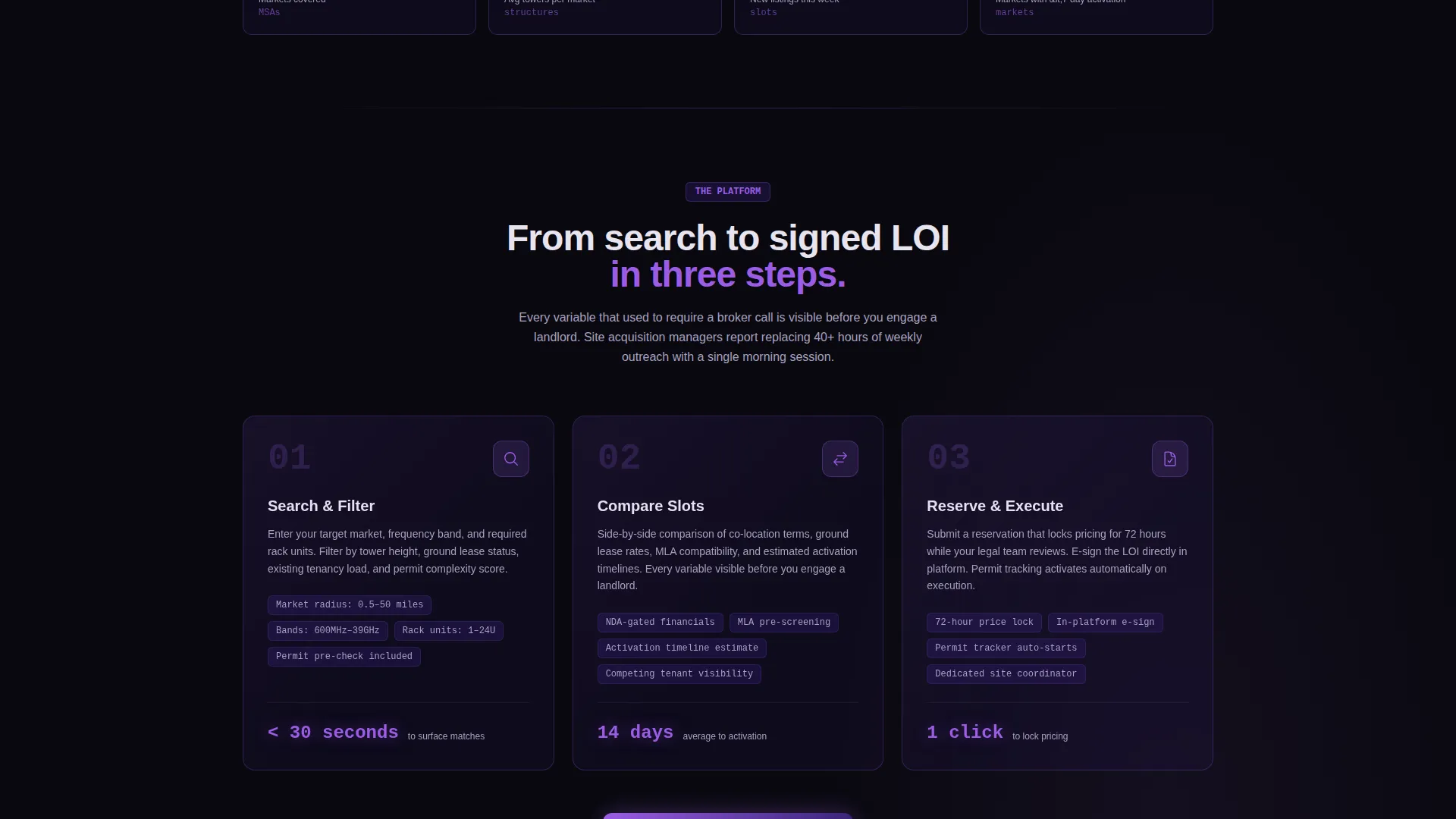
Section three materializes three glass-panel steps as the visitor scrolls: Search, Compare, and Reserve. Each panel appears in sequence, making a complex procurement process feel approachable. The visual rhythm matches the simplicity the platform is promising.
Carrier and Towerco Social Proof
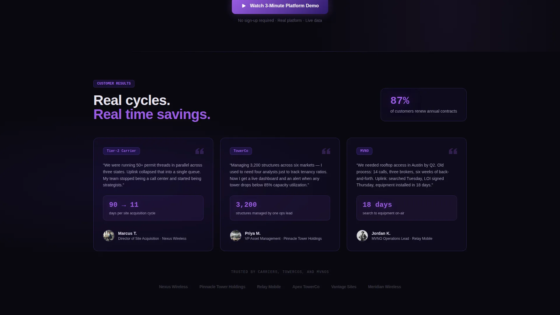
Section four stacks named testimonials and specific outcome metrics from real carriers and tower companies. A representative example reads: reduced site acquisition cycle from 90 days to 11. Specificity here does the heavy lifting that generic testimonials cannot.
Dual Conversion Path calls to action
The primary call to action, labeled "Search Available Towers," appears beneath the header stats and recurs as a persistent glass-pill button after the second scroll section. A secondary path, labeled "Request Portfolio Analysis," captures company name and portfolio size for towerco asset managers before routing to a sales team. Both paths serve distinct buyer intents without competing.
Page sections overview
| Section | Purpose |
|---|---|
| Stats Metrics Header | Opens with four animated counters to establish platform scale immediately |
| Tagline Strip | Delivers the single positioning line beneath the stats wall |
| Tower Density Map | Shows geographic inventory clusters to high-intent acquisition managers |
| Booking Flow Steps | Visualizes the three-step process: Search, Compare, Reserve |
| Social Proof Stack | Presents named carrier and towerco outcomes with specific time metrics |
| Primary call to action Block | Drives visitors to the live filtered tower search interface |
| Portfolio Analysis call to action | Captures asset manager intent for bulk data and sales routing |
Design & branding system
The visual identity follows a Tech Glass theme built on the Void and Violet color system. The result feels like staring into a fiber-optic cable cross-section: absolute darkness broken by precise, electric light.
- Core palette: void black (#09090F) for backgrounds, deep structural violet (#2D1B69) for depth layers, luminous orchid (#9B5DE5) for interactive elements and data highlights, and frosted glass white (#E8E4F0) for typography and card surfaces
- Glass-morphism panels float above void-black backgrounds with borders that catch violet light like signal refraction
- Hover states transition from violet to orchid, mimicking the visual rhythm of a signal handshake completing
Mobile & speed optimization
The Uplink template is structured with a mobile-first layout so the scroll-reveal experience translates across screen sizes. The glass-panel sections and counter animations are designed to remain legible and impactful on smaller viewports.
- Persistent glass-pill call to action button is sized and positioned for thumb-reach on mobile screens
- Section-level scroll reveals are scoped so mobile visitors experience the same progressive disclosure as desktop users
How this template helps you convert
The page is structured as a click-through landing page designed to move high-intent telecom industry visitors toward one of two clear actions without friction.
- The stats-first header establishes platform credibility in under five seconds, removing the need for a visitor to read paragraphs before trusting the product.
- The scroll-reveal architecture builds the sales argument in layers, so by the time the call to action recurs after section two, the visitor has already seen scale, process, and proof.
Other information about this template
This template is part of a broader set of vertical SaaS landing page templates built for technology-category niches requiring data-dense, high-trust presentation styles.
- The template style is Scroll Reveal (Progressive), meaning sections animate into view as the user scrolls rather than loading all at once
- The header concept is Stats and Metrics, a creative direction suited to platforms where raw numbers are the most persuasive asset
- The landing page direction is Click-Through, optimized to route qualified visitors into a product demo or sales flow rather than capturing leads on the page itself
- The Void and Violet color system is purpose-built for technology products where a clinical, high-precision aesthetic signals reliability to a professional buyer audience
Theme
Tech Glass
Creative direction
Stats-First Impact
Color system
Void & Violet
Style
Scroll Reveal (Progressive)
Direction
Click-Through
Page Sections
Animated Stats-wall Header
Progressive Scroll-reveal Layout
Tower Density Map Section
Three-step Glass-panel Booking Flow
Named Social Proof with Outcome Metrics
Dual Call to Action Conversion Paths
Related questions
Who is the primary audience for this landing page template?
Can I adjust the stat counter numbers to match my platform's real metrics?
Does the page support two different types of visitors?
How does the scroll-reveal structure benefit conversion?
Is this template suitable for a telecom startup with a smaller tower inventory?



