Beacon - Powerful Campground Landing Page Template
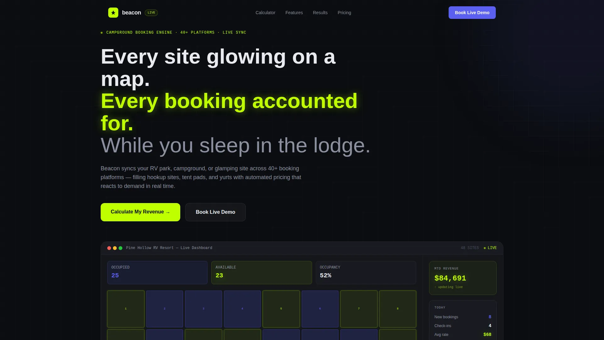
Beacon is a campground and RV park booking app landing page template built for lead generation. It opens with an interactive site-map preview and a live revenue calculator, then cascades into a modular card grid of features. The Tech Glass visual theme, Acid Digital color palette, and animated card layout make the product itself the hero, no stock photography needed.
by Rocket studio
Quick summary
Beacon is a single-page, card-grid landing page template for a campground and RV park booking application. It leads with a working mini-dashboard and an instant revenue calculator, then delivers feature cards in a staggered, animated grid. The dark Tech Glass design and electric lime accents make the app feel alive from the first scroll.
Who this template is for
This template is built for teams and founders who are launching or marketing a campground booking app to outdoor hospitality operators. It speaks directly to the people buying the software, not the campers booking the sites.
- Family-run RV park owners moving off paper ledgers and onto digital reservations
- State park concessionaires managing seasonal staff and fluctuating availability
- Glamping startups that need dynamic pricing ready before their first property opens
What problem this template solves
Campground booking software is a hard sell when prospects cannot immediately see the value. A generic landing page full of bullet points and tent photography does not show operators how the product handles their actual chaos, double-bookings, empty sites, and late-night phone calls.
- Operators cannot visualize how a dashboard replaces their paper ledger until they see it running
- The revenue upside of reduced double-bookings stays abstract until a real number appears on screen
- A weak first impression loses operators who are skeptical that any software understands their workflow
What you get with this template
You get a complete, conversion-focused landing page layout designed specifically for a campground and RV park booking app. Every section is purpose-built, from the interactive header to the persistent demo bar at the bottom.
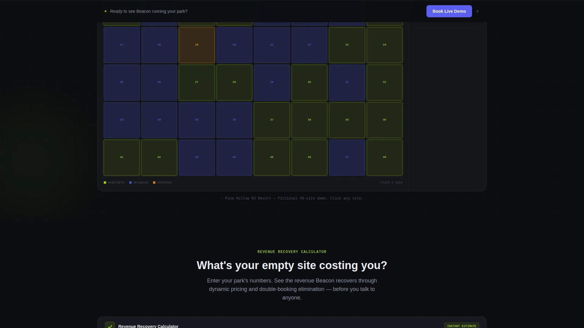
- An interactive 48-site map preview showing live occupancy, mid-checkout states, and a climbing revenue ticker
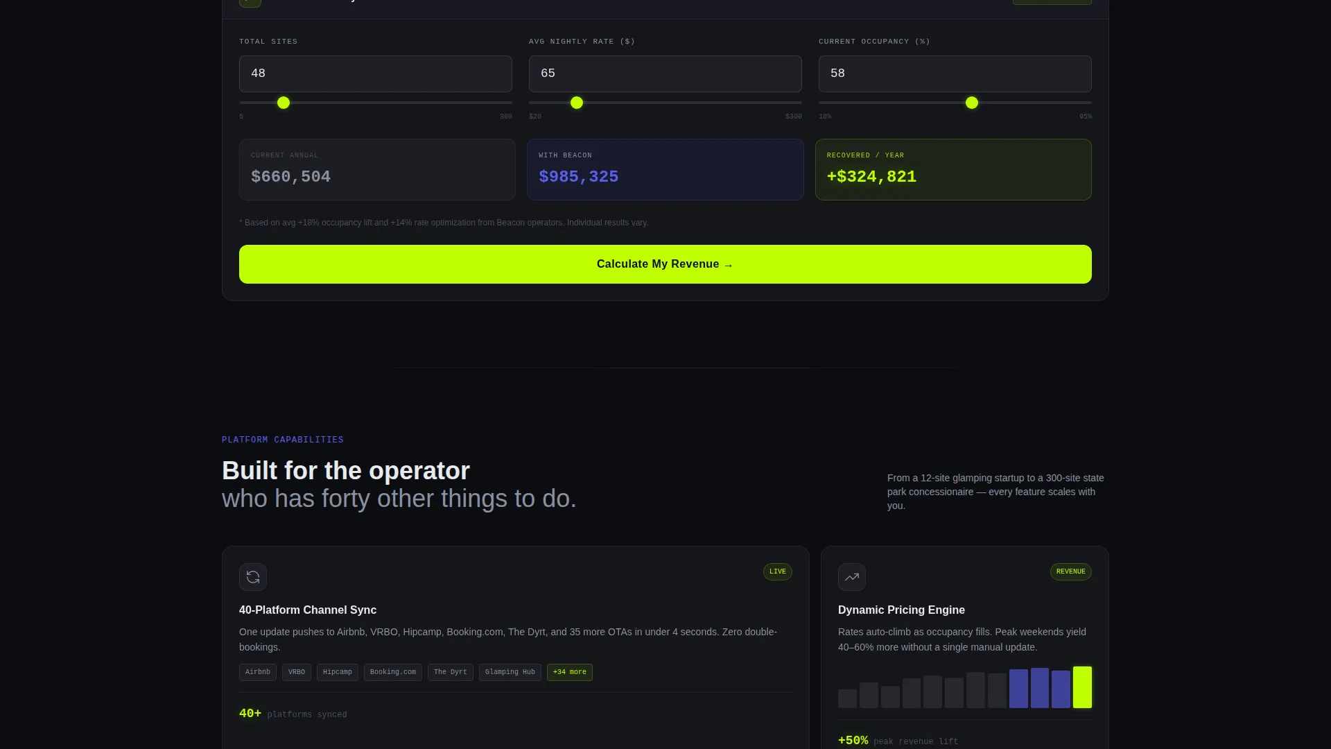
- A built-in revenue calculator that projects annual earnings from reduced double-bookings and dynamic pricing
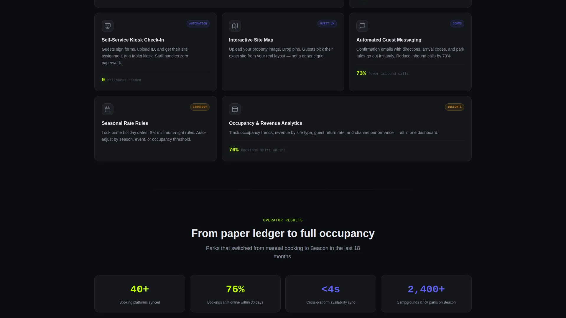
- A modular frosted-glass card grid presenting individual features with scroll-entry micro-animations
- A three-field lead capture form that slides down automatically after the calculator produces a result
- A persistent bottom bar with a secondary call-to-action for visitors who skip the calculator
Feature list
This template packs purposeful, app-specific components into every section. Each one is drawn directly from the brief and serves a specific job in the conversion flow.
Interactive Site-Map Dashboard
The header drops visitors into a functioning mini-dashboard for a fictional 48-site campground called Pine Hollow RV Resort. Occupied sites glow in UV blue, available sites pulse in soft lime, and one site flashes amber mid-checkout. A revenue ticker climbs in real time in the top-right corner.
Live Revenue Calculator
Below the header sits a Revenue Calculator card. Visitors enter their number of sites, average nightly rate, and current occupancy percentage. The tool instantly projects annual revenue recovered through reduced double-bookings and dynamic pricing, and that lime-colored result anchors every section that follows.
Modular Feature Card Grid
Features are presented as frosted-glass tiles in a staggered grid. Each card covers one capability, channel sync, automated check-in kiosks, seasonal rate rules, or guest messaging. Cards float into place on scroll-enter, powered by lightweight micro-animations that feel like a cockpit powering up.
Slide-Down Lead Capture Form
After the calculator delivers a result, a form slides into view asking for park name, total number of sites, and email address. Only three fields appear, and two are pre-filled from calculator inputs. This keeps friction low and ties the signup moment to a revenue number the visitor just generated.
Persistent Demo call to action Bar
A bottom bar stays visible throughout the entire scroll. It carries a "Book a Live Demo" call-to-action in UV blue for visitors who prefer to talk before they calculate. This secondary path captures intent from skeptical operators without interrupting the main calculator flow.
Staggered Scroll Animations
Every feature card enters the viewport with a stagger-and-float animation. The effect is deliberate: each card feels like an instrument coming online, building a sense that the product is sophisticated but calm. Scroll behavior escalates the stakes from convenience to revenue to growth.
Page sections overview
| Section | Purpose |
|---|---|
| Interactive Map Header | Show live occupancy and revenue in a fictional dashboard |
| Revenue Calculator Card | Let visitors project their own annual revenue gain |
| Channel Sync Card | Highlight availability sync across listing platforms |
| Auto Check-In Card | Present automated kiosk check-in as a feature |
| Seasonal Rate Rules Card | Explain dynamic and seasonal pricing capability |
| Guest Messaging Card | Cover automated communication with arriving guests |
| Lead Capture Form | Collect park name, site count, and email after calculator use |
| Persistent Demo Bar | Offer a secondary demo path for bottom-of-page visitors |
Design & branding system
The visual identity follows a Tech Glass theme using an Acid Digital color system. The palette is designed to feel like a heads-up display projected onto a windshield at night, dark, luminous, and information-dense.
- Core colors: void black (#0B0D10) for backgrounds, translucent panel gray (#1A1D23 at 60% opacity) for frosted-glass card surfaces, electric lime (#BFFF00) for active states and primary calls-to-action, and cool UV blue (#5B5FEF) for secondary actions and graph lines
- Electric lime fires only on hover states, live data readouts, and primary calls-to-action so it retains maximum visual impact
- Card surfaces use frosted-glass treatment over near-black backgrounds, keeping the layout information-dense without feeling cluttered
Mobile & speed optimization
The card grid layout is modular by design, which means it scales naturally across screen sizes without breaking the staggered flow. Each section is a self-contained tile that reflows cleanly on smaller viewports.
- Frosted-glass cards and the site-map grid are sized for touch interaction on mobile devices
- The three-field lead form is minimal by design, reducing input friction on phone keyboards
- Micro-animations are tied to scroll-entry events, so they trigger only when a card enters the viewport
How this template helps you convert
The conversion strategy is built around giving value before asking for anything. The layout earns the click rather than demanding it.
- The revenue calculator runs before any form appears, the visitor's own projected revenue number becomes the emotional reason to sign up, making the lead form feel like claiming found money rather than filling out a contact sheet.
- The slide-down form pre-fills two fields from calculator inputs, removing repetition and lowering the effort required to complete the signup at the moment motivation is highest.
- The persistent bottom bar ensures that operators who skip the calculator still see a clear path to a live demo, capturing intent from every visitor type without cluttering the main scroll flow.
Other information about this template
This template is designed as a single landing page and works as a standalone marketing asset for a campground booking app product launch or a paid campaign destination.
- The template style is Card Grid (Modular), meaning individual feature sections can be reordered or swapped without breaking the overall layout
- The header concept is Interactive Preview, the dashboard and ticker are built into the template as visual components, not linked to a live backend
- The creative direction is Calculator First, placing a utility tool above persuasion copy so the page earns attention through usefulness
- The landing page direction is Lead Generation, with the primary conversion action being the three-field form that appears after the calculator result
- This template suits outdoor hospitality technology products including campground management software, RV park reservation systems, and glamping platform apps
Theme
Tech Glass
Creative direction
Calculator/Tool First
Color system
Acid Digital
Style
Card Grid (Modular)
Direction
Lead Generation
Page Sections
Interactive Site-map Dashboard
Instant Revenue Calculator
Modular Feature Card Grid
Slide-down Lead Capture Form
Persistent Demo Bottom Bar
Related questions
Who is this landing page template designed for?
Does the revenue calculator connect to a live database?
Can I reorder the feature cards in the grid?
What makes this template different from a generic software landing page?
How does the lead capture flow work?



