Beacon - Powerful Eldercare Landing Page Template
Beacon is a split-screen eldercare analytics landing page template built for platforms that unify nursing home metrics into a single dashboard. It combines a glassmorphic dark visual system, animated data sequences, and an industry-report scroll narrative to guide care network directors, compliance officers, and families toward an app download or demo request.
by Rocket studio
Quick summary
Beacon is a single-page landing page template designed for elder care analytics platforms. It uses a 50/50 split-screen layout, a deep glassmorphic color system, and a chapter-by-chapter scroll narrative to present complex facility data clearly. The page moves visitors from problem awareness to live interaction to a confident app download decision.
Who this template is for
This template is built for teams launching or promoting an elder care analytics dashboard product. It speaks directly to three distinct buyer profiles.
- Regional care network directors who oversee multiple facilities from one office
- Compliance officers preparing for Centers for Medicare and Medicaid Services (CMS) audits and needing real data fast
- Adult children researching senior care options who want factual metrics rather than marketing brochures
What problem this template solves
Care platforms struggle to communicate the depth of their data to a skeptical, time-pressured audience. A generic landing page undersells a powerful product and loses high-intent visitors before they ever reach a download button.
- Fragmented metrics across facilities are hard to visualize in static promotional copy
- Different buyer personas need different proof points on the same page
- Visitors need to experience the dashboard before committing to a download or demo
What you get with this template
Beacon delivers a fully structured, visually rich landing page template ready to adapt to your elder care platform. Every section is designed around a specific persuasion moment.
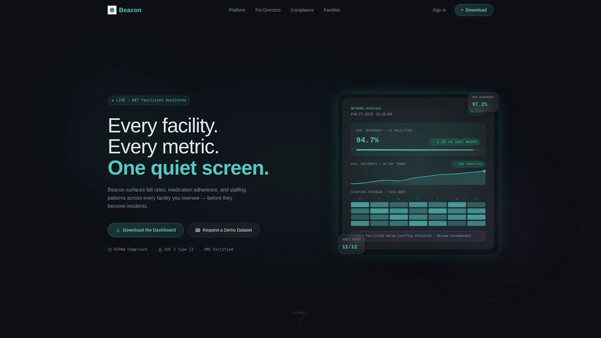
- A cinematic dark header with animated dashboard data and a teal-glow reveal sequence
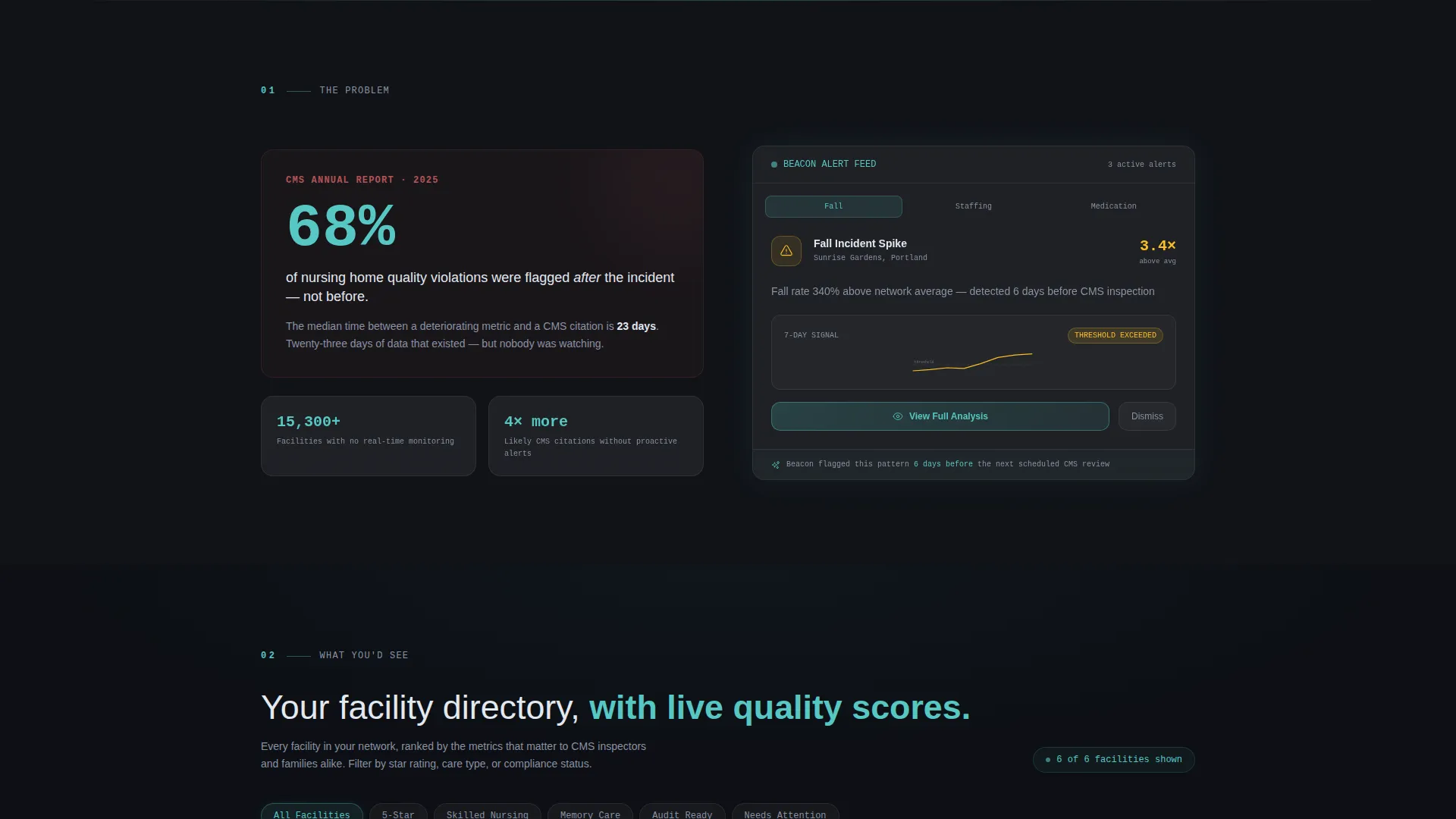
- Three scroll sections that escalate from problem framing to live discovery to actionable comparison
- A mid-scroll interactive mini-dashboard where visitors filter facilities and toggle metric views before downloading
Feature list
This template is built around six deliberate design and layout features. Each one serves the conversion journey from first impression to final tap.
Animated Dark Header Scene
The header opens on a near-black viewport. A single dashboard card fades in from center, its edges lit with a soft teal luminance. Inside the card, a 30-day fall-incident trend line draws itself, occupancy percentages tick upward, and a staffing heatmap cycles through a week. A headline etches in after two seconds, then the glow settles.
Split-Screen 50/50 Layout
Every scroll section pairs a data statement on one side with a live visual on the other. This structure keeps the narrative moving and gives each persona a clear focal point without crowding the layout.
Interactive Mid-Scroll Mini-Dashboard
Visitors can filter dummy facility cards by star rating and toggle between staffing and incident metric views directly on the page. This hands-on moment makes the download feel like unlocking a tool they have already started using.
Glassmorphic Frosted Card System
Cards float above the near-black background using white at 8% opacity with a 12-pixel blur. This layered depth effect gives the interface its distinctive control-room atmosphere without relying on photography.
Facility Discovery Grid and Comparison Table
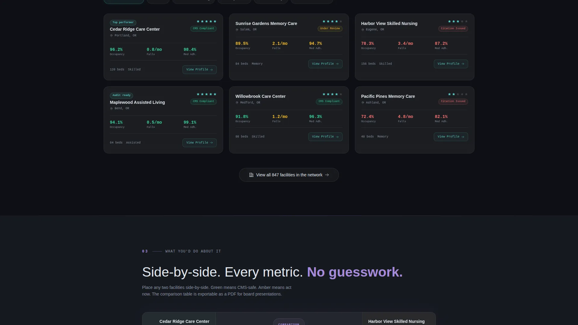
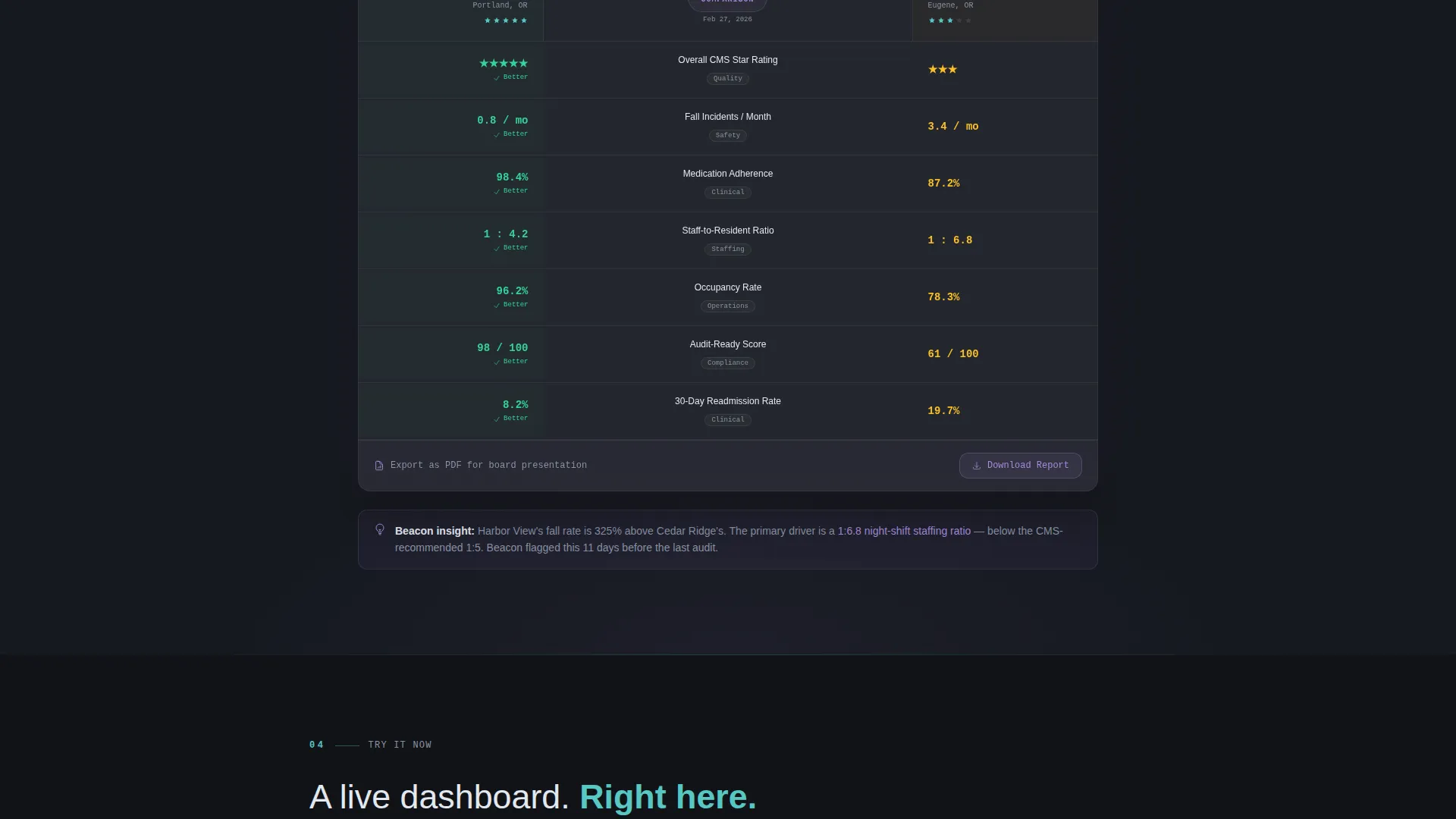
Section two presents a directory-style grid of filterable facility cards with live quality scores. Section three layers a side-by-side comparison table where two facilities sit together, with metrics glowing green or amber.
Dual-Path Conversion Footer
The primary call to action reads "Download the Dashboard" with paired App Store and Google Play badges displayed in teal on a frosted pill-shaped container. A secondary path offers "Request a Demo Dataset" for compliance-focused visitors who need to see real numbers before committing.
Page sections overview
| Section | Purpose |
|---|---|
| Animated header scene | Introduce the platform with data-led visuals and headline reveal |
| Problem framing split | Present a CMS statistic alongside a dashboard solution card |
| Facility discovery grid | Let visitors explore filterable facility cards with quality scores |
| Side-by-side comparison | Show two facilities compared with color-coded metric indicators |
| Interactive mini-dashboard | Let visitors filter and toggle live dummy data mid-scroll |
| Dual-path call to action footer | Drive app downloads and demo dataset requests |
Design & branding system
The visual identity uses a glassmorphic color system built entirely around a near-black base. The result feels like a dim control room coming to life at shift change.
- Base background sits at deep charcoal (#0D0F14); cards use white at 8% opacity with a 12-pixel blur for the frosted glass effect
- Soft clinical teal (#56C7C3) carries all active states, data highlights, and hover glows; muted lavender (#A78BDB) marks alert badges and secondary accents
- Body text renders in cool white (#E2E8F0) for legibility against dark surfaces; every interactive element carries a faint teal glow on hover
Mobile & speed optimization
The template layout is structured to stay readable and functional across screen sizes. The split-screen proportions adapt so data cards remain prominent on smaller viewports.
- Frosted card components are sized and spaced for touch targets on mobile screens
- The interactive mini-dashboard and filter chips are built to function cleanly on narrow displays without horizontal scrolling
How this template helps you convert
Beacon earns the download by layering trust across the scroll rather than asking for it upfront.
- The animated header makes an immediate emotional impression, showing the platform in motion before any copy is read
- The industry-report scroll narrative builds credibility section by section, moving from "here is what is broken" to "here is what you would see" to "here is what you would do about it"
- The interactive mini-dashboard removes the biggest objection by letting visitors experience the core product feature before they ever reach the download button
Other information about this template
Beacon sits at the intersection of a Directory and Discovery theme, an Industry Report creative direction, and an App Download conversion goal. These three elements work together to serve a niche that is underserved by generic SaaS templates.
- The template style is a strict 50/50 split screen, making it suitable for platforms that need to pair narrative copy with live data visuals
- The header concept is a Dark Full-Bleed and Glow treatment, which is distinct from standard hero banners and reinforces the control-room atmosphere
- The color system is fully glassmorphic, meaning the layered translucency is a core structural element rather than a decorative choice
- This template is categorized under Technology and the Elder Care Vertical SaaS subcategory, making it a strong fit for analytics products serving skilled nursing facilities, assisted living networks, and similar care environments
Theme
Directory & Discovery
Creative direction
Industry Report
Color system
Glassmorphic
Style
Split Screen (50/50)
Direction
App Download
Page Sections
Animated Dark Header with Data Reveal
Split-screen 50/50 Section Layout
Interactive Mid-scroll Mini-dashboard
Glassmorphic Frosted Card Components
Facility Discovery Grid and Comparison Table
Dual-path Conversion Footer
Related questions
Who is this landing page template designed for?
Can I adapt the dummy data in the mini-dashboard to my own facility metrics?
Does this template support both an app download and a demo request path?
What makes the visual design different from a standard SaaS landing page?
Is this template suitable for a single product or a multi-facility network platform?



