Nonprofit Software Directory Website Template
Beacon is a nonprofit donor management landing page template built on a bento grid layout with a Tech Glass visual style. It showcases a live interactive micro-dashboard, animated capability cards, and a frictionless app download flow. Designed for development directors, grant writers, and volunteer coordinators, it communicates platform value through density, motion, and clarity.
by Rocket studio
Quick summary
Beacon is a single-page landing page template for a nonprofit donor management platform. It combines an interactive browser-rendered dashboard preview, a reveal-driven bento grid spec sheet, and a streamlined app download call to action. The design uses a void-black and violet color system to make every data point feel urgent and alive.
Who this template is for
This template is built for teams launching a nonprofit software product and needing a landing page that earns trust fast. It speaks directly to the people who live inside donor data every day.
- Development directors managing a spring gala and a capital campaign at the same time
- Grant writers who need giving histories pulled in seconds, not hours
- Volunteer coordinators drowning in "did we send them a receipt?" threads
What problem this template solves
Nonprofit fundraising teams often struggle to communicate complex platform value on a single page. A static screenshot or a generic hero image does not show what the software actually does. This template solves that gap with an interactive preview that breathes and a bento grid that proves each feature without a paragraph of explanation.
- Visitors cannot trust what they cannot see, so the live dashboard replaces skepticism with experience
- Long-form feature lists lose busy development directors mid-scroll, so bento clusters answer one question at a time
- A download decision stalls without a clear low-friction path, so the sticky call-to-action and CSV import modal collapse the gap between demo and commitment
What you get with this template
You get a fully structured, high-interactivity landing page template ready to represent a nonprofit donor management platform. Every section is purposefully sequenced to move a skeptical visitor toward downloading the app.
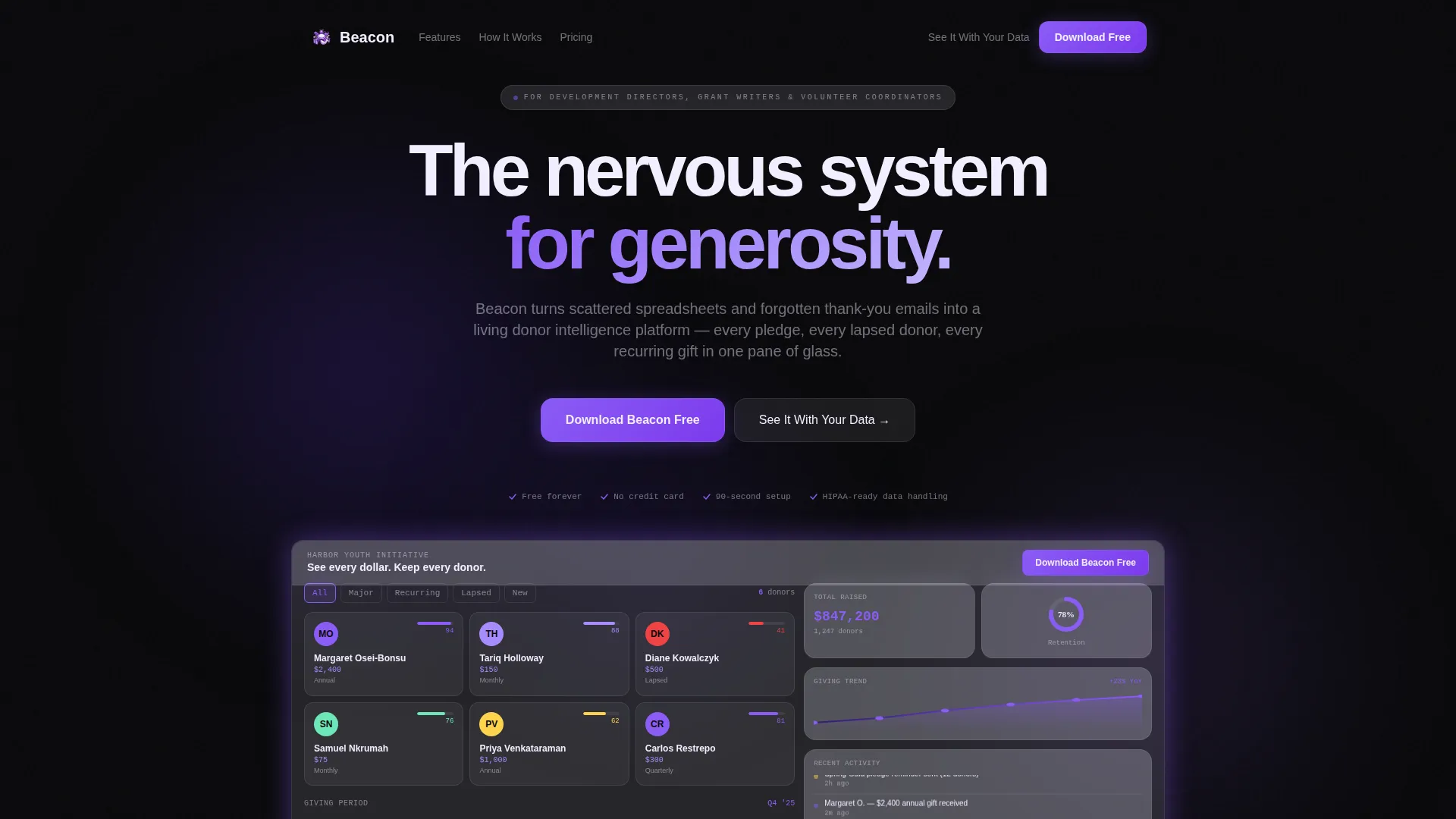
- An interactive hero micro-dashboard rendered in the browser, showing live-updating donor tiles, a giving trend sparkline, a retention donut chart, and a scrolling activity feed
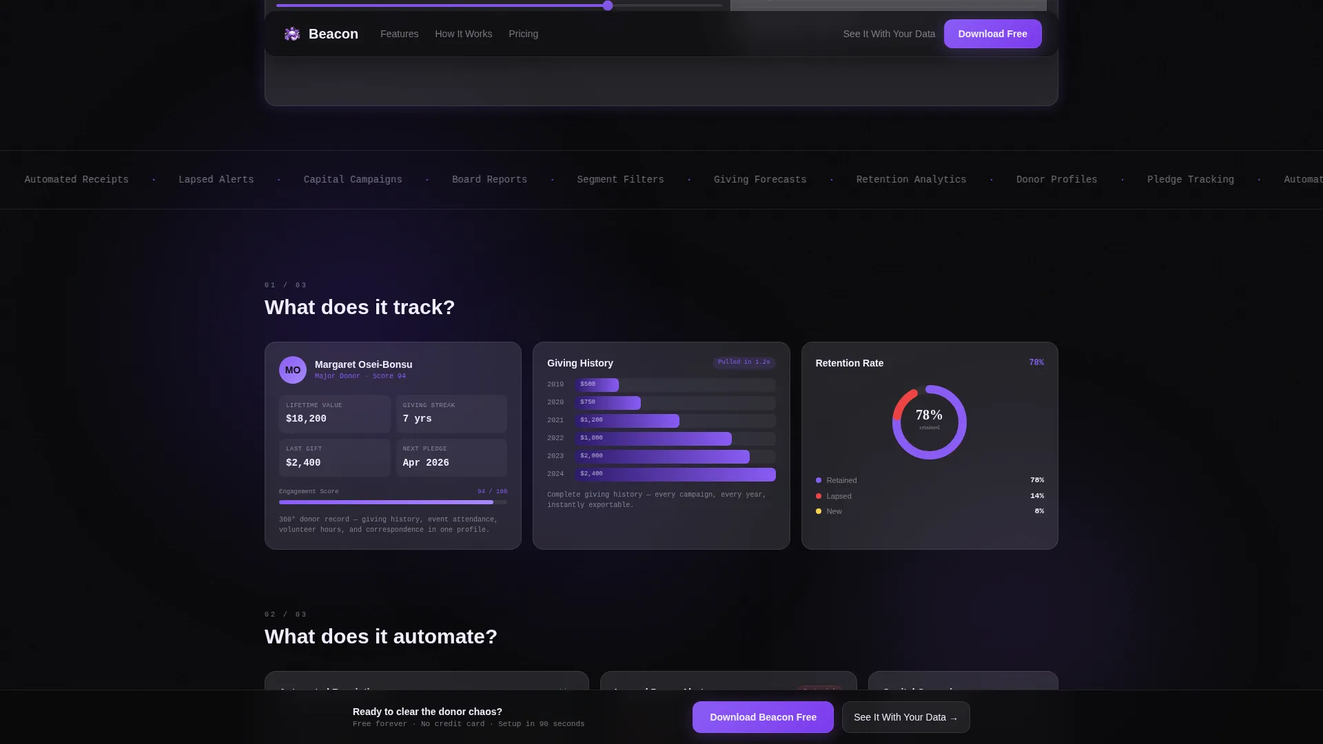
- Three progressive bento grid clusters that reveal capabilities in sequence, answering what the platform tracks, automates, and predicts
- A sticky download call-to-action bar with a platform toggle, email capture field, and a CSV drag-and-drop import modal for in-browser data preview
Feature list
This template is built around a set of deliberate, high-impact components that work together to communicate platform credibility.
Interactive Hero Micro-Dashboard
The header renders a functioning mini-dashboard for a fictional nonprofit called Harbor Youth Initiative. Visitors see live-updating donor tiles, a Q1 through Q4 giving trend sparkline, a retention donut chart held at 78%, and a real-time activity feed. The headline "See every dollar. Keep every donor." is typeset in a frosted glass bar pinned to the top of the preview.
Reveal-Driven Bento Grid
The bento grid does not scroll linearly. Cards reveal in clusters of three, each cluster answering a progressively deeper question about the platform. Cluster one covers tracking. Cluster two covers automation. Cluster three covers prediction. Each cell contains one metric or micro-animation, keeping the proof dense and fast.
Capability Micro-Animations
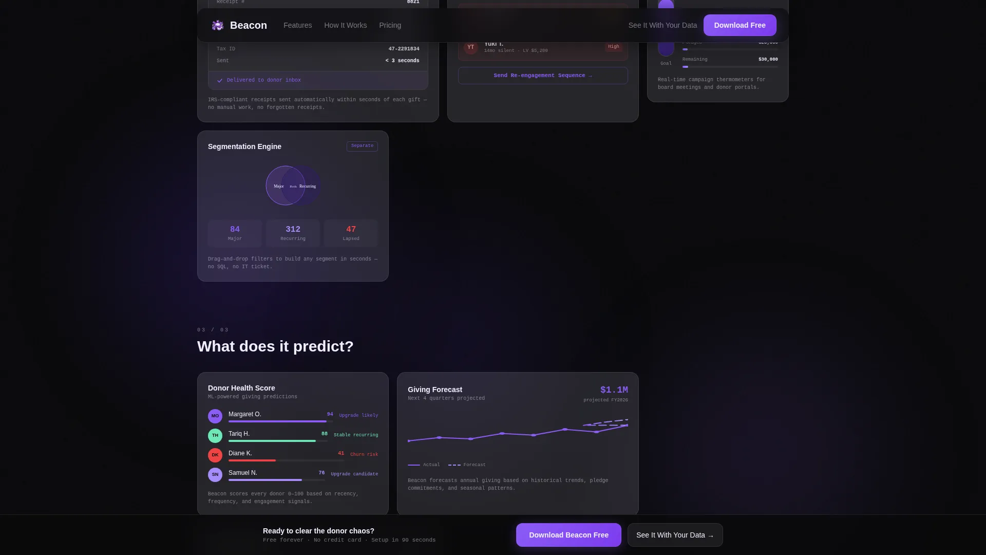
Individual bento cells carry discrete live animations: a receipt generating in real time, a segmentation Venn diagram pulling apart, and a campaign thermometer filling to 94%. These animations replace paragraphs of copy with direct, believable demonstrations of platform behavior.
Frictionless App Download Flow
The primary call to action is a frosted violet "Download Beacon Free" button. It appears first inside the interactive header and again as a sticky bottom bar after the second bento cluster. Tapping it reveals a platform toggle for iOS, Android, and Desktop, plus a single email field with micro-copy promising a 90-second setup walkthrough.
CSV Import Preview Modal
A secondary conversion path labeled "See It With Your Data" opens a lightweight modal. Development directors can drag a comma-separated values file of anonymized donor records to preview their own dashboard in the browser before committing to a download. This single feature collapses the trust gap between demo and real use.
Segment Filter Interactivity
Visitors can click segment filters inside the hero dashboard to watch the donor grid rearrange in real time. A draggable date slider lets them see how giving patterns shift across time periods. These interactions make the platform feel tangible before any download happens.
Page sections overview
| Section | Purpose |
|---|---|
| Hero Interactive Dashboard | Live micro-dashboard preview with pinned frosted headline and donor tiles |
| Bento Cluster One | Tracks donor profiles, giving history, pledge status, and retention donut |
| Bento Cluster Two | Shows automated receipting, lapsed alerts, campaign thermometers, and segmentation |
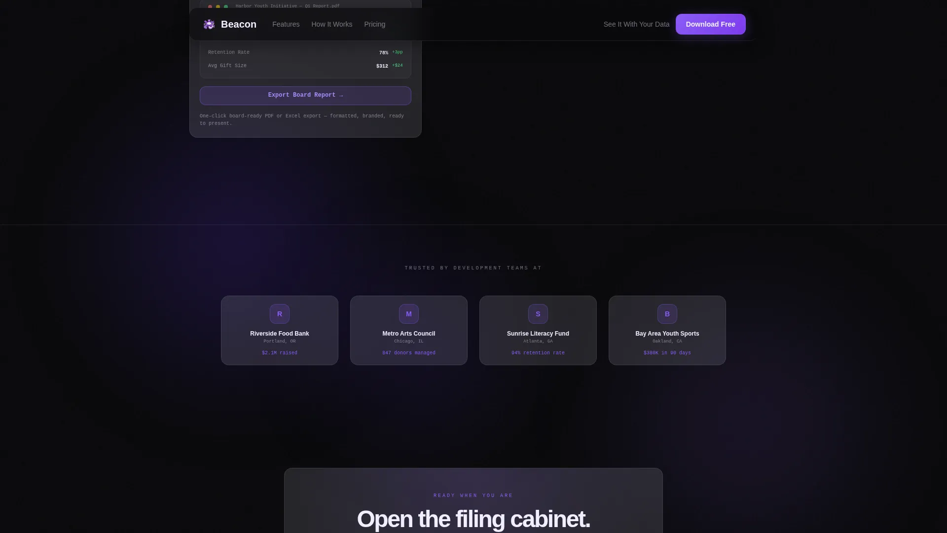
| Bento Cluster Three | Displays giving score, churn risk, board export, and trend forecasting |
| Download Call to Action | Sticky bar with platform toggle, email field, and CSV import modal |
| Footer | Horizontal flow footer pattern closing the page |
Design & branding system
The visual identity follows a Tech Glass aesthetic that feels like a planetarium control room at 2 a.m. Every color decision serves legibility and hierarchy inside a dark interface.
- Void black (#09090B) forms the primary background, making every lit element command full attention
- Deep ultraviolet (#2D1B69) layers behind card surfaces, and luminous orchid (#8B5CF6) activates on hover states, progress bars, and donor score indicators
- Card surfaces carry 12% white opacity with a subtle backdrop blur, rendered in frosted glass white (#F0EEFF), which also serves as the primary text color on dark panels and flips to void on light summary cards
Mobile & speed optimization
The template is designed desktop-first because development directors work at desks. The layout still includes a mobile-responsive fallback so the page remains functional across screen sizes.
- Static sections use server-rendered components to keep initial load lean, while interactive elements like the dashboard and modals are isolated as client components
- GSAP ScrollTrigger powers staggered bento reveals and sparkline animations, keeping motion purposeful and tied to scroll position rather than firing all at once
- Typography uses Plus Jakarta Sans for headings and body text, with JetBrains Mono reserved for data labels and metrics, creating a clear visual hierarchy between narrative and numbers
How this template helps you convert
This landing page is built around one outcome: getting a qualified visitor to download the app. Every structural decision supports that single goal.
- The interactive dashboard replaces passive reading with active exploration, so visitors build confidence in the platform before they ever see a download button
- The bento grid clusters answer trust questions in sequence, moving from "what does it track" to "what does it automate" to "what does it predict," so each scroll deepens commitment rather than introducing new hesitation
- The CSV import modal lets development directors preview their own data in the browser before downloading, removing the final objection between interest and action
Other information about this template
This template is built for teams that need to launch a nonprofit donor management landing page with a high level of interactivity and visual credibility. A few additional details are worth noting.
- Typography pairing uses Plus Jakarta Sans and JetBrains Mono, both available via standard font delivery services
- Animation is handled with GSAP ScrollTrigger, which manages staggered reveals, live dashboard updates, and magnetic call-to-action behavior
- The bento grid style suits product teams that want to communicate feature density without overwhelming visitors with long blocks of text
- The footer follows a Vercel Horizontal Flow pattern, keeping the closing section clean and consistent with the overall design language
- The localization defaults are set for English, United States dollar formatting, MM/DD/YYYY date display, and the United States nonprofit sector context
Theme
Tech Glass
Creative direction
Spec Sheet
Color system
Void & Violet
Style
Bento Grid
Direction
App Download
Page Sections
Interactive Hero Micro-dashboard
Progressive Bento Grid Reveal
Capability Micro-animations
Sticky Download Call to Action
CSV Import Preview Modal
Clickable Segment Filters and Date Slider
Related questions
Who is this landing page template designed for?
Does the interactive dashboard show real donor data?
What is the CSV import modal and how does it work?
Can the color system and typography be customized?
Is this template suitable for both desktop and mobile visitors?



