AI for Real Estate Portfolio Website Template
Beacon is a single-page AI real estate recommendation landing page built for tech-forward property platforms. It combines a Data Command visual theme with a card grid layout to showcase a machine-learning engine that matches buyers to properties before they know to search. The Void and Violet color system and staggered card animations make the experience feel like a live data system locking onto its target.
by Rocket studio
Quick summary
Beacon is a modular card grid landing page for a predictive real estate AI engine. It uses a dark Data Command aesthetic, staggered card animations, and a focused micro-conversion flow to drive app downloads. The template is built for platforms that want to show serious AI capability without overwhelming the visitor.
Who this template is for
This template is designed for teams building AI-powered property search products. It speaks clearly to the people most likely to act on a smarter recommendation engine.
- First-time home buyers who feel lost browsing too many listings at once
- Relocating professionals who need to pick a city and a neighborhood at the same time
- Real estate investor groups scanning emerging zip codes for strong return potential
What problem this template solves
Most real estate search pages pile on filters and listings without ever narrowing the choice down. Visitors leave without confidence. Beacon flips that dynamic by leading with proof that the engine already has an answer.
- Buyers feel overwhelmed by too many options and no clear signal on which property fits them
- Relocation decisions are stressful when city choice and home search have to happen simultaneously
- Investor teams waste time scanning listings manually when data signals could surface the right zip codes faster
What you get with this template
You get a complete single-page layout built around a modular card system. Every section is designed to build trust and momentum toward one clear action: downloading the app.
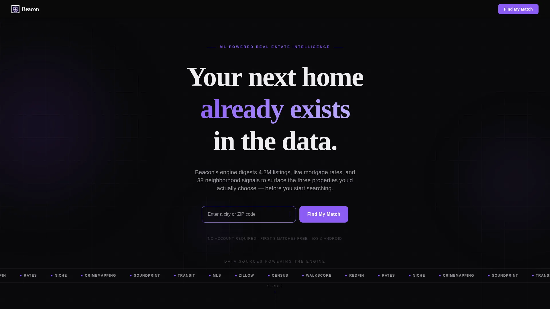
- A header with a logo bar, oversized headline, and a violet-outlined city or zip code input field
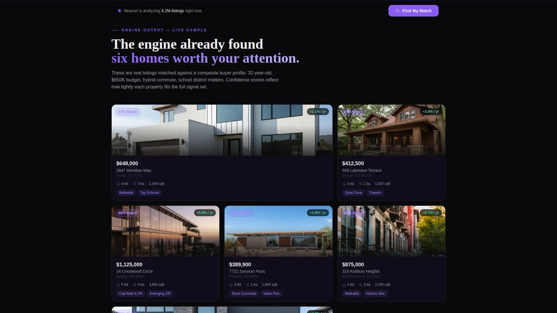
- Staggered card grid sections showing AI-matched property samples, data dimension breakdowns, and user testimonials
- A two-step micro-conversion flow ending with iOS and Android download buttons, a QR code, and a match-confirmation message
Feature list
This section covers the core built-in components and design behaviors that make Beacon work as a conversion-focused landing page.
Scrolling Integration Logo Bar
A horizontal strip of data-source logos moves in a slow, silent conveyor across the void background inside the header. It signals credibility immediately, before any copy has to earn it.
AI Match Card Grid with Confidence Badges
Sample property cards animate upward in a staggered sequence as the visitor scrolls. Each card carries a violet confidence-percentage badge that makes the AI output feel real and computed, not decorative.
Flip Cards for Data Dimensions
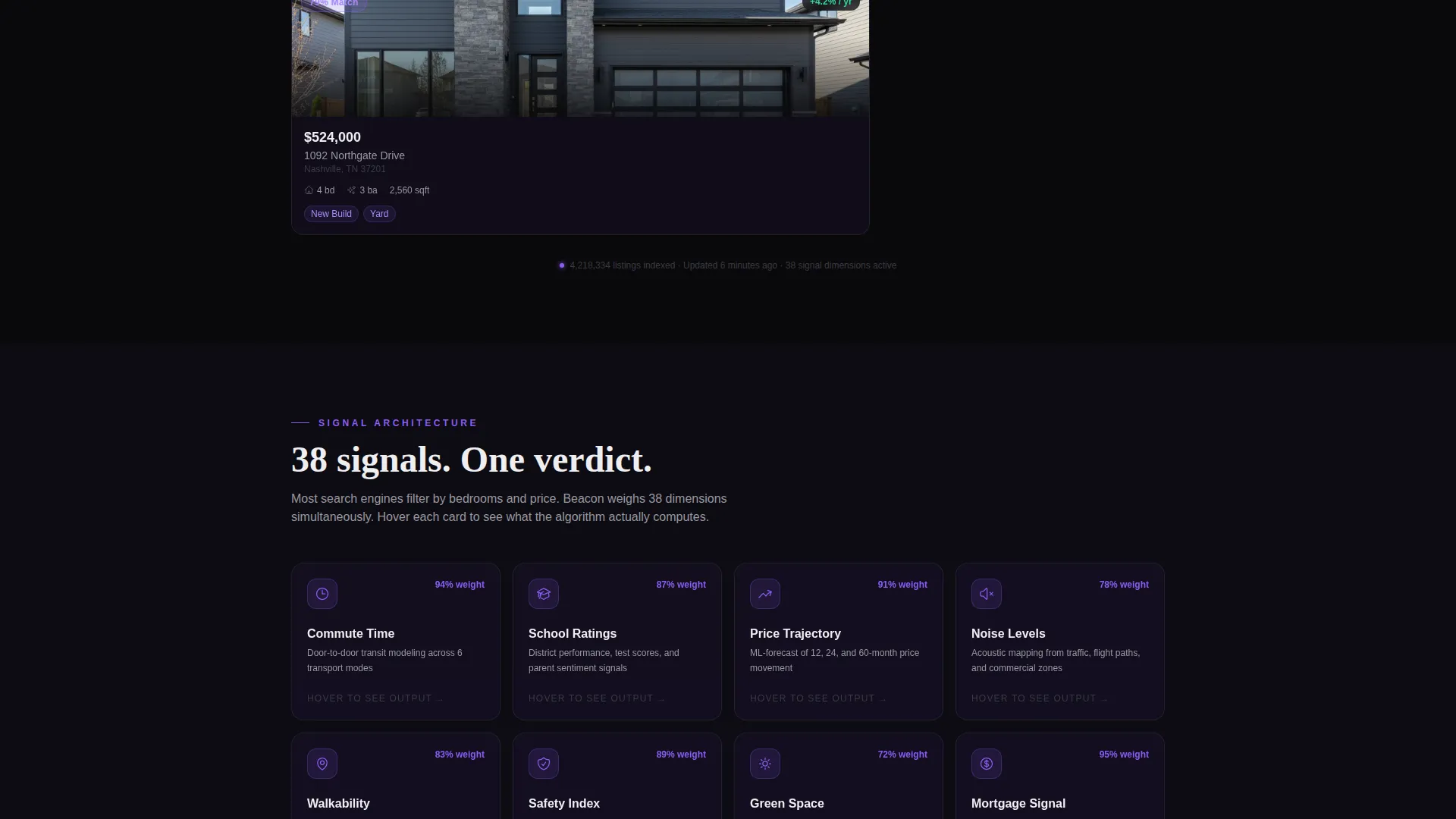
A dedicated section uses cards that flip on hover to reveal the algorithmic factors the engine weighs. Commute time, school ratings, price trajectory, and noise levels each get their own card face and reveal.
Testimonial Cards with Match-Score Rings
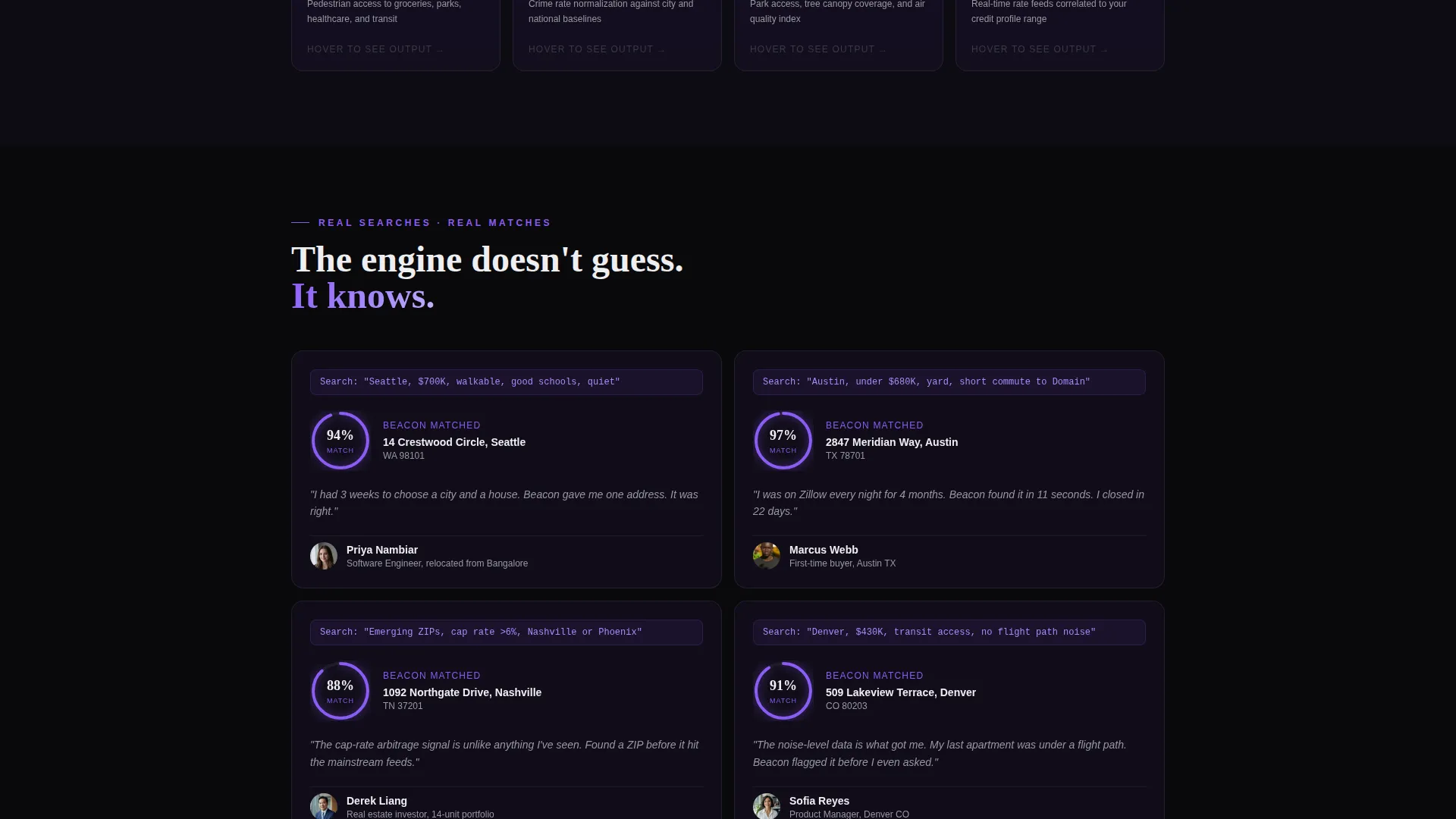
User testimonial cards display the original search query alongside the property the engine found. A circular match-score ring fills like a loading indicator, reinforcing trust through visual proof of performance.
Two-Step App Download Flow
The primary call-to-action button triggers a two-step micro-flow. Step one collects city, budget range, and lifestyle preferences via quick-tap chips. Step two presents the download buttons with a QR code and a confirmation that the first three matches are ready.
Fixed Bottom Conversion Bar
After the visitor passes the second scroll section, a fixed bottom bar surfaces the primary call-to-action button again. It stays visible without interrupting the scroll, keeping the conversion path open at all times.
Page sections overview
| Section | Purpose |
|---|---|
| Header Input Zone | Establishes AI premise and captures initial city or zip code intent |
| Data Source Logo Bar | Builds credibility by showing the engine's real data inputs |
| AI Match Card Grid | Demonstrates live-style property recommendations with confidence scores |
| Data Dimension Cards | Explains the factors the engine weighs using flip-card interactions |
| Testimonial Card Grid | Provides social proof through real search queries and AI match results |
| Fixed call to action Bar | Keeps the download action visible after the second scroll section |
| Two-Step Download Flow | Converts visitor intent into an app download with minimal friction |
Design & branding system
The visual identity is built around a Data Command theme that treats darkness as a design asset rather than a default. The palette and motion work together to make every violet accent feel like a signal worth following.
- Core colors: absolute void black (#09090B), deep space indigo (#1E1332), electric violet (#8B5CF6) for interactive elements and data highlights, and cold phosphor white (#EEEEF0) for all typography and card borders
- Cards use hairline phosphor borders that brighten on hover, with violet gradients tracing the visual connections between them
- Typography lands in oversized phosphor white against the void, reinforcing the satellite interface feel the template is built to deliver
Mobile & speed optimization
The card grid layout is built to translate cleanly from desktop to smaller screens. The modular structure means card columns can reflow without breaking the visual hierarchy.
- The fixed bottom call-to-action bar is designed for thumb-reach interaction on mobile devices
- The two-step micro-flow uses quick-tap chips that work well on touch screens, keeping the path to download fast and low-effort
How this template helps you convert
Beacon earns the download by making the engine's output visible before asking for anything. The conversion path is short and each step is backed by proof.
- The header input field creates immediate personal investment by asking visitors to enter their own city or zip code right away, making the engine feel relevant before they scroll.
- Each card grid section layers in more evidence: AI-matched properties, the data dimensions behind the match, and real user results with visible match scores, so the visitor's trust builds with every scroll.
- The two-step micro-flow reduces commitment friction by collecting preferences through quick-tap chips rather than long forms, then closes with download buttons and a QR code alongside a message that the first three matches are already waiting.
Other information about this template
Beacon is designed for product teams, real estate technology startups, and app marketing teams that want a high-impact single-page presence for an AI-driven property recommendation tool. The template's modular card system makes it straightforward to swap in real data, real testimonials, or live API outputs as the product matures.
- The template style is Card Grid (Modular), making individual sections easy to rearrange or extend
- The creative direction is Launch Energy: the page starts in quiet stillness and builds momentum through staggered animations and increasingly dense data grids
- The header concept is a Logo Bar, a horizontal scrolling strip intended to communicate the breadth of data sources feeding the engine
- The landing page direction is App Download, meaning every section and call-to-action is oriented toward getting the visitor to install the mobile app
Theme
Data Command
Creative direction
Launch Energy
Color system
Void & Violet
Style
Card Grid (Modular)
Direction
App Download
Page Sections
Scrolling Data Source Logo Bar
AI Match Cards with Confidence Badges
Flip Cards for Algorithm Factors
Testimonial Cards with Match-score Rings
Two-step App Download Micro-flow
Fixed Bottom Conversion Bar
Related questions
What kind of product is this template built for?
Can I customize the card content and property samples?
Who is the target audience this template is designed to reach?
Does the template include both iOS and Android download prompts?
What makes the visual design feel different from a standard real estate template?



