Micro-SaaS & Developer Tools Professional Website Template
Beacon is a real-time event tracking landing page template built for developer and analytics teams at growth-stage SaaS companies. It features an animated metrics wall, an interactive competitor comparison table, a simulated query sandbox, scroll-triggered migration stories, and a progressive two-step lead capture form, all wrapped in a dark, terminal-inspired Data Command aesthetic.
by Rocket studio
Quick summary
Beacon is a single-page landing page template for a real-time event tracking tool. It combines live-counter animations, an interactive competitor comparison table, a simulated query sandbox, and scroll-triggered social proof cards. The design runs on a dark ops-center palette with teal accents, monospaced data streams, and a progressive lead capture form that qualifies visitors by event volume.
Who this template is for
This template is built for teams who need to sell technical infrastructure to a technically literate audience. It speaks directly to the people who evaluate event tracking tools and sign off on migrations.
- Growth leads and product managers at Series B SaaS companies who debug onboarding funnels and need dashboard-ready behavioral data
- Mobile engineers validating feature flags before a release and analytics directors moving off legacy platforms with per-event pricing
What problem this template solves
Most analytics tool landing pages describe features with static screenshots. Beacon's structure lets visitors interact with the product logic before they ever fill out a form. That matters when your buyers are engineers and data leads who distrust marketing copy by default.
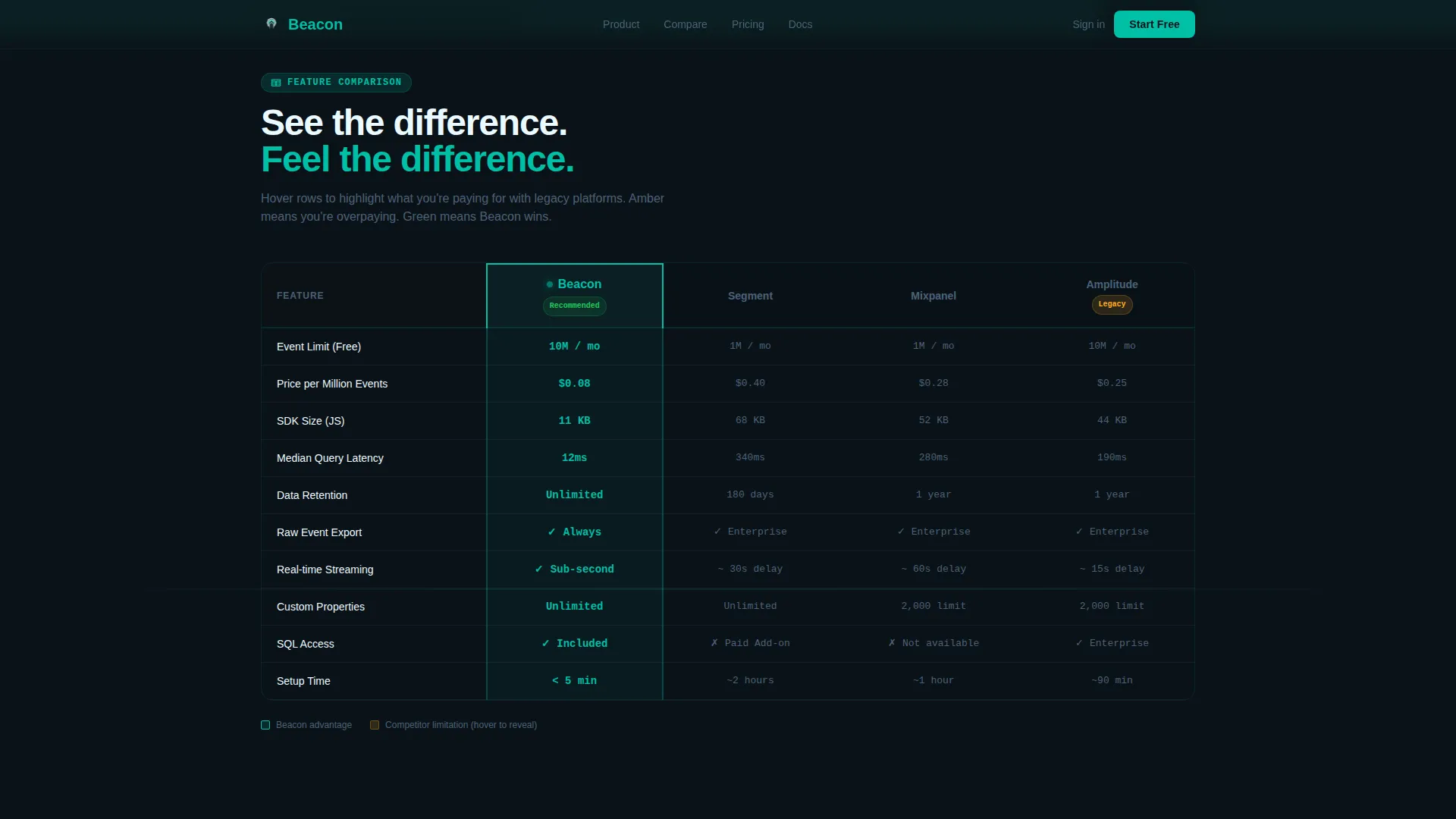
- The comparison table with hover-highlighted cells replaces vague claims with side-by-side specifics: event limits, pricing per million events, SDK size, query latency, and data retention
- The query sandbox and migration story counters move visitors from passive reading to active product evaluation, reducing the gap between first impression and purchase intent
What you get with this template
You get a fully structured, single-page lead generation template with every major section pre-built and ready to customize. The layout escalates deliberately: see the difference, feel the difference, then hear it from someone who switched.
- An animated hero metrics wall, a four-column interactive comparison table, an embedded query sandbox section, three scroll-triggered migration story cards, and a sticky progressive call-to-action bar
- A Teal Catalyst color system, JetBrains Mono and Plus Jakarta Sans typography pairing, and a mission-control terminal visual language throughout
Feature list
This template is built around interactive and animated components that reflect the product's core value: live, verifiable data.
Animated Metrics Wall Hero
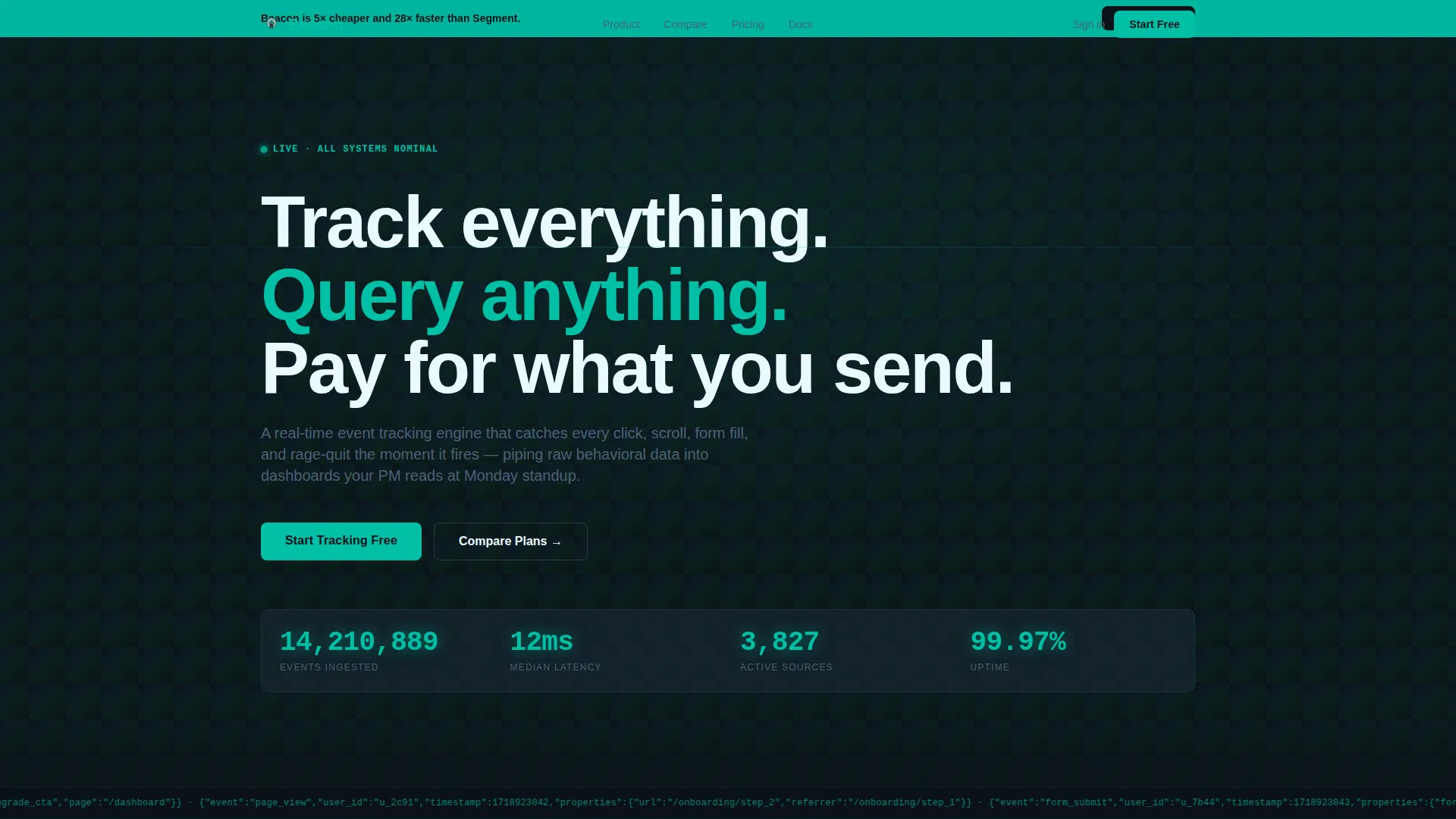
The hero section fills the full viewport with live-incrementing counters showing events ingested, median latency, and active sources. A raw JSON sample scrolls horizontally like a ticker below the counters, and the headline fades in over the data stream. The effect immediately signals infrastructure credibility.
Interactive Competitor Comparison Table
Visitors can toggle between three competitor columns and Beacon in a four-column table. Cells highlight green or amber on hover, letting buyers instantly see where Beacon leads and where rivals fall short. Compared dimensions include event limits, pricing per million events, SDK size, query latency, and data retention.
Simulated Query Sandbox
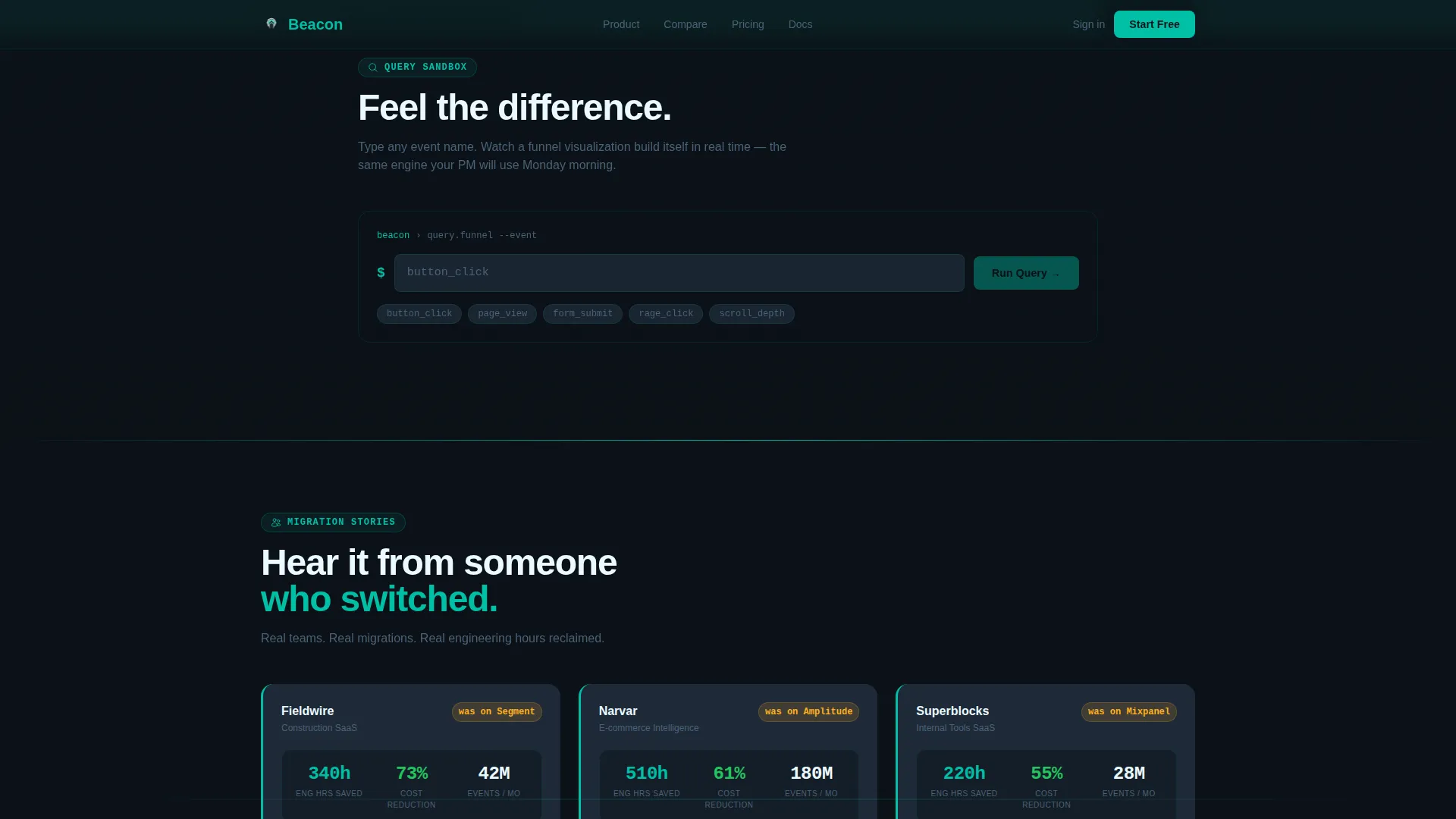
Section two provides an embedded query input field. When a visitor types an event name, a simulated funnel visualization builds itself in real time. This gives technical buyers a hands-on feel for the query interface without leaving the page.
Scroll-Triggered Migration Stories
Three customer story cards animate into view as they enter the viewport. Each card displays an animated counter showing engineering hours saved during migration. The counters spin up on scroll, turning social proof into a live data moment rather than a static testimonial block.
Progressive Two-Step Lead Form
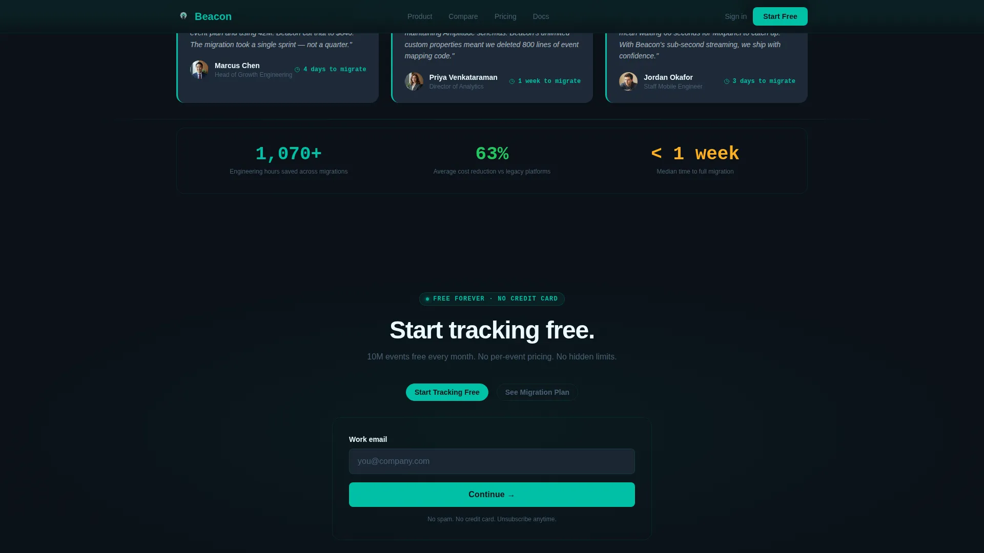
The primary call-to-action form starts with a single work email field. On submission, a second step appears asking for monthly event volume via a dropdown and the visitor's current tracking provider. This staged approach qualifies leads without front-loading friction.
Sticky Teal Call-to-Action Bar
After the visitor scrolls past the comparison table, a slim teal bar pins to the viewport with the primary call to action. A secondary path inside the bar offers a migration plan option for visitors who have spent meaningful time on the comparison table, deepening qualification automatically.
Page sections overview
| Section | Purpose |
|---|---|
| Hero Metrics Wall | Animate live event counters, JSON ticker, and headline to establish infrastructure credibility instantly |
| Competitor Comparison Table | Let visitors toggle and hover-compare Beacon against three rivals across five key dimensions |
| Query Sandbox | Give technical visitors a simulated event query input that builds a funnel visualization in real time |
| Migration Story Cards | Show scroll-triggered animated counters of engineering hours saved across three customer stories |
| Progressive call to action Form | Capture work email first, then qualify by event volume and current provider in a two-step flow |
| Sticky call to action Bar | Pin a teal action bar after the table scroll and surface a secondary migration plan offer |
Design & branding system
The visual identity follows a Data Command theme. Every color, font, and animation choice reinforces the feeling of a live ops center rather than a marketing page.
- Color system: deep ops-center black (#0B1218) for backgrounds, primary teal (#00BFA6) for interactive elements and counters, cool slate (#1E2A38) for card surfaces and table rows, catalyst white (#EAFAFF) for text and dividers, and accent amber (#FFB020) for warning states, competitor limits exceeded, and deprecated tool markers
- Typography: JetBrains Mono for all data display, code samples, and counter values; Plus Jakarta Sans for interface copy, headings, and descriptive text
Mobile & speed optimization
The template is designed desktop-first, reflecting the primary audience of analytics directors and engineers working at workstations. Responsive mobile layout is included for secondary access scenarios.
- Intersection Observer drives scroll-triggered counter animations, keeping them tied to actual viewport entry rather than page load
- A requestAnimationFrame loop handles the JSON ticker scroll and CSS transitions manage all table cell highlight states, keeping animation logic efficient within the browser's rendering cycle
How this template helps you convert
The page earns the lead by letting visitors interact with real product logic before asking for any personal information. Each section builds on the previous one to deepen intent.
- The hero section establishes data credibility immediately with live-incrementing counters and a raw JSON ticker, so technically skeptical buyers trust the product is real infrastructure before they read a single marketing sentence
- The comparison table triggers active evaluation: visitors who spend time toggling and hovering are self-qualifying, and the secondary call-to-action path surfaces specifically for those high-intent visitors
- The two-step progressive form reduces friction at the conversion point by asking only for a work email first, then collecting volume and provider context in a second step once micro-commitment is established
Other information about this template
This template suits any developer-focused or analytics SaaS product that needs to communicate performance, pricing transparency, and migration ease to a technical buying committee.
- The template style is a Comparison Table layout, and the creative direction follows an Interactive Explorer approach where scrolling through the page functions as the product demo itself
- The header concept is a Stats and Metrics wall, and the lead generation direction uses a progressive form with two qualification steps rather than a single long form
- The Teal Catalyst color system and Data Command theme are designed to feel native to the tools this audience already uses every day: terminals, dashboards, and monitoring consoles
Theme
Data Command
Creative direction
Interactive Explorer
Color system
Teal Catalyst
Style
Comparison Table
Direction
Lead Generation
Page Sections
Animated Live Metrics Hero
Interactive Competitor Comparison Table
Simulated Query Sandbox
Scroll-triggered Migration Counters
Progressive Two-step Lead Form
Sticky Post-table Call to Action Bar
Related questions
Who is this template designed for?
Can I change the competitor columns in the comparison table?
Is the query sandbox connected to live data?
How does the progressive lead form work?
What animation techniques does this template use?



