Results-Driven Nonprofit Landing Page Template
Ledger is a scroll-reveal landing page template built for nonprofit billing and invoicing platforms. It combines a Dashboard Pro theme with a Monochrome Steel palette, Dark Glass Panel header, and a progressive Feature Matrix layout. The design guides development directors, fiscal managers, and operations leads from first scroll to app download with zero friction.
by Rocket studio
Quick summary
Ledger is a single-page, scroll-reveal landing page template designed for nonprofit finance and invoicing platforms. It uses a dark, steel-toned dashboard aesthetic to speak directly to grant managers and fiscal operations leads. Every section reveals progressively as the visitor scrolls, building confidence feature by feature until the app download call to action feels like the only logical next step.
Who this template is for
This template is built for SaaS founders and product teams launching nonprofit billing or invoicing software. It resonates with audiences who work inside complex grant environments and need a page that proves the product understands their workflow before asking for anything.
- Development directors managing multiple open grants at quarter-end
- Fiscal managers at community health centers handling government reimbursement billing
- Operations leads at mid-size non-governmental organizations who still rely on manual document templates
What problem this template solves
Nonprofit finance teams carry a specific burden that generic invoicing software pages never acknowledge. A landing page that leads with spreadsheet pain, fund allocation complexity, and audit-season stress earns instant recognition from the right visitor.
- Generic SaaS templates fail to reflect the restricted-fund and compliance realities nonprofit buyers face
- Most billing software pages lead with features rather than the workflow problems that actually keep finance teams up at night
- Visitors leave before the call to action because the page never earns their trust with relevant, specific proof
What you get with this template
You get a fully structured, single-page scroll-reveal landing page built around a Feature Matrix creative direction. The layout is designed to progressively reveal platform capabilities in a way that feels like a product booting up row by row.
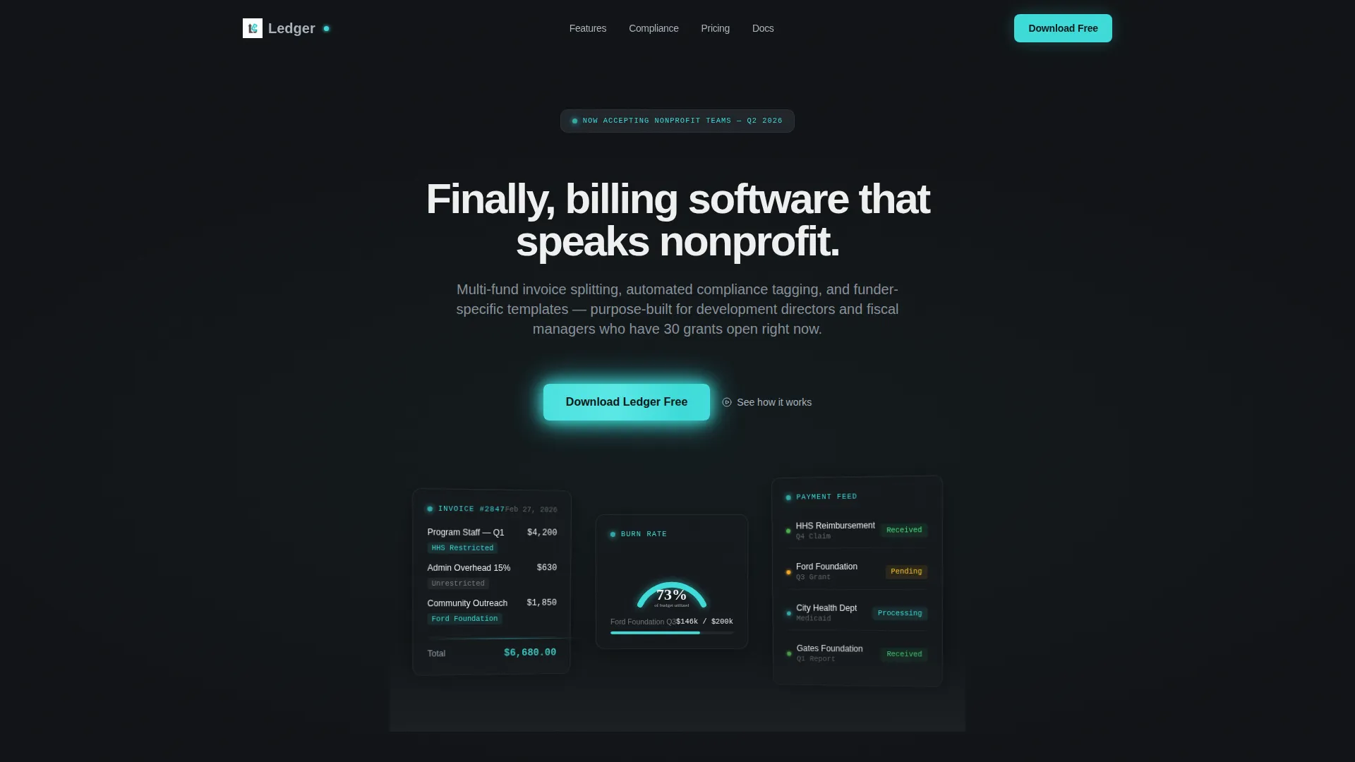
- A Dark Glass Panels header with three floating frosted-glass user interface cards showing live invoice previews, a grant burn-rate gauge, and a payment status feed
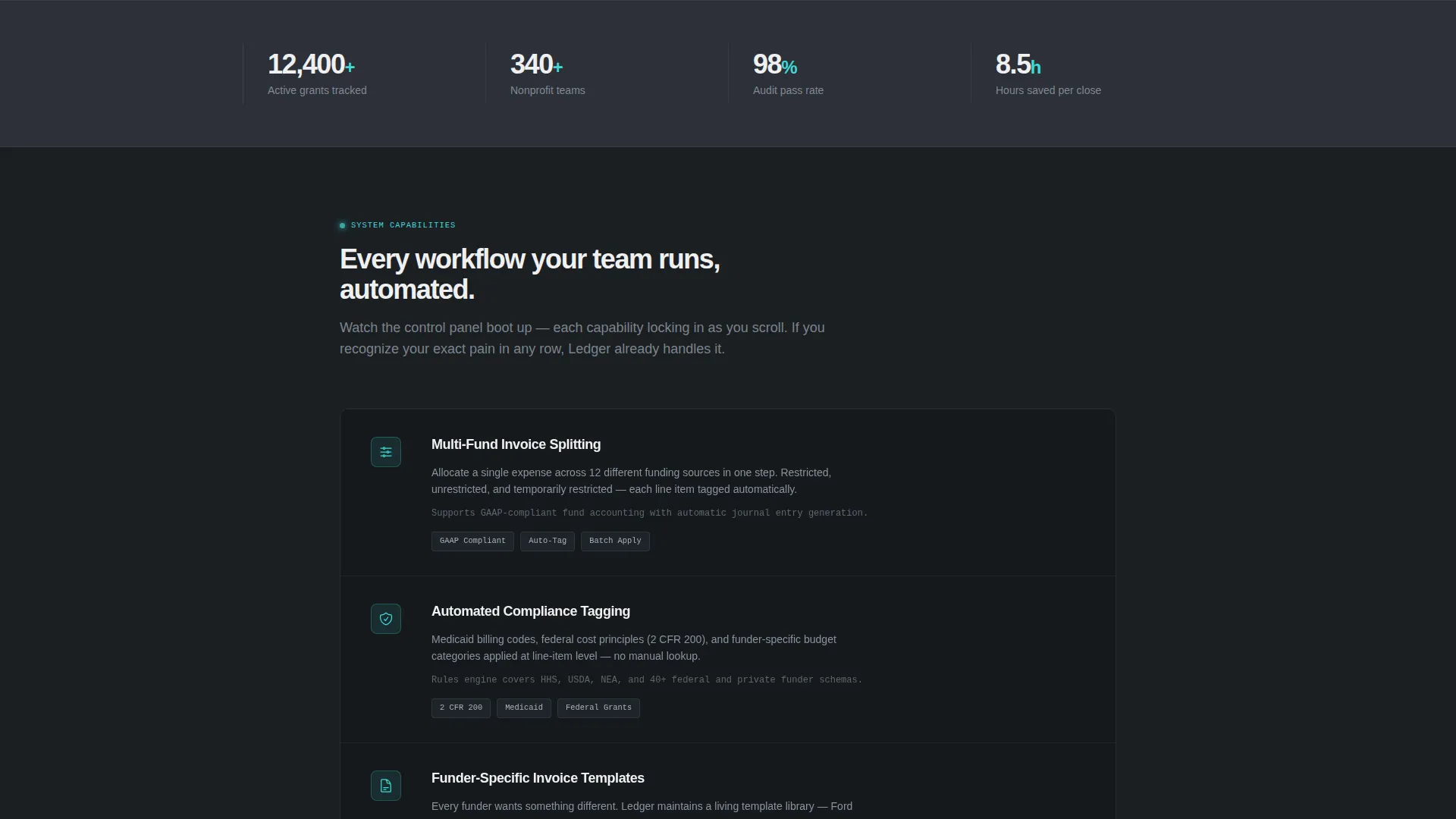
- A scrolling Feature Matrix that reveals capability rows one by one, each locking into the grid with a teal checkbox icon
- A progressive lead-capture form and a floating app download call-to-action bar that appears after the third scroll reveal
Feature list
This template is purpose-built for one job: converting nonprofit finance professionals into confident app downloaders. Every component below comes from the source brief.
Dark Glass Panel Header
Three translucent, frosted-glass user interface cards float against a near-black background at subtle parallax angles. Each panel displays a distinct data view: a live invoice with fund tags, a grant burn-rate gauge at 73%, and a real-time payment status feed. The header makes the product the visual, replacing hero photography entirely.
Progressive Scroll Reveal Matrix
As the visitor scrolls, each capability row enters from zero opacity and locks into a clean grid. A teal checkbox icon lights up on arrival for each feature, creating a satisfying rhythm of discovery. The effect feels like watching a control panel activate system by system.
Before and After Comparison Panel
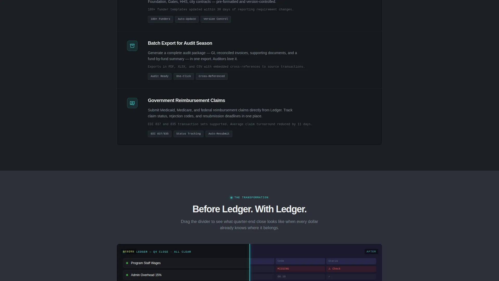
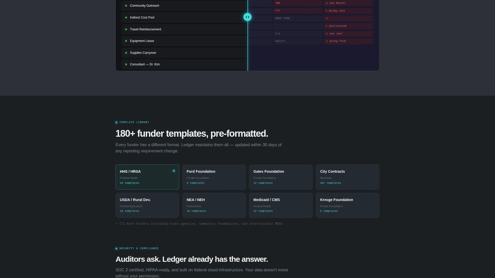
A mid-page panel dissolves a cluttered spreadsheet screenshot on the left into a clean dashboard view on the right. This single moment of contrast does more persuasive work than a paragraph of copy. It appears as a pause point within the Feature Matrix scroll sequence.
Floating App Download Bar
A persistent call-to-action bar pins to the viewport after the third scroll reveal. It presents the primary download button in teal on dark glass, with a secondary "Try the Web App" text link beneath for browser-first visitors. The bar stays present without blocking content.
Progressive Lead Capture Form
A short form placed before the final call-to-action block collects organization type, approximate number of active grants, and a work email address. On completion, it unlocks a custom setup guide PDF alongside the app download. No credit card and no trial timer are required.
OS-Aware Download Flow
The download call to action detects the visitor's operating system automatically and routes to the appropriate download. A secondary browser-based option is always visible for visitors who prefer not to install. This removes a common friction point at the moment of conversion.
Page sections overview
| Section | Purpose |
|---|---|
| Dark Glass Header | Establish product credibility with live user interface data panels |
| Typed Headline | Anchor attention with a single, direct brand statement |
| Scroll Reveal Row 1 | Introduce multi-fund invoice splitting capability |
| Scroll Reveal Row 2 | Present automated compliance tagging feature |
| Scroll Reveal Row 3 | Show funder-specific invoice template options |
| Scroll Reveal Row 4 | Highlight batch export for audit season |
| Before and After Panel | Contrast old workflow pain with the platform solution |
| Security Badge Row | Build trust with compliance credentials before the ask |
| Lead Capture Form | Qualify visitors and deliver a personalized setup guide |
| Floating Download Bar | Drive app download with persistent, low-friction call to action |
Design & branding system
The Monochrome Steel color system creates a functional, server-room aesthetic that signals precision and reliability. Backgrounds alternate between deep gunmetal (#1B1F23) and panel charcoal (#2C3038) to add visual depth without introducing decorative color. Signal teal (#3DDBD9) appears exclusively on interactive elements: active toggles, call to action buttons, and checkbox icons on scroll reveal.
- Headings render in near-white (#F0F0F0) with tight letter spacing; body text sits in brushed chromium (#A8B2BD) for comfortable contrast
- Frosted glass panels use a near-black (#111316) field so the floating user interface cards read as product surfaces, not decoration
- Teal never touches a background surface; it only appears where the visitor can take an action
Mobile & speed optimization
The scroll-reveal layout is built with a progressive disclosure structure, meaning content loads in logical visual stages rather than all at once. This approach keeps the initial viewport clean and lets the animation sequence feel intentional on any screen size.
- The floating download bar adapts to smaller viewports without obscuring the active content section
- The lead capture form uses a dropdown and a slider input, both of which are touch-friendly by default design
How this template helps you convert
Every design decision in this template serves the single goal of moving a skeptical nonprofit finance professional toward downloading the app. The page earns the click before it asks for it.
- The Feature Matrix scroll sequence builds a cumulative case for the platform, so by the time the visitor reaches the call to action, every relevant pain point has already been addressed on-screen
- The lead capture form gives the visitor an immediate reward, a personalized setup guide PDF, before they commit to a download, which lowers the perceived risk of the conversion step
- The floating download bar stays in view after the third reveal so the conversion path is always one tap away, without the visitor needing to scroll back to find it
Other information about this template
This template is categorized under Technology, specifically within the Nonprofit Software and SaaS subcategory. It is optimized for the nonprofit billing and invoicing niche and is well suited to any platform addressing grant management, fund allocation workflows, or government reimbursement billing for mission-driven organizations.
- The Dashboard Pro theme and Monochrome Steel palette are a matched intersection, meaning the visual system was selected specifically to reinforce the platform's credibility with a data-driven audience
- The template style is Scroll Reveal (Progressive), and the landing-page direction is App Download, making it distinct from lead-generation or sales-call oriented templates in the same category
- Founders launching tools that serve health centers, advocacy groups, arts organizations, or education nonprofits will find the organization-type dropdown in the lead form already maps to their audience segments
Theme
Dashboard Pro
Creative direction
Feature Matrix
Color system
Monochrome Steel
Style
Scroll Reveal (Progressive)
Direction
App Download
Page Sections
Dark Glass Panel Header
Progressive Scroll Reveal Matrix
Before and After Comparison Panel
Floating App Download Bar
Progressive Lead Capture Form
Related questions
Who is this template designed for?
Can I change the color system or branding?
Does this template require coding knowledge to use?
What makes the floating download bar different from a standard sticky header?
Is the lead capture form connected to a backend system?



